


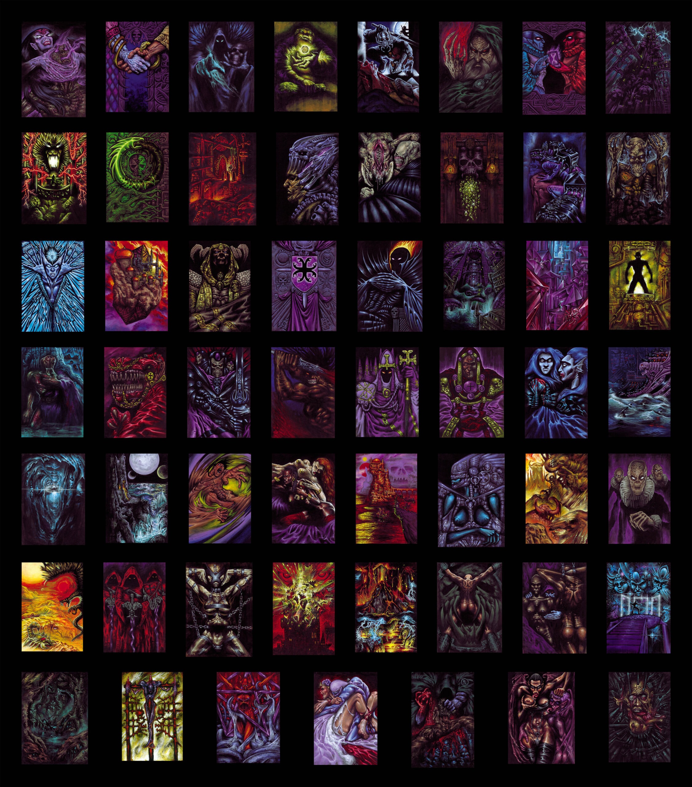
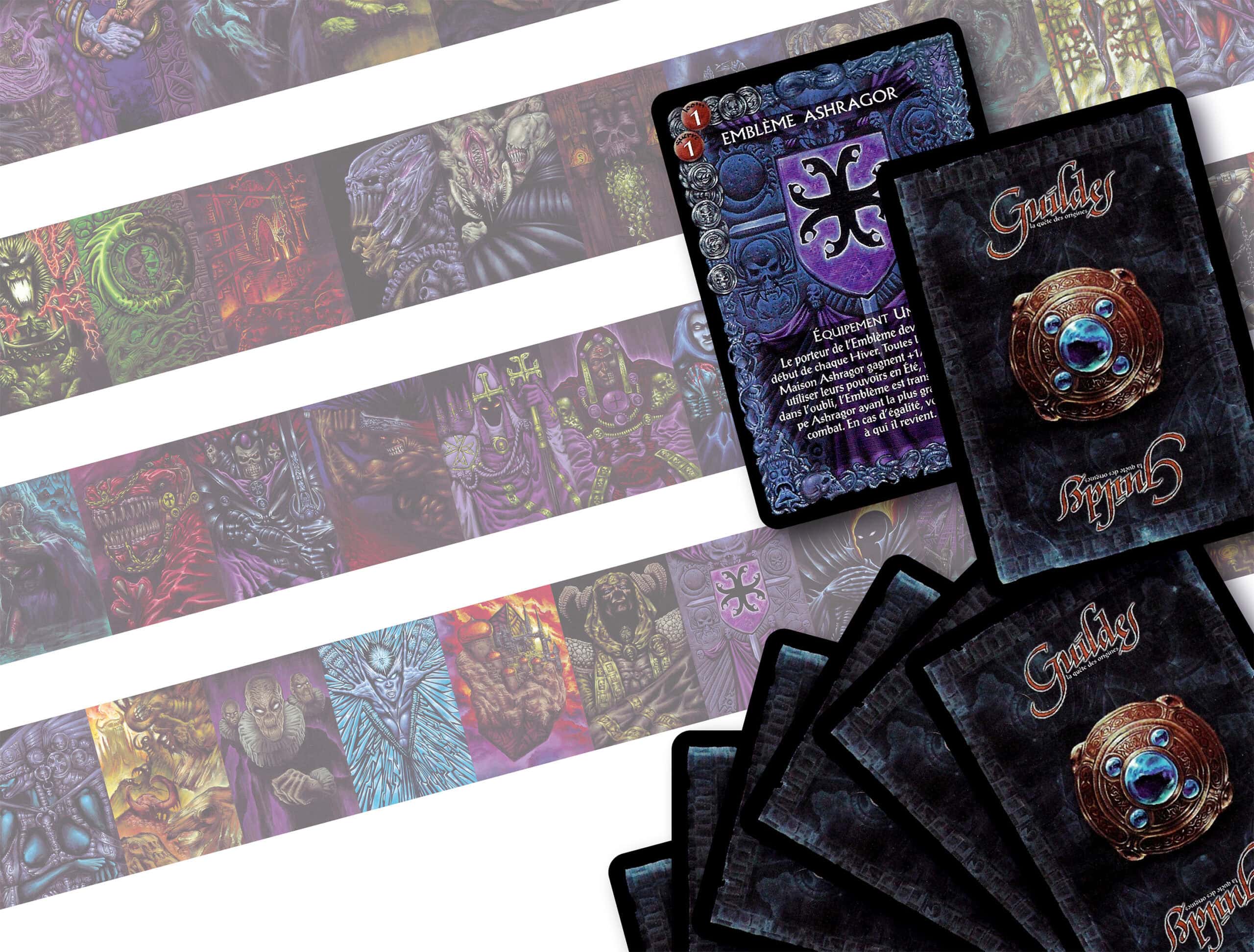
Complete Deck Carousel
1 – Enrôlement Forcé (Forced Enrolment)
2 – Le Conjureur (The Conjurer)
3 – Accusation
4 – Esclavagisme (Slavery)
5 – Harnais de Contrôle (Control Harness)
6 – Les Agents Doubles (The Double Agents)
7 – Autel de Puissance (Altar of Power)
8 – Bannissement (Banishment)
9- Droit de Cuissage (Droit du Seigneur)
10 – Les Archions (The Archions)
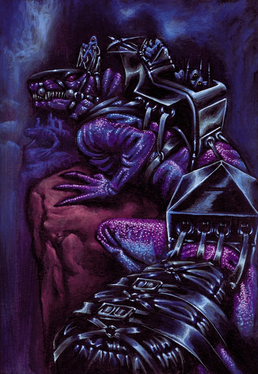
11 – Nécro-Animation (Necro-Animation)
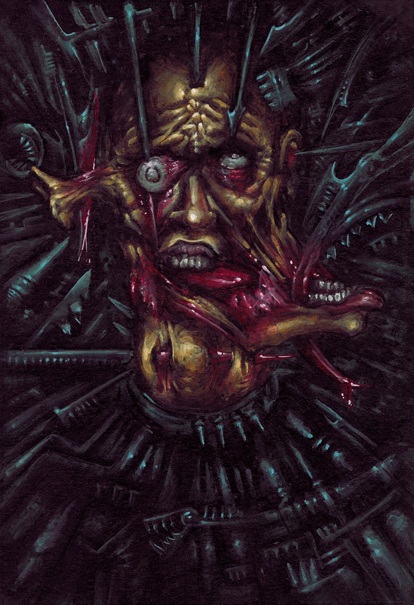
12 – Place du Supplice (Place of Torment)
13 – Renouveau (Renewal)
14 – Les Bromys (The Bromys)
15 – Les Moines Rouges (The Red Monks)
16 – Torture
17 – A la Gloire du Martyr (To Martyr’s Glory)
18 – Autel de l’Espoir (Altar of Hope)
19 – Folie Meurtrière (Murderous Frenzy)
20 – Les Succubes (The Succubi)
21 – Corruption
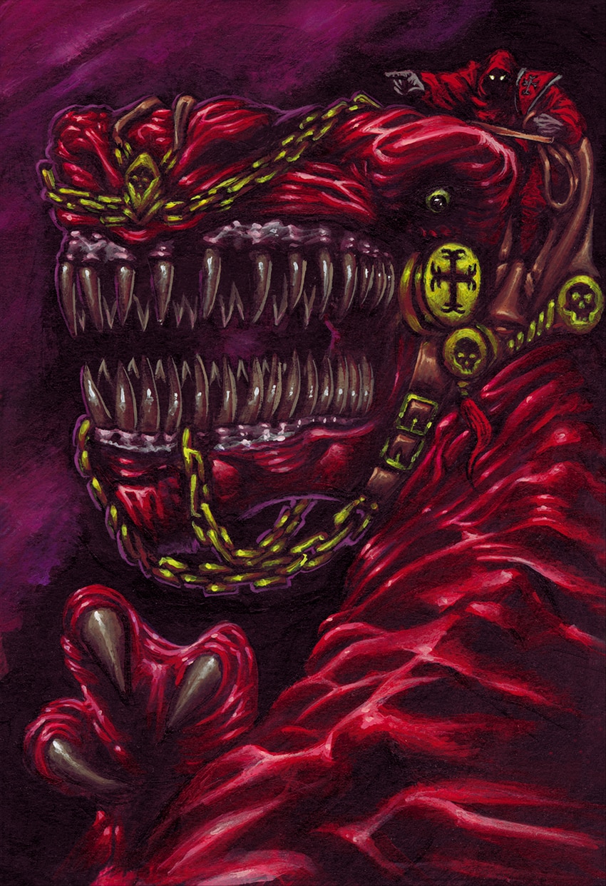
22 – Les Démons (The Demons)
23 – Le Déserteur (The Deserter)
24 – Expérience Douteuse (Dubious Experiment)
25 – Sacrifice Rituel (Ritual Sacrifice)
26 – Échange de Bon Procédé (Quid Pro Quo)
27 – La Cour des Eternels (Court of the Eternals)
28 – Chapelle des Erreurs Passées (Chapel of the Past Errors)
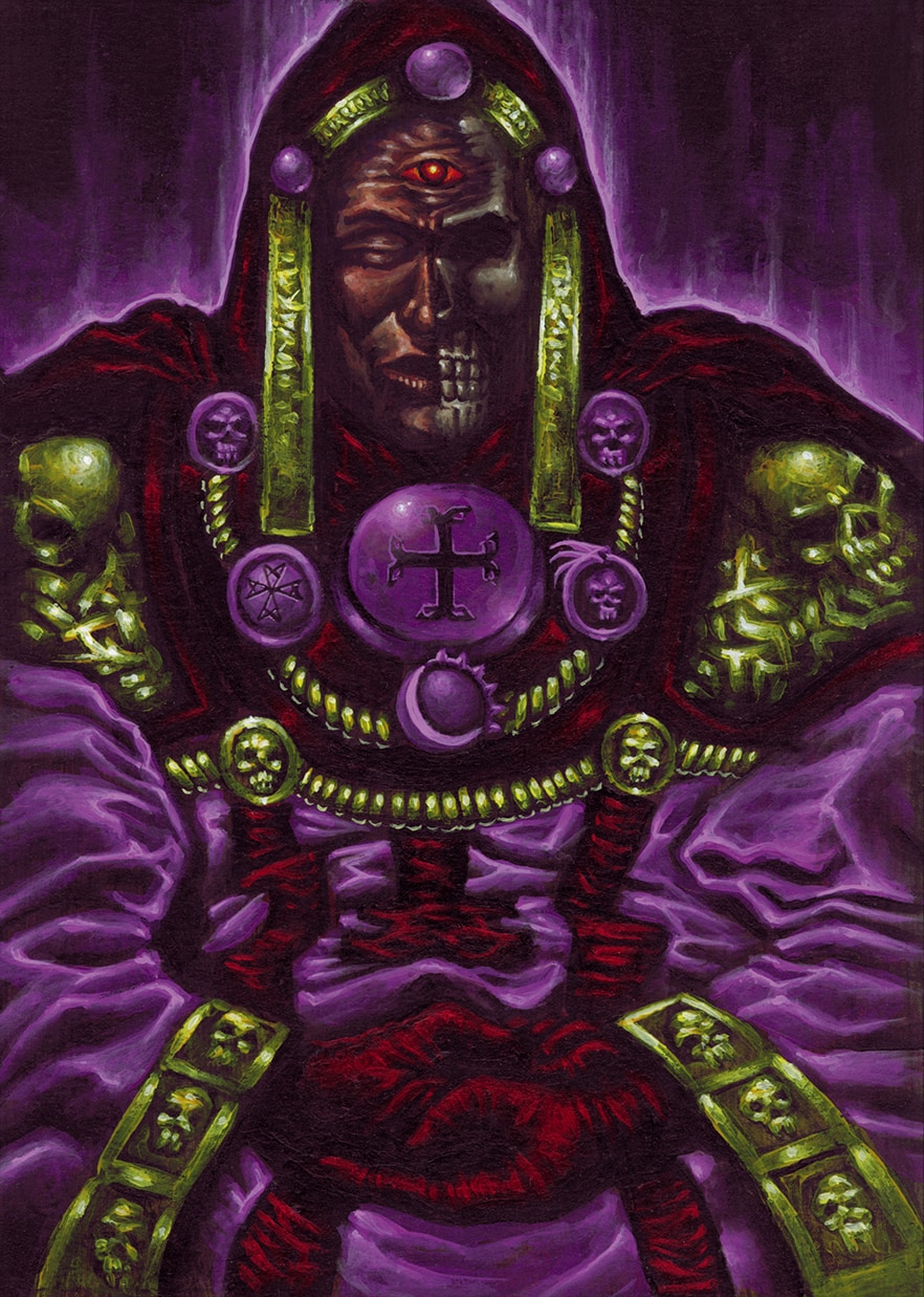
29 – Les Éminences (The Eminences)
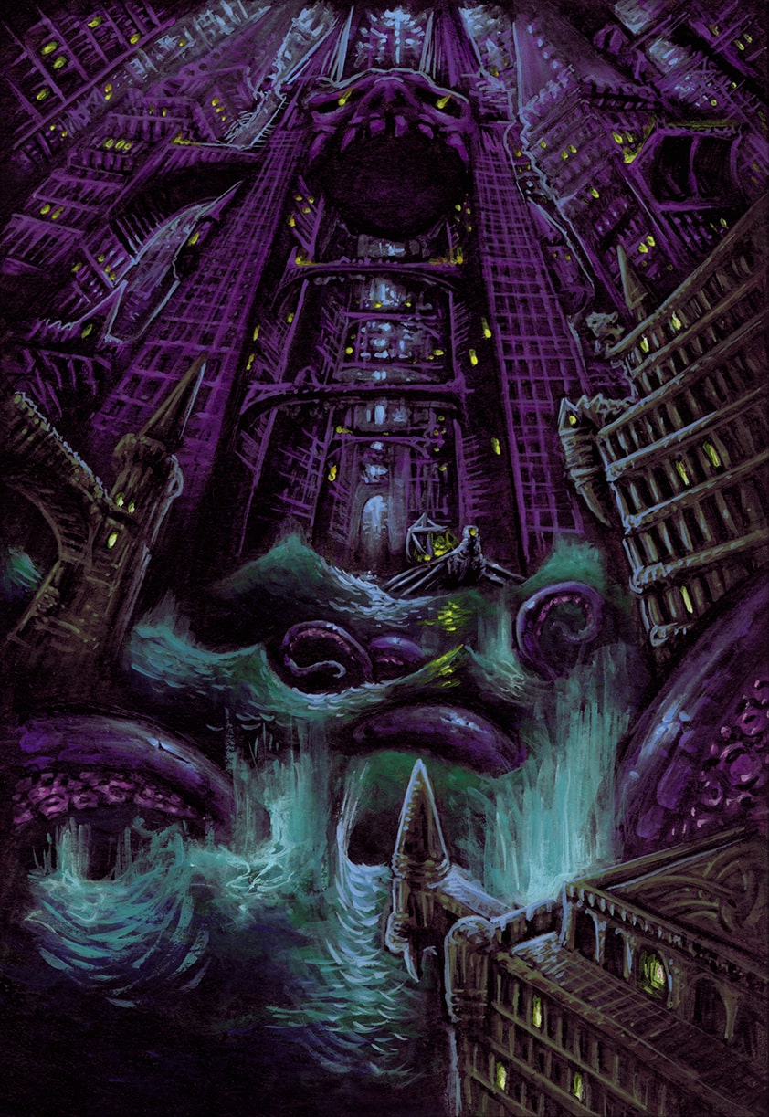
30 – Laboratoire Alchimique (Alchemical Laboratory)
31 – Les Voleurs d’Esprit (The Mind Stealers)
32 – Celes
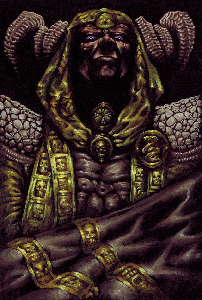
33 – Kahim
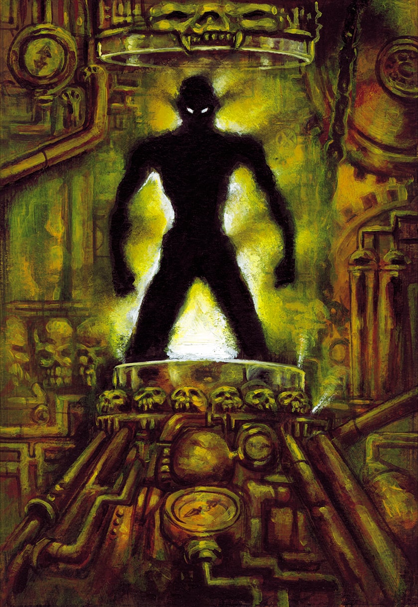
34 – Palais des Ombres (Palace of Shadows)
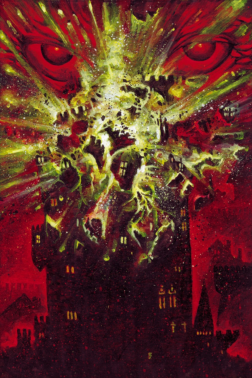
35 – Retour de Flammes (Backfire)
36 – Sacrifice Ultime (Ultimate Sacrifice)
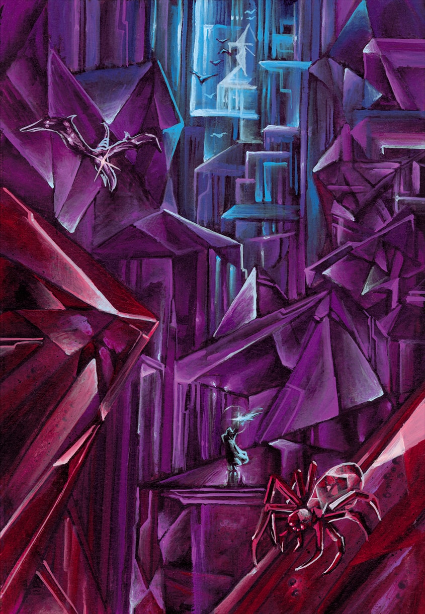
37 – Sanctuaire des Âmes (Sanctuary of Souls)
38 – Tour de la Nécromancie (Tower of Necromancy)
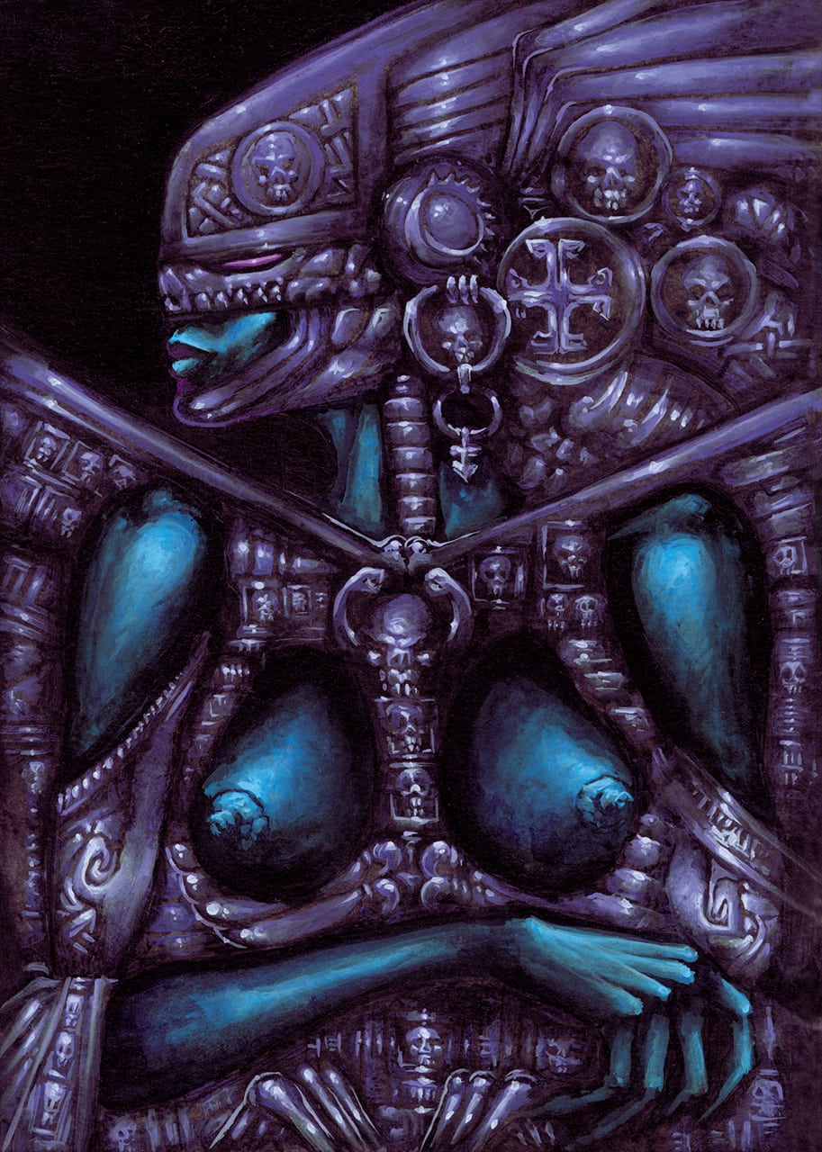
39 – Soumission (Submission)
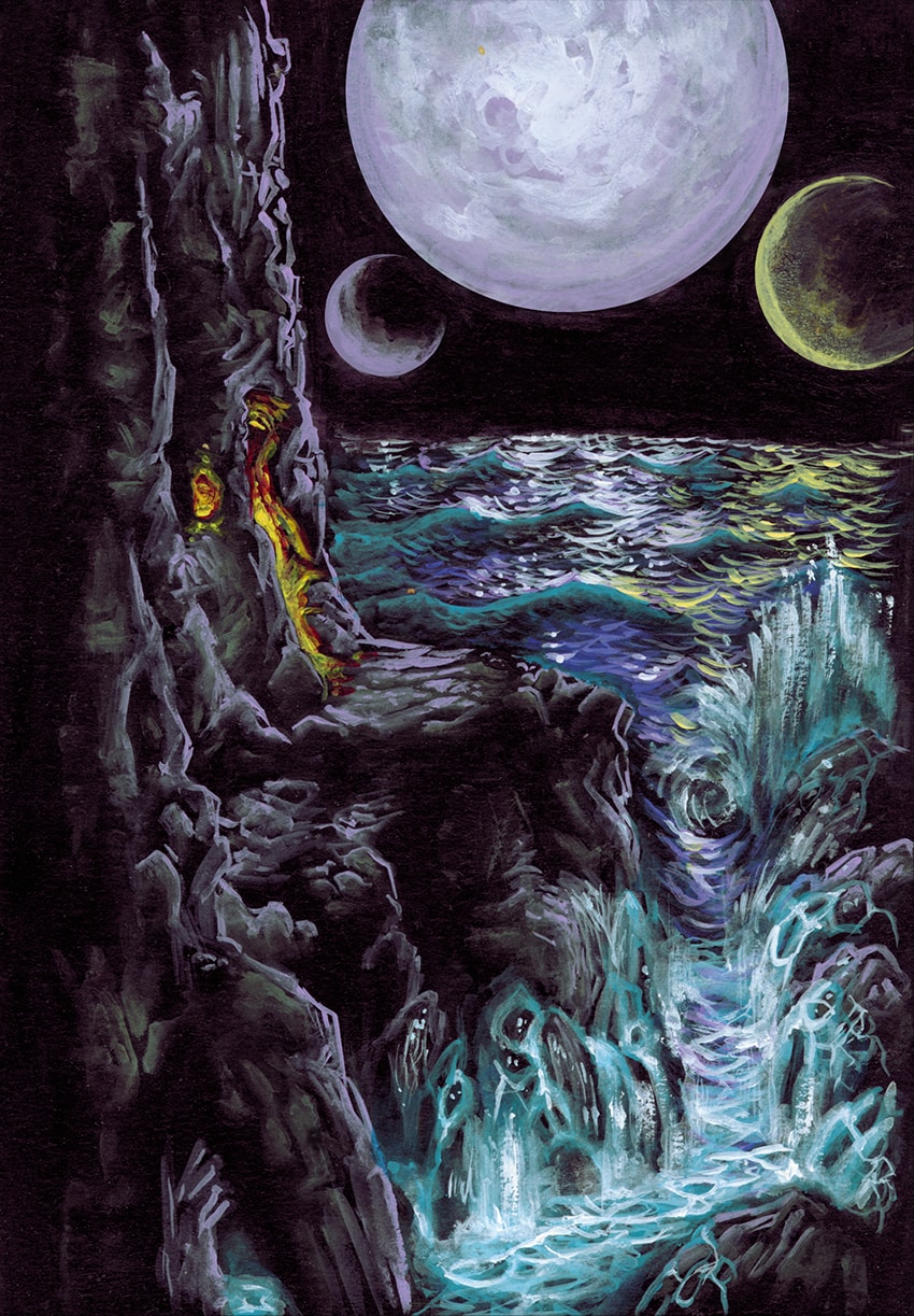
40 – Falaises des Marées Éternelles (Cliffs of the Eternal Tides)
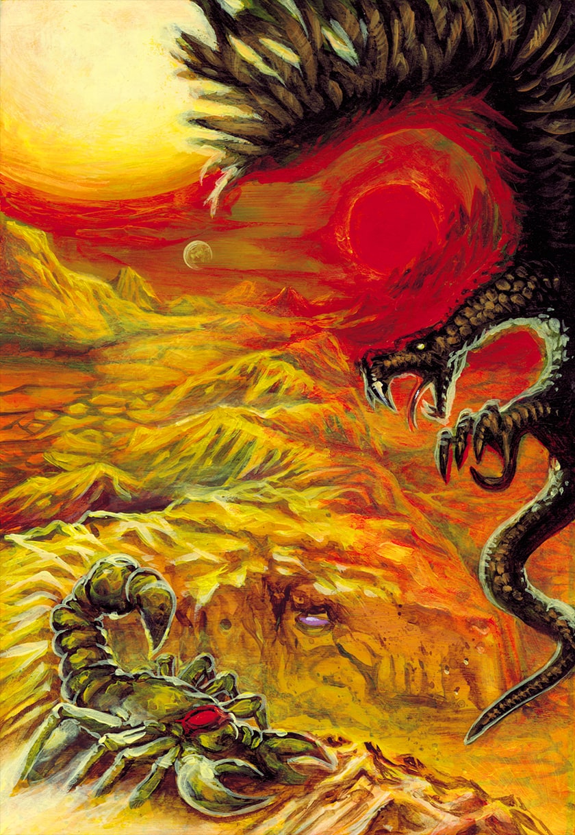
41 – Désert de l’Agonie (Desert of Agony)
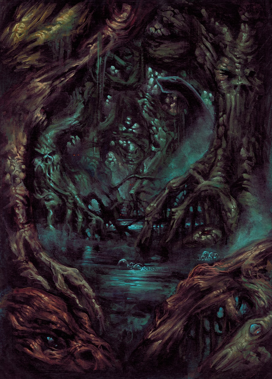
42 – Mangrove des Lueurs Perdues (Mangrove of the Lost Gleams)
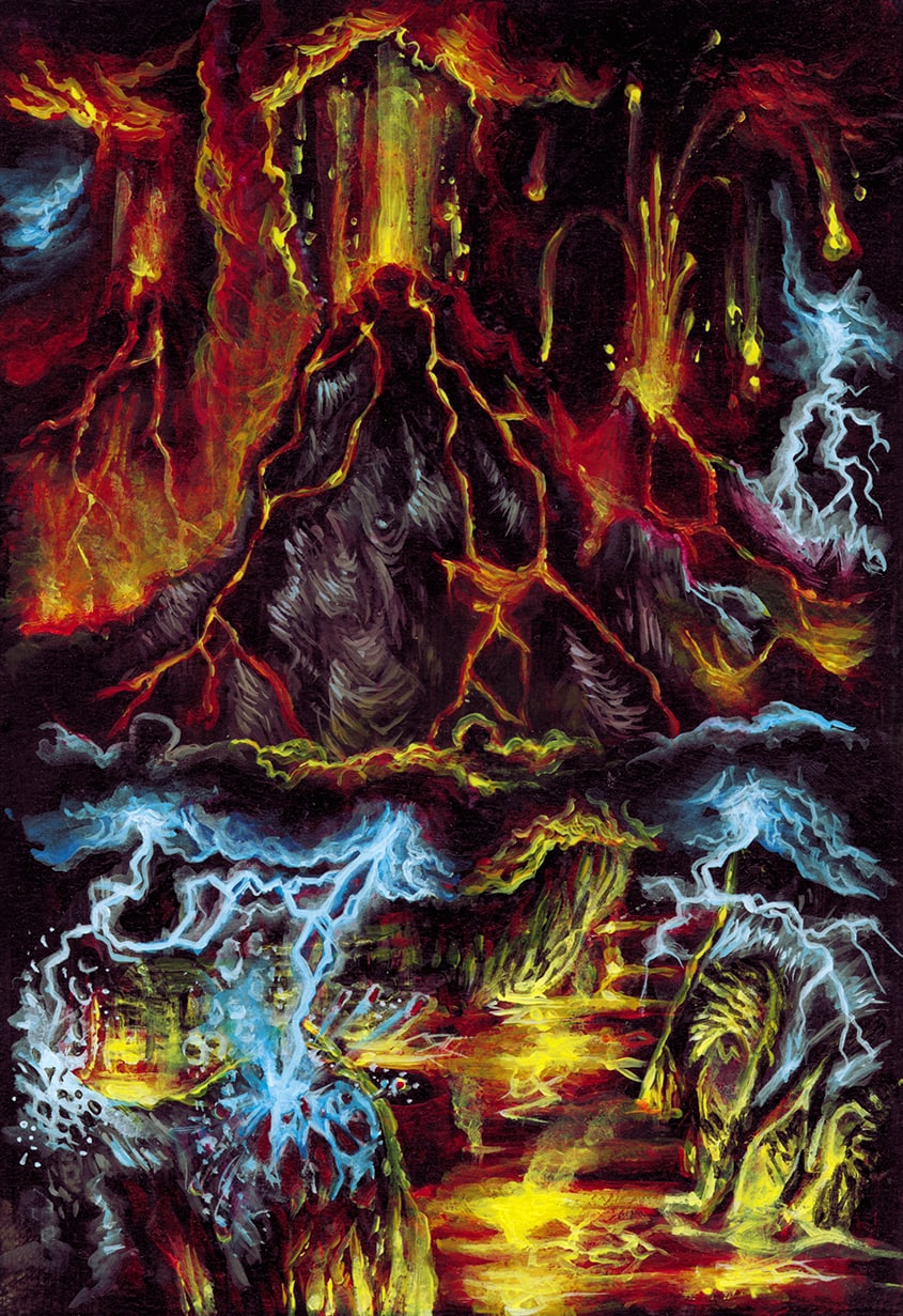
43 – Les Cimes de Dévastation (The Peaks of Devastation)
44 – Le Pays de Cristal (The Land of Crystal)
45 – La Vallée des Ossements (The Valley of Bones)
46 – Port d’Attache Ashragor (Ashragor Homeport)
47 – Havre Ashragor (Ashragor Harbor)
48 – Caravane Ashragor (Ashragor Caravan)
49 – Flotte Ashragor (Ashragor Fleet)
50 – Tyrex
51 – Pontifex
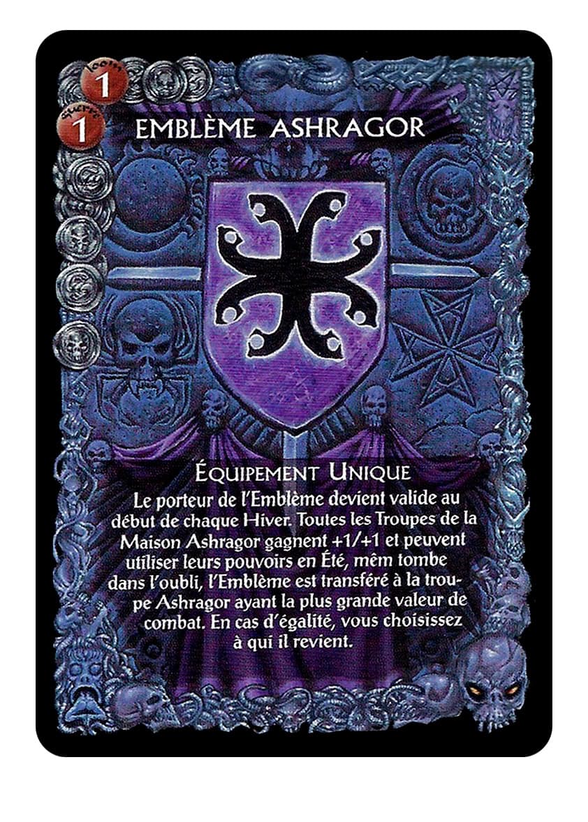
52 – Bannière Ashragor (Ashragor Banner)
53 – Ashragor
54 – Hiver (Winter)
55 – Mortuus Evocatus
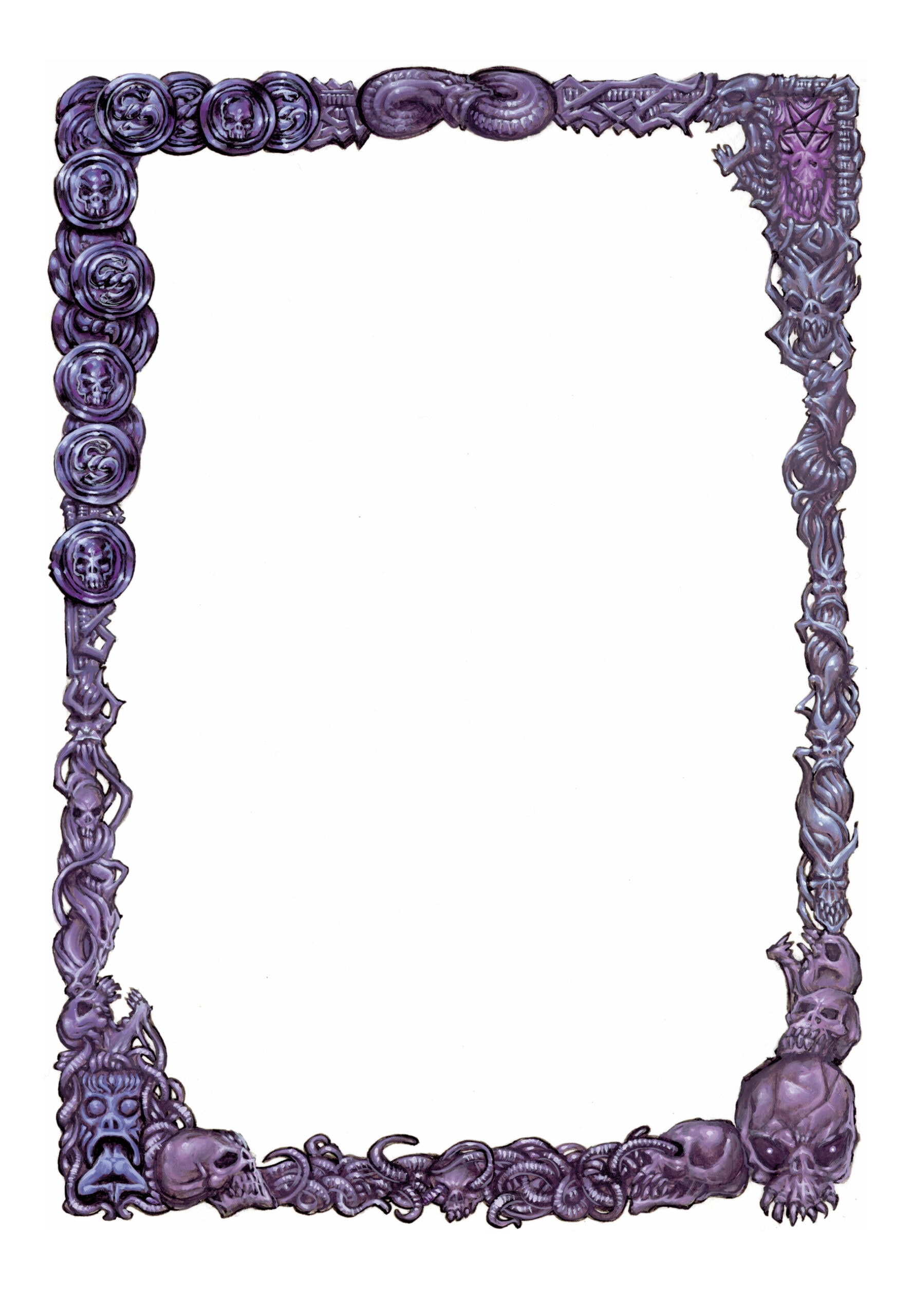
56 – Bordure Ashragor (Ashragor Frame)
The Context
🃏 This series of Illustrations has been made for a French Customizable Card Game (CCG) named “Guildes”.
I have been in charge of the conception and realization of one of the 6 Factions (Houses) of the game named “The Ashragors”. The complete set of cards of this faction counts 54 Cards, plus the artwork for the faction frame and an extra, previously unpublished, unique card, counting 56. Later on, this Game World has given birth to an whole Role-Playing Game (RPG) on its own including the aforementioned factions.
Exceptionally, this set presents the illustrations as they have been conceived before any graphic, game data or printing layout has been made over them. Ergo, all the details which might have been hidden on the printed versions of these cards are now fully accessible.
● The First part of this project is the “Cards Overview” section where the totality of the illustrations can be viewed as a single grid of images. You can also view each card individually via the “Complete Deck Carousel”.
● The Second part of this project is a “Art Direction and World Design” section where I will reveal in exclusivity how I have conceived the whole project from scratch, according the parameters of the game and the instructions of the Game Designers and Art Director. A form of “Backstage / Behind the scene” section.
● The Third part is a detailed “Cards Sorted List” where each card’s illustration and title are presented in the original french language, along with its translation in english, when necessary. The cards are sorted by rarity and occurrence according the CCG original parameters. In this “Individual Concept of each Card”, I reveal many anecdotes pertaining to the history of the card and the life of the game production project, along the principles of creation, design and execution of each card.
Cards Original Format : 10.5 cm x 15.5 cm
The Cards Overview
Note : the Card Back Illustration has been made by Didier Graffet.
The Art Direction and World Design
1: The “Guildes” CCG
This CCG was presenting a confrontation for supremacy between 6 major Factions or Houses : The Felsins, The Kheyzas, The Gehemdals, The Ulmeqs, The Venn’dys and The Ashragors.
It has been decided that each House would have been designed and realized exclusively by one illustrator per faction, giving each House both an unity within each faction and a striking diversity with each other. Each illustrator designing and devoting his/her own style to bring each of “his” House to life.
For some reasons, I have been given the responsibility of designing the House of Ashragors, a faction of Demon-worshipping people well versed in black magic and all sort of wicked practices. The Art Director gave each of us a lot of liberty about the design of these cards, the point was to basically create an whole civilization from scratch that could be reused for the upcoming Role Playing Game version of this CCG, so the responsibility was consequent -better not mess this up- but very exciting altogether!
Each Illustrator had also in charge the illustrated framework that would be used for each card of his faction ; this framework will be used to display the numbers and technical data of the game such as the card’s attributes, specificity, power use, etc. Consequently, the Art Direction united very astutely the visual consistency of the House with a practical game use. I will expand on that later on when I will comment the Ashragor Framework in the “Backstage” section.
2: Conceiving the House of Ashragor
When I remember the briefing of the Art Director it was very simple, as he did not want to limit our creativity, as far I was concerned, this was something like : “The Ashragors are our equivalent of the Melniboné people from Michael Moorcock’s Stormbringer series.
They take their name from a Demon Lord named Ashragor who is their quasi-divine leader. They devote themselves to black magic, demonology, decadent lifestyle, pervert practices and breeding with demons…”
Right.
As I said it earlier, beyond the fact this very concept never left my mind when I was conceiving each card, the whole staff was very eager to see which kind of ideas each illustrator would develop for each of the creatures, characters, places or artefacts that would make the “flesh” of his House. It was the responsibility of each to come up with his own concept that he would apply graphically to every of his creation, as far I was concerned, I came up very early with three major axes for the Ashragors :
A-They should not look too much like “Classical Demons”.
B-They should have a caste-based system.
C-They must have quite a restricted color palette.
A-They should not look too much like “Classical Demons”
For the First Point, the trap would have been to dive happily in the classical “big-grinning-demon-with-muscles-and-horns”. Now if the Ashragors and the “Guildes” world were supposed to be original, I decided to, mostly, distance myself from an approach which has been overdone over years of heroic-fantasy productions. I wanted the Ashragors have their own original style and “flavour” that would be reflected on their costumes, appearance and “graphic charter”, so to speak. So I opted for something more “disturbing” with a form of dark elegance instead of a blunt devilry-looking regalia.
Of course, such “devil based” reference would be still used from time to time on a semiotics level. But the point was to evoke angst, horror, darkness and mystery rather than display blunt force, fanged maws and flames. The Ashragors were supposed to be masters of intrigue, secret arcana and subtle treacheries, ergo, their design should reflect this “lifestyle”. More gothic, less blazing.
B-They should have a caste-based system
For the Second Point, the cards list was specifying that a lot of creatures and/or active characters would have very different roles or aptitudes such as magic, combat or tactical specialization, so I came up with the idea that the Ashragors would have been ruled by an iron-hand through a very rigid caste system.
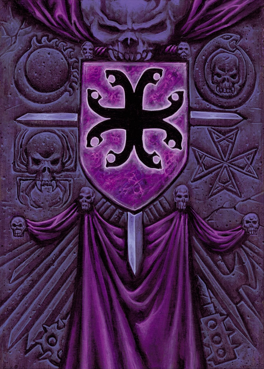
Since their supreme leader was a Demon Lord, one of these castes must be a religious-based one, like a form of reverse papacy that would have political and spiritual power over the whole faction. Working on religious garments and symbols to turn them to a dark version of what they are in the real world was giving me the basis of the principle that I would apply later on over the whole graphic charter : corrupting real-history references instead of destroying or reinventing them. I designed an heraldic cross pattée symbol to illustrate this Order, but I made it as an outlined version of the real-world Maltese Knights Order, to evoke an idea of anti-templar order.
The Ashragors were renowned for their mastery of black magic, so I had to evidently come up with a Sorcerers order and to display their symbols each time a magic-wielding character would show up. I came up with an half-moon crescent, half-sun symbol to display their use of various energies. The moon representing the dark forces of the night and the sun the withering power of the desiccation.
Even if the ultimate ruling power was to be a religious one, I finally needed another elite section of the society to attend the material, diplomatic and political affairs of the Ashragors ; beyond this role, such a caste would have been the perfect place to set future palace intrigues, treacheries and power shifts ; ergo, the next caste had to be the one of the Aristocracy. I came up with an Ouroboros figure coiling around a skull, to allude a connection with the serpent-headed cross emblem of the House, confirming this caste was directly connected to the ruling power.
Finally, since I have been told that this House was very much versed into spying, wicked plots, brutal assassinations and coup d’état, the last Order had to be the one of Assassins. To figure their role, I imagined a spider whose body and abdomen would be made out of a skull, alluding to poison, stealth and silent action.
Eventually, I came up with these four major castes :
● The Sorcerers Order
● The Assassins Order
● The Aristocracy Order
● The Priesthood Order
In addition of these four castes with their respective symbols, I decided to give to the ruling Demon Lord Ashragor his own coat of arms symbolizing the whole House. Being passionate about heraldry, I thought that if this ancient power would have incarnated himself in the material world he would have founded his own dynasty, whose symbol would have been applied to each and every of his people, so decided to grant him the following emblazonment :
“De pourpre, à la croix gringolée de Sable” (Purple, with a Sable serpent-headed cross)
I will expand more on this Coat of Arms when we come to the Ashragor Emblem. But, basically, this coat of arms with the serpent-headed cross will be reused on many cards as a symbol of unity for all the Ashragor people, structures and/or artefacts.
C-They must have quite a restricted color palette
For the Third Point, if I had to give the whole House a proper regalia, I must take in consideration that they are quite subtle and refined-albeit decadent- people. Ergo, I had to focus on subtle and discreet colors such as mauve, black, violet, purple and dark green or dark blue hues with some red and gold highlights to add to the “majestic, haughty elite” feeling. Garments should be rich and embroidered but without being too flashy. Silk, satin, lace and embroidered fabric with refined gold jewelry should be preferred.
Of course, I would not use exclusively these colors for every card as it would turn the uniformity feeling into a tedious-looking one, though the use of other colors would indicate either a specific set of events, circumstances or conditions which would require that the color code being warped somehow. I will describe moreover on each card’s individual description.
Individual Concept of each Card
1: Common Cards
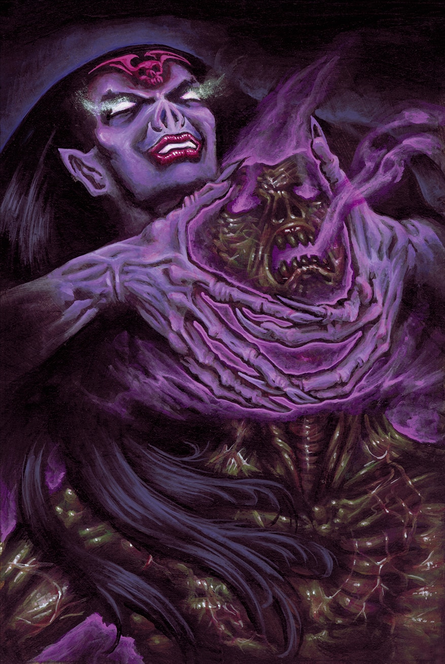
1-Enrôlement Forcé (Forced Enrolment)
I had no real description for this card, beyond the fact it was enabling to “convert” one of the opponent’s card to the Ashragor side. I decided to completely cast out the “traditional” military enlistment in favor of the “black magic” system and depict a life draining mage evolving to a vampire-like form ; then using her dark power to convert the opponent to her will, turning him eventually into a subservient zombie.
The flesh is being dried out and sticks to his skeleton and muscles, indicating that his essence is drained both at the mental and physical level.
I purposefully ignored the “vampire with fangs” on the face of the mage to avoid the “Dracula” feeling, opting for a bat muzzle that alludes to the draining nature of the Mage instead of versing into a stereotypical depiction.
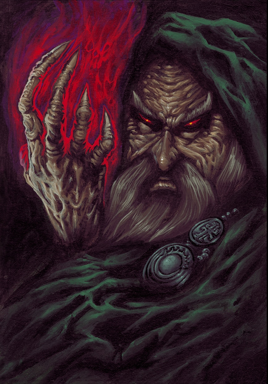
2-Le Conjureur (The Conjurer)
One of my first Ashragor Mage, the Conjurer was the typical Magic user, according its depiction. I opted for a dark green cloak and hood to make it contrasting with the reddish magical energy pouring forth from his hand, using the rule of complementary colors ; since the green was quite dark, i would not have the “color clash” this method could provoke sometimes, when overused.
As stated earlier, he is wearing both the serpent-headed cross of the Ashragor House and the Moonsun emblem of the Sorcerers as cloak’s fibulae.
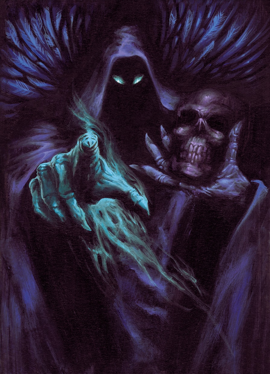
3-Accusation
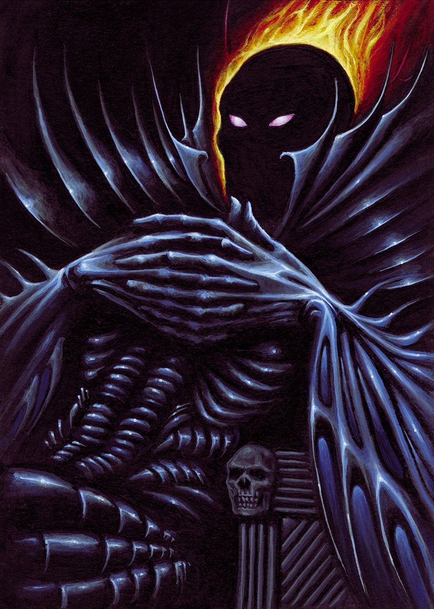
The title of this card was plain clear to me, I can’t really remember what were the card’s effect but I am pretty sure it was quite unpleasant for the opponent’s side. Ergo, the menacing dark angel of Death figure addressing the player sounded convincing enough for the metaphor.
To be able to read this gesture visually, it is essential to not lose the form of the hand on the foreground with too much color animation on the background, consequently, I kept the background palette relatively uniform to emphasize the impact of the impending judgement feeling.
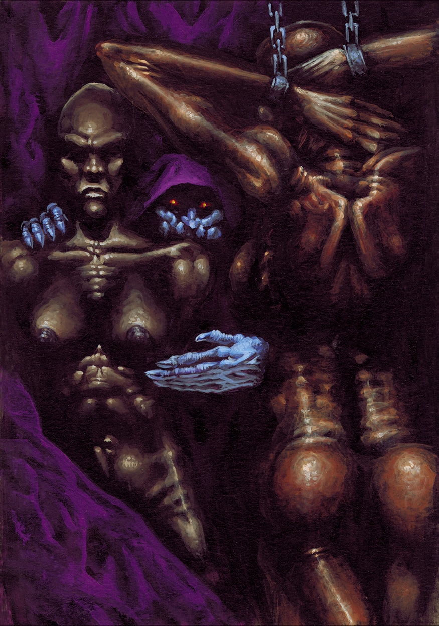
4–Esclavagisme (Slavery)
The “Slavery” card is one of the many reasons for which I put this work behind adult’s wall. When I remember the editorial rules enacted by the Art Direction, it has been considered back then that the CCG might have been shipped for the american and/ or canadian market ; consequently the (loosely) rules were “No breasts! No nipples! No full frontal nudity!…Try your best!…”.
Well… I tried my best… I am not sure I completely succeeded on this one.
Let say the frontal nudity of one is not completely full and the other one is rather a full backal nudity…
It was not deliberately made out of outright provocation, but if I had to stick both to what slavery is supposed to look and combine it with an Ashragor’s lifestyle which is mainly devoted to pervert practices, then I have to come with something which is quite obvious.
It has to be understood that, back then, french vision and censorship towards nudity and/or material which might look offensive to such or such audience were completely different than the american ones. As I said it, I enjoyed quite a freedom concerning my artistic interpretation of the cards ; and if the game production entrusted me to illustrate the wickest civilization of the “Guildes” world, it is because they knew that I will have a no-holds-barred stance towards it.
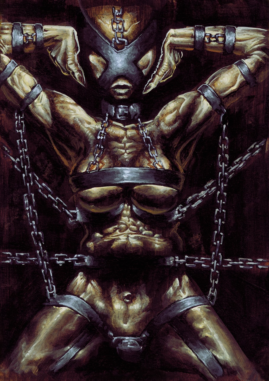
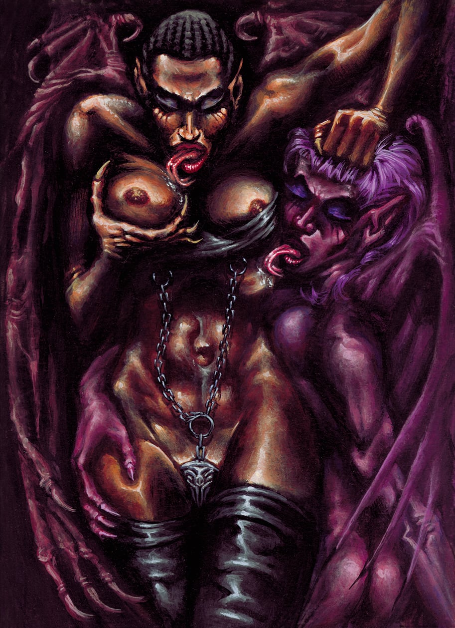
5-Harnais de Contrôle (Control Harness)
I figure that this card is more succesful at satisfying the “forbidden nudity” rule. Nonetheless, I applied there the “wicked Ashragor interpretation” of that item card by twisting it towards a “BDSM” looking apparatus which was in line with the pain-based civilization of the Ashragors.
Giving the female figure a sort of strange choreographic movement was a deliberate intention of mine to confuse the viewer about the role of the Harness and how it is supposed to be used ; is it something you put on the victim to subdue him/her to your volition or is it a magical garb that you equip to dominate others from afar? Is this female the prey or the predator?…
I left purposefully the interpretation open.
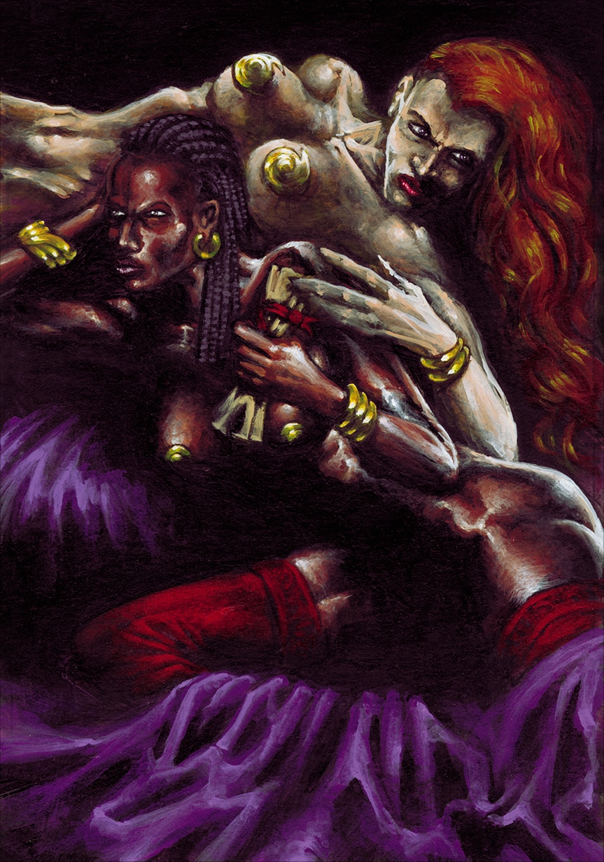
6-Les Agents Doubles (The Double Agents)
Look, another non-nude scene that I successfully crafted (notice that no sexual features are visible).
The Double Agents were clearly the infiltrated spies troops of the game, so I imagined a scene were two Ashragor Agents were exfiltrating stolen information from some enemy palace’s harem.
When you come to real world espionage method of recruiting double agents according the MICE method (acronym for Money, Ideology, Compromise, and Ego or Extortion), sex is one of the many levers that you can apply as a trigger to obtain loyalty and/or information. Therefore, it was just logical and more original for me to use this kind of scenery instead of a more classical “two cloaked figures in a back alley”.
The red stockings of the forground agent are there to lead the eye upwards with the matching color of the ribbon surrounding the scroll that she hands to the background agent and then connect visually with her lipstick and redhair hairdress. It helps to go along the vertical handing movement by contrasting it with the horizontal position of the bodies. The purple silk sheet is there as a hint to the Ashragor’s palette.
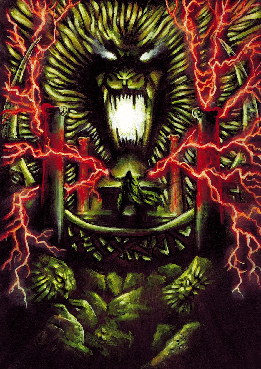
7-Autel de Puissance (Altar of Power)
Altar of Power’s card inspired me immediately with, well… some necessity to really express what true Power is supposed to be. It could not be shy, timid or casual. One must feel that, as soon he stands on the Altar, looking for Power, Power is what he will get.
I imagined this gigantic roaring golden Lion-Spirit, infused with blazing energy, answering to some form of summoning from the altar and imbuing the aspirant with raw energy figured with the red lightning.
If I did not stick to the traditional Ashragor palette and iconography on this one it is because I figured this Altar would have been located in a forgotten place, half-buried at the end of some foreign land, out of the reach of all but the bravest who will dare to summon the Power Lion.
Now, will the aspirant be able to withstand and master this raw Power or be eventually overwhelmed and devoured by it, this is another story…
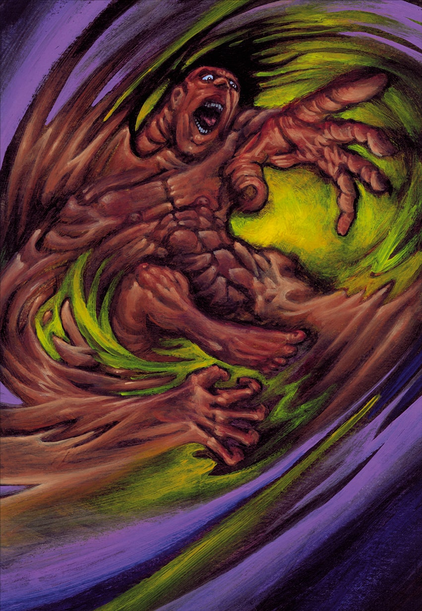
8-Bannissement (Banishment)
For a form of spell which will remove some other card from the game, I needed to be quite clear as well on its usage. And since I did not want to be scolded about gender equality, I have decided to display a (non-full-frontal) nude man being engulfed in a vortex.
Playing on a difference of scale and/or warp effect on some limbs was increasing the feeling of distortion, swirling movement and abyssal fall, as much as directing the eye to the center of the card. I could have done the warping and maelstrom distortion effects on some software like Photoshop et al. but I wanted to keep the art clear of any digital intervention, as a principle.
The yellow/mauve background has both a visual and allegorical reason to exist : visually, using the rules of complementary colors, it helps to contrast and define clearly the waves movements of the whirlpool ; the allegory is that the foreground color (mauve) is the place where the Ashragor casting the spell stands from, the background horizon abyss (yellow) is where the opponent goes on the opposite side. Ergo, something opposed in color to the Ashragor’s color.
Up to the viewer to imagine how the “yellow dimension” looks like, in the end…
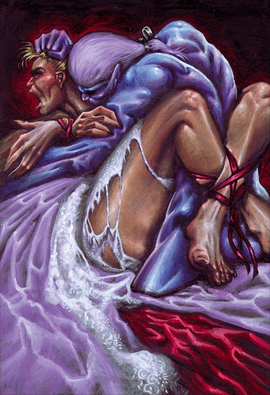
9-Droit de Cuissage (Droit du Seigneur)
I guess this card is, as well, a touchy subject, especially nowadays.
Now if I have to do my job as an illustrator and stick to the meaning of the card, the “Droit du Seigneur” definition is pretty clear according Wikipedia : ” Droit du seigneur (‘lord’s right’) was a supposed legal right in medieval Europe, allowing feudal lords to have sexual relations with subordinate women, in particular, on their wedding nights.”
I also remember that this card was supposed to affect only female opponent troops.
Consequently, I had to illustrate nothing less than a rape scene. Okay.
I think I asked twice the Art Director if he was totally sure the Game Production would give me his authorization before I go into this and it was definitively a yes. As stated earlier, the Ashragors were not the civilization to be trifled with and were supposed to display the worst inclinations a conscious being might have, representing proportionally how Evil might looks like and act.
Cruelty, Wickedness, Malice and Abuse were some of the keywords for the Ashragors, ergo I had to represent that matter of fact along the gameplay which has been chosen for them ; so if they are supposed to be brutal, cruel and careless, the illustration has to display this as well.
At a time when some movies, series, books or companies are voluntarily censoring themselves (or sued) and forced to represent “absolute evil” in a way that is supposed to not shock any group or audience, one may ask themselves if there is a way to represent “absolute evil” without hurting anyone’s feeling… which sounds contradictory to me.
If any kind of depiction of what Evil might truly looks like is censored, then there is no chance to represent efficiently Good compared to it. It leads to a self-limitation of expression and questions seriously the freedom of an artist or author and the possibility to debate, figure or position oneself about such core questions.
Now, the editorial lines of most media having evolved to what they are now, I wonder if this CCG would have ever been published as is.
On the design level, I mainly used contrasted colors to embody the ongoing action : the pale mauve of the braid’s dress is contrasted with the violent red of the silk sheet that I reused as a background, to emphasize the violence of the act and outline the desperate scream of the victim. The same red is being reused for the bonds to give to the whole a symbolic unity : the color red representing the rape is altogether penetrating visually the torn dress, binding the victim in powerlessness and surrounding her own person as a permanent aura of aggression. Ripping, Binding and Lasting are what the effects of a rape are supposed to be, according what I know.
I used that contrast effect in reverse on the skin tones of the protagonist to clearly differentiate the aggressor from the aggressed : the aggressor is blue-skinned to embody his coldness and inhumanity and the aggressed is vividly flesh-colored to make her appear as completely human, for one might be able to identify themselves to her and feel a form of compassion.
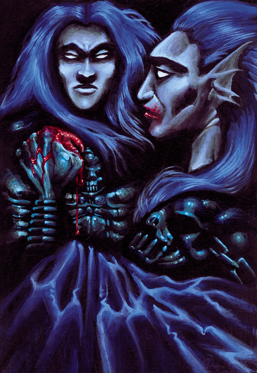
10-Les Archions (The Archions)
This troops card represents a group of supernatural beings helping the Ashragors side ; nevertheless, they were not being “technically” Demons according what I have been told, back then ; there were more a form of “Fallen Archangels”, so the trick here was to display something “angelic” enough to respect that matter of fact, yet clearly expressing visually their dark fealty.
So I used mainly shades of blue to give the picture a feeling of cold-heartedness, opposed to the warmth feeling that you could expect at beholding angels. I kept the capes and armors quite discreet as I did not want to much contrast with the effect I wanted to achieve, you can barely notice the skulls theme of the armors and I made them quite dull to not confuse the reading sense of the card.
The main colored contrast is on the blood staining the hand and lips of the Archion on the foreground, as if he had just licked it away from his fingers, eventually tainting the pristineness of his face.
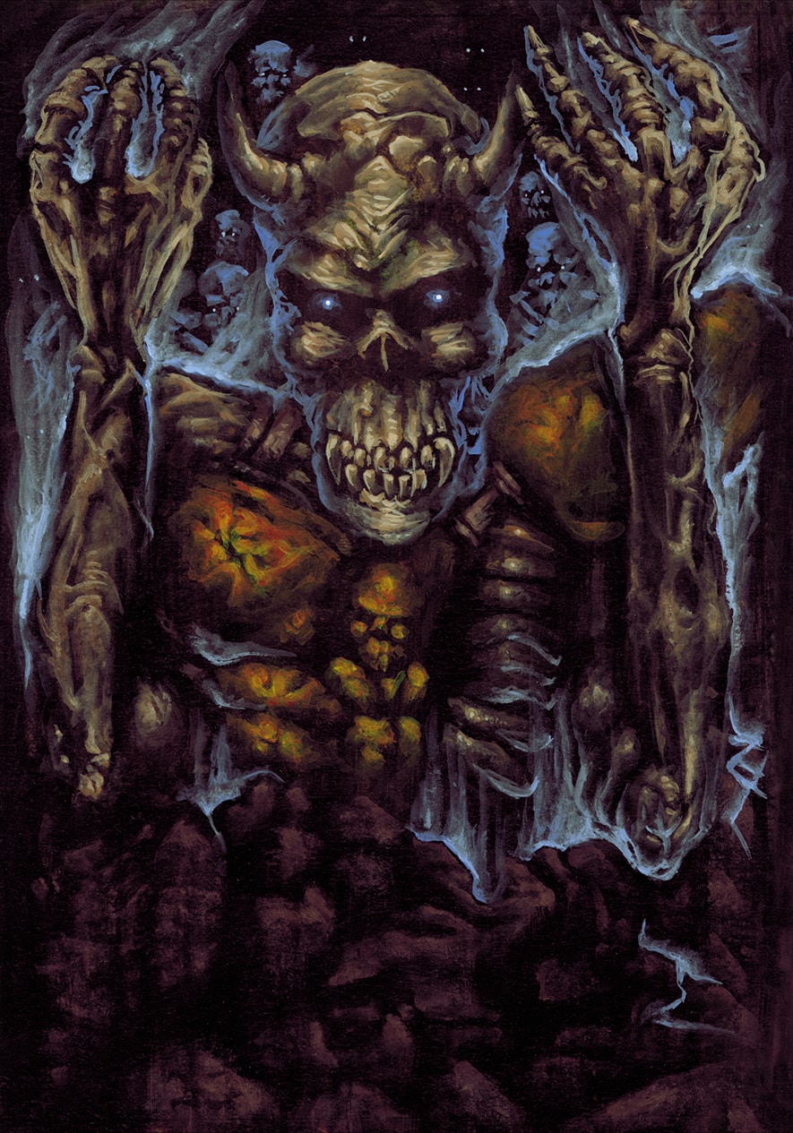
11-Nécro-Animation (Necro-Animation)
A spell cast to resurrect one’s forfeited troop and bring it into your deck. As a form of classical “animate dead” spell there are no thousands of ways to depict it ; yet, I managed to induce some Ashragor’s features within, to be sure the theme of the illustration would not be confused with another faction which would have a card effect which would be more or less similar.
I made the animated dead horned to allude to the fact the Ashragors are breeding with demons and may retains some of their demonic features beyond death ; and even its corroded armor retains the skulls theme of the House. I have willingly painted it to a toned-down copper-like material to have a slight contrast with the surrounding cold tones of the foreground, background and the wisps of the magical aura.
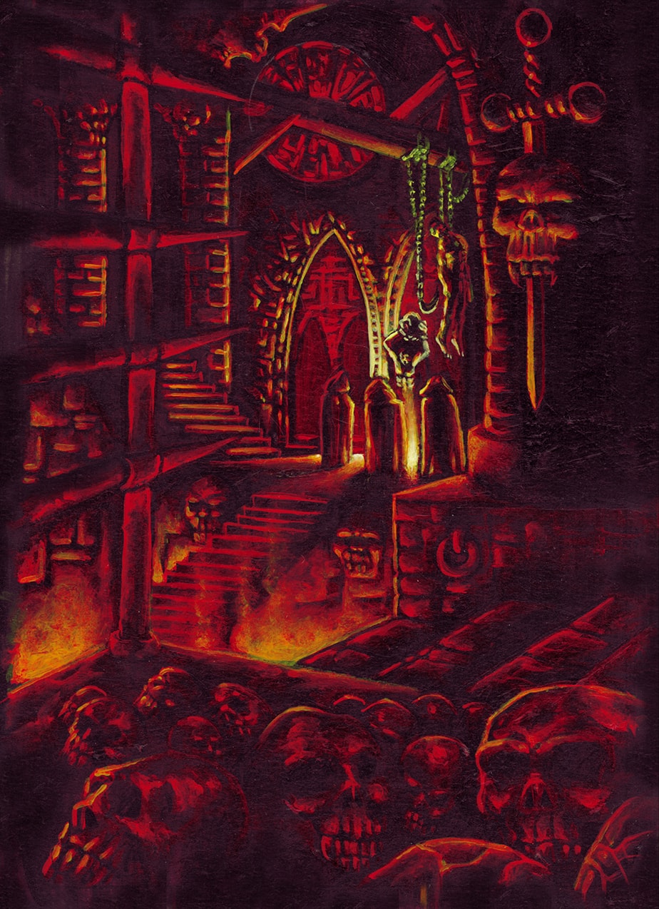
12-Place du Supplice (Place of Torment)
Since many effects of the Ashragors’ cards would imply many, many gruesome consequences for the opponent’s deck, I had to use a form of variation in their depiction to avoid any feeling of redundancy. Ergo, I chose purposefully a distant framing of the actual torture scene which was ongoing, instead of a close depiction of the torture scene itself (I was keeping that option for the “Torture” card below). Preparing in advance a set choice of concepts helps you to decide faster which concept you apply to which scene and you save more time.
Thus, the “Place of Torment” card was my “zoomed out” scene as it was serving the concept of the “place” type of card, enabling me to emphasize more onto the architecture than onto the character figures.
The scene is bathed in hellish red with the inferno’s light source coming upwards, inducing an effect of an underground “dark cathedral” mixed with middle-age catacombs. The only bright contrast of the card is on the distant scene in the middle of the card where three hooded figure are surrounding a man bound to a torture stake ; it helps to guide the eye towards the burning source of bright yellow light, almost white, of the scene, evoking the color of an iron bar brought to a white hot temperature… The iron grate made of spikes on the left foreground is also here to guide the eye towards the main scene.
You don’t know what is really going on here, but you might definitely guess; sometimes, suggesting is better than showing…
13-Renouveau (Renewal)
This effect being one of the few healing cards on the Ashragors’ side, I purposefully changed the color palette to make clear that this card was widely different from the player’s regular arsenal. Yet, I did not want to make it too flashy and lively either.
Ergo, I chose a tender green to emphasize on the concept of “vegetal” rejuvenation feeling and made it contrasted with a dark reddish ochre alluding to a form of rust or decay which would be progressively converted to a form of vegetal growth…. Or would it be the contrary? After all, perhaps the Ashragors are using decay and corruption of life as a source of actual healing. Once again, I leave the viewer to decide…
To enforce this ambiguous feeling, I used a little bit of Gestalt Effect on the double Ouroboros figures which are devouring each other (another allusion to the ever changing life-death cycle) : the dark Ouroboros is forming the background of the light Ouroboros and vice versa, so the whole circle figure has multiple layers of perception depending if you focus on the dark Ouroboros or the light one.
The skull figure in the center, half green, half ochre, has each of its halves displaying the opposite color compared to the background color it is set in. This is an allusion to the Yin/Yang figure stating that everything contains a part of its extreme opposite. If the Ashragors would have had an healer caste, I would have definitely used that figure as emblem.
Concerning the background, I made the greenish part as a moss-covered stone containing the symbol of the hourglass (the passing time) and a few wheels or cogwheels (the dynamic cycle resuming) opposing the ochre side with its straight vertical and horizontal lines of the industrial rusted pipes (the stagnation) and the small skull on the top right (the decay). Note that the central skull is itself embedded into the hub of a large cogwheel (death cycle or life cycle, depending in which direction the viewer wants the wheel to turn).
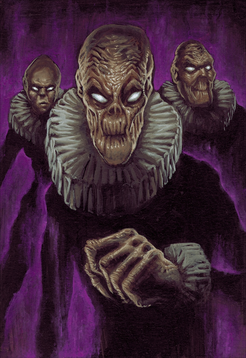
14-Les Bromys (The Bromys)
Another card whose title and origin were more than mysterious, I knew nothing about this card except that they were troops. The staff told me that I was in charge with what the “Bromys” could look like as they did not have any idea about them themselves…. a good opportunity to invent a set visual concept which would be reused later.
In the end, I wanted to enforce the idea that the dark negative energy of Ashragor’s magic was ultimately corrupting physically their users. Since these troops were quite potent magically I wanted to display a sort of decadent and contrasted aspect for them, hence their desiccated skin, lifeless gaze and shriveled faces, even the female Bromy on the left background has no hair and a misshapen skull.
To make their outlook even more grotesque and unhealthy, I chose a simple fashion style pertaining to the Renaissance, as if they were some sort of corrupted Jesuits : a simple black body tight suit with a large ruff to allude the Minions of French King François the 1st ; e.g. : they are the servile dark sycophants of the dark King.
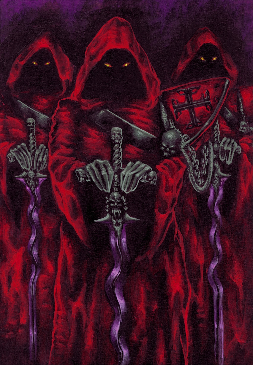
15-Les Moines Rouges (The Red Monks)
These troops were supposed to be quite powerful and had quite a vivid evoking name concerning their color, obviously… For me, they were a form of dark monk-crusaders or templars supposed to display all the might of the Ashragor Empire ; thus, I mixed their hooded robes with military elements such as the baldric and the emblazoned pauldron to give out the feeling of a religious army.
I made their wavy swords made out of purple metal to both avoid overwhelming too much the layout with an excess of red, as much as attracting the attention of the viewer onto the fact Ashragors’ weapons were made mostly of magical material with gruesome properties. Such as creating wounds which are ever-bleeding and cannot be cicatrized normally. Hence the shape of the swords and the red of the capes which suggest the concept of a bleeding wound more than showing it.
16-Torture
Being one of the 6 “tormenting” cards of the Ashragor’s arsenal, I applied on this one the reverse system that I applied on the aforementioned “Place of Torment” card ; “Place of Torment” being a place, it justified the option of “zooming out” to emphasize on the architecture, the “Torture” card being an effect, I chose the “zooming in” option to clearly depict what a torture session might mean in the Ashragor culture.
As in the “Droit du Seigneur” card, there are no one thousand ways to represent the epitome of suffering, the Art Direction has been very clear about the “no-holds-barred stance” which was the main line of the Ashragors’ civilization , this culture was meant to inspire horror and fear and I could not run the risk to belittle or undermine that principle by displaying an edulcorated scene.
Consequently, I invented this apparatus which was meant to dismantle the victim piece by piece. I chose a machine over a classic medieval figure of tormentor or executioner to enforce the idea that the various Ashragor methods of inflicting pain were a large part of their design and technology ; inducing an “industrialization” of torture, where no living being but the victim are present, reinforce the dehumanization feeling of the scene. Ergo the contrast between the organic flesh and bleeding tones of the victim with the coldness and aggressivity of the sharp instruments tearing him apart methodically.
Of all the cards I have ever conceived for the Ashragors, the “Torture” card has been the only one which ever raised a concerned feedback from some of the customers (or rather their parents) ; yet, as I stated earlier in the introduction, that game has been printed and distributed as is without any censorship, nor even a PG rating, as France had its own system of rating back then concerning sensitive topics and their representation.
It is not up to me to judge if that matter of fact was a good thing or a bad thing, it is just how it was. Now, when some episodes of Game of Thrones or Walking Dead are displaying things which are way more gruesome, I think I am not that much away from the “editorial line” of the present time.
If I am being hired to represent horror, I have to represent horror.
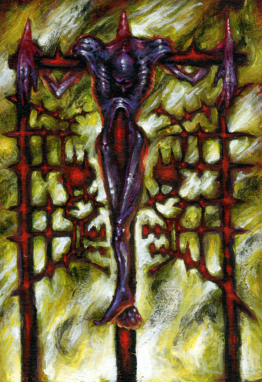
17-A la Gloire du Martyr (To Martyr’s Glory)
The third of the 6 “tormenting” card’ series. After the “zooming in an ongoing action” and “zooming out from ongoing action ” options of the previous tormenting cards, I simply applied the “classical framing on an afterwards action” representation on this one, as I wanted something very symmetrical and still, almost as an emblem, for the “Martyr” card.
Since “Place of Torment” and “Torture” were depicting an ongoing action, I wanted something stiller for the two following ones ; playing on the “front/back” depiction and “before action/after action” idea instead .
Consequently, the “Martyr” card pictures the dead victim after everything has been done to him ; since the idea of “Martyr” had clearly an important religious meaning, I figured that this ceremony had to display something very strong on the symbolic level as the Ashragors would use pain and sacrifice in multiple ways to achieve multiple results. Hence that idea of a sacrificed corpse being used as the ultimate ornament of a complex spiked grate representing an abstract skull, backlit by a pyre ; the whole rite having magical effects, up to the Ashragors’ benefits, without a doubt.
Since the concept of martyrdom implies a form of “volunteering”, the victim is obviously an Ashragor “offering” his life for the glory of his House, hence the purple tinge of his skin ; the red-hot color of the iron grate completing the Ashragor’s palette. The yellow-white flames on the background are here to evoke the intensity of the heat, as much as helping to define clearly the outlines of the graphics of the grate and the overall scene.
2: Uncommon Cards
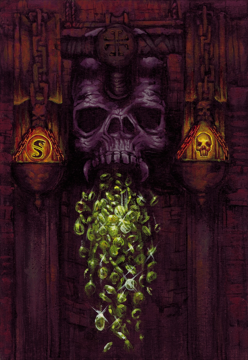
18-Autel de l’Espoir (Altar of Hope)
It would sound peculiar that the Ashragor faction would have a card with such a paradoxical title, regarding their dark agenda. Though, this card was supposed to give back to the Ashragor player a considerable amount of “money” (coins named “Guilders” in the game) in exchange of trading back one of his cards, thus replenishing his funds to help the war effort.
Since the card was rather a “non-destructive” one, I applied the same Art Direction as for the “Renewal” card, which is: tuning down the usual Ashragor palette; yet, with clear Ashragor visual elements to avoid any discrepancy with the faction’s overall style.
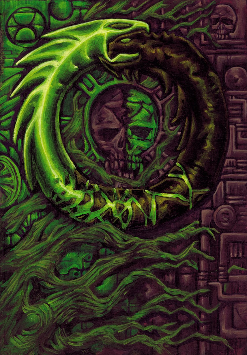
Then, I have imagined huge mechanical scales comparing the weight of a small skull (symbolizing the card traded) with the weight of a Guilder coin (representing a “gold standard” of sort and the amount of gold the player will get). I reused the double-headed snake symbol for the “Ashragor Frame” where many Guilders were supposed to be represented; I will develop more on that when we will come to the framework.
The result of this weighing operation would generate a rain of golden coins flowing out from the mouth of the large central skull, standing as the main axis of the scales. I kept the overall background down with a dark rusted tinge -emphasizing the feeling of some heavy, decayed apparatus- to enhance the contrast with the warm golden tones of both the shower of gold and the symbols on the scales. There is a just a discreet reminder of the serpent-headed cross above the large skull, just in case this one was not sufficient enough to recollect whose that machine was belonging to.
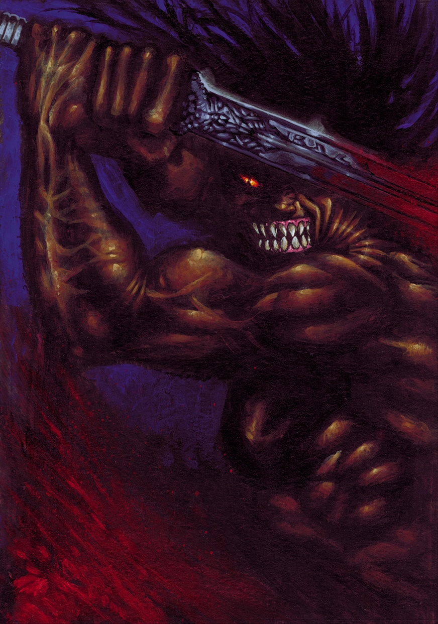
19-Folie Meurtrière (Murderous Frenzy)
A form of “bloodlust” enhancement which would boost the fighting capacities of a troops card. I chose deliberately to tune down the “blood red” color taking too much of the card’s surface and chose to focus on the movement and expression of the character instead.
I chose a deep purple-blue, nighttime background which would not interfere with everything which was occurring on the foreground. The overall colored presence of the muscles and blood are plunged in shadow, as much as the face of the warrior; this to display on the top middle of the card all the spots of bright colors summarizing the state of berserk hate. Such as the pink of the gums – displaying the ferocious grin, the burning orange of the evil eye and the cold steel blue of the ornate sword.
The movement of the black mane of the hair on top right is mirroring the movement of the blood stain on bottom left, forming a visual diagonal which lead the gaze towards the center of interest and helping to understand the backward looping arc of the sword’s slicing movement.
20-Les Succubes (The Succubi)
What would be a demon-worshipping culture without his own array of demonic, lustful, sensual temptresses? At a time when the fear of censorship is forcing some to represent that classical epitome of sex with an head-to-toe covering garb and a non-alluring, non-provocative and non-sexual stance, I have deliberately chosen to do exactly the opposite. And I go along my own choice and the one taken by the staff’s art direction.
Indeed, we assumed that the Art Direction had to be consistent the whole way concerning what the Ashragors are supposed to represent: an Evil Civilization, the opposite of everything which is a Good Civilization, as far as these definitions are accepted as a general consensus.
Therefore, we have to take the symbolical opposite of every feature a “Good” Civilization is supposed to represent, without getting too deep into philosophical debates. Consequently, for Compassion we oppose Torture, for Freedom we oppose Slavery and, logically, for Love we oppose Lust. If we have been adamant thus far with graphic depictions of that conception of “Evil” for both “Torture” and “Slavery”, it was making no sense to suddenly censor ourselves when it comes to sexual depiction themes.
As for the “Droit du Seigneur” card, I chose to stick strictly to the very definition of what a Succubus is, according Wikipedia, no more, no less : “A succubus is a fiend in female form, or supernatural entity in folklore (traced back to medieval legend), that appears in dreams and takes the form of a woman in order to seduce men, usually through sexual activity.”
Ergo, there is not one thousand ways to depict a female demon who wants to lure males into a “sexual activity”: the “not too much nudity” rule had to be accommodated to that matter of fact to some extent; even the staff agreed with me on that.
Eventually, I went with that sapphic scene between two Succubi which leaves no ambiguity about its purpose. Even if most Succubi, in the traditional heroic-fantasy world, are sometimes displayed with fancy skin colors, I chose to apply that stance on only one of them- the one on the right. It enabled me to apply the Ashragor color palette through her purple skin to maintain intact the color consistency of the Ashragor troops.
Since that part was done, I wanted to create something a bit different for the Succubus on the left and I decided to create what was probably the first Succubus of black African ethnicity : I wanted her to have a dark, yet realistic, tone of skin which would warm up the general tinge of the card’s palette and opted for a “cornrows” type of short hairstyle, radically opposed to the traditional “long soft brushing” hairstyle present in most Succubi depictions. The whole sensual atmosphere being enhanced by their loving embrace, their licking activities and the way the Black Succubus is offering her breast to the viewer.
I just added some black leather kind of thighs boots and bra to refer to a sort of “Ashragor uniform” which would allude to the fact that, if the Succubi are temptresses, they are still a “Troop” card. The very small metal thong supported with chains enabled me to place the Ouroboros small ring maintaining them altogether to finally display the symbol of the Aristocratic caste these demon females were belonging to.
So, in the end, I managed to make the Full Frontal Nudity not completely full…
21–Corruption
Going along with what I did for the “Altar of Hope” card, I chose to apply the same principle of color palette when it was coming to the “money” themes. Therefore, I wanted to enforce the idea that “gold is everything” with the Corruption card. And if it is everything, its source of light and color had to affect the whole illustration.
I took inspiration from a classical baroque French painter of the 16th/17th Century named Georges de La Tour who used mainly Tenebrism/Chiaroscuro style in most of his paintings; those ones having a single, small yet intense, source of light which gave to his sceneries a dramatic and intense atmosphere throughout this single source of light.
I decided to apply that technique to that card and replace the candle source of light by a golden radiance emitted from the coin, achieving the same effect to give out a sinister tone to the scene. The idea was to depict a form of secret Rendezvous scene, emblematic about what corruption induced and the dark, discreet places where it was supposed to transpire.
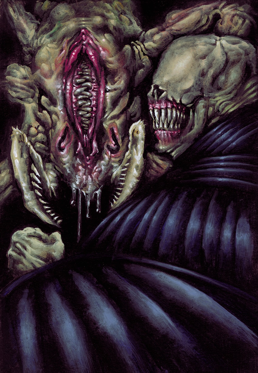
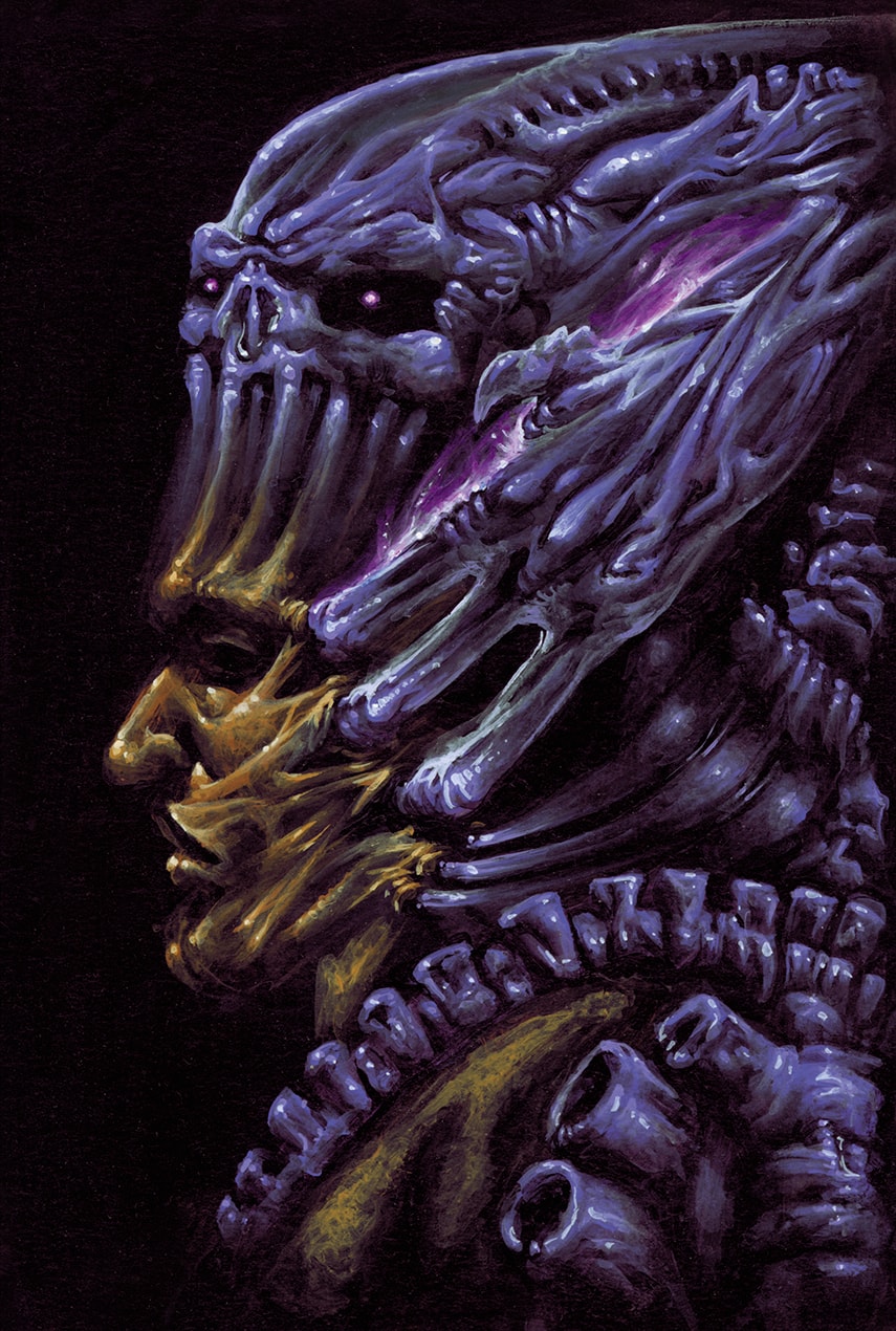
22-Les Démons (The Demons)
This card was a very important one, less on a gameplay level than on a graphic level. Indeed, it had to represent my whole conception of how the epitome of the Ashragor’s founding mythology would be perceived and imagined in the future, so the initial reflection about an “editorial line” of the demonic bestiary had to be thought carefully in advance. It was a true interesting challenge.
As I have stated in the Foreword of this project, I wanted to go against the “traditional” depiction of how demons are mostly represented in the heroic-fantasy world, e.g. : big horns, bat wings, etc.
I opted toward a more “organic” and “deranging” approach which would lead the viewer towards something close to the nightmarish paraphernalia of a Lovercraft instead of a baroque approach of a Gustave Doré, even if I love both of them equally.
I have come to note that what triggers the horror feeling proceeds essentially from a sequence in 3 points:
● Allude to something pertaining to the human body for the viewer has a conscious or unconscious feeling that he is in front of something he knows or is familiar with intimately.
● Twist or warp that feature in a counter-nature way to “hurt” the abovementioned conscious/unconscious intimate feeling, you will go instantly to the root of what triggers the repulsion/horror feeling, for it is an instantaneous animal reaction, not a second-thought, civilized, mental one.
● Eventually, the horror feeling will not come from a sort of “impending danger” that one would feel in front of an exogen source – like a dangerous animal full of fangs and claws which could threaten one’s life ; it will come from an endogen source which will be generated by the “animal” empathy one would feel immediately in front of a crippled, warped arrangement of human body part(s) telling him that “something is definitively wrong here”.
For instance, a demon could look threatening if he exhibits long claws at the extremities of his fingers… He would look horrible if you bend these fingers to the opposite side of how human fingers are supposed to bend.
The mind will instantaneously convert this counter-nature bending visual information into an empathetic information which tells that all these fingers are currently breaking, a pain that anyone can easily imagine and identify to. Ergo, the horror feeling doesn’t come from the potential menace the demon is incarnating, but rather from the anthropomorphic projection of the fact that he must actually feel a pain that you could actually feel yourself.
Human mind has a need to reorganize and interpret a visual information in a way which could lead to something familiar and known (in either a good or bad way). But if you trick the mind by putting it in presence of something which initially looks familiar and known, then blurring that initial comprehension with a contradictory information, you confuse the mind by telling it that it is in presence of something it cannot analyze, organize, comprehend or interpret. And fear comes from the unknown.
Angst comes from the mind, horror comes from the guts.
Ergo, the foreground Demon has no eyes ; since the gaze -from an animal, instinctive perspective- is the first thing we try to spot to interpret the intention of any living being we are confronted to. Having no real facial expression of his own, but his ravenous grin out of his stretched gums, this demon is more prone to evoke uneasiness and repulsion since no one can really tell what his next move will be.
Related to the theory I developed above, the background Demon is made of a blend of insect pedipalps and legs mixed with a female human body part (I will let you figure out which one), the upside-down nostrils, as much as the vertical fanged mouth, adding to the confusion feeling, since that maw configuration is non-existent in animals possessing teeth.
For the color palette, I have kept it simple to not disturb the reading of the complex shapes : the foreground Demon’s cape is a dark blue with an odd leathery, linear texture which I imagined as being ever-shifting according non-Euclidian angles ; as if his garb was made out of a dimensional fabric incomprehensible for the human mind.
To “unite” the graphic color of the demons’ flesh, I used a cadaveric colored off-white to evoke decay, bone and pallor of death which contrast efficiently with the blood gorged nauseating pink around their mouths, gums or “lips”.
I remember that the Art Director instantaneous’ reaction to that image has been : “Ewwww! …That’s disgusting!…”
I guess that meant I did my job well.
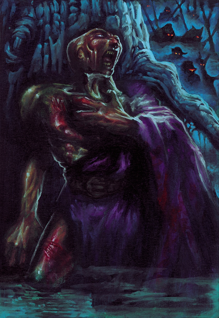
23-Le Déserteur (The Deserter)
For this card, I wanted to enforce that betraying the Ashragors’ side was a really bad idea. Consequently, I wanted to go with a kind of “manhunt” horde going after anyone who would be foolish enough to have that bad idea.
The Ashragor deserter on the foreground is panting in a swamp, hiding away from the menacing searching party unleashed after him in the misty background. I purposefully gave him a natural skin tone instead of the purple/bluish tones that I use sometimes for the Ashragor people, and this for two reasons:
I wanted a warm color for the foreground character to make him standing out from the general cold atmosphere, as much as I wanted him to display bleeding wounds that he would have endured during his escape ; in this case, it is much more convincing to evoke bleeding wounds with a natural skin tone, as flesh has a tendency to get redder in the wounded areas, as the blood flows naturally towards the cut areas to start the cicatrization process.
In addition, someone achieving a strenuous effort has his extremities (hands, feet, etc.) and the thick areas of the face (nose, cheeks, ears, etc.) getting redder as well with the sudden amount of blood required to sustain the effort. On the other hand, most areas of the body where the skin is thin (around the eyes, back of the hands, etc.) get rather a bluish tinge since the veins have a tendency to appear more distinctively through the thin surface.
His torn toga is being purple and I gave him a slightly misshapen skull, both to allude to the fact that he is still being part of the Ashragor’s demon breed.
24-Expérience Douteuse (Dubious Experiment)
Initially, I thought that effect was something concerning an alchemical experiment of sort, but when I did read the description, it appeared more as a form of assassination being consecutive to a “mistake” done by the opponent’s side. Therefore, it was finally the opportunity to introduce visually the Caste of Assassins in action.
The problem with assassins is that, if they want to be discreet, they are required to wear rather dark garments and operate mostly during nighttime ; thus presenting the double challenge to altogether depict them in a way that will be logical with their activities as much as visual enough for the viewer to identify them.
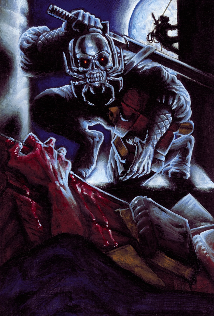
And since I have conceived those assassins as a form of ninja wearing mostly black colors, I used a full moon scene which will be the required source of light to help at recognizing them. The silvery backlight presents the main character in a gear very close to the usual ninja‘s equipment: Shinobi Shozoku or Keikogi for the body -including Hakama for the legs and a short Kimono for the torso, Kawan Kote (lightweight padded vambraces) for the forearms and Tabi (thick socks) for silent and nimble movement. The main figure on the window’s ledge is sheathing back a Ninja-To (short straight blade) to the scabbard strapped in his back.
The main difference with the traditional ninja being the skull-spider mask covering the face of the Ashragor assassins. It was designed as both a protection and a psychological tool of terror to confuse or impress the victim as soon that one would have recognized the “emblem face” of the assassins’ order.
The foreground scene represents the aftermath scene after the accomplished mission : the bloody hand of the victim is still grasping the edge of the collapsed table where some books are still present ; that helps to connect visually with the books seized by the main assassin for the viewer deduct the point of the whole scene : the Ashragor infiltrators have been sent to retrieve intelligence or crucial discovery made by the enemy camp and are being stormed by an entire squad of them.
The far away silhouette of the other Ashragor assassin in front of the full moon is there to figure out the idea of a fortress or castle being assaulted in silence as much as giving more distance to the perspective of the image, which might have been too crowded otherwise.
25-Sacrifice Rituel (Ritual Sacrifice)
The fourth of the 6 “tormenting” cards’ series. After the “zooming in an ongoing action” (“Torture” card), “zooming out from ongoing action ” (“Place of Torment” card), “classical framing on an afterwards action” (“Martyr” card), I used “classical framing on an ongoing action” variation for this one.
Since the “ritual” adjective in the title was an indication of a religious process, a scene displaying a victim laid on an altar with his heart being torn out from his chest- the Aztec way- sounded appropriate to me.
I willingly discarded the idea of using a blade to tear the heart out, since removing the heart with a bare hand was giving a stronger impact and alluded that some magic was at work.
I wanted to keep the figure of the tormentor relatively simple to avoid blurring the main focus of attention which was the victim and his bleeding heart; that is why the tormentor is wearing a robe with a dark green, non-flashy color. Beside, I used that color already for the “Conjurer” who was belonging to the Aristocratic Order as well ; consequently, using the same color was making sense to create a form of unity, confirmed by the Ouroboros brooch holding the cape.
Visually, I did not want a lot of gore spreading all over the surface of the illustration, that is why I concentrated it to the heart and hand area to focus the attention on that point. The Altar is tilted askew to help with the movement and to prevent the reading sense being cut horizontally in separate layers. That is also the reason for which I used tones of blue for the altar to connect it visually with the tinge of the tormentor’s arms skin.
3: Rare Cards
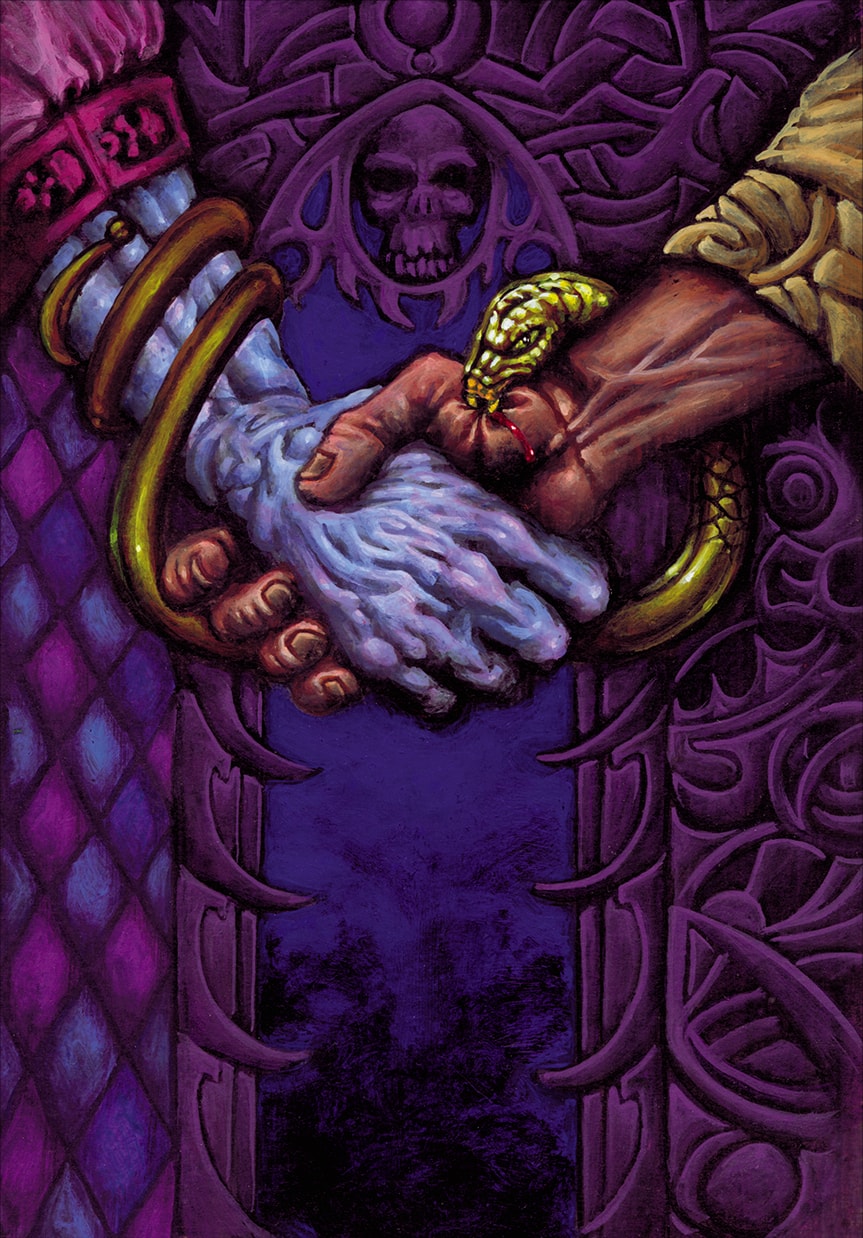
26-Échange de Bon Procédé (Quid Pro Quo)
As this card was supposed to give an instant retaliation following an enemy’s attack or hostile maneuver, I used the subtlety of the title to display something more “diplomatic” in that counter-attack than something which would have been too bluntly violent. The symbolic contrast of the friendly handshake which is used as a mean to poison the opponent’s emissary sounded treacherous enough for me to stand in its own right amidst the Ashragors’ arsenal of foul play.
The origins of the handshake is traced back to the middle-ages when people were offering their hands to show they were not hiding daggers or short weapons in their sleeves ; I took the exact opposite of the concept by creating this magical adder-bracer which would uncoil and bite the hand shaken at the user’s discretion. Yes, never trust fully an Ashragor.
Since only the hands were to be seen, I chose to focus on the difference of garments and skins’ colors to clearly identify the two protagonists, this time, strictly sticking to the original Ashragor’s palette for the left protagonist. I applied it as well for the decor which I kept simple to not blur the comprehension of the ongoing action, the gold of the snake being there to contrast enough with the surrounding colors to understand the process of jewel-to-snake transformation.
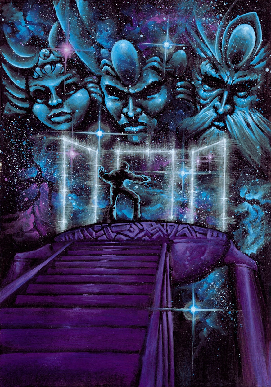
27-La Cour des Eternels (Court of the Eternals)
Since that card was a location and its description was rather mysterious, I used the very evocation of the title to design the concept of the painting ; basically, representing someone who is bound to appear in front of superior beings, whether out of a request to present to them or to be judged by them.
The idea was to represent some extradimensional space where the Eternals would be represented as Godlike faces displaying the Three Ages of Life ; from left to right : a Child, an Adult and an Ancient. Beneath their faces, three portals would be presented as temporal choices between these ages of life : Past, Present and Future. Would the guest had to choose between fixing his past, influencing his present or modifying his future? Would he be offered visions of those three times as a form of divination? Would he be judged for what he did, what he does or what he will do? I leave that interpretation to the viewer…
Graphically speaking, I represented an immense stair pictured from a low-angle shot, to enforce the idea of awe, leading to a simple circular platform representing the wholeness of the cycle of Time, since these beings would escape and control its essence.
The orb-shaped ornament they bear above their forehead is graphically evolving from the size of a pellet (Child), then grown to the size of an egg (Adult) to be later on adorned with geometric “wrinkles” for the Ancient.
The starry space background into which the faces of the Eternals are set is there to distort the perception of their actual size : are these faces standing just above the guest out of a size of 6-7 meters tall or are they very, very far away in the void, having the size of galaxies? Once again, I leave the viewer to decide…
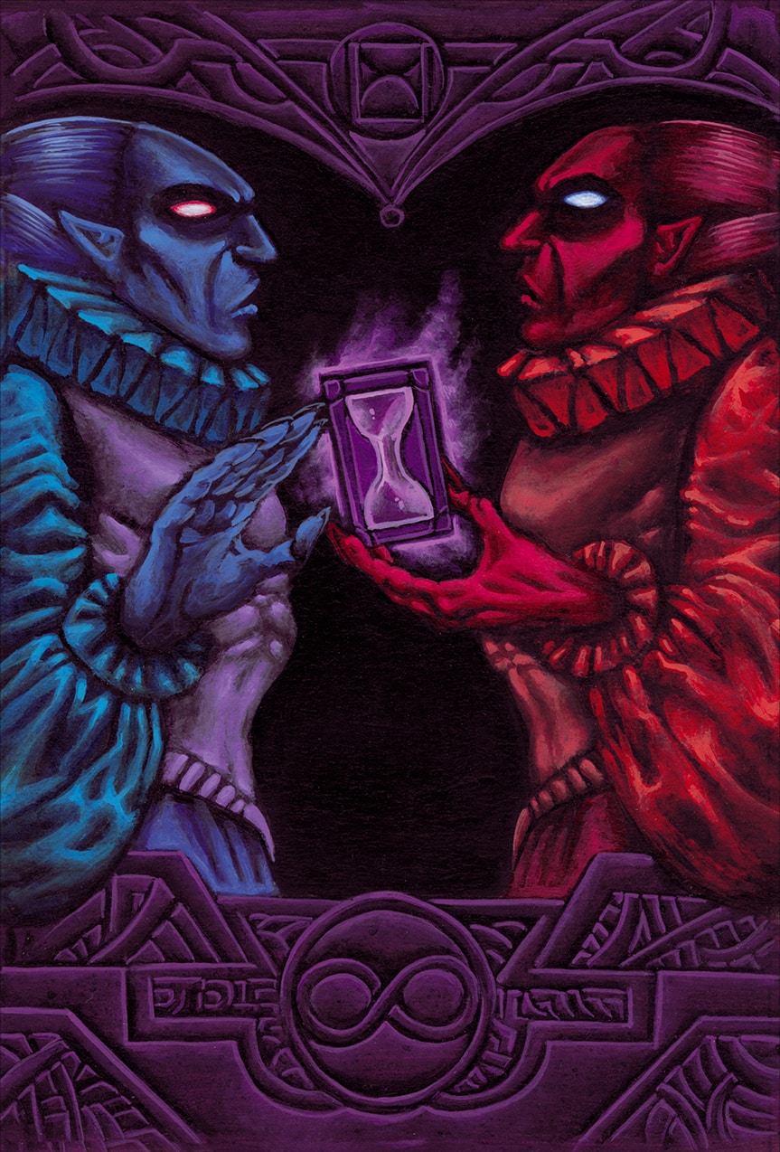
28-Chapelle des Erreurs Passées (Chapel of the Past Errors)
Similar, to some extent, to the “Court of the Eternals”, the principle of this card was, once again, dealing with time on the conceptual level as much as taking back some action on the gameplay level. Therefore, I needed to apply a similar principle pertaining to the relativity of time as the Court above, though without being redundant.
I used a very hierarchical principle pertaining to these two cards’ titles to get my inspiration set : sticking to the idea that a “chapel” is much smaller than a “court”, the concept of an individual, almost intimate, encounter was sounding more logical than an awe-inspiring assembly with god-like beings such as in the “court”.
Consequently, I imagined this scene where an Ashragor set in the Present (figured in blue on the left) would meet his own double from the Past (figured in red on the right)…. Conversely, the red Ashragor could, as well, be coming from the Future and meeting the Present Ashragor that would actyually represent his Past…. The relativity of Time allows many different readings of this card.
Now, about the possible interactions of meeting your own double, whether from the Future or the Past can vary widely depending the conception of each ; would your future self warn you about some impending event or can you visit your own past self to help him fixing some mistake? Once again, the possibilities are multiple.
That is why I represented the ongoing actions between the two time doubles as being interpretable in multiple ways : the red Ashragor from the future could come to offer more “time” to his own past self (figured by the hourglass he is holding) and the reaction of the blue Ashragor could either be that he is about to accept or discard the offer (depending on how you interpret his hand gesture). Conversely, the blue Ashragor from the Present could have just offered the Hourglass to his red past self, concluding the transaction with a motion of his hand…
I used a reverse color code for each time double, their eyes being of the color of his counterpart’s garments, to induce an idea of mirroring continuity and complementarity, such as in a Yin-Yang figure ; a cycle-based theme that I used as well in the “Renewal” card, that is why the hourglass icon of the Chapel set above is treated graphically in a similar way. The infinity sign, set on the opposite field below, evokes the “looping feeling” of the scene and their endless interpretations and possibilities about changing your past or your future.
Evidently, I used a violet for the background of the chapel, since it is the perfect balance between red and blue, symbolizing a place where the Future and the Past can meet in harmony.
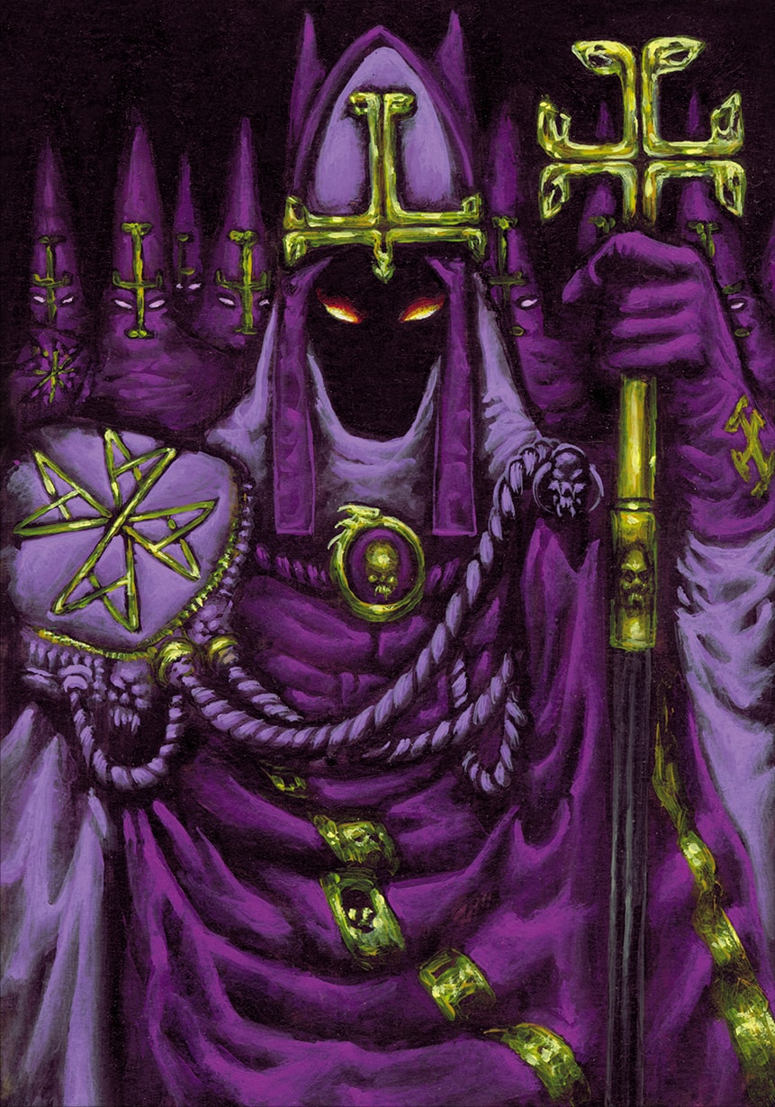
29–Les Éminences (The Eminences)
A major and iconic Troop card as far as the Ashragors’ religious nature is being concerned. Since “Eminence” is also the name for a dark purple color and these troops were to represent the essence of the clergy handling the “spiritual life” of the Ashragor faction, this card had to represent the regalia of the Priesthood Order in full.
Therefore I pictured a sort of “anti-bishop” on the foreground bearing the integral array of his charge :
● A miter and a crosier displaying the serpent-headed cross of the Ashragor House. I purposefully stretched the cross to make it figure as an upside-down Christian cross, to allude to the traditional antichrist reverse cross within demonology.
● An heavy pauldron on the right shoulder, embroidered with the outlined cross pattée symbol of the Religious Order.
● A brooch on the chest, clasping his heavy mantle, figuring the Ouroboros and skull symbol of the Aristocrat Order, as to signal the prominent political importance of the Eminences within the Ashragor society.
All the other elements of the religious garments are adorned with skulls and dark symbols, to fully display the concept of corrupting the traditional symbols of Christian priesthood. Of course, mauve and purple had to be the main colors of the garments as they altogether represent the main palette of the Ashragor as much as the traditional color of Roman Catholic Bishops.
The face is hollow and void if not for the blazing eyes, to evoke the fact that the highest members of the Ashragor Church are so much corrupted by the essence of their Demon Lord that they would eventually turn into shadows.
The group of lesser Eminences lined in the background wear Capirotes (pointed conical hood fully covering the face) to allude to the processions costumes worn by religious brotherhoods during the Semana Santa (Holy Week) in Spain ; such hoods were also worn during the Spanish Inquisition ; finally, they are also evoking the hoods worn by the Ku Klux Klan, thus fusing the three concepts of Punishment, Inquisition and Hate.
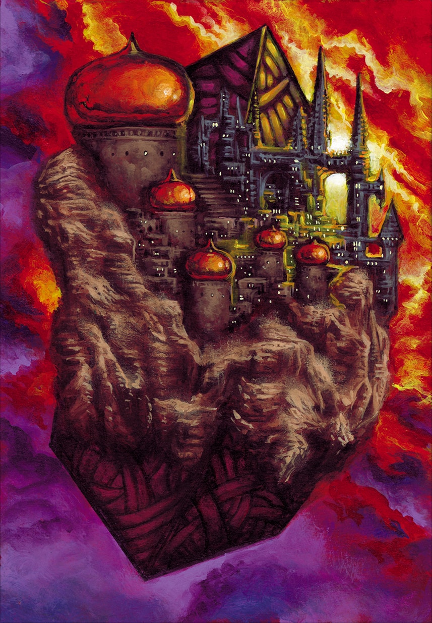
30-Laboratoire Alchimique (Alchemical Laboratory)
For this location, I wanted to avoid the classical “dark-basement-filled-with-shelves-potions -scrolls-and-dried-toads” picture, as it was too expected and unoriginal. Instead, I chose to reverse completely the concept, both in shape and role.
Instead of a small, secluded and secret place, I made it a gigantic fortress for everyone to be seen and, instead of representing a collection of small esoteric objects lined on a desk, I rather made these esoteric items immense and, actually, making up the very structure of this fortress-laboratory.
That is why there are huge cube-like shapes bearing complex patterns, protruding from the top and base of the Laboratory. This one being, actually, an huge city devoted to the Ashragor’s researches floating high in the sky to make it both intimidating and unreachable. The idea being that the Laboratory would be able to travel to any place where other Ashragors would need their alchemical expertise, as much as travelling easily to any far away places to collect rare or precious materials.
If that picture was to be animated, the patterns on the cubes would be ever shifting and changing in a mesmerizing way, even to eventually shift from cubes to other forms of polyhedrons or Platonic solids. Meaning that the Laboratory has, actually, grown itself out of alchemical experiment as a form of gigantic and mongrelly Philosopher’s stone.
Visually, I wanted the floating Laboratory to be displayed on a sunset, both to evoke the fire of the furnace and the coming of the night. Also, it enabled me to enhance the reddish flares reflected by the copper domes, the copper metal being an allusion to the etymology of Orichalcum (meaning “Mountain Copper”), the mysterious and mythological metal used by the Atlanteans ; de facto, alluding that the “Ashragor’s floating mountain of copper” achievement has been made through the discovery of harnessing the secrets of Orichalcum.
31-Les Voleurs d’Esprit (The Mind Stealers)
These creatures were supposed to drain the “mana”, mind, sanity or energy of the opponent’s troops in a very secretive and nasty way ; therefore, I imagined them as “out of phase” and invisible parasites which would graft themselves onto the head of their victims to slowly feed on their brain and devour their mind, eventually leaving an empty shell.
Basically, they are supposed to be unseen as belonging to an invisible plane, only to be revealed by the strongest divination and close examination of the victim, such as the scene pictured. This entity would attach itself to the head, slowly piercing and introducing its claws, fangs and various sucking appendages into its prey, coiling and fusing eventually with the victim’s essence, body and mind.
I kept the amount of different colors to a minimum, as I wanted the action to be as clear and readable as possible; the warmth of the skin tone of the victim contrasts with the texture of the Stealer, this one ripping and stretching the flesh apart to eventually fuse gradually into it, symbolizing its slow absorption by the parasite.
32-Celes
As a strong magic-user female hero, I wanted Celes to be as far as possible as the traditional witch in robes, sticking to my own guidelines, and I wanted to give her her own “flavor” and paraphernalia.
Thus I designed a form of majestic blue-skinned female displaying more a sort of articulated and ornamented armor than a traditional wizard’s robe. I displayed her on profile to present the complexity of her immense headgear that she wears as a crest, being inspired by the Art Nouveau painting style developed by painters such as Gustav Klimt, since I wanted Celes to be hieratic and erotic at the same time, evoking her magical danger, allure and seduction power altogether.
That is why I, (oops) once again, derogated to the (loose) “no breasts, no nipples…” rule of the Art Director, who chuckled at the picture and told me “Yeah, that’s ok…. These nipples are blue, so that doesn’t count…”.
In the headdress of Celes are displayed the symbols of the serpent-headed cross of the Ashragor faction and the Moon-Sun indicating her status of Sorceress.
33-Kahim
Another card whose I knew nothing about but a very scarce description…. I remember I did call the Art Director, back then, to obtain a more precise idea about that named Hero, whose I started to doodle as a warrior, initially. He checked the stats of the character and told me : “Yeah… it is not a warrior… he is more of a Mage actually…”.
So after Celes, I had to design another powerful Mage…. The only difference was that he was male. Since I wanted to avoid any form of visual redundancy compared to Celes, I did design Kahim with parameters which would be as diverse as possible from his female counterpart.
First, I chose to figure him facing the viewer and not on profile ; giving him that judgmental gaze upon the card holder immediately made me think that Kahim should also belong to the Priesthood Caste as if he was a sort of Mage-Inquisitor, about to sentence his victim. Hence the slight low-angle shot to make him more dominating and imposing, as much as the cross pattée symbol that he is wearing above the Ouroboros one.
Second, I purposefully and radically went away from the Ashragor palette to work essentially with the golden and brownish tones. This to make him very different from Celes, color-wise, yet looking complementary through the use of primary colors, displaying the essential and primal nature of their respective magics. At the time, the card list was not complete and a third mage hero was in discussion; therefore, I was saving the “red” color for this third mage to eventually have a sort of primary colors – Red-Yellow-Blue – “trinity” of magic-users…. Unfortunately, that idea has been dropped by the staff and I could not complete that idea.
Also, the rich golden embroidered garments were there to indicate his powerful Aristocrat status -indicated with the Ouroboros-skull symbol of his hood- paired with his immense wealth-indicated with the Ashragor Guilder (money coin) brooch that he is wearing on the left of his chest.
Third, the golden color was also there to make a general contrast with the only color spots belonging to the Ashragor’s palette that Kahim actually display : his purple eyes. Indeed, I did conceive Celes as displaying her Ashragor power externally, through seduction and allure; whereas I did conceive Kahim as expressing his Ashragor power internally, focusing and concentrating it from within, through willpower and gaze.
Following the same idea as for Celes, I did add an elaborate headdress in the form of ram’s horns for Kahim, as to mark a form of leadership or ceremonial mastery within the demon’s cult.
I do remember that Celes and Kahim pictures have been selected to be enlarged to a big poster size to adorn the stand presenting the CCG in Paris Gamecon.
Ergo, do I conclude they are rather working well as a pair.
34-Palais des Ombres (Palace of Shadows)
This location card was a form of “healing” or “regenerating” place where you could retrieve one of your troops for a cost ; the reverse effect of the “Altar of Hope” card, sort of.
Consequently, I did use overall the same color codes as for the Altar, following my own Art Direction that I did apply already for the Ashragor cards with a “regenerative” role, such as “Renewal”.
Since that card was, basically, reconstructing/resurrecting troops back from the dead, I chose to apply the golden/copperish hues inherited from the “Altar of Hope” card to create a sort of “alchemical reconstructing factory” which would assemble the being back to his former state. Hence the choice of displaying a form of “steampunk” environment filled with pipes, tubes, gears and dials, along with skulls ornaments, to emphasize the fact that Ashragors were using death and life matters as a material they could craft as easily as other races would craft gems or metal. Suggesting even more the Ashragor’s inhumanity and disdain for life.
I purposefully left the shadow silhouette emerging from the cloning tube with almost no visible features; it is more a menacing, evil shape backlit by the alchemical fumes of the “death factory”. I thus did stick to the title of the card and purposefully left to the viewer’s imagination who/what that mysterious shadow could be once “treated” by the factory…and alluded to the fact that this “re-creation” could spawn something even worse than who/what it was before…
35-Retour de Flammes (Backfire)
A very nasty and typical Ashragor effect card which would return an opponent’s effect against himself. Since the Backfire title was alluding to something very dramatic and of huge proportions, I definitely opted for a booming effect, similar to a backdraft, to illustrate the fact that the Ashragors were not to be trifled with.
I wanted a sort of typical European 15th – 16th century painting atmosphere such as the one found in Hyeronimus Bosch‘s distant flaming cities that he displays in his works like The Haywain Triptych, The Last Judgement, The Temptation of St. Anthony or the The Garden of Earthly Delights.
Basically, I did represent a far-away depiction of an opponent’s city in flames with its main citadel exploding and falling into ruins through the very willpower of a powerful Ashragor Mage. The city is displayed as successive layers of buildings and ramparts’ distant silhouettes, backlit by fire and hellish blood red haze. The mage’s willpower is being figured by the eyes appearing above the inferno’s fumes of the flaming city.
Meaning that no one is far away enough when it comes to vengeance. And judgement shall fall inexorably, no matter the time or the distance.
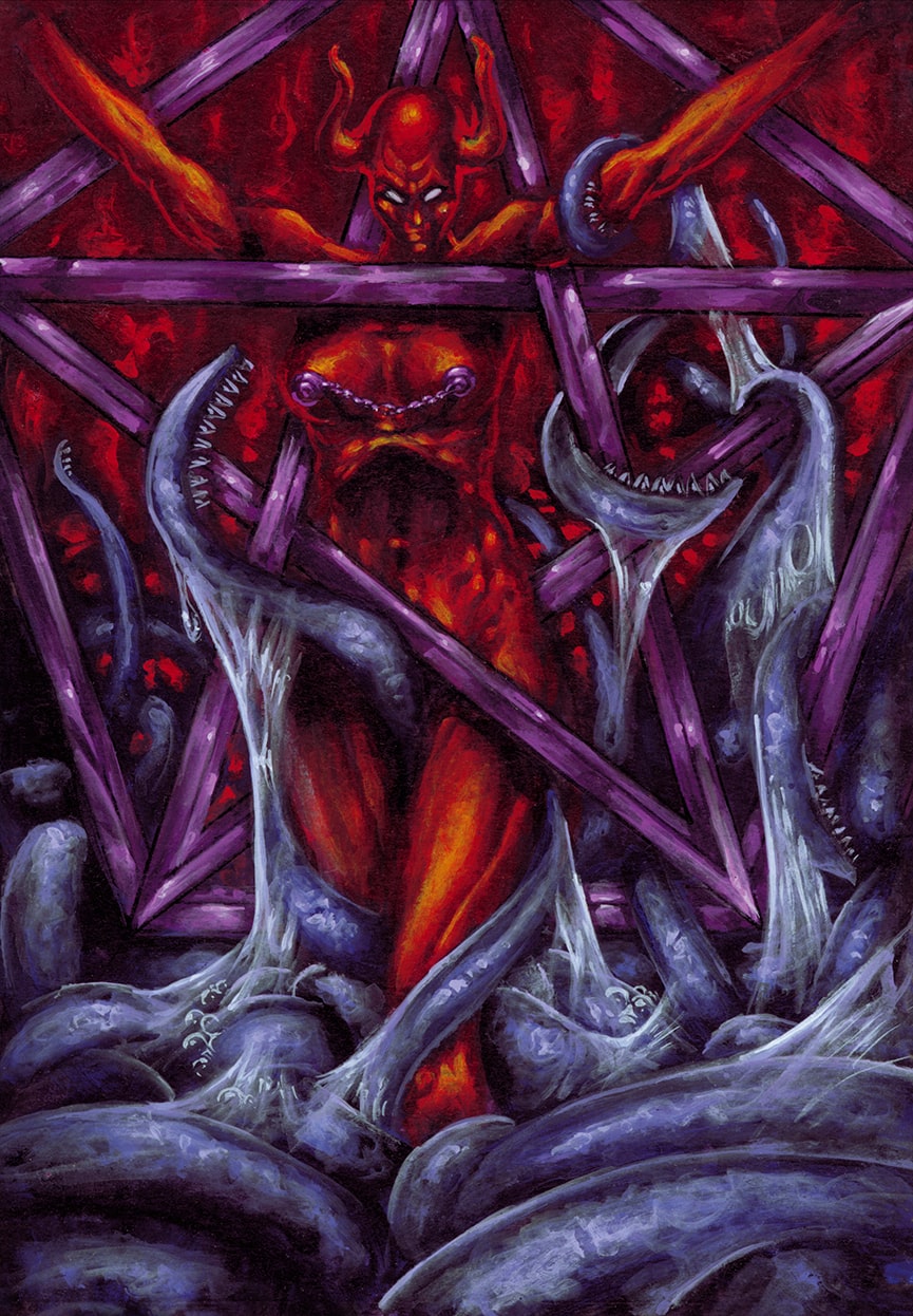
36-Sacrifice Ultime (Ultimate Sacrifice)
The fifth of the 6 “tormenting” cards’ series. After the “zooming in an ongoing action” (“Torture” card), “zooming out from ongoing action ” (“Place of Torment” card), “classical framing on an afterwards action” (“Martyr” card), “classical framing on an ongoing action” (“Ritual Sacrifice” card) I was left with the “classical framing on a beforehand action” display option.
Though, since I had two cards left in the “tormenting series”, I chose to subdivide that display in two subcategories: one would be a beforehand action displayed from the back and one would be a beforehand action displayed from the front. “Ultimate Sacrifice” would be that one, the back option would be used for the “Submission” card below.
Since that sacrifice was meant to be ultimate, I wanted to enforce the idea that the Ashragor would sacrifice one of their most valuable representatives in the form of a demon-bred female Aristocrat offered to some outer dimensional entity.
Since that card was quite powerful, I wanted to enforce the principle of that demon-bred female being totally willing about offering her life to her demon god Ashragor ; therefore, she is not bound but is “happily” offering herself in the core of the sacrificial place, where she is about to be consumed alive to trigger and unleash a powerful magic upon the opponent’s ranks.
The core of that sacrificial place is the demonic purple pentagram standing in the guise of a “pentagram-cage” which is supposed to harness the agony and black energy of the female to trigger the said magic.
The pentagram itself is conceived as an impossible object, such as defined by geometrical figures like the Penrose Triangle, e.g. : a two-dimensional figure which is instantly and subconsciously interpreted by the visual system as representing a projection of a three-dimensional object.
Meaning that the pentagram is both 2D (to be interpreted as a flat pentagram) and 3D (for the female being able to stand within it) altogether. There is normally no room for the female to have enough space to stand between the pentagram‘s branches, yet she does. That is why I baptized that non-Euclidian shape as being the impossible pentagram (or the Penrose Pentagram, as you like), thus inducing that powerful magic was currently at work and the classical laws of physics were being warped to allow the outer dimensional entity to appear.
Since that scene was really iconic about a form of “diabolical sacrifice”, I did indent a bit my resolution to not be too “classical” about demon depiction and allowed myself to have the sacrificed female to display a bright red naked skin along an horned head; I chose to have the victim being naked as I did not want too many details to blur the comprehension of the impossible pentagram‘s shape nor the grasping pattern of the entity’s tentacles.
Though, note that I did manage to not display any genitals nor any nipples whatsoever. Tentacles and body jewelry can be so helpful sometimes…
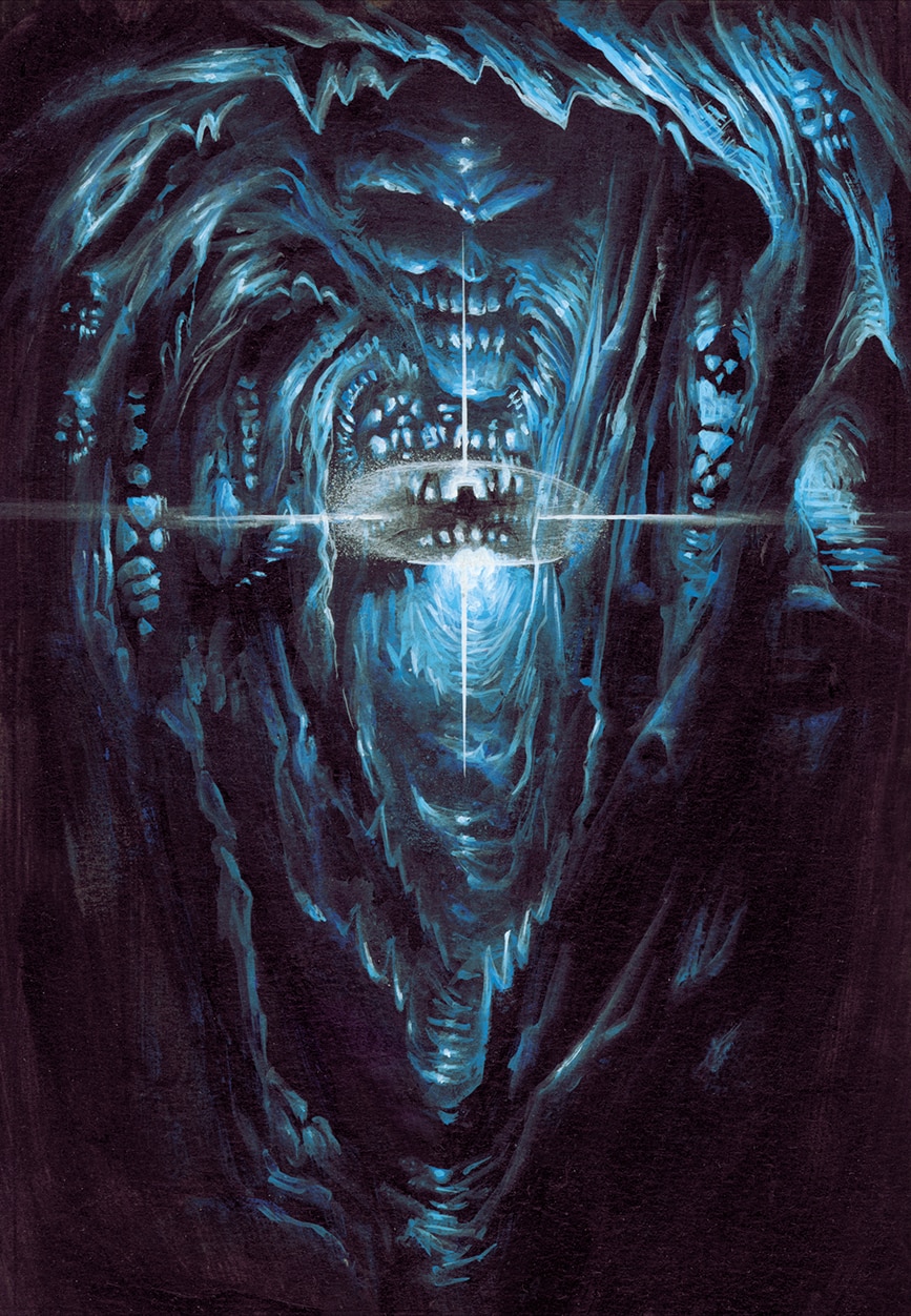
37-Sanctuaire des Âmes (Sanctuary of Souls)
A very cryptic card with a very cryptic title… actually, the production staff was so much in a hurry that they did not have a description for that card’s effect yet ; therefore, I did not have any idea about its characteristics except that it was a location card, obviously.
What is important in teamwork is that, as an illustrator, you have to be able to help your team to face with some unexpected delay or whereabouts and have an art conception which would actively relieve the narrative or gameplay designers from a potential dead-end or inextricable situation.
Meaning that, since the role of that card was undefined yet, I could not run the risk to depict a very precise action or scene that would, later on, be contradicted by the text or rules ; though, the deadline was such that I needed to create that illustration in due time and the production staff would later on “adapt” to the picture.
Keeping that in mind, I purposefully created a place distant enough for it doesn’t show too much, yet with a strong and meaningful architecture for it doesn’t looks too “undecided”.
Zooming out from the scene of the Sanctuary‘s core enabled me to stay mysterious enough, depicting a strange pulse of energy in the distance that the narrative staff could interpret later on in any way they wished, e.g. : leaving enough “room” for the narrative staff to imagine anything without being inconsistent with the rules. At the same time, the idea of a gigantic cave-tunnel sculpted with skulls and strange architectures was evoking enough the “light at the end of the tunnel” to allude to the Souls‘ theme, thus keeping the “freedom of interpretation” of the place and the consistency with the title both intact.
Visually, I stayed minimalist with the color range, blue hues always helping when it comes to evoke spirituality and long-distance visualization, since, on earth, the layers of atmosphere have tendency to tint distant objects and landscapes with more and more blue, until they merge with atmosphere.
I did not want display any other color which would distract the viewer from the main focus of the card which is the burst of light at the end of the cave and the altar-bridge in front of it.
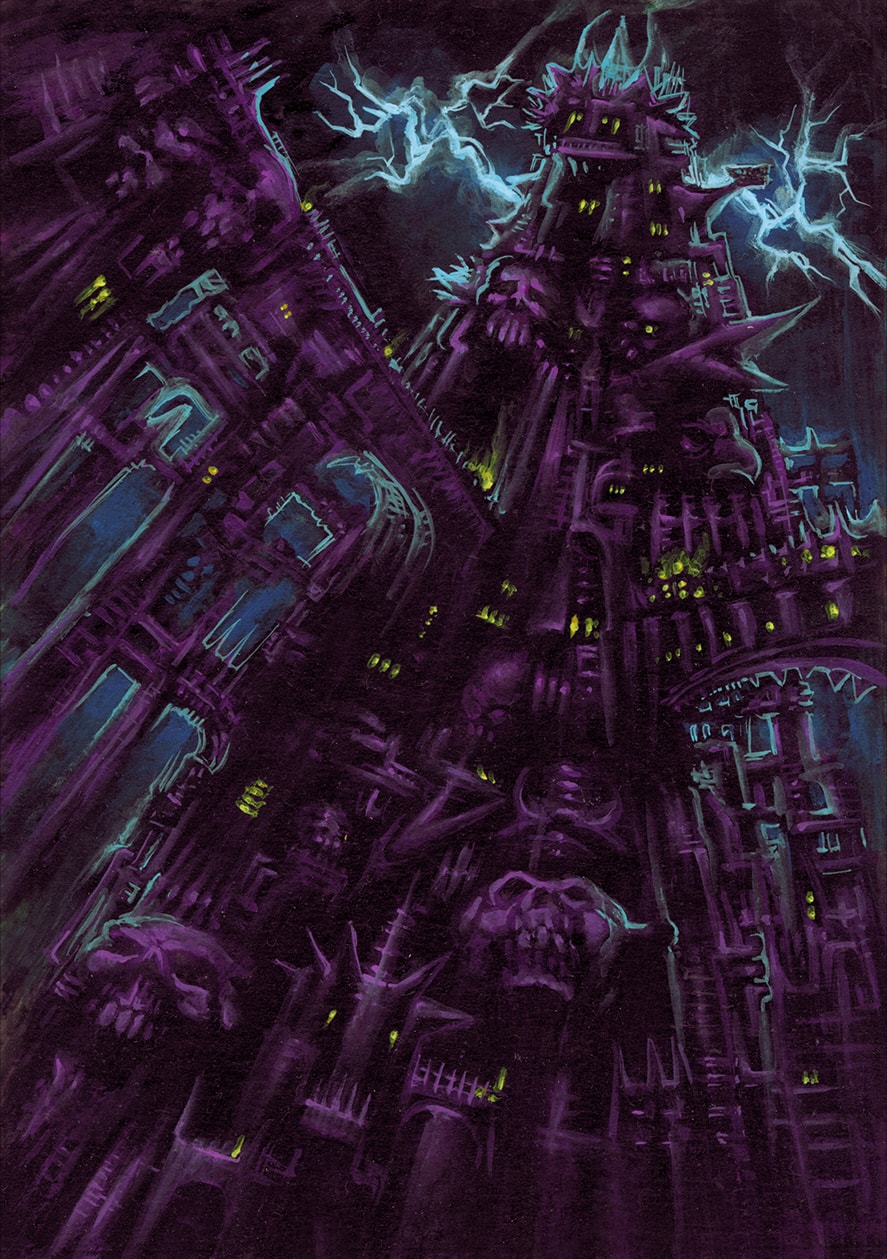
38-Tour de la Nécromancie (Tower of Necromancy)
If an Ashragor architecture would had to be the epitome of the Ashragor architecture that would have been this one, obviously. The idea of that unending tower, full of spiky bridges, immense skulls, pointed redoubts and razor bartizans pictured from a low-angle shot and reaching up to a storm lit sky went pretty early in my mind.
Of course, that was the occasion to give in the full use of the Ashragor palette and stay within the purple tones to keep intact the twilight and dark atmosphere. In a nighttime or storm scene, most of the hues are blended altogether towards a monochrome range of colors.
The only sources of lights are the thunderbolt backlighting the top of the tower -which enables the lightning reflection to give more volume to the architecture- and the tiny yellow lights of the torches and windows which help figuring the scale of the structure, emphasizing on its skyscraper size.
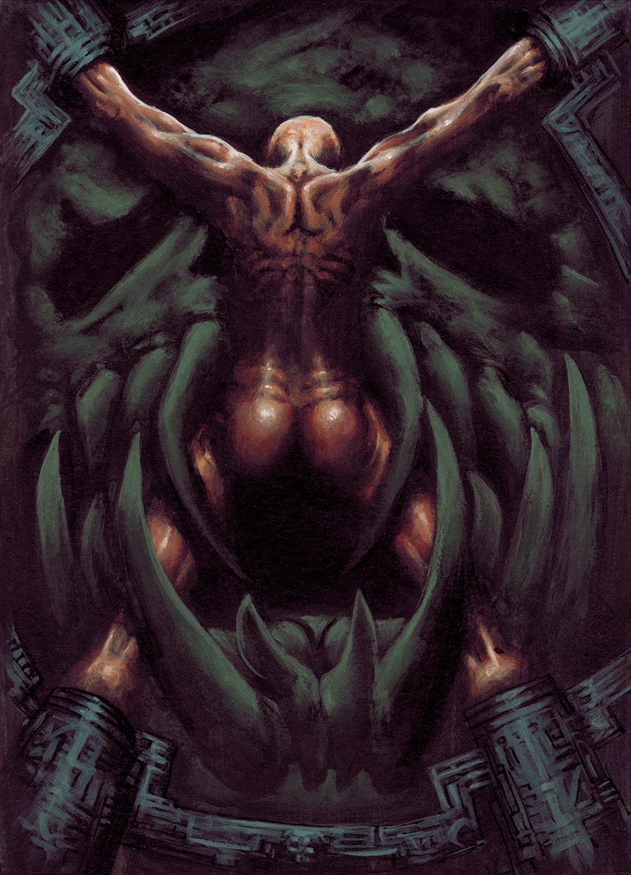
39-Soumission (Submission)
Submission being the 6th and last of the 6 “tormenting” cards’ series, I had but one picture composition option to eventually use, as explained in the “Ultimate Sacrifice” card above : a “classical” framing representing a beforehand action displayed from the back.
Since that “torment” card sounded less destructive than the others (submitting is not murdering, I guess…), I kept, as on many occasions, the interpretations of the card open by displaying that naked female figure being about to be engulfed by a gigantic skull-machine ; possibly bringing her into a submissive state by a variety of means which I leave to the imagination of the audience…
Visually, I wanted to focus the attention of the viewer to the core of the action which is the center of the card, hence the X-shaped position of the victim whose warm skin tones and texture are brought to the foreground, contrasting with the dark green of the engulfing skull which are bringing it more to the background, as if it was eventually emerging from the shadow to seize its prey. The circular structure into which the female’s feet and hands are embedded into are also there to center and circumscribe the action’s frame, thus directing furthermore the gaze to the center of the card.
I did not want the two acting figures to struggle visually too much with each other, color and texture-wise, as I wanted to induce a feeling of slowness and progressive consumption instead of a quick and violent devouring.
The idea was to allude to a form of unholy Eucharist or unholy communion with the skull -the victim standing in the role of the wafer- which would leave her completely enthralled by the will of the Ashragor Demon-God.
4: Territory Cards
Foreword
The concept of the Territories cards was that each Faction had its own place that the Player can deploy and use as it fits to complement his strategy with the other types of card (Troops, Places, Effects, etc.). Each Territory type of card had to reflect their kinship to their respective Faction and the Ashragor were making no exception. Ergo : the Ashragor Territories had to reflect darkness, evil, destruction, strangeness, danger and awe.
As far Art Direction was concerned, I enjoyed a full liberty of interpretation for this part, as well ; so, beyond the fact that each Territory must reflect an “Ashragor feeling”, I was free to create whatever I deemed appropriate to fulfill the project.
As most of the time in my works when I got a lot of freedom of creation, I decided to impose myself my own Art Direction to avoid redundancy, as I wanted to represent as much variety as possible ; and the idea to “color” each kind of possible terrain with an Ashragor feeling was an interesting challenge.
Therefore, since I had 6 cards to illustrate (and name), I decided that I needed one water-based terrain, one desert-based, one swamp-based, one representing magic, one representing destruction and one representing death ; thus, I was opting for hostile or uncertain types of terrains for the first 3 cards and synthetizing the epitome of the Ashragor civilization in the 3 last cards (Magic, Destruction and Death).
Once this mindset was clearly determined, half of the job was already done! (well… more or less…). And I “just” needed to infuse the freedom of my creativity into each of these individual territories set within a definite frame concept.
40-Falaises des Marées Eternelles (Cliffs of the Eternal Tides)
This was my “water-based” terrain and, actually, I started with this one. I really love how the ever shifting movement of the water material acts and moves in sea sceneries : water has altogether an immense weight, a lightness of transparency, a deep and dark range of colors and an immense power of bright light reflection ; yes, ocean is a paradox and a picture has to represent just that : the uncertainty of something which is altogether beautiful, dangerous and untamable.
Water evokes as well Magic and Mystery, as much as the Night would do, therefore, I decided to paint a nighttime water scene to enforce the “darkness” theme of the Ashragors and I wanted to add a moon based source of light as I thought the silvery reflections upon the waves could bring something interesting to the scenery.
In addition, it was a kind of allusion to the Moon symbol that I used for the Ashragor Order of Wizards, bringing in the idea of Dark Magic or Sorcery, which can be as unpredictable and dangerous as an ocean at night…
It was at this moment that I asked to the production staff : ” Hey… how many moons are they in your world? And which color are they?…” – I always check these kind of details when I deal with supernatural or alien worlds, creatures and, basically, non-real settings or civilizations ; in World Design, the slightest omission can ruin the credibility of a game, world or book if the picture contradicts the text or vice-versa. So, you have to think to these details in advance.
Therefore, the response of the staff was : “Errrr…. Actually… We did not think to that… Give us some time for we can solve that out…” and, after the Art Director did hang the phone, I have understood at his embarrassed tone that, indeed, they did not think to the stellar and astronomical components of their world… Sometimes, the most lethal details are the most obvious.
What is interesting in this anecdote, is that my question did actually broaden and boost the creativity of the editorial staff and did help them to perceive and conceive their world at a broader scale.
It is always highly rewarding for an illustrator to have a part of active contribution into the editorial creation of a world setting -whatever the scale is- and not only with his designs, but also with his suggestions or questionings, as it triggers a form of dynamic between the creative teams : the writers inspire the illustrators and the illustrators inspire the writers. It is a sort of “virtuous circle” which triggers a nice dynamic which helps the whole production.
Ergo, when a few days later, the Art Director called me, the editorial staff had decided that their world would have Three Moons : one big and two smaller ones, one of those being in warmer tones than the two others, the later ones being more like “classical” moons in color : silvery and/or cold tones based. So, in the end, I cannot help to think that, if the “Guildes” world has Three moons, it is a bit thanks to me, eh eh…
For the picture itself, I decided to represent dangerous cliffs stormed by a furious ocean. The Three moons being the main source of light, I did spread their different reflection colors over the horizon and partially over the rocks, except for the two smaller ones as they were logically shedding less light than the main big one, that is why the yellow moon reflection is shown only over water.
To “break” a bit these immense sources of light, I did decide to add a smaller secondary one, which is the bright fire-like lighting shedding through the cave on the foreground.
I wanted to add this to give a dynamic to the picture-reading and avoid too much monotony over the scenery, bringing an identifiable graphic by color which would be unidentified by depiction, nonetheless. A form of story in the story: why this cave is lit such a way? Is it inhabited? Is it a natural or supernatural phenomenon? Is it the lair of a creature? What is going on there? I left purposefully the mystery open and its interpretation up to the viewer…
41-Désert de l’Agonie (Desert of Agony)
For the “desert-based” territory, I was obviously needing to change radically my color palette to propose a true change in atmosphere and feelings- that is why I suspended somehow my own “Ashragor palette” constraint when I dealt with the Territories.
Therefore, if the “Cliffs of Eternal Tides” were giving off a sensation of Night, Darkness and Movement, I opted to depict the radical opposite for the Desert: Scorching, Bright and Stillness.
This time, the production staff did learn from their precedent “nighttime” experience and did anticipate my next evident question concerning that “day time” scene: “Then… how many suns are they in your world?…”. And two was the answer.
Which was really nice, since it was enabling me to really create an “alien” type of landscape. The binary suns allowed me to set a color range from bright yellow to sunset-type red, limiting the palette of colors to the warmest types for the picture doesn’t look too variegated.
The biggest sun was my main source of golden light and helped me to “push back” the red sun to the background, instilling a sense of distance and immensity, complemented by the mountain range on the horizon, bathed by the hellish red light. Then, every landscape element bathed in orange color was consequently on the medium range and, finally, the more contrasted elements-illuminated by the yellow light-were logically on the foreground.
That color setting helped me to give the scale of the central mountain range which is, actually, a creature… a very, very big creature. As far as the fauna of that desert was concerned, I imagined a life form such as a giant snake type with a rocky appearance which would be able to camouflage itself as a small mountain range, ready to awake as soon preys would be nearby.
If you pay attention, the small mauve dot set within the central mountain range is actually the eye of the creature, its head extending on the right in a beak-like shape and its fangs planted into the desert floor. Its spine coiling and zigzagging away towards the horizon, forming the peaks of the false mountain range.
I added two “smaller” creatures struggling on the prime foreground to increase the feeling of distance and perspective: a winged snake and a cyclops-scorpion. Now, “smaller” is all relative, regarding the size of the camouflaged mountain-creature-which is supposed to be around 600-800 meters long and 20-30 meters high, implying that the snake and the scorpion would be probably around the size of an elephant.
42-Mangrove des Lueurs Perdues (Mangrove of the Lost Gleams)
When I came to the “swamp-based” territory, I really wanted to induce the feeling of “hidden dangers under a deceiving appearance of innocuity” and play with a form of “spot the monster” principle.
Overall, I wanted to present a mangrove sinister enough as is ; that is why I mainly played on very dark green, brown and bluish tones to set a shadowy atmosphere, only illuminated by the few sources of light, hardly penetrating through the thick canopy, forming very small gleams of light (hence the name of the card).
To complete that idea of an “evil swamp”, treacherous enough to swallow anyone foolish enough to put a foot in it, I added evil and distorted faces onto the bark of trees ; meaning that even the vegetation there was ill-intended… ready to trip, attack, strangle, catch or even devour the travelers. Evil “Ents”, so to speak.
Then I imagined a fauna which would completely blend into the environment; their bodies, fur or scales having the appearance of the surrounding…. being completely hidden and unnoticed until it is too late. As there are actually 8 predators present in this picture.
Did you notice them? No?… Well…
Now you know.
Add to that treacherous quicksands and unexpected water holes and you will understand why “the gleams” are not the only things to be lost in this mangrove…
43–Les Cimes de Dévastation (The Peaks of Devastation)
The “destruction-based” territory, needed to be as chaotic and “uproaring” as possible; that is why I did take a risk and did something that I normally don’t do : play exclusively with all the primary colors : yellow, blue and red.
Most of the times, you have to be cautious with such a palette, as you always run the risk to end up with a kaleidoscope of very bright colors which struggle with each other and blur the sense of reading, as much as confusing the comprehension of the card… well, now… that is exactly what I needed for the “destruction territory” : to give off an impress of chaos, confusion and offense.
The trick was to dose enough these very strong colors to not “destruct” the sight too much, yet signifying clearly that this territory was a place where any normal living organism would not last more than a few minutes. Hell on earth.
Therefore, I imagined that the willpower of the Demon God Ashragor would completely be unleashed on that place, possibly opening gates on the very infernal planes that he is reigning onto.
Thus, it was only but logical that this land would be ever-stormed by erupting volcanos, instant tides of magma and rains of fire and ashes. Clouds of smoke and ashes would, in turn, create crackling storms of lightning which would hit randomly the land, triggering earthquakes and landslides, which in turn would open chasm onto fire pits, releasing magma and creating more eruptions, thus completing the loop and increasing again and again that everlasting cycle of destruction. An infernal climatic ecosystem.
I chose to devote around 2/3 of the cards to the warm colors of fire and lava and 1/3 to the blue tones of lightning, thus to avoid having too much of an unbalanced composition and the primary colors clashing too much with each other.
44-Le Pays de Cristal (The Land of Crystal)
For the “magic-based” territory, I wanted something embodying the idea that the land was not only a place where magic was present, but that the land was actually created by magic.
Therefore, I thought for some time before figuring out that idea; which needed to be completed by the fact that I needed to represent something which was looking like none of the previous Territories.
Then, I came with the idea of the crystal material. Gems are strange, naturally sharp and organized, giving off the idea of being originally carved by some superior order… enough to embody the essence of Magic; even more if an whole landscape is made out of it. I just needed to add a slight feeling of danger for it fit completely with the Ashragor’s concept.
I stayed simple in my color range: red for the foreground, purple for the medium range and blue for the background and faraway distance. Bluish tones in a landscape evoke horizon, because of the layers of atmosphere adding up which give bluish tinges to distant objects.
The whole color palette of the card was then naturally inducing the feeling of a vast valley of steep-sided cliffs, made up of sharp-edged, gigantic gemstones. Their facets glittering and reflecting away to the infinite any source of light-natural or otherwise.
Beyond that, these 3 colors were also inducing the idea that a part of these cliffs were made of Ruby (the foreground), Amethyst (the medium range) and Sapphire (the background/horizon). Possibly confusing and mesmerizing the traveler to lead him astray into some dangerous fascination.
I have placed an explorer with a bluish torch in the middle of the card to give out the scale, meaning that the Crystal Pteranodon creature above him would be of respectable size.
Playing with that idea of relative scale and ever shifting colors depending of the light source, as much as the distance between the foreground and the medium range, it is impossible to tell what is the actual size of the Ruby Spider on the foreground. It might be a tiny spider just walking across an edge set very close to the viewer… or it might be an elephant-size Spider very close to the traveler…
45-La Vallée des Ossements (The Valley of Bones)
Ending the Territories series with the “death-based” one was nothing but logical regarding the Ashragor theme. I imagined a place similar to a country made up exclusively of bones, as an immense twisted “elephant’s graveyard”… but not only with elephants…
Since that idea was clearly set, it induced that that land would be relatively “dry” and “desolated” to say the least; though, I could not use the same color codes as the “desert” and “destruction” cards or it would lead to a form of visual redundancy. The idea of a “dead” and abandoned place led me instead to choose a softer palette of pale yellow, saffron, beige and ochre; something closer to the bone and ivory color range, to enforce that idea of “elephant’s graveyard”.
Thereafter, it was relatively easy to play with that idea of gigantic fossilized and petrified skeletons, blending up with rocks and cliffs or, actually, creating up the very mountain ranges and cliffs of that valley themselves. Within that valley, you could not avoid to step upon a bone or a skull, as I was imagining that the desiccating power of that place would eventually kill anything alive within minutes, hours or day, depending of their size or power; finally dissolving their flesh before aggregating their very bones to the rest of the land to form sinister spires, mountains of skulls or forest of ribcages…
I represented various types of creatures’ skulls or bones at every layer between the foreground and the background, to give off a feeling of immensity within that deadly country. I added a towering skull on the edge of the horizon-probably the skull of a long lost Titan- to set altogether the scale, the distance and to allude to the power of the Valley.
The red ochre mountain of human skulls on the foreground plays a similar role to help figure out the scale. I added an huge mammoth skull on its summit as an allusion to the idea of an “elephant’s graveyard”.
5: Unique Cards
Foreword
Pertaining to the gameplay, each of the Ashragor’s Faction needed its official Illustrator to illustrate a precise type of Unique cards with a precise role and nature which were commons to all the Factions. These Cards were very rare and powerful so, as far Art Direction was concerned, the outlook and design of each of these Unique Cards had to reflect both this rarity and power. The Categories were as follow:
● A Location Card representing the Homeport of the Faction (Starting Place)
● A Location Card representing the Harbor of the Faction (Arrival Place)
● A Troops Card representing the Caravan of the Faction
● A Troops Card representing the Fleet of the Faction
● A Troops Card representing the Ultimate Creature of the Faction
● A Troops Card representing the Ultimate Hero of the Faction
● An Item Card representing the Emblem of the Faction
● A Troops Card representing the Leader of the Faction
Also, the two following Cards have been created along this series’ concept but have a special Status :
● An Event Card representing the Season of the Faction (called Augur)
● A Troops Card representing the Elite Troops of the Faction
Actually, concerning the two cards above, only the Augur one (“Winter” Season for the Ashragors) has actually been published. The Season Card was Special and not belonging to the Ashragors faction, per say, as the borders of those Cards were the same for All the Seasons of All the Factions : they belonged to the “World” Faction which was rather Neutral as it was representing the continent “battlefield” on which all the factions were waging war between them to achieve its control.
Concerning the concept of Elite Troops, it happened the Staff had decided to drop entirely the concept for all the Factions and none of them have ever been published for any faction or implemented into the game… except that most of the Illustrators have effectively created the Illustration before it has been cancelled.
That is why, in exclusivity, I have decided to publish this Elite Troops Illustration, previously unknown and unreleased.
46-Port d’Attache Ashragor (Ashragor Homeport)
For the Starting location Port of the Ashragor Homeworld, I wanted something really gigantic and impressive, displaying both a gigantesque architecture as much as a feeling of overwhelming danger. To stay consistent with the Art Direction that I have imposed on myself, I decided to reuse some of the architectural elements that I used for the Tower of Necromancy : a mystical and dark palette of colors and a perspective point of view which was reaching to the skies, to implement the feeling of crushing dominance exerted by this ruthless people. The water component of the port needed to be terrific as well.
That’s why I have come up with this gigantic skull topping an immense network of dark skyscrapers reaching to the infinite, only dimly lit on the top by the indirect light of the storms. The idea was to give a feeling of infinite evil city with hundreds of bridges passing over the stormy waters and hundreds of windows giving out the feeling that the hordes of Ashragors were endless.
Also, there is nothing more terrifying and chaotic than a stormy ocean at night, especially when you don’t know what dwells below. Therefore, I have decided to add gigantic tentacles within the crashing waves of the Homeport to signal that the access to this port was guarded by some eerie and immense squid-like creature(s) summoned by the Ashragors which would destroy anything within its range which was not belonging to the Demon-Folk.
47-Havre Ashragor (Ashragor Harbor)
For the Arrival location Port over the uncharted Continent, I needed to keep consistent with the Ashragor architecture while making sure that it would be distinct enough from the starting point, along with a feeling of “remote base” which would be the starting point for all the Ashragors’ expansion.
To make that distinction, I decided to focus on the warm colors on the Ashragor palette whereas I have used the cold hues for the starting port, eg : flamboyant burning colors like red, orange and yellow with just a touch of mauve as complementary to still make the connection with the main color of the faction.
Therefore, I was alluding to a form of Night (Start) to Day (Arrival) inducing the feeling of a long trip and the beginning of a new era. Also, since it is not really possible to tell if the sun is setting or rising, I was keeping the mystery intact about the daytime, implying the metaphore that the Dawn of the Ashragors would mean the Dusk of all other civilizations.
I have created a “small”, yet towering, Ashragor City which was starting to develop and expand on the cape of that peninsula ; using rich gold and red copper tones to allude to both the riches and bloodlust of its builders. The blood-red sun was there to emphasize that upcoming massacre feeling, along the figure of the skull in the distance, which could be either a monument carved by the Ashragors’ mighty necromancy or the visage of Death itself, watching the upcoming and inevitable advent of doom.
Once again, I let the viewer decide…
48-Caravane Ashragor (Ashragor Caravan)
What was interesting with the concept of a Caravan was that it needed, by definition, to aggregate the presence of animal mounts, vehicles and riders/coachmen/crew. Thus, these three components were needed to be present at a degree or another for the concept to work. Now, what is even more interesting, is to use these requirements and to warp them to fit your very artist vision and feeling of the subject you have to depict.
To enforce the fact that the Ashragors were a people up to their reputation of excessiveness, I have decided that they would have breed/engineered/capture the fastest and most versatile of the reptiles, adapted to move on the most difficult landscapes: lizards.
Lizards being extremely fast and being able to climb on any surface, it would be the perfect candidate to cross territories which would be normally unreachable for other animals ; beyond that, I was imagining that these creatures would be able to blend with their environment like chameleons would do, thus making a caravan crossing enemies’ lines almost unnoticed. Whether the Ashragors managed to capture and tame these giant creatures or they fabricated them by magic is left to the imagination of the viewer…
I overall decided to give the creature the most symbolic colors of the Ashragor’s palette : Purple and Mauve, completed by the shiny, leathery smooth black of the harnesses, combat Howdahs (Litters) and strapped merchandises.
I have represented this caravan as being self-sufficient : the Howdahs would protect and fight the convoy and would ensure the strapped merchandises or equipment strapped on the hindquarters would arrive to their destination. The first Howdah open, being an observation platform to allow a 360° surveillance; the second howdah is a sort of little, pyramid shaped, mounted bunker which would allow the troops to sustain an assault while being protected from most of missiles.
49–Flotte Ashragor (Ashragor Fleet)
For the Ashragor Fleet, I wanted to emphasize all the might of the Demon-folk by blending their art of necromancy with their alchemical and technological superiority. I based my initial design upon the Ancient Greek heavy warships such as Quadriremes, Quinqueremes, etc. all of them being collectively known as Polyremes : gigantic warships with a great number of decks into which a great numbers of rowers and crew were present to maneuver the ship to achieve its full potential of naval destruction.
With that in mind, I have literally conceived “sea fortresses” for the Ashragor Ships : the vessels would be very large and towering, to accommodate a lot of rowers and crewmen within, plus large cargo areas to store troops and war machines.
The hull of each ship would be covered with black magical armor plates and purple metal bolted frames to reinforce it. It would use both sails and rows to face any environmental situation and be able to gain speed very quickly during naval combat, being able to use their ship ram to pierce through the hull of enemies ships ; that is why the front ram is dented and elaborated to quickly sink other vessels.
The front conning tower of each ship would be a quite large platform able to welcome siege engines such as ballistae, catapults or trebuchets to be used during naval combat and the giant skull figurehead would be able to breathe fire or gas upon the enemy decks to decimate its crew during boarding.
After having discussed with the staff, it happened that the enchanted metal used by the Ashragors to armor their ships was defined as “attracting bad luck [for others]” …to represent this, I added shark fins escorting the ships, wherever they might go, as these ships would attract all predators of the ocean, anticipating the feast ; it indicates that, even if one would jump overboard to survive an Ashragor boarding, he would be still doomed and devoured.
50-Tyrex
In the same process of crushing, towering style pertaining to the Ashragor Faction, I wanted a creature which would mirror their nature : something immense and dreadful, able to strike the imagination of the viewer and relate to something they already knew and identify as a nightmare creature, yet, without it being an unrealistic monster or demon based creature. I wanted something referring to a true animal, whether present… or past.
So obviously, I came with the idea of the Dinosaur… and its most famous representant: the Tyrannosaurus Rex. Its translation from Latin being ” Tyrant Lizard King ” it would totally fit for a people devoted to domination through destruction and oppression.
In line with the concept I developed for the Caravan, I imagined that most of Ashragors would have a particular affinity for reptiles, as, after all, their heraldic emblem was Serpents. Thus, their most terrifying Warbeast would be a tamed/crafted/bioengineered Tyrannosaurus (that the staff, later on, baptized very originally “Tyrex”…).
I have made it bright red as the rarity of the Card would justify that this rare beast would be the most pure, blatant and obvious epitome of the bloodlust of the Ashragors, hence the plain use of a single one of their emblematic colors, matching the robe of the Red Monk mounting it.
51-Pontifex
For the ultimate Hero of the Ashragor People, I wanted someone with a very powerful and emblematic aura, giving out a lot of spirituality since the Ashragors were a very spiritual people… after all, they serve an evil God.
Also, I wanted someone who could federate the political and material power of this highly hierarchized nation. Therefore, it needed symbolize both a religious and political powers altogether.
So it was quite evident from that point that the ultimate head of the earthly power of the Ashragors would be a Pope…. Or rather, an Anti-Pope.
Working along I have developed for the Eminences and the Red Monks, here was the opportunity to represent the individual incarnating on Earth the will of their Evil God.
I have come with a mix of three concepts altogether : Immortality – granted for being the chosen one of an evil God, Christian attire – to symbolize being the Head of an organized Church and Oriental feeling – to create a form of concept oxymoron : ultimate ascension achieved not by compassion but by cruelty.
Therefore, it refined even more in my mind with the triple concept of Demigod, Anti-Pope and Anti-Buddha.
Then, I created an attire for the Pontifex which borrowed both to the Christian and Buddhist cultures: the ornamental cords, silk robe and gloves, shoulder pads and sleeves trims are inspired from western ecclesiastic culture. The cords are connecting the 5 emblems of all the Orders of the Ashragor World, topped by an huge gem in which rests the main Emblem of the Ashragor House, implying that all the Orders are connected with each other and under the direct domination of the Pontifex in this world and Ashragor beyond this world…
The “Phrygian-like” hat borrows to the traditional costume that Tibetan Lamas or Chinese Priests use to wear ; the Pontifex also rests in a meditative stance, eyes closed and hands resting in one another, alluding to a Lotus position found in Hatha-Yoga or Zen.
For the Demigod aspect, I get inspired by Hel, Goddess of the Viking underworld and I split the face of the Pontifex in two: one “human” aspect incarnating the earth world and one skull aspect incarnating its relation to the undead world and its ability to exist beyond death. The red “Third Eye” was an allusion to its ability to see through all things as much as a reference to an “Evil Buddha” which would attain cosmic awareness through Evil.
52-Bannière Ashragor (Ashragor Banner)
For the Ashragor Emblem, it was mandatory that it would display the totality of the Heraldic work that I have conceived from the start for each of the Orders, as stated in the Foreword of this project.
Since this House was very medieval in its conception and genre. I wanted to enforce its graphic strength by displaying its coat of arms in all its glory by creating an ornamental heraldic display of all the symbols of the Orders, for the player being able to refer to later while discovering every unit and, then, deduct the role or such or such troop, item or creature.
The idea was to display a graphic arrangement of the main blazon, surrounded by all the symbols carved in a ceremony hall, along the hanging banner of plain purple hanging from this ceremonial display.
The main blazon uses slightly contrasted colors in the range of purples for it doesn’t look too dull with the black serpent-headed cross, alluding that the blazon encased in the wall would be made out with a slightly textured and precious material, such as purple marble or amethyst. I wanted the color range for this picture to be very narrow and impacting, to emphasize on its Essence and the main lead color which alludes the best to the mystic quality and mystery of the Ashragors : plain Purple.
It is topped by a carved skull looking down on it, alluding that Death will always watch on the Ashragors and the three encased blades supporting the shield is a metaphor of the Ashragor’s expansion in every direction, the fourth one being death itself.
From top to bottom and left to right, I have represented the emblems of :
● The half-moon crescent and half-sun symbol of the Sorcerers Order.
● The Ouroboros symbol of the Aristocracy Order.
● The skull spider symbol of the Assassins Order.
● The cross pattée symbol of the Priesthood Order.
The hanging plain purple banner underneath respond to the one hanging on top, as much as the purple blazon is being structured by the three blades to create a vertical reading of the composition first, then an horizontal one ; a metaphor for the higher spiritual descending power has to be considered first, before it branches out horizontally and expand on the material world ; creating a cross pattern sense of viewing for the image.
53-Ashragor
Here was the ultimate challenge : to represent Ashragor himself, the evil Demon Lord who was at the origin of the whole civilization bearing his name and whose influence was underlying the whole narrative concept as much as the whole Art Direction… better not fail on this one.
First, the concept of Ashragor as an entity was so vast and impacting that I had to think for a long time about his possible appearance : here was a being who was incarnating itself as the epitome of all evil values and whose different aspects were controlling every stage of the Ashragor people as a nation. Thus, the infinity of his influence had to be taken into consideration ; eg : I could not only focus exclusively on the war aspect, the spiritual aspect or the magical aspect ; ALL of them had to be present in a single entity.
Second, the Ashragors are a dictature : a single being appears as a figure of authority and impose by sheer force or terror his will to his people ; no backtalk or contradiction is allowed and the ones who do not conform to this ideology are swiftly annihilated. You don’t negotiate with Evil. This aspect of tyranny had to be present as well.
Third, pertaining to my original decision in Art Direction, the aspect of Ashragor must be the epitome of this art direction ; it must be a being so strange, so untraditional and so atypical that, by looking at him, it would confirm conceptually the coherence and consistency of all the Art Direction decisions which have been made thus far, basically : by looking at Ashragor, one would say ” Oh yes, that totally make sense he looks that way…”. The top black cherry ornament on the top of a structured cake, so to speak.
So I have came with these 3 basic concepts: Ashragor had to be Infinite, Tyrannical and Atypical.
With that in mind, I started to think about the essential question : how do you represent Pure Evil?
I could not indulge myself into the classical “Big winged, muscled, horned demon with fangs and a big grin on his face” or else it would have completely reduced the concept to some fleshy and flashy incarnation that doesn’t bring anything original to the depiction of demons. Beyond that, to represent a being in a material form would desacralize somehow the idea of a being which is supposed to be unreachable, unending, unkillable and ungraspable… as Evil itself. I had to illustrate a concept and not a person or a creature.
Consequently, Ashragor had to be Immaterial.
Immaterial but being able to strike fear and radiate an immense power and being able to connect directly to the Collective Unconscious as stated by Carl Jung. Something someone can relate to, no matter what his culture or historical background might be…
And what is more universal as the fear of the Unknown?
And what is the element of unknown which represents a fear common to all human beings since beginning of times? : Shadow.
Fear of the Dark is the most primal instinctive fear of human : darkness holds all the potential of threats of menaces ; as, if you cannot see what is lurking Darkness, if you cannot identify what is menacing you, if you cannot understand or comprehend the scale, nature, size or dimension of what you are facing, then come the terror, as terror comes from what we cannot understand and fathom.
Hence I created Ashragor not as a defined being, but as an undefined being made out of shadows, whose nature was holding potentially all the primal fears of humanity since the beginning of times : he has no face, no race, no fangs, no facial expression ; you cannot know what he thinks, what he plots or what he feels. You cannot even know if he has thoughts or feelings at all.
He is the opposite of everything we might relate to ; a shadow being, a silhouette, the negative aspect of ourselves, the projection of our innermost evil and cruelty which make us inhuman in some circumstances… Because it represents no specific fear or danger, therefore he represents them all. The face of our angst is a blind void.
Thus, I satisfy the concepts of Infinite and Atypical.
To enforce the backlit silhouette concept mystery, I have defined his shadow head by an halo of flame to evocate the relationship to Hell. His eyes are cold and unreadable and made out of cold purple energy. Ashragor, like shadow, cannot be hurt, grasped or hit, he is made of pure negative energy.
Yet, to make the interface with his people and servants, he needs to be incarnated somehow, even temporarily. That is why I have imagined an armor which would be more like a vessel, holding altogether the infinite shadow shape of Ashragor than a mere protective armor…. since there is literally nothing to protect.
Then, I used the same reasoning about garments that I had for the Demons card, since they were as close as possible to the alien, indefinable dimension which Ashragor was originated from ; I used design geometrical shapes instead of identifiable figures like skulls or the like, to enforce the fact that this being was made out of pure concepts that you could find in quantum physics such as the String Theory : a form of linear math of Evil, so to speak.
In addition, the design of the lines was enabling me to apply molding shapes to the outlines of the “body” of Ashragor, which was just a simulacrum of human shape. I wanted him to be elegant and mysterious, like a mountain forest during a moonless night. His armor is made of a single colored bluish, dark metal as I wanted the overall color ambiance to be almost monochromatic, to enforce the impact of the flames around Ashragor‘s head and direct the vision to that very focus point. And the uniformity of color of Ashragor‘s armor also represent the quintessential and primordial nature of darkness itself.
Along the concept of the flaming head, I completed the allusion to the symbolic of traditional infernal world by giving him dragon-like wings growing from his sleeves and a demon wing-like high collar, enforcing the allure of Majesty you expect from a supreme ruler, crowned with fire.
He is resting back on a throne made out of the same patterns as his armor, and I wanted give him an almost relaxed attitude, as if he would already know all the ends… His fingers are entwined in a thinking attitude, almost meditative, as if he was observing, amused, the agitation of the mere mortals beneath him… This King has all Eternity to make his plans to fruition, he doesn’t need to menace, burst out of anger or prove anything to anyone. He knows that, in the end, all his enemies will die and all the civilizations will collapse but his own.
Thus, I satisfied the concept of Tyranny.
And Ashragor was born to life… or, rather, unlife.
54-Hiver (Winter)
For the Augur of Winter, the delicate aspect was it had to be both very representative of the Ashragor world…. while not being completely into it.
Since the Ashragors’ Season was -logically- Winter, I had to make this weather manifestation prominent in the card, while keeping the kinship to the Ashragor’s art direction on the background, yet clearly identifiable.
Then I decided that the color palette should embodies the very essence of chilling winter : white and ice blue, the filiation to the Ashragors would be given by the shape, stance and adornments of the entity incarnating Winter.
Since I had to depict a mythological entity or, even, a concept. I wanted the depiction of this Season being highly hieratical and symbolic. Therefore, I decided to handle that representation through pictural solutions borrowed to Art Nouveau‘s painters like Gustave Klimt or Alphonse Mucha whose symbolist style has always been an inspiration for me.
Therefore, I decided to mix a form of “2D symbolic pattern” of the Ice aspect with a “3D representation” of the character herself… as, yes, Winter would be female. The contrast between the sensuality of a woman character with the chilling death aspect of the cold Season appeared interesting to me. It was also an homage to Alphonse Mucha’ Seasons series which were representing mostly females, as, in French, the gender of the word “Season” is female.
Consequently, I imagined a blue-skinned woman “Ice Queen” clad with a robe made of ice shards, facing the viewer and positioning her hands in a way which would allude to a projection of ice and blizzard out of her person. The whole ice pattern is emanating from the center of the card and from the space created by her hands. I wanted something very symmetrical and geometrical with an aggressive, blade-like triangular shapes which would allude to the shards and cutting aspect of ice.
All the triangular shapes and angles are arranged to have the same origin point in the composition to enforce the feeling of explosion and irradiation coming from a single focal point. The shape of the hands, the cleavage, the sleeves, the face and the headgear are all pictured along the same sharp lines which are all converging towards the center of the card.
On the top zone of the card, I completed the robe of ice with an high collar, behind Winter‘s head, made out of crystal or ice lace arranged in a succession of eccentric circles which, also, radiate from the center of the card. Every layer of the collar is adorned with small triangles on its fringe, like small teeth to allude the “bite of the cold”.
The range of colors is very narrow : essentially turquoise blue for ice and cobalt blue for the skin to simply make the distinction between the “2D” and “3D” effect effective.
I completed the whole with a small skull within a burst of ice on the top of the Crown of Winter, to allude that winter is the death of everything and to relate to the Ashragor’s regalia.
55-Mortuus Evocatus
This card has never been published or revealed before. As I have mentioned in the Foreword of the Unique Cards, by the time I have completed this illustration, the staff has dropped the whole concept of the “Elite Troops” entirely.
Though, I wanted to nevertheless describe this ultimate card of the Ashragors’s civilization in a way to complete this Art Direction and World Design demonstration.
Beside Demons, which kind of creature could emphasize an absolute fanaticism, devoted entirely to the will of an evil, immortal god? Which troop would be fearless enough, resilient enough and inhumane enough to stand as the ultimate force which would strike fear in even the tougher of combatants? The answer would be Undead, of course.
My idea was that the most fanatics of living Ashragors would gladly sacrifice their mortal lives and forms during a necromantic ritual, during which they would perform a ritualistic form of suicide , like some servants of the Sumerian Kings which were sacrificed and buried alive for the King had his own Court in the afterlife.
After having been infused by the darkest black magic, they would reborn as a sort of Death Knights which would follow and execute the will of their god upon earth unquestioningly, ready to rampage and kill without fear, fatigue or remorse.
And, since they never had an official name, I have decided to baptize them Mortuus Evocatus, which is the latin name for The Summoned Dead or The Deadly Summoned. I wanted give them a Latin name to evocate something like a Praetorian Guard and to stay consistent with the clergy and spiritual hierarchy that was imbuing the whole Ashragor’s civilization.
Visually, since I wanted the enforce the “elite” feeling to these troops, I didn’t want to go with the “rusted” sort of armor. Since most of Unique cards had a sleek and smooth design, I decided to contrast the skull texture with polished and shining magical black metal for their armor, an “Elite Black Guard” of sort. The Ouroboros medallion signals their Elite status as belonging to the Aristocratic, ruling power.
They all bear an huge indestructible Amethyst on their helms which would hold their soul safe if their material form would be destroyed ; thus, enabling some necromancer to transfer that soul again in a new dead body for the Knight continues to serve beyond death the will of Ashragor. Their only color is plain purple capes and mantles, to enforce the “roman-based” inspiration behind these characters as much as the intense connection to the spiritual world this color is symbolizing.
56-Bordure Ashragor (Ashragor Frame)
The final work for this project was the frame. Each faction’s card had its image encased into a pictural framework which would display the game informations such as cost, life points, power, etc.
Therefore, each illustrator had to create this framework according the same structure, yet with an original graphic design which would be representative of his faction, without being too overwhelming in its design and/or color for it to not disturb the illustration it encases.
The structure of each faction frame had the following mandatory interface elements :
● There must be a rectangular area of a precise dimension on the top right of the card. Depending of the card type, this area would be left as is or animated graphically with a numeric value.
● There must be a rectangular area of a precise dimension on lower left of the card. Depending of the card type, this area would be left as is or animated graphically with a numeric value.
● The top left quarter of the frame must display 7 circular money coins (or “Guilders”) set at a precise location. Depending of the card type, none, some or all of the coins would be left as is or animated graphically with a numeric value.
To abide by the constraint of readability – and being aware that the color palette of the frame should not conflict with the one of the main picture – I have decided to opt for quite a discreet palette, ranging from mauve to a light purple ; since there were many elements displayed and the shapes and game-related zones had to be identified immediately, the option of an almost monochromic palette was the most reasonable.
● The very Top Central element of the card frame is a variation of the Ouroboros forming the Infinity Symbol ” ∞ ” as I wanted the emblematic animal of the Ashragors -the Serpent- to be present and enforced on the frame.
● The Top Left area holding the coins into which the values would be embedded are displaying the same symbols that I have used in the cards Corruption and Altar of Hope, to stay consistent with the overall details of the Art Direction : the obverse of the coin is a Skull and its Reverse is a double headed serpent (Amphisbaena) as these two symbols are the most emblematic within the Ashragors’ symbolic.
● The Top Right rectangular area is the most reddish purple of the whole frame and represents a devil’s face with an inverted pentagram carved on his forehead, to induce the Ashragors’ kinship to the demonic world.The Lower left rectangular area is the most bluish mauve of the whole frame to visually create a counterpart effect with the area diametrically opposed to it. It represents a demonic face engulfing a naked person, to pay homage to the iconography of classical Hell as represented by painters such as Bosch in the Garden of Earthly Delights.
● The Lower Right area is adorned with a big skull to balance harmoniously the composition, for there are four centers of interests at each corner of the frame.
The rest of the frame are various elements which are connecting the four centers of interest by gradually shifting in their shapes and colors to blend harmoniously with both their starting and arrival points, to avoid there is a visual “cut” in the frame which would perturb or conflict with the main image. AI used alternatively gargoyles-like figures, skulls, worms and the like to bring a slight feeling of unease at perceiving the frame as something which is “swarming” and discreetly alive under the fingers of the player…
This post belongs to the Category :
Check my latest posts!
- Article Header Design: “Niger: a New Severe Threat for the Future of France’s Nuclear Energy?”
- Article Header Design: “Revisiting Uranium Supply Security”
- Article Header Design: “The Future of Uranium Demand – China’s Surge”
- Article Header Design: “Uranium and the Renewal of Nuclear Energy”
- Article Header Design: “The Return of Nuclear Energy”
Check the latest comments!
Thank you very much for your comment coming from an IT expert, Nouha!
Very interesting article and excellent choice for th Sphinx!!
Splendid as always! And also this showcase the very broad scope of your design skills!
Related Themes :
Related Links :
Game Link :
Concepts Links :
Items Links :
Visual Links :
Your comment will be posted after approval
Leave a Comment