


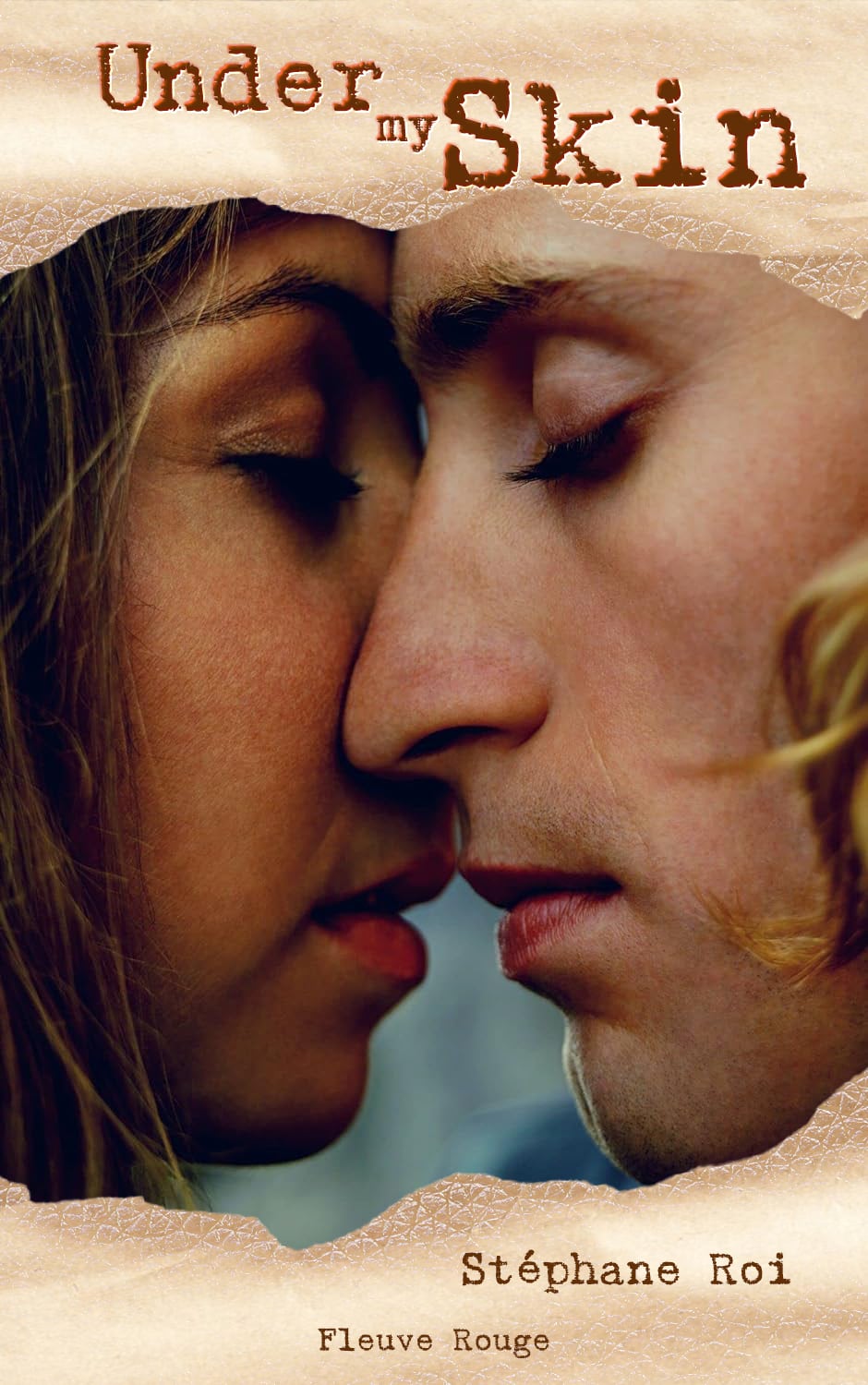
Under my Skin – English Cover

Manque de Peau – French Cover
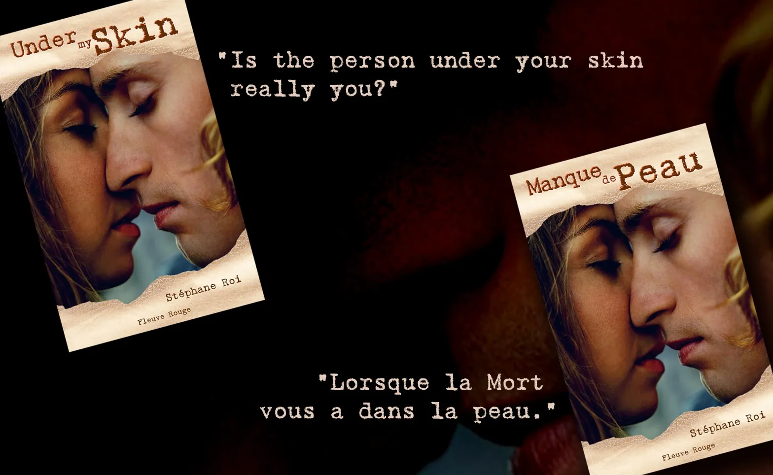
Presentation of both covers with their pitches in either language
The Context
📚 This article is dedicated to a series of 28 practical exercises, one per article, consisting of applying a fluid and organic methodology which is : creating a story from a given visual, then impacting the art direction of the base visual, nuanced by the story thus created. It is an interdependent cycle generating the following creative flow: Basic Visual > Analysis and Psychological impact> Narrative reflection and Narrative design > Story > Improved Visual.
Through 28 concrete examples, and then 28 stories, I will present how a visual can inspire a story and how, in return, the story will guide the art direction to nuance the said visual. For it can improve the semiological atmosphere of the result of the narrative design, which is the Story.
I will also indicate how the differences in cultural context between the English version (or American) and the French version will slightly nuance the stories, mainly for the choice of the Title and Pitch. And, consequently, how these differences in titles will affect the final visual.
Each of these articles will then present TWO “back covers” of the same story, as well as TWO “front covers” for each of the two languages.
It is the reciprocity between Image and Story, Story and Image.
The Story (English Version)
Under my Skin
“Is the person under your skin really you?”
A serial killer is suffering from a degenerative epidermal disease. To slow down this disease, this killer must hunt down a victim every month and dismember it to clad in their skin with which he fuses. Like a shark, he must touch them, brush against them and caress them beforehand to find out if they are to his “taste”…
It turns out that this ritual also gives the killer the ability to take on the appearance of the victim for a whole month…
Two FBI detectives are on this case: Agent Jill Deray, Psychiatry Doctor and profiler; and Agent Lance Skinner, a former member of the Delta Force specializing in infiltration and exfiltration.
They are working together for the first time. A man. A woman. A ruthless hunter.
A hunter?…
…or a huntress?
The Story (French Version)
Manque de Peau
“Quand la Mort vous a dans la peau.”
Un tueur atteint d’une maladie dégénérative de l’épiderme se doit de tuer tous les mois afin de dépecer ses victimes pour se vêtir de leur peau avec laquelle il fusionne. Tel un requin, il se doit de les toucher, de les frôler et de les caresser auparavant pour savoir s’ils sont à son “goût”…
Il s’avère que cela lui donne
également la capacité de prendre l’apparence de sa victime pour un mois…
Deux détectives du FBI le traquent : l’Agent Jill Deray, également Doctoresse en Psychiatrie et profileuse ; et l’Agent Lance Skinner, ancien membre de la Delta Force spécialiste de l’infiltration et de l’exfiltration.
Ils travaillent pour la première fois ensemble. Un homme. Une femme. Un tueur.
Un tueur?…
…ou une tueuse?
The Creative Process
Step 1: Analysis of the Picture
A-The emotional and psychological feeling
The proposed visual – before any graphic intervention – represents a zoom on two profile faces touching each other, skin to skin, which suggests an intimate contact.
Intimate but not necessarily loving or tender, since the expressions of the faces are relatively neutral: the two persons represented are not really smiling or grimacing, both have their eyes closed and seem immersed in intense reflection, or even a meditation.
• Are they immersed in a deep mutual love feeling, enjoying a moment of supposed intimacy?
• Are they in a form of restrained and symbolic adversity, like a “gentle face-to-face”?
• Are they in a purely tactile approach to the other, as if they were blind?
• Are they communing towards a common goal or dream, whatever it may be?
B-The ambiguity of the characters
The people depicted appear to embody a woman on the left and a man on the right, but is it really the case?
• The long hair and light eye makeup of the “woman” on left seems to indicate her feminine nature, as well as the red appearance of her lips which could evoke a lipstick touch.
• But “the man” on the right also has very red lips, and his hair is also long, his features are thin, emaciated, almost feminine in their symbolism; while the features of the “woman” are more babyish and rounded, they form an “archetypal opposition” between the pointed and the round, the concave and the convex. And this, regardless of their respective genres.
This “couple” is therefore visually ambiguous, deliberately departing from a standard classification of the male/female opposition.
In the current socio-cultural context, it could as well be two women, two men, a woman on the right and a man on the left, or two transgender people… since only a close-up of their faces is visible. And, therefore, this photo deliberately does not give us enough information to be able to deduce their sexual gender using a vision of their bodies, their clothes or their body language. A doubt remains.
Their “genders” rather evoke a form of combined and ambiguous androgyny where the sexual deduction of the representation of these characters is only a “narrative vagueness” which the storyteller can easily seize and play with narratively.
Consequently, the ambiguous sexuality and emotional neutrality of this image gives us the opportunity to be able to influence it in one direction or another, towards any given emotion or towards its opposite.
And, if necessary, to be able to create surprise by going against a cognitive bias that one could receive when interpreting this visual way too quickly.
From the surprise that goes against preconceived ideas, narrative interest is born.
Step 2: Narrative Approach
A-Literary Genre
Our recent Western cultures are mainly focused on individual feeling and introspective emotional analysis. Therefore, most spectators viewing this image would deduce that this visual represents tenderness, sensuality, intimate proximity and, consequently, Love. With more or less hazards linked to the experimentation of this feeling.
In order to create an emotional contrast opposed to this commonplace, I decided to go against the general feeling and therefore to create my story on the theme of Thriller and Horror.
B-From intimacy to predatory “gustation”
Indeed, the neutrality of the characters almost immediately reminded me of something deeper than a “simple sentimental relationship”. However, intimacy had to be present in the story, because it is factual from the visual: the characters are skin to skin. However, there are many situations that can lead to epidermal proximity regardless of love: rape, hand-to-hand violence and predation, especially concerning certain animals for whom smell and taste are essential during hunting.
Some sharks have “taste buds” all over the surface of their skin, allowing them to “taste” their prey by simply “brushing” their bodies against the prey to check if it is to their liking. I therefore imagined that the killer could have a similar need, requiring to “brush” his skin against his prey – and therefore resorting to a certain intimacy – to be able to identify it as an “appropriate” victim to consume. Thus, I designed the concept of a predator who would synthesize a perverse need for intimacy with a physiological need to “consume skin” for a very specific use.
C-The “skin disguise” as a suspense leverage
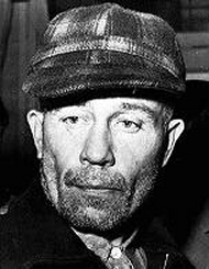
I tapped in my knowledge of certain serial killers such as “Ed Gein” who skinned their victims out of morbid fetishism; then, the idea of a serial killer who would be driven by a need for survival seemed interesting to me. In fact, it allowed to not submit the intrigue exclusively to the “classic profiling” of a killer through psychiatric means alone, but also to induce a feeling of emergency dependent on biology to define the killer’s modus operandi.
Thus, the investigation could be enriched with twists and turns and a wider range of deductions, hypotheses or errors on the part of the investigators, throughout the story. This gives the opportunity to prod the reader in a wrong direction, while being faced with a wider range of emotions. The concept may even relativize the reader’s emotions to the point of possibly empathizing with a sick being who needs to kill to survive. The philosophical aspect of survival at all costs at the expense of morality was then interesting to explore and develop.
Finally, the fact that “consuming” the skin of his victims allows the killer to take on the identity and body of his victim adds an additional lever of suspense: the fact that his appearance can change very regularly during the story causes an intellectual and emotional instability in the reader. And this instability would be echoed by the growing paranoia of the investigators; after all, the killer could be right next to you…he could even be your co-worker.
This is why, in the end, I concluded the summary of the back cover with a question leaving open the field of possibilities: since the appearance of the killer can be indifferently masculine or feminine, his original gender can also be masculine or feminine (or even something else?…).
This brings us back to the visual ambiguity from the original photo picture: a “man” and a “woman”, skin to skin… except that, now, the filter of the story makes them appear in a different light… with, possibly, one of the two protagonists with intentions which may differ very much from what he – or she – initially appear to emit…
This also allows us to raise the question of sexual identity within our modern societies by linking it to a strong sociological theme, inviting the reader to position themselves towards it.
D-The Title (French and English)
• The French Title is “Manque de Peau” (Translated as “Lack of Skin”). It is a homophony playing on the French slang expression “Manque de Pot” (literally “Lack of Pot”) which means “Out of Luck”. In this case “Peau” (“Skin” in French) and “Pot” (“Pot” in French) are pronounced identically and have the same sound.
It is a pun implying that, if the killer is literally in a “lacking skin” mode, it also means that his next victim is therefore “out of luck” in crossing his path.
• The English Title is “Under my Skin”. The expressions and cultural context between France and the USA being very varied, it was not possible to literally translate “Lack of Skin” for the English version, as it would have no “second meaning” and, then, was lacking the subtlety needed for a paranoid thriller.
So, I chose a vintage reference to the American song by Frank Sinatra, “I’ve got you under my skin” which evokes a devouring and carnal love and I applied it literally to the story, as it was making more sense for American readers. Additionally, if the book was to be written, I was considering the song be heard by one of the characters to add to the semiological atmosphere.
E-The Pitch (French and English)
• The French Pitch is “Quand la Mort vous a dans la peau”. Literally translated from French, it means a slang expression: “When Death got you under its skin”; just like the reasoning on the English Title described above, it is a form of allusion to the song by Frank Sinatra “I’ve got you under my skin”, as this expression also exists in French.
The idea was to hook the reader with a familiar image of closeness, all-consuming intimacy and obsessive pursuit, while twisting this popular expression on the theme of skin.
• The English Pitch is “Is the person under your skin really you?”. Unlike the French pitch, I didn’t want any supplementary allusion to the Frank Sinatra’s song because that would have been a redundancy with the Title.
Asking a disturbing question is much stronger, as it questions the very identity of the reader and the relationship with their own body. It makes a direct link with the phenomenon of confusion and intimate paranoia leading to madness which will be diffused throughout the story.
F-Easter Egg Bonus: The names of Author and Publishing House
“Easter eggs” are very common in video games. This concept is a form of “private joke” hidden within the program which allows an allusion, a meme or a hidden message to be transmitted to those who know how to detect it. In this exercise and all the following ones, I use this playful semantics to “invent” an author name in relation with the story itself, as well as for the publishing house which is fictitious, according to the same principle.
The author of this book is “Stéphane Roi”, which is the literal translation into French of “Stephen King”, great master of horror.
The publishing house “Fleuve Rouge” means “Red Mainstem”. This is a reference to “Fleuve Noir” (“Black Mainstem”) which is a French publishing house specializing in police, espionage and anticipation novels… I simply added a little more blood…
Step 3: The orientation of Art Direction for the Cover
A-Choice of picture enhancement
Once the story was designed, it was necessary to stage the initial visual without necessarily stripping it of its initial aspect: in fact, the neutrality and ambiguity of the initial characters were strong enough to stand on their own and to encourage the reader to a form of indecision.
I just had to add a slight “nudge” to orient the cover visual to dispel a possible romantic interpretation. Though, I had to achieve this without eliminating the mysterious aura of the photo where romance COULD be a possible interpretation, but not the only one.
In short: it is only at the end of the book that the reader will be able to “understand” retroactively the scene presented on the cover and deduce, at that moment, a romantic, horrific or suspicious reading from the visual.
• Therefore, I decided to apply a relatively discreet skin texture with a torn effect at the top and bottom of the cover. It did not have to be gory or bloody, but simply present enough to “evoke” the stakes of the story and reinforce the intimate aspect between the protagonists in the photo
• The “torn” aspect of the skin evokes the tearing of the killer’s modus operandi, of course, but also the emotional “tearing” of the protagonists: the one of the investigators, the one of the victims and the one of the killer who, too, is fighting for survival.
• The choice of skin color of the texture had to be one of either character in the visual, in order to create a semantic link between them and the design. It could therefore be of a “light flesh” tone like the face on the right, or of a more “brown” tone like the face on the left. Though, as the “brown” appearance was rather evoking leather – a dead material, I finally decided to opt for the “light flesh” tone – evoking (almost) living skin.
B-Typographic choice
As the literary genre oscillates between horror and thriller, it required a typeface that evokes these two atmospheres.
I opted for the Gabriele Dark Ribbon -Black.
• This typeface being related to the “typewriter” style, it evokes a purely informative, direct and pragmatic administrative character; suitable for illustrating investigation reports or documents where only raw information counts, without embellishment and without emotion. It is a typeface form related to the family of “Mechanistic” typeface which was born following the industrial era and, then, at the time of the security anxiety rising within growing modern megalopolises.
• In addition, its textured appearance -as if the glyph was engorged with ink– evokes even more the urgency of a report typed very quickly, without concern about the final presentation: this announces the stress linked to the “run against the clock” atmosphere within the story. Its torn contours also makes a visual link with the semantic tearing of the skin texture which comes in the background.
• To establish a chromatic balance with the color of the skin texture that I sampled from the character on the right (as specified above), I also sampled the darkest skin color from the character on the left. I used it as color for the font text, completing the link between the text color and the texture color, mirroring the two skin tones of the protagonists. There is also a slight reddish border outline in the lower part of the glyphs’ bevel effect, as if the text was branded and carved into the skin texture.
This post belongs to the Category :
Check my latest posts!
- Article Header Design: “AI at War (2) – Preparing for the US-China War?”
- Videogame : Fishprey
- Article Header Design: “Niger: a New Severe Threat for the Future of France’s Nuclear Energy?”
- Article Header Design: “Revisiting Uranium Supply Security”
- Article Header Design: “The Future of Uranium Demand – China’s Surge”
Check the latest comments!
Thank you very much for your comment coming from an IT expert, Nouha!
Very interesting article and excellent choice for th Sphinx!!
Splendid as always! And also this showcase the very broad scope of your design skills!
Related Themes :
Related Links :
Your comment will be posted after approval
Leave a Comment