






The Complete Team of The 4M

“The 4M against The Pandemics” – Project and Supergroup Logo




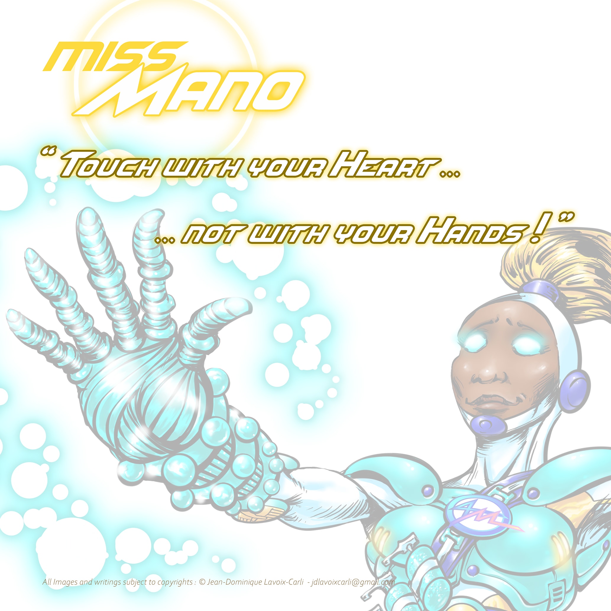
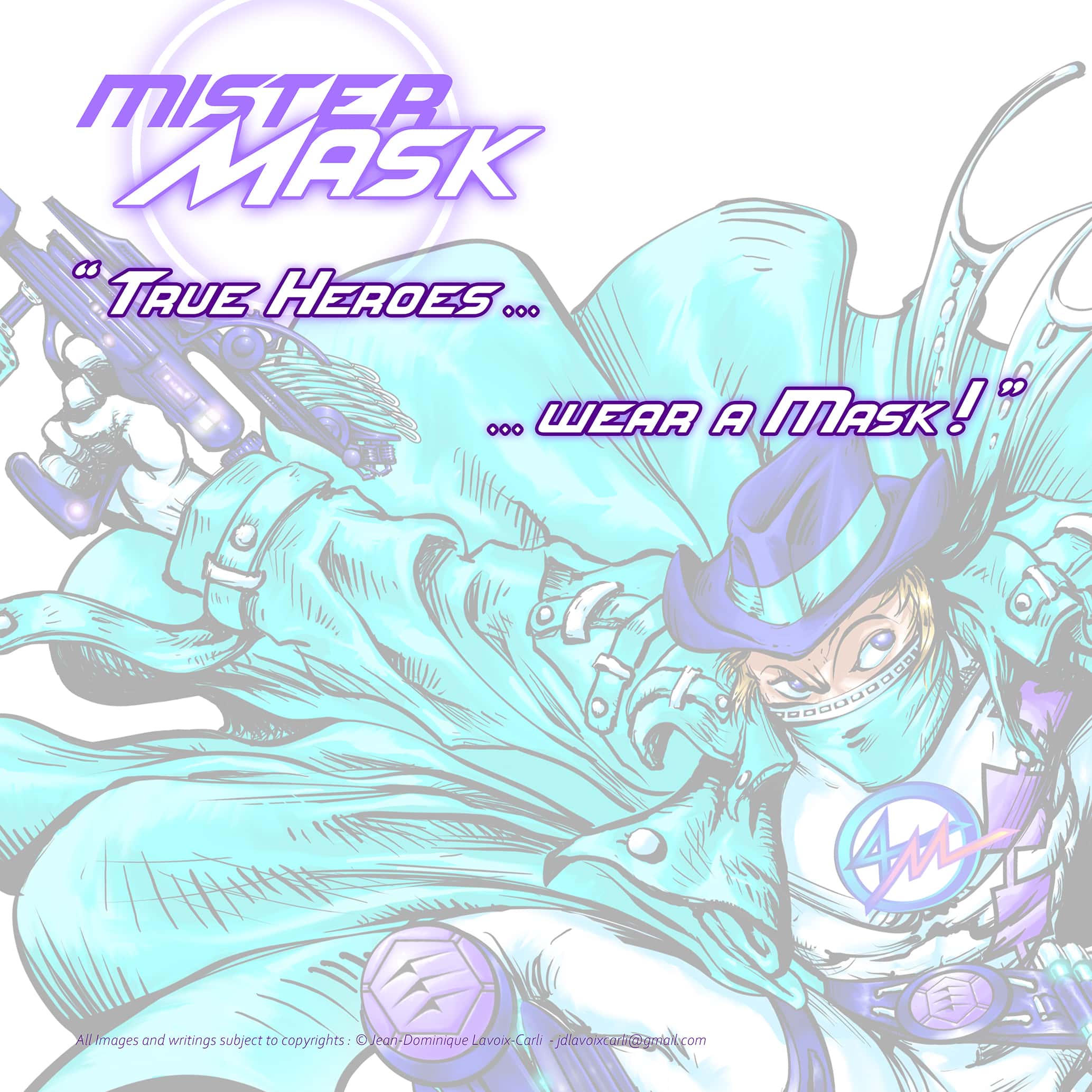
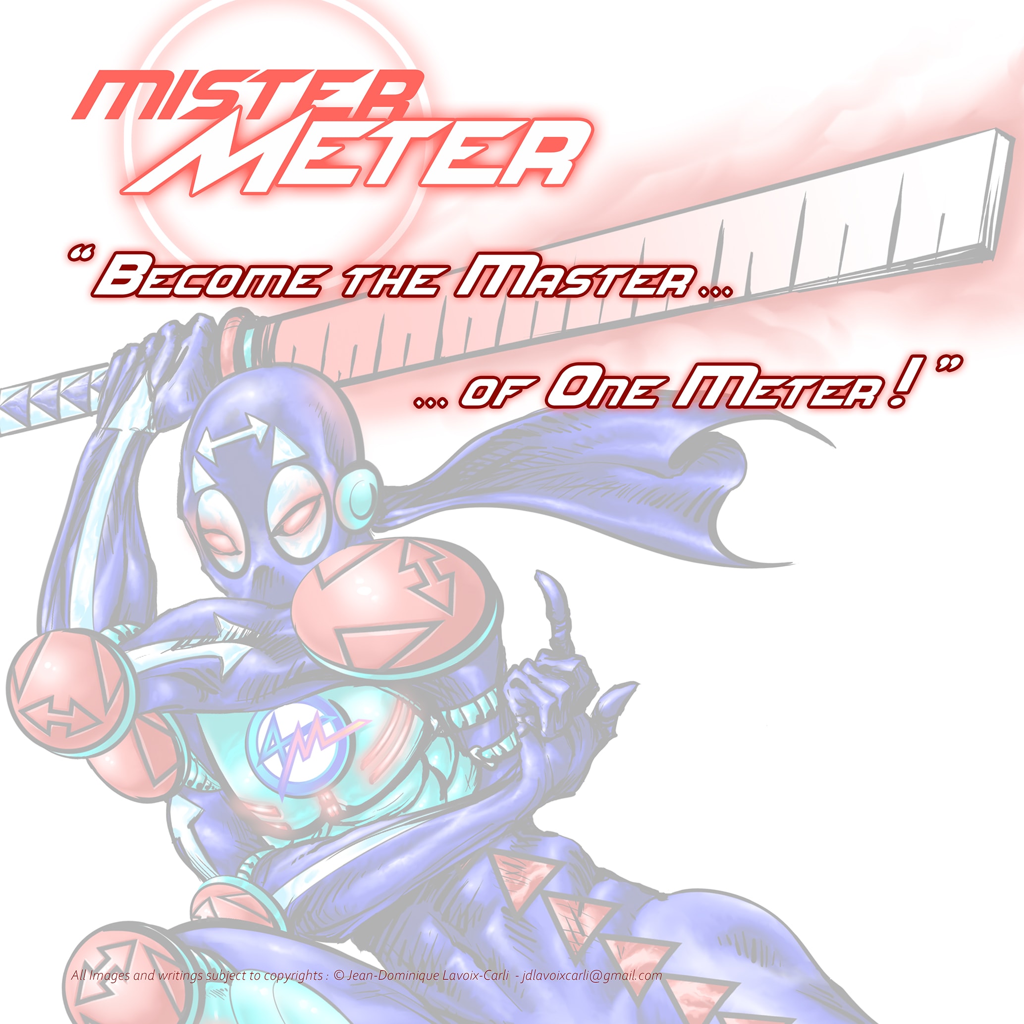
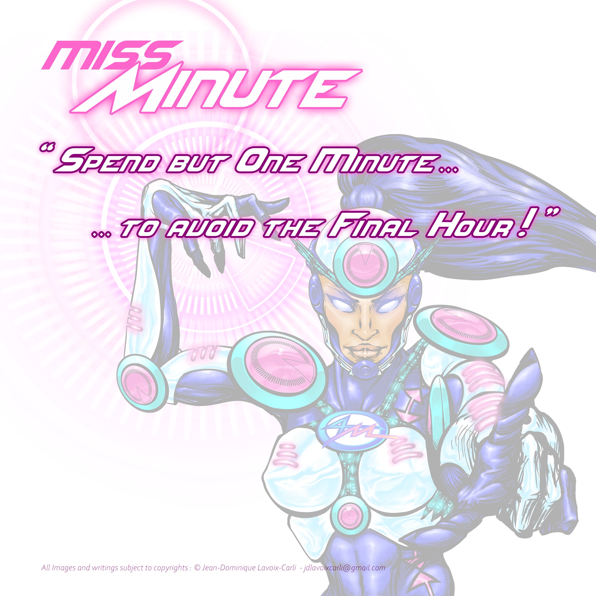


☣️ Pandemics could also be of the Future and not only of the Past, as shows the Hantavirus, Gastroenteritis, Avian Flu or Ebola threats.
The 4M are a comic-inspired and World Architecture project created during the COVID-19 pandemic to translate preventive health measures into empowering teenage narratives.
With the rise of current pandemics and the inevitability of future ones, I have designed a new way of communicating crucial information to be delivered to the young generation in times of health crisis.
Therefore, I created The 4M : a team of Superheroes fighting all the Pandemics.
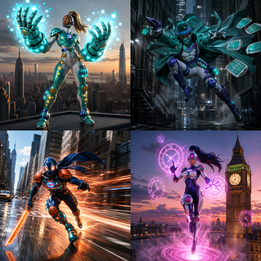
Beyond Character Design: Building a Franchise
I did not simply create “Cool Superheroes”, I have designed my project as a transmedia franchise which can radiate through all media to maximize their impact in time of real-world crisis pandemics.
Creating memorable characters is only the beginning.
As a World Architect, my objective was never to design four superheroes in isolation, but to create a coherent universe capable of expanding naturally across multiple media, audiences and real-world applications.
The 4M were conceived as a complete transmedia ecosystem. A single creative vision capable of becoming comics, animation, films, educational campaigns, toys, premium collectibles, video games, pharmaceutical products and public awareness initiatives : each adaptation reinforcing the same visual language and educational message.
Rather than repeating the same concept across different media, every version explores a different way of engaging its audience. A blockbuster poster inspires. A LEGO© adaptation makes the heroes approachable for younger children. A video game transforms prevention into active learning.
Everyday products encourage healthy habits long after the campaign itself has ended.
The following gallery illustrates how a single original concept can evolve into an entire franchise while remaining visually coherent, emotionally engaging and socially meaningful.
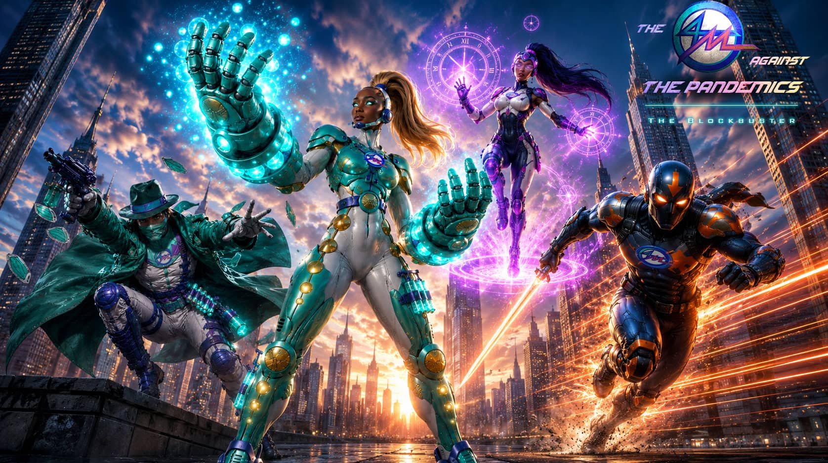
The Blockbuster : The 4M – The Movie
From concept art to cinematic universe.
The 4M were designed to evolve naturally into a live-action blockbuster where entertainment meets public health awareness.


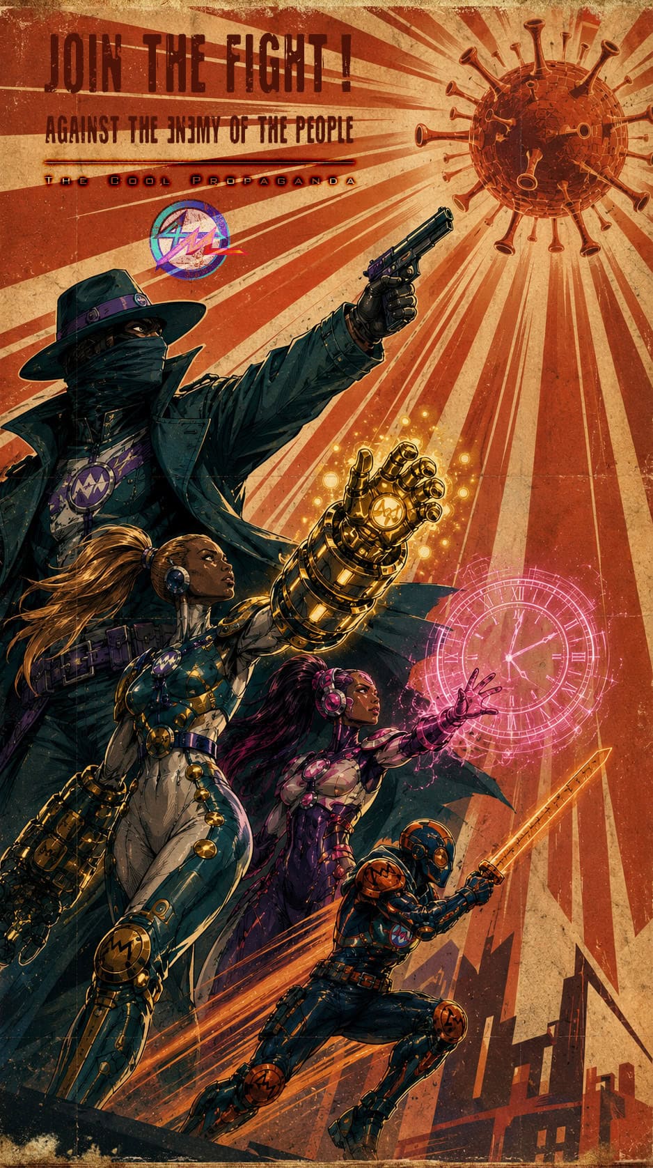


The Context
☣️ The Problem is simple : Health Communications mostly fails when adressing adolescents.
Teenagers occupy a unique position in public health communication.
They are old enough to understand complex concepts, yet often resistant to messages perceived as patronizing, moralizing, or disconnected from their reality.
During major health crises such as COVID-19, many communication campaigns struggled to effectively engage adolescents because they tended to fall into one of four extreme mistakes.
It is a difficult audience to reach and that’s exactly links the communication gap between generations and why traditional health messaging misses teenagers most of the times…
Part 1 : Identifying the Mistakes
1: Infantilization without Respect
A significant portion of health communication aimed at younger audiences relies on visual codes originally designed for children.
Typical Examples to NOT use :
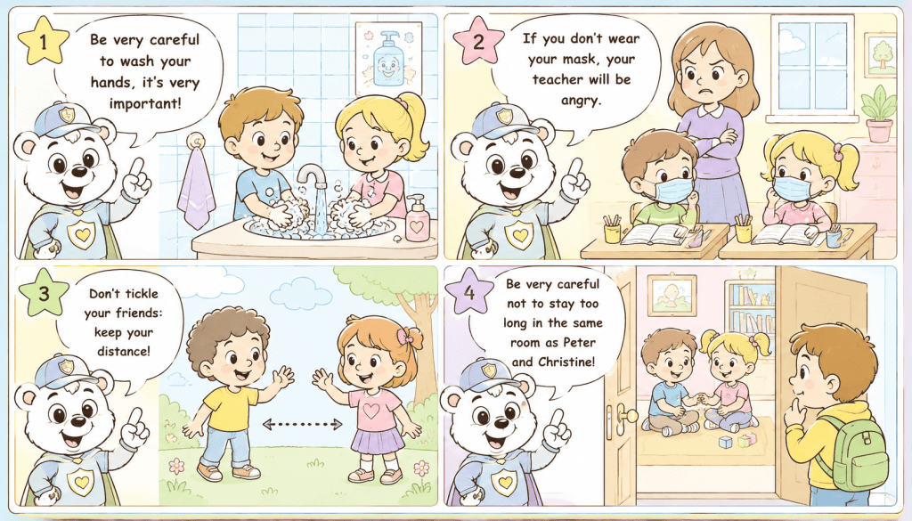
❌ Simplified cartoon character.
❌ Childlike illustration.
❌ Pastel color palette.
❌ Educational mascot.
❌ Overly simplified language.
❌ Classroom-style messaging.
While such approaches may work well for children aged 6 to 10, they frequently fail to resonate with teenagers.
For many adolescents, these visuals can feel condescending, outdated, embarrassing or detached from their cultural reference.
Teenagers generally seek symbols associated with autonomy, identity, competence, and social belonging.
When health communication resembles elementary-school material, engagement often decreases because the audience does not identify with the message.
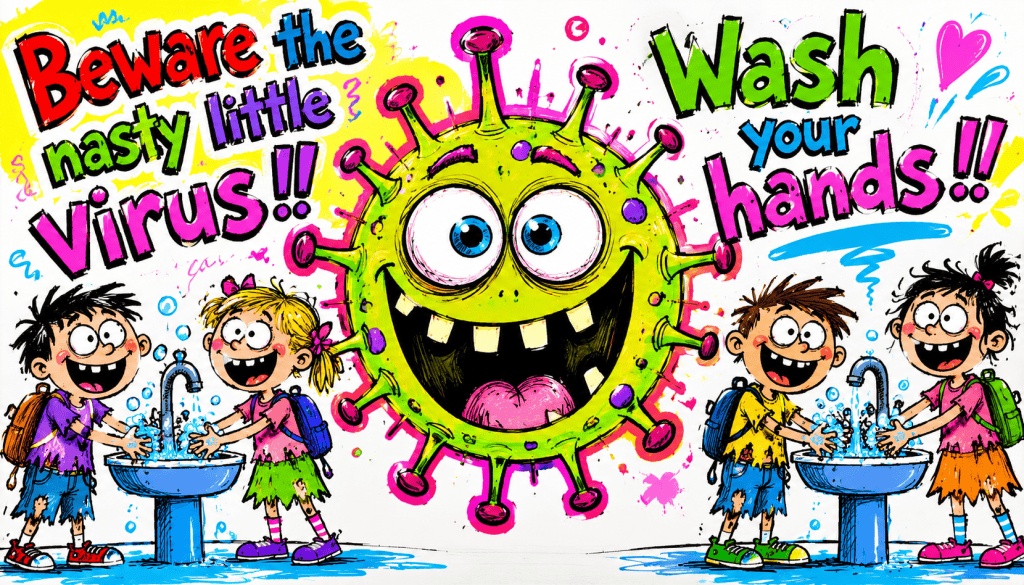
❌ Smiling cartoon germs with oversized eyes.
❌ Friendly mascot characters teaching hygiene.
❌ Coloring-book style educational posters.
❌ Ugly and/or flashy colors and bad quality drawings.
❌ School-oriented visual campaigns designed for primary education but distributed to older students.
The information may be accurate, yet the visual language fails to match the psychological maturity of the audience.
2: Technocratic Communication without Empathy
At the opposite end of the spectrum lies highly institutional communication.
This approach often prioritizes accuracy and compliance but neglects emotional engagement.
Typical Examples to NOT use :
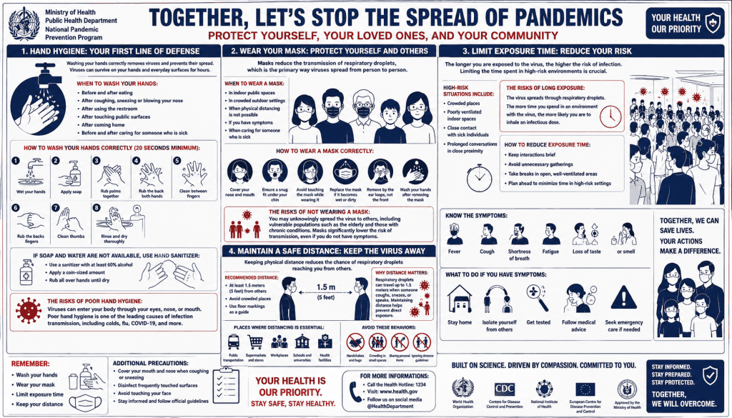
❌ Dense blocks of text, administrative language and/or official directive.
❌ Overabundance of not hierarchized informations in a counter-intuitive layout which actually kills all useful informations.
❌ Statistical data and boring formal layout.
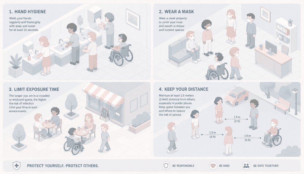
❌ Governmental visual codes using the ugliest and/or most neutral color palettes…
❌ Anonymous representation of citizens, abusive neutrality, forced inclusivity and political correctness blurring the message…
Although factually rigorous, such communication can appear Cold, Distant, Bureaucratic, Uninspiring and Difficult to remember.
For many teenagers, this style of messaging feels disconnected from everyday life and competes poorly against the highly visual and narrative-driven content they consume online.
3: Fear Without Agency
Another common issue is the overreliance on anxiety-based communication.
Typical Examples to NOT use :
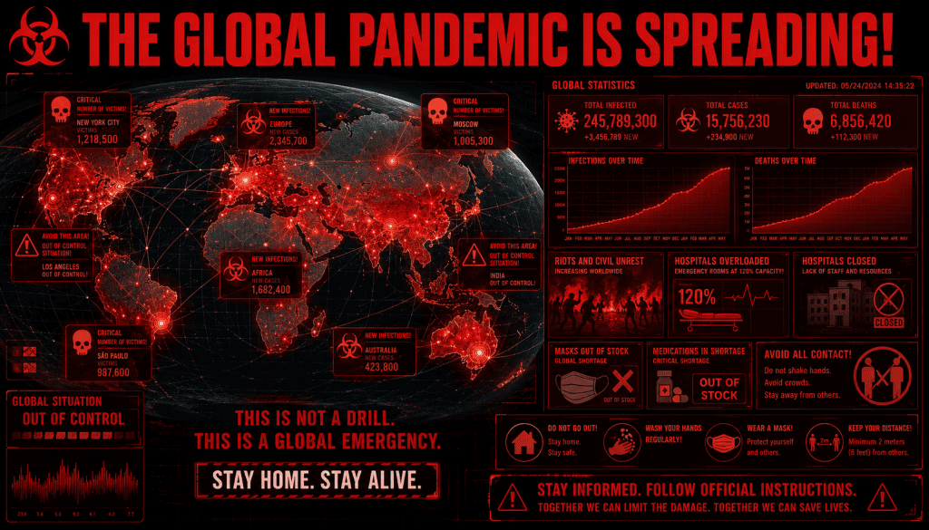
❌ Risks.
❌ Death tolls.
❌ Hospitalization rates.
❌ Threat scenarios.
❌ Panic tone and agressive color palettes.
While awareness of danger is important, excessive emphasis on fear can lead to:
❌ Message avoidance.
❌ Emotional fatigue.
❌ Desensitization.
❌ Feelings of helplessness and despair.
When individuals are repeatedly exposed to alarming information without being offered meaningful ways to act, they may disengage altogether. This phenomenon is particularly relevant among adolescents, who often respond more positively to empowerment than to fear.
4: Information Without Storytelling
Humans naturally remember stories better than instructions.
Yet many public health campaigns communicate through lists, directives, and procedural explanations which sounds like lectures or sermons:
Typical Examples to NOT use :
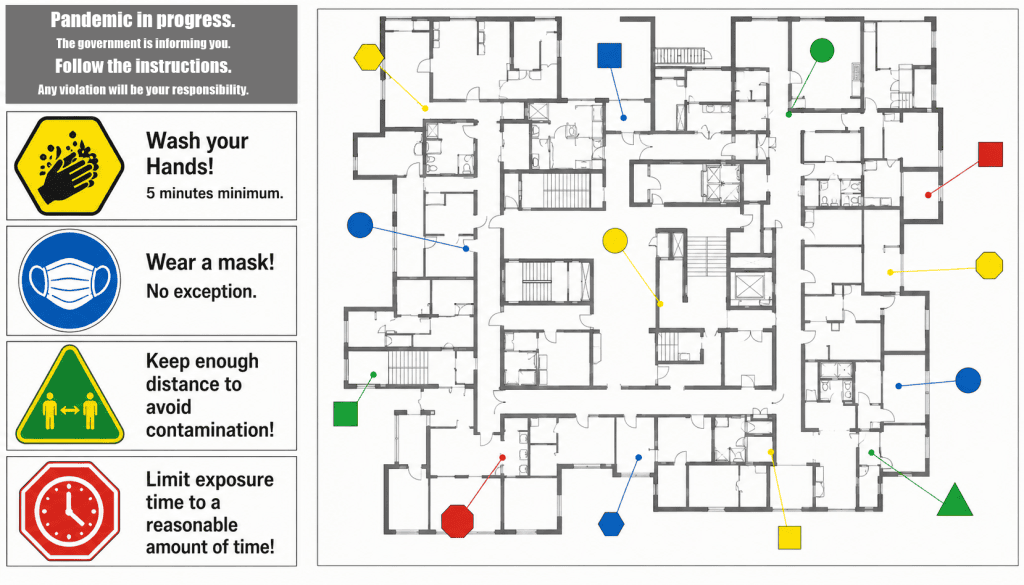
❌ Wash your hands! (Without explaining Why)
❌ Wear a mask! (Without explaining Where)
❌ Keep your distance! (Without explaining How)
❌ Limit exposure time! (Without explaining When)
They tell you What… but they don’t tell you Why.
And, most of the time, abandon you on your own without much information. Leaving you to deal with an unknow menace which brings only more anxiety and confusion.
These recommendations are scientifically valid but lack narrative structure.
Without characters, symbols, metaphors, or memorable narratives, information remains difficult to internalize and transmit socially ; especially if the government or the official organizations transmits a message which sounds like they are avoiding their responsability and are doing the bare minimum without really caring.
Storytelling transforms instructions into experiences: Superpowers, recognizable faces, strong personalities, equipment and adventures.
Symbols transform recommendations into identities: cool looking logotypes, vibrant colors, classy superheroes suits matching existing superheroes’ references.
Part 2 : The Solution of Comics Codes
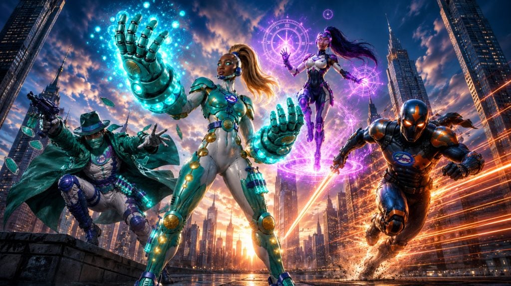
Heroic Figures as Characters transform abstract concepts into relatable models of behavior: mnemonic mottos, pitches or quotes; iconic fighting scenes; emotional investment and identification through diverse representation: male, female and the 4 main ethnic groups.
Thus, as an author-illustrator, I have noticed the abovementioned difficulty of transmitting to the young generation of 17-12-year-olds (and over) the safety information necessary to fight the pandemics. Therefore, I have decided to use an effective communication grounded in the genre of stories, full of “punchy” graphic codes, which can attract teenagers: the world of Super-Heroes, such as the “Avengers” or the “X-Men”.
Such a story would allow the younger generation to identify with the characters.
They would no longer suffer the anxiogenic circumstances of the pandemics, but, on the contrary be offered the opportunity to act, and react, fundamentally become empowered, as heroes …
Therefore, I created 4 Super-Hero Characters, each of them embodying one of the 4 essential Preventive Measures, all starting with “M” and forming the “4M Supergroup”, namely:
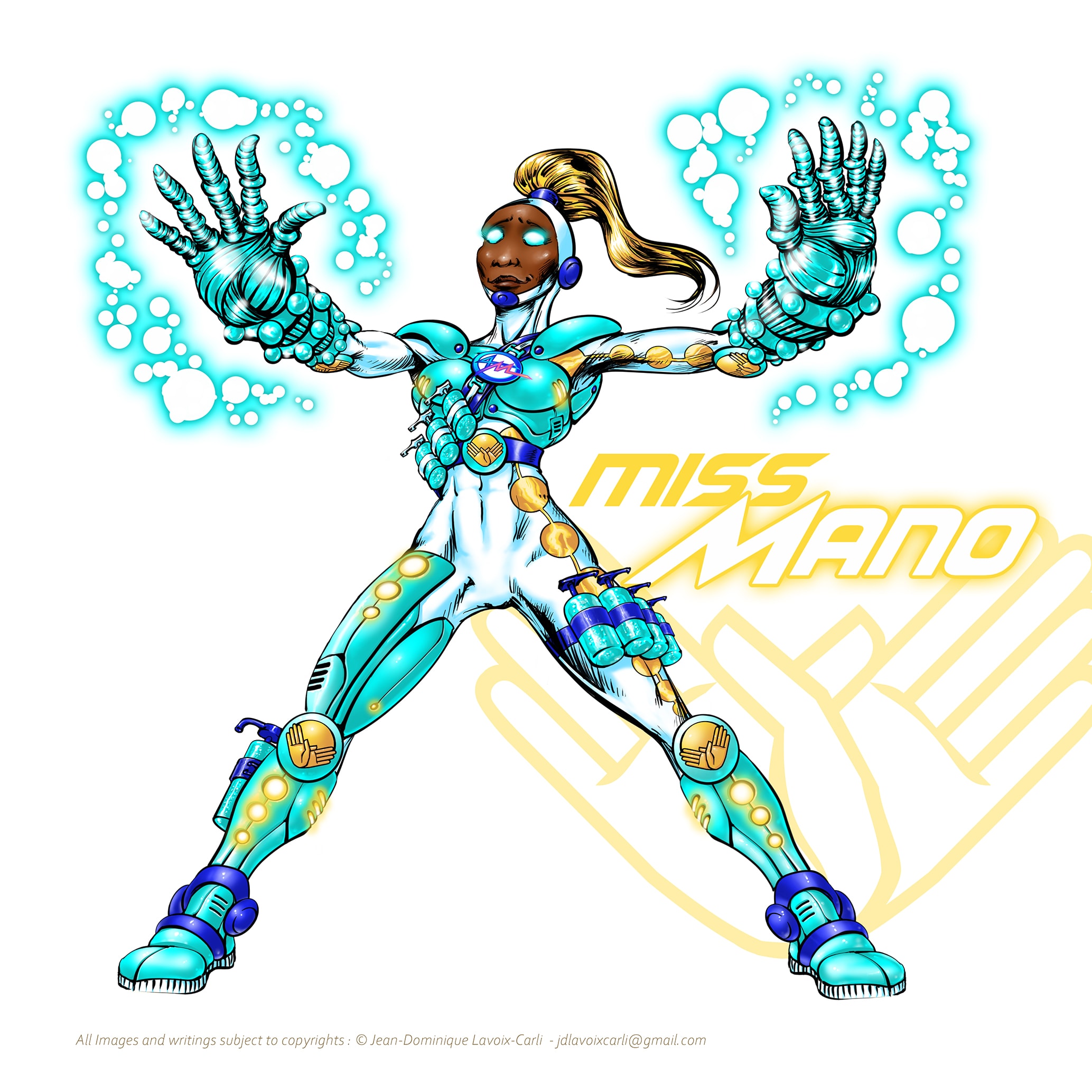
• Hand cleaning is embodied by Miss Mano.
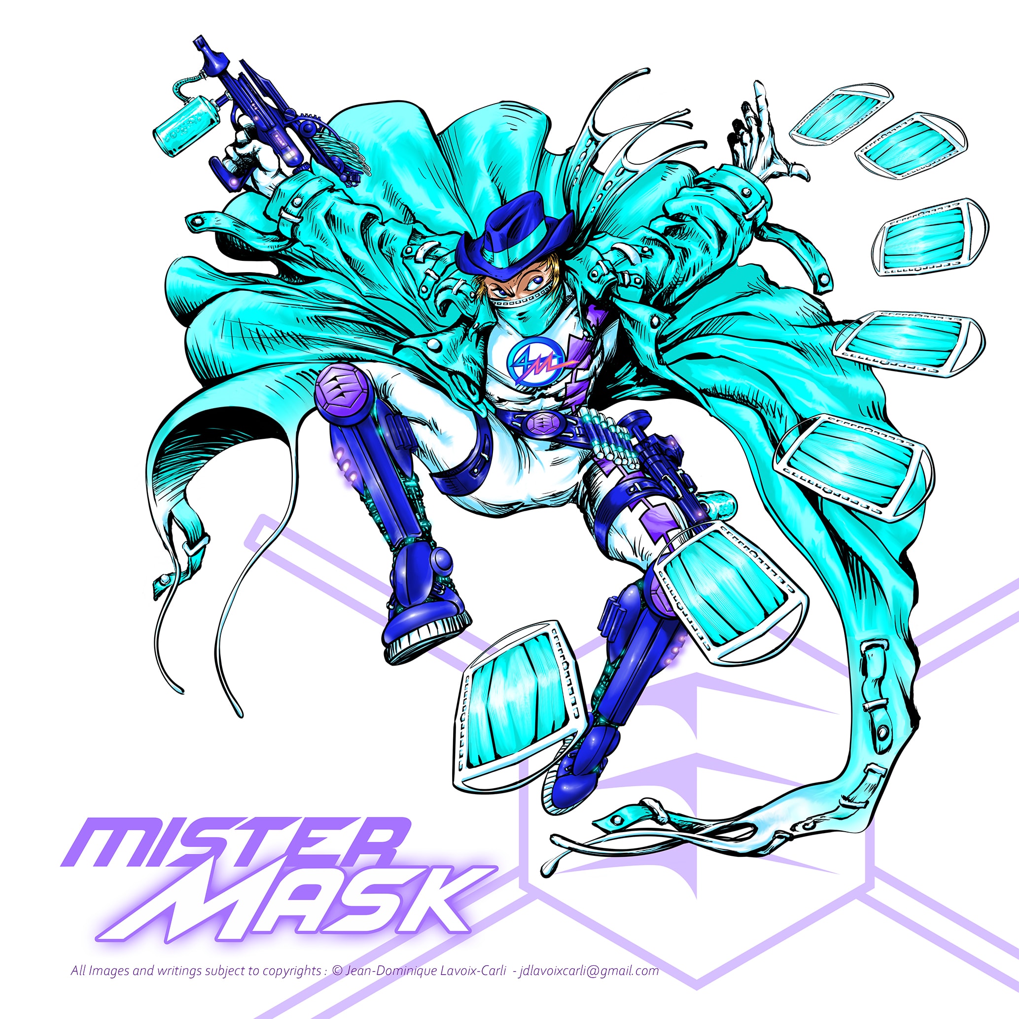
• Wearing a mask is embodied by Mister Mask.
• Physical distancing is embodied by Mister Meter.
• The duration of virus exposure is embodied by Miss Minute.
Since, between infantilized communication and technocratic communication, lies an opportunity:
A form of health communication that remains scientifically accurate while embracing the visual and narrative language familiar to adolescents.
This includes:
✅ Strong visual identities: I replace government official iconography or approximate puerile symbolism with mature, efficient and vibrant graphic charter.
✅ Symbolic characters: I replace generic, anonymous or interchangeable daily-life figures with strong, iconic and powerful characters.
✅ Memorable slogans: I replace reading sentences, boring sermons or moronic “falsely funny” sentences with mnemonic heroic mottos.
✅ Storytelling: I replace simplistic situation or -most often- NOTHING AT ALL with comics based epic adventures.
✅ Humor: I replace administrative boring tone or child-like gags and stupid jokes with subtle, straight-to-the point, corrosive and sense-related humor.
✅ Empowerment: I replace anxiety, helplessness and self-defeating thoughts with power, evolution and storytelling propagation.
✅ Positive action: I replace passive obedience, submissive conformity and pessimistic resignation with optimism, vigilance and efficient prevention.
Rather than presenting young people as passive recipients of health information, such an approach invites them to become active participants.
Part 3 : World Architecture – How to Apply Narrative Systems Design
Creating a visually compelling campaign is not simply a matter of designing attractive characters.
To create a system capable of transmitting information, generating identification and encouraging behavioral change, every component must support the others.
For the 4M Project, I needed to build:
• Archetypes.
• A symbolic logic.
• A visual grammar.
• A mnemonic system.
• A transmedia universe.
Each element had to function independently while also reinforcing the overall narrative ecosystem.
The objective was not merely to create four superheroes, but to create a coherent symbolic framework capable of transforming abstract health recommendations into memorable characters, stories, symbols and behaviors.
To achieve this, I methodically identified the different layers that would need to be designed simultaneously in order to build a complete and scalable universe.
1: Concept & Narrative Foundation
The first challenge was not visual, but conceptual.
How do you transform preventive measures into characters people can emotionally relate to?
Health communication often presents information as instructions. Stories, however, present information as actions.
Instead of asking teenagers to memorize rules, the project sought to transform those rules into heroes, symbols and adventures.
Each preventive measure therefore became an archetype, each archetype became a character, and each character became a vehicle for identification.
The objective was not only to explain prevention, but to make prevention meaningful.
Therefore, I did structure down the project first in:
• A mnemonic Motto : To embody both the function of the preventive gesture and also to make a “cool character slogan” symbolizing the hero which would be easy to remember. Similar to “I am the Night” of the Batman©.
• The Core preventive principle : Which would be determining for the “style of superhero” I would have to develop visually and how it would embody this principle within the superhero mythology already known by the teenagers.
• The Superpowers : I needed to blend subtlety actual scientific protection and data with a magnified “superhero mythology” and humor to ease communicating the message towards teenagers. This part would define the behavioral empowerment synergy of the character.
• The Equipment : Similar to Superpowers above, I needed to borrow to the actual scientific recommendations and data to base my concept on real life gear required to face a true pandemics. Thus, creating a form of “science-fiction equipment” mixed with humor, it eases communicating the message more efficiently towards teenagers concerning wearing or using such actual medical gear. This part would match the responsibility synergy of the character.
• Ethnicity and Genders : I needed two males and two females, one from each continent to show globality of response towards a worldwide pandemic:
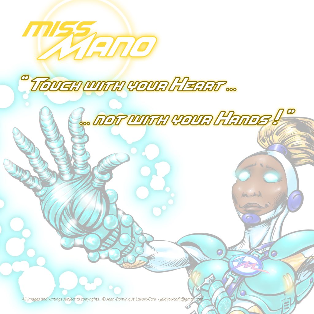
Miss Mano
Mnemonic Motto :
“Touch with your heart……not with your hands.”
Core preventive principle :
Miss Mano transforms hand hygiene into empowerment.
Ethnicity, Gender and Superhero inspiration :
• Super Mood Board Inspirations : Hellboy©, Ironman©, Klaw©, Mister Fantastic©, Storm©, Thanos© (and his Infinity Power Glove), The Vision©.
• Ethnicity : Black and representing Sub-Saharan Africa and/or Afro-Americans and/or Aborigine Australians.
• Key Words : Endurance, Power, Resilience, Strength, Superstrength. She is the Power Blaster type.
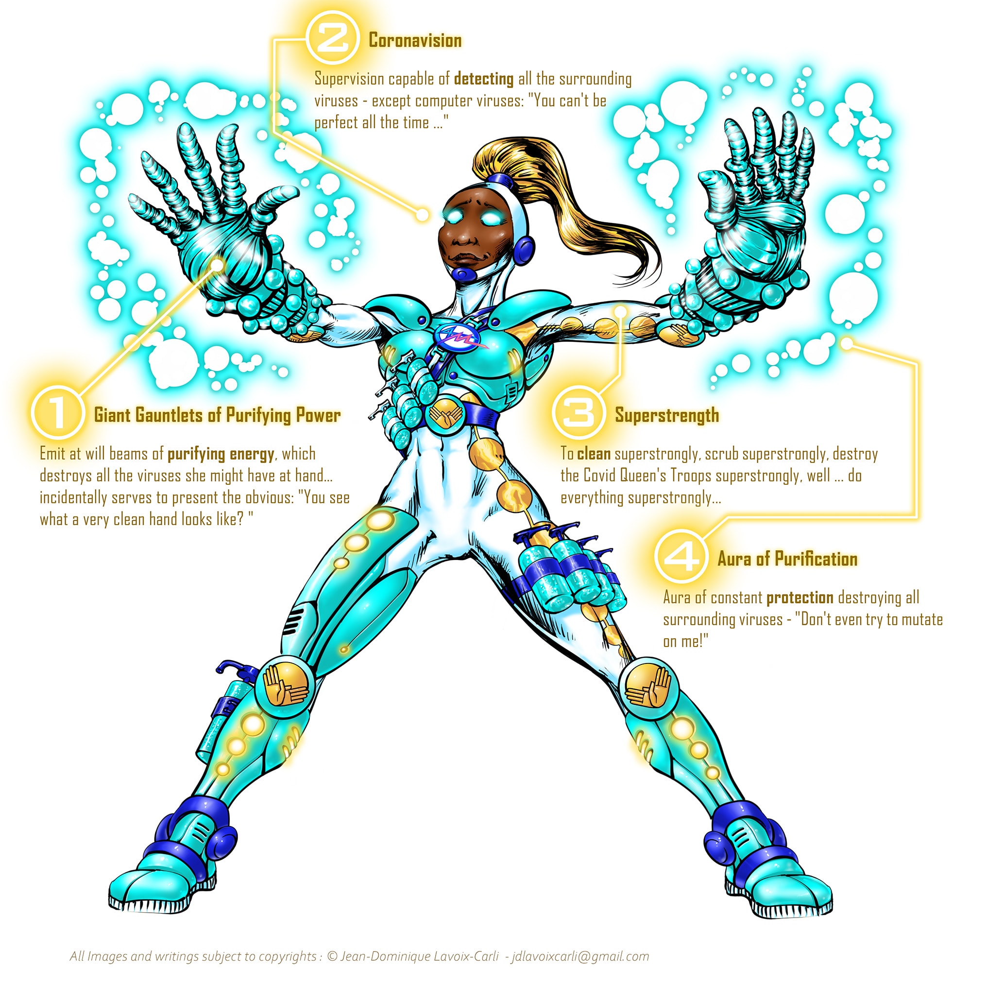
Powers :
1 – Giant Gauntlets of Purifying Power : Emit at will beams of purifying energy, which destroys all the viruses she might have at hand… incidentally serves to present the obvious: “You see what a very clean hand looks like?”
2 – Coronavision : Supervision capable of detecting all the surrounding viruses – except computer viruses: “You can’t be perfect all the time…”
3 – Superstrength : To clean superstrongly, scrub superstrongly, destroy the Covid Queen’s Troops superstrongly, well … do everything superstrongly…
4 – Aura of purification : Aura of constant protection destroying all surrounding viruses – “Don’t even try to mutate on me!”
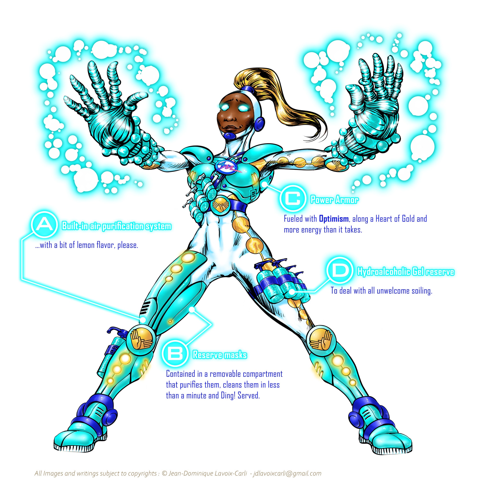
Equipment :
A – Built-in air purification system : …with a bit of lemon flavor, please.
B – Reserve masks : Contained in a removable compartment that purifies them, cleans them in less than a minute and Ding! Served.
C – Power Armor : Fueled with Optimism, along with a Heart of Gold and more energy than it takes.
D – Hydroalcoholic Gel reserve : To deal with all unwelcome soiling.
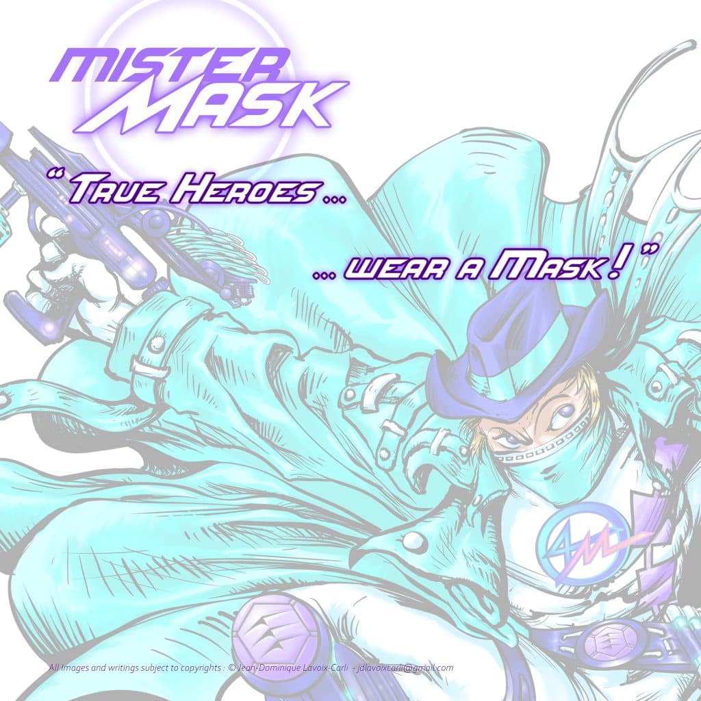
Mister Mask
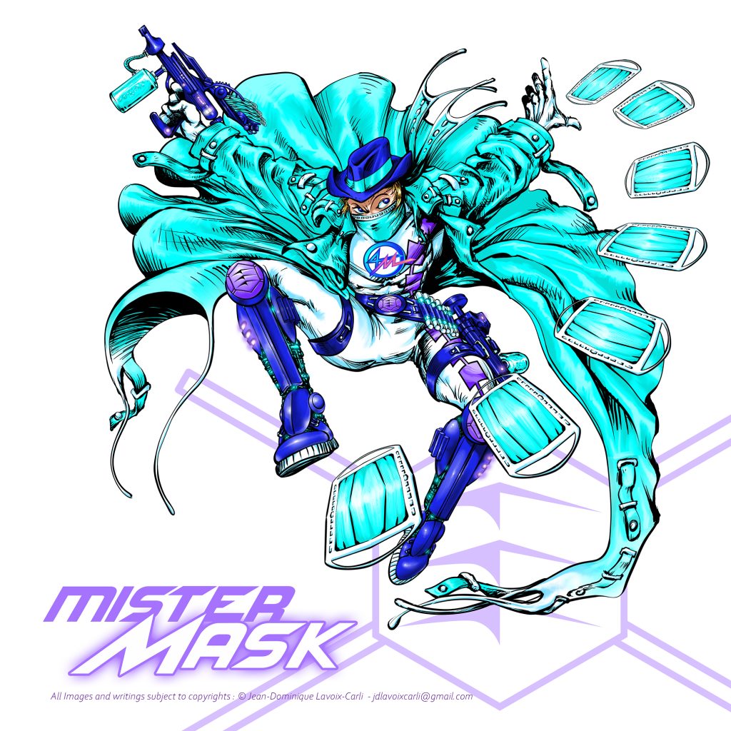
Mnemonic Motto :
“True Heroes… …wear a mask.”
Core preventive principle :
Mister Mask transforms mask wearing into identity.
Ethnicity, Gender and Superhero inspiration :
• Super Mood Board Inspirations : The Batman©, Daredevil©, Darkman©, The Phantom Stranger©, The Shadow©.
• Ethnicity : Caucasian and representing Europe continent and/or White Americans & Australians.
• Key Words : Adaptability, Concealment, Dexterity, Precision, Stealth. He is the Vigilante Infiltrator type.
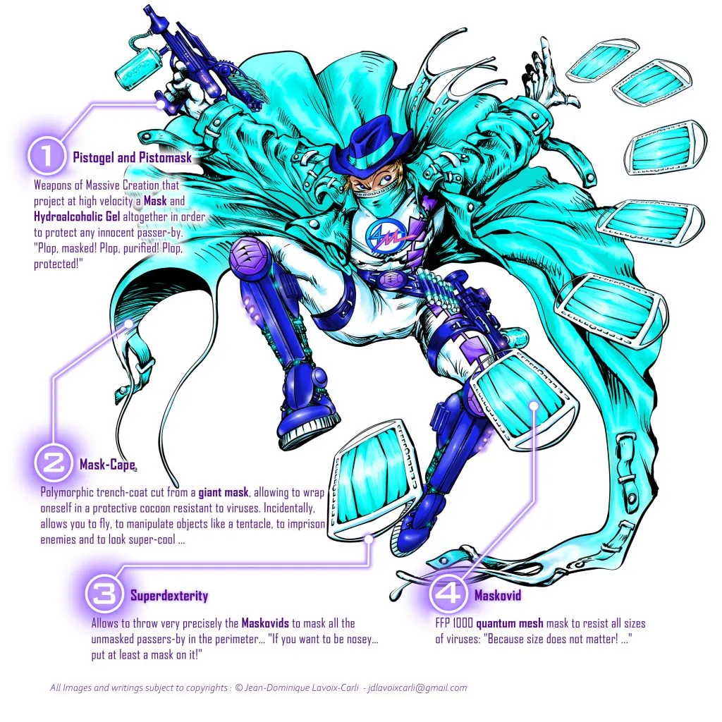
Powers :
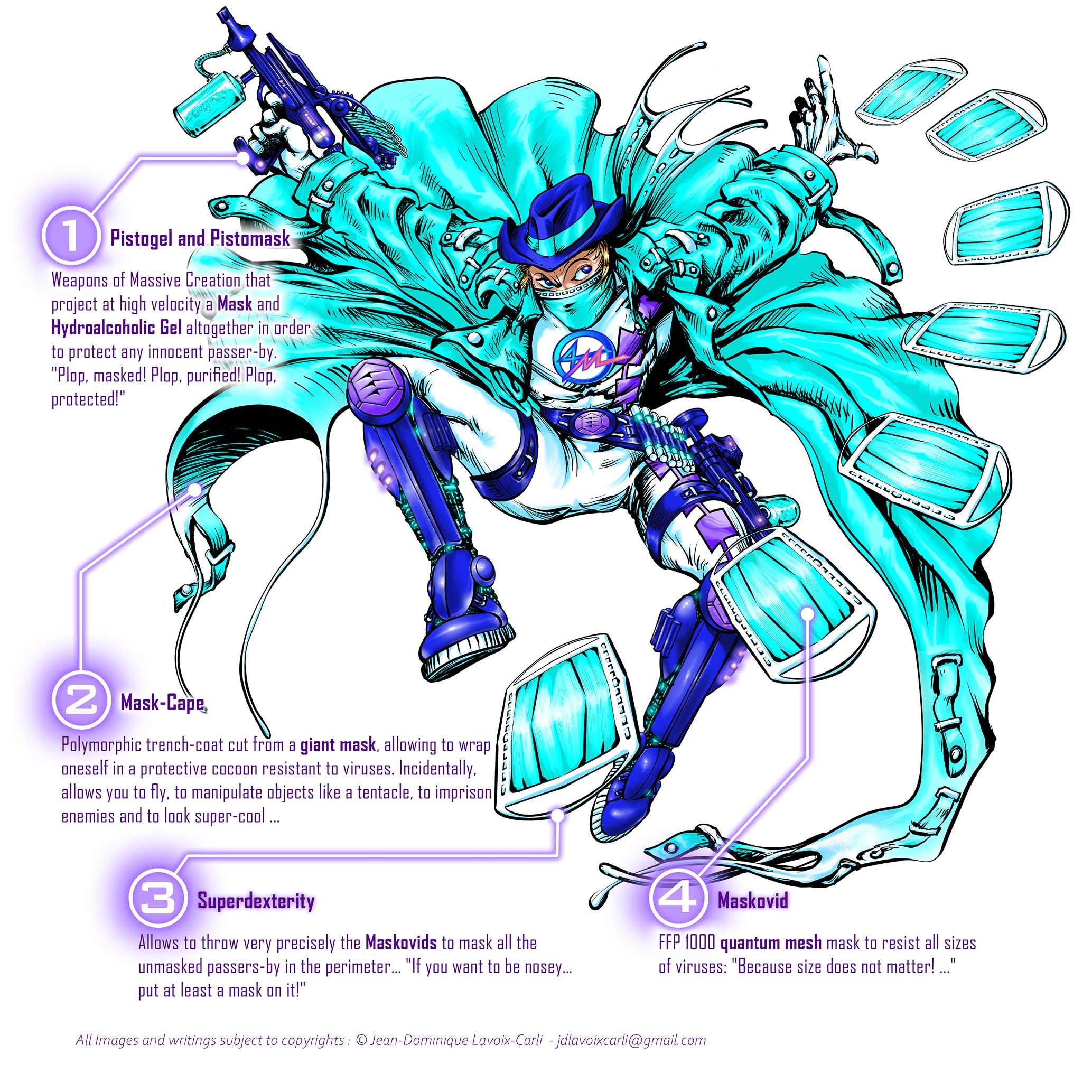
1 -Pistogel and Pistomask : Weapons of Massive Creation that project at high velocity a Mask and Hydroalcoholic Gel altogether in order to protect any innocent passer-by. “Plop, masked! Plop, purified! Plop, protected!”
2 – Mask-Cape : Polymorphic trench-coat cut from a giant mask, allowing to wrap oneself in a protective cocoon resistant to viruses. Incidentally, allows you to fly, to manipulate objects like a tentacle, to imprison enemies and to look super-cool…
3 – Superdexterity : Allows to throw very precisely the Maskovids to mask all the unmasked passers-by in the perimeter… “If you want to be nosey… put at least a mask on it!”
4 – Maskovid : FFP 1000 quantum mesh mask to resist all sizes of viruses: “Because size does not matter! …”
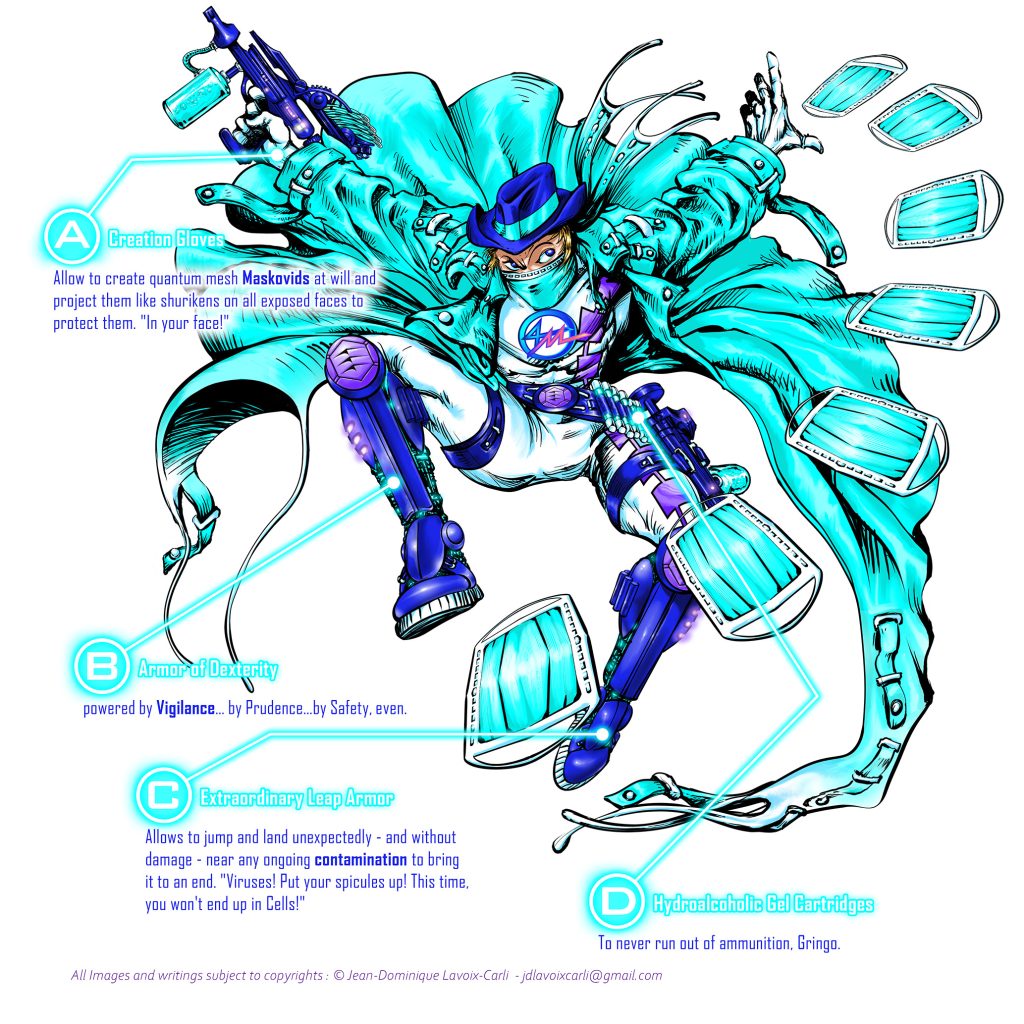
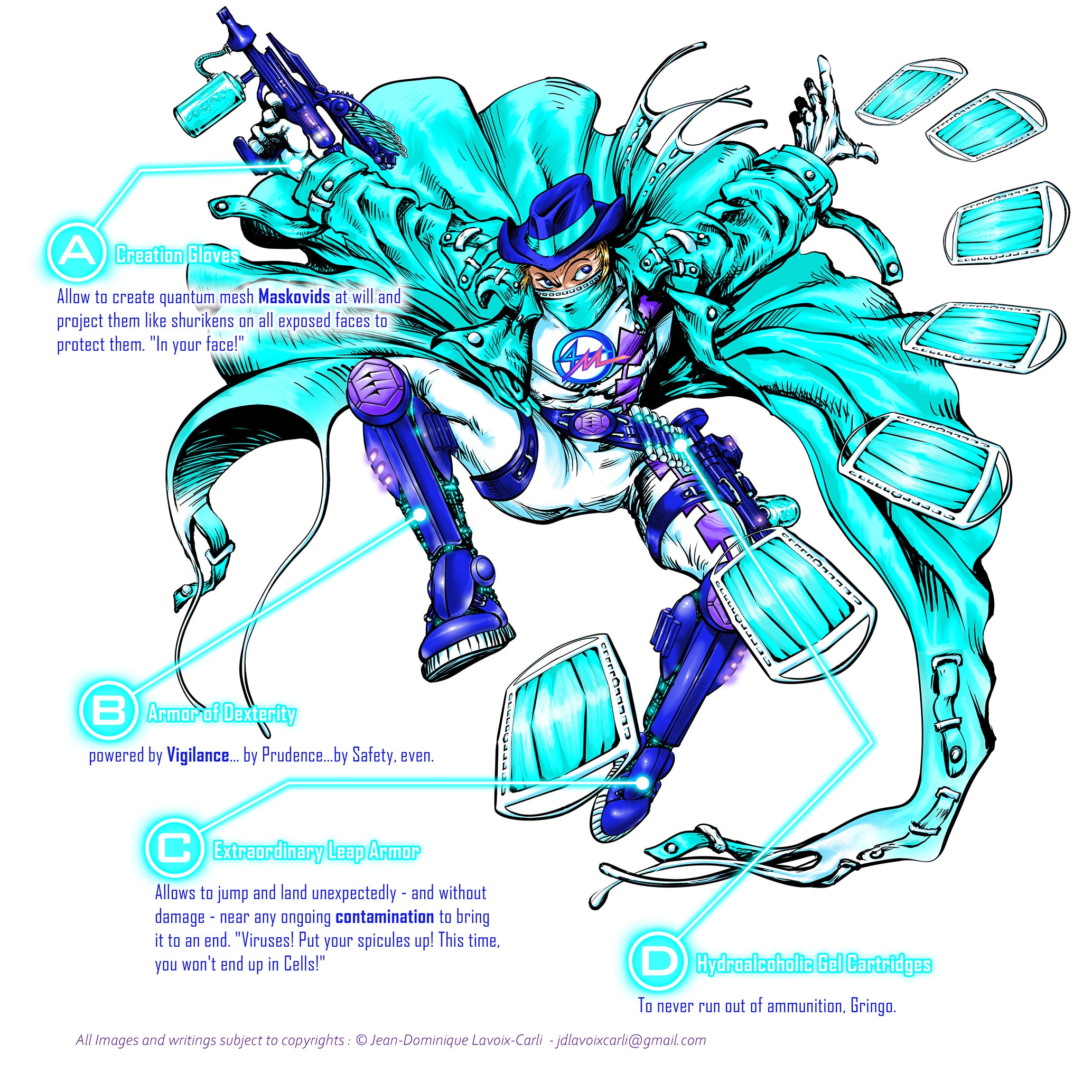
Equipment :
A – Creation Gloves : Allow to create quantum mesh Maskovids at will and project them like shurikens on all exposed faces to protect them. “In your face!”
D – Hydroalcoholic Gel Cartridges : To never run out of ammunition, Gringo.
C – Extraordinary Leap Armor : Allows to jump and land unexpectedly – and without damage – near any ongoing contamination to bring it to an end. “Viruses! Put your spicules up! This time, you won’t end up in Cells!”
B – Armor of Dexterity : powered by Vigilance… by Prudence…by Safety, even.
Mister Meter
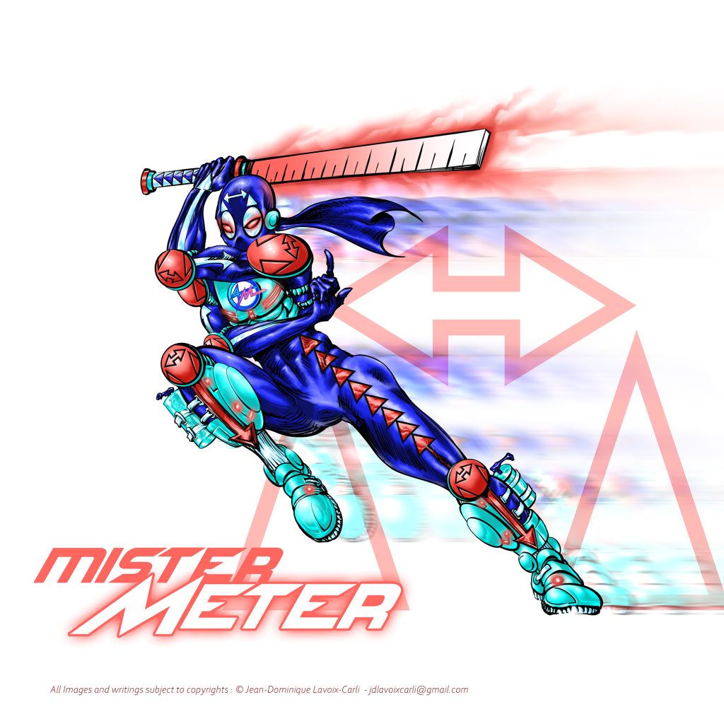
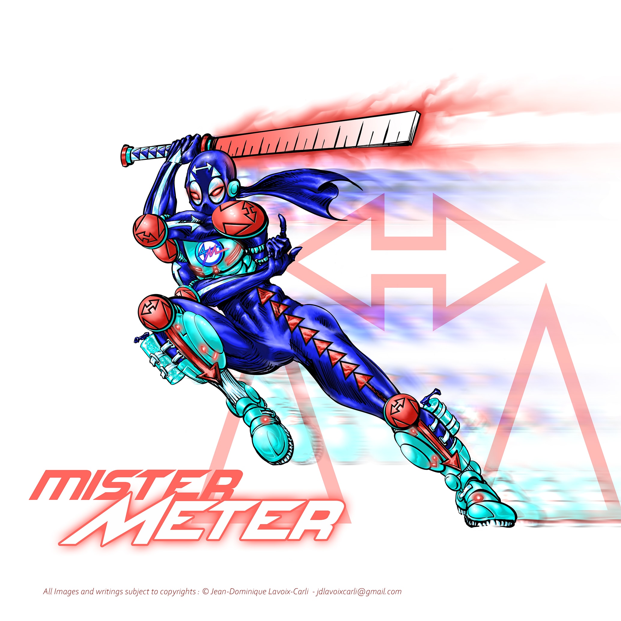
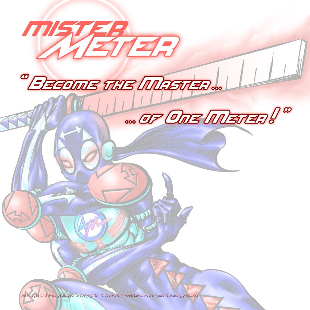
Mister Meter – Full Character, Logo and Title
Mnemonic Motto :
“Become the Master…… of one Meter.”
Core preventive principle :
Mister Meter transforms physical distancing into mastery.
Ethnicity, Gender and Superhero inspiration :
• Super Mood Board Inspirations : Deadpool©, Deathstroke©, The Flash©, Psylocke©, Quicksilver©, The Silver Samurai©, Tarantula©.
• Ethnicity : Asian and representing Asia and/or South America continent and/or Polynesia and/or Natives.
• Key Words : Agility, Martial Arts, Nimbleness, Superspeed. He is the Speedster Striker type.
Powers :
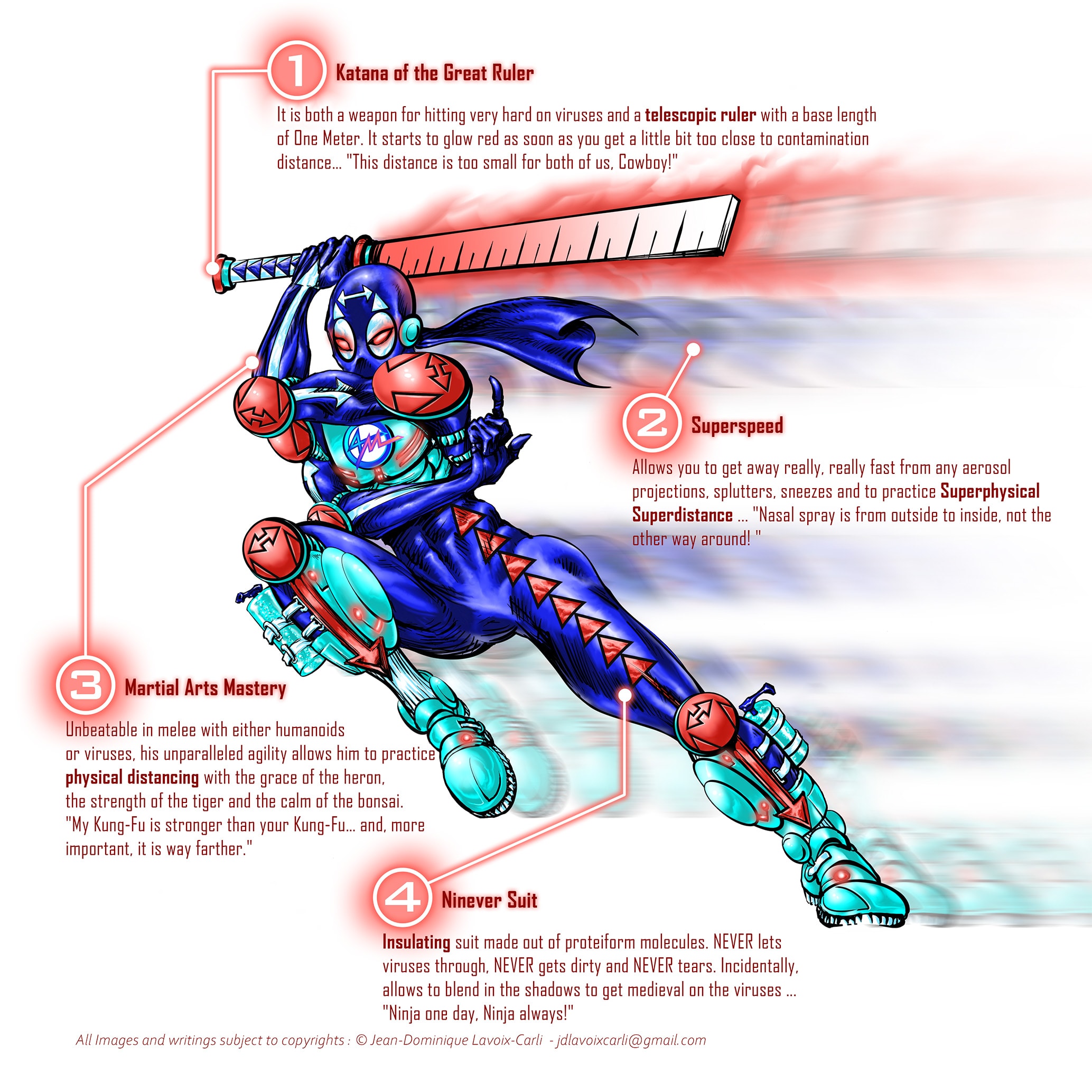
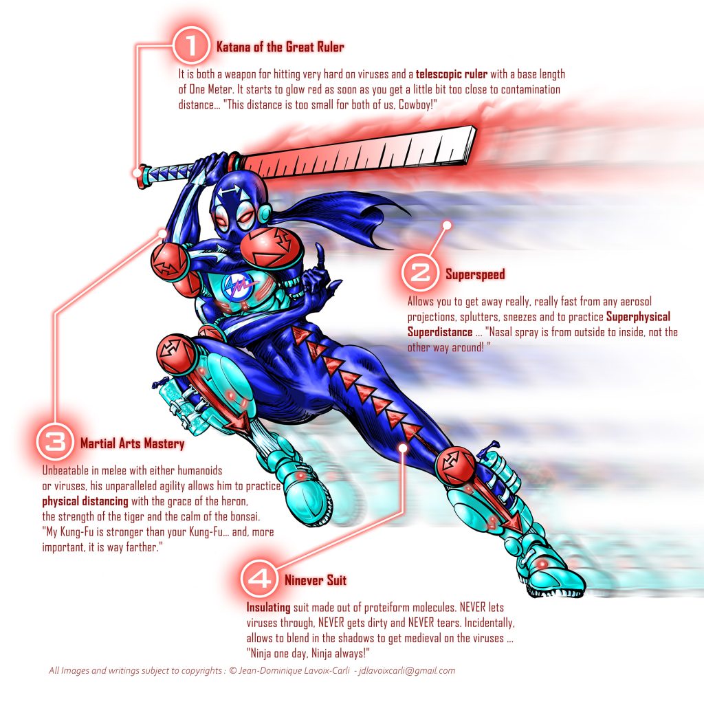
1 – Katana of the Great Ruler : It is both a weapon for hitting very hard viruses and a telescopic ruler with a base length of One Meter. It starts to glow red as soon as you get a little bit too close to contamination distance… “This distance is too small for both of us, Cowboy!”
2 – Superspeed : Allows you to get away really, really fast from any aerosol projections, splutters, sneezes and to practice Superphysical Superdistance… “Nasal spray is from outside to inside, not the other way around! “
3 – Martial Arts Mastery : Unbeatable in melee with either humanoids or viruses, his unparalleled agility allows him to practice physical distancing with the grace of the heron, the strength of the tiger and the calm of the bonsai. “My Kung-Fu is stronger than your Kung-Fu… and, more important, it is way farther.”
4 – Ninever Suit : Insulating suit made out of proteiform molecules. NEVER lets viruses through, NEVER gets dirty and NEVER tears. Incidentally, allows to blend in the shadows to get medieval on the viruses … “Ninja one day, Ninja always!”
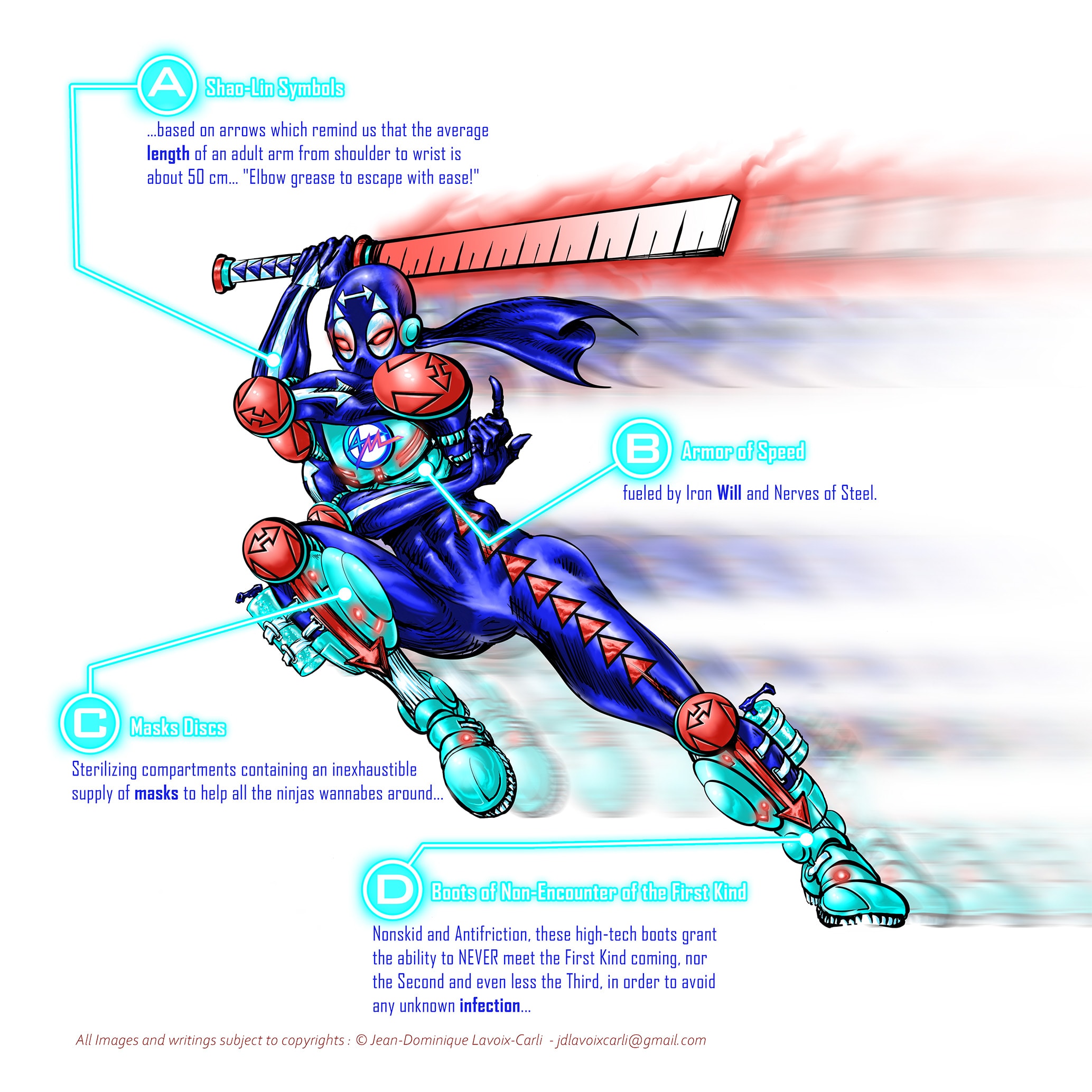
Equipment :
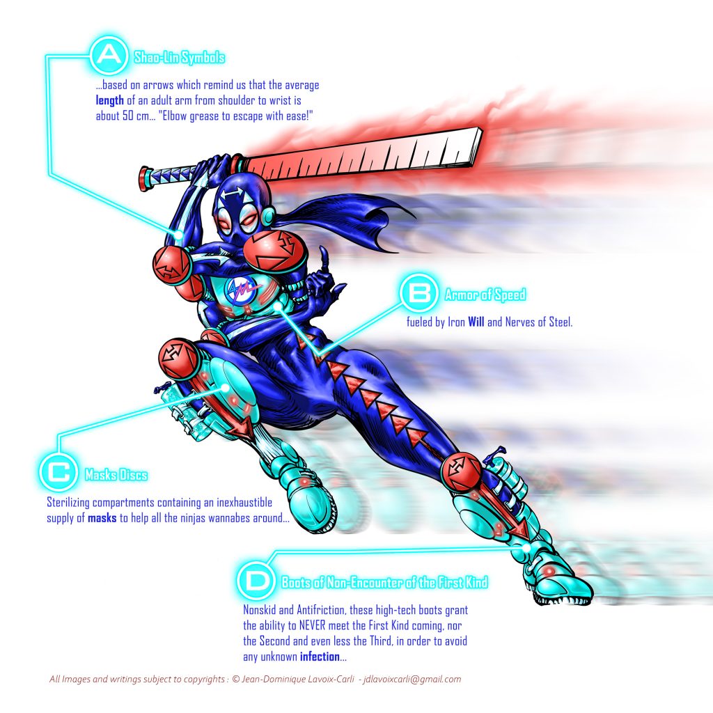
A – Shao-Lin Symbols : …based on arrows which remind us that the average length of an adult arm from shoulder to wrist is about 50 cm… “Elbow grease to escape with ease!”
B -Armor of Speed : fueled by Iron Will and Nerves of Steel.
C – Masks Discs : Sterilizing compartments containing an inexhaustible supply of masks to help all the ninjas wannabes around …
D – Boots of Non- Encounter of the First Kind : Nonskid and Antifriction, these high-tech boots grant the ability to NEVER meet the First Kind coming, nor the Second and even less the Third, in order to avoid any unknown infection…
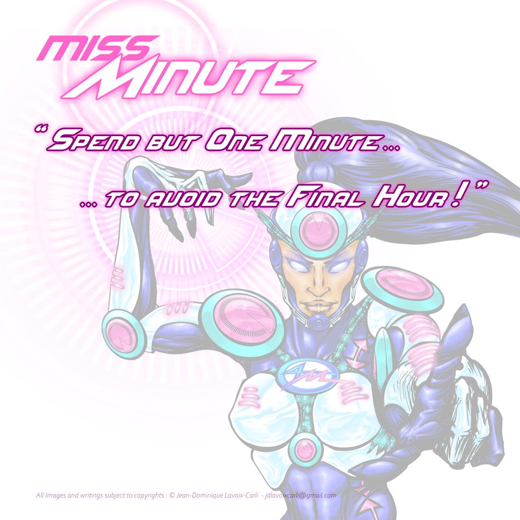
Miss Minute
Mnemonic Motto :
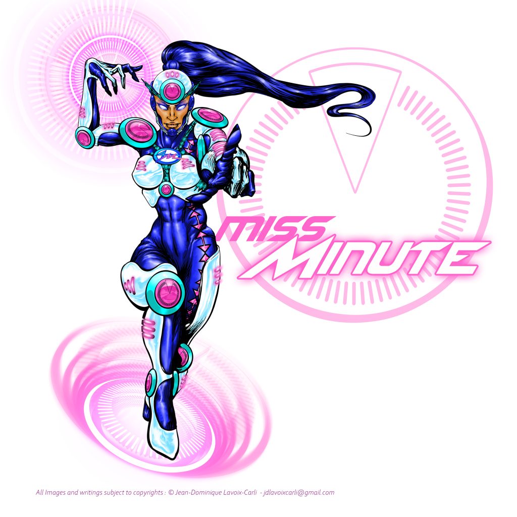
“Spend but One Minute……to avoid the Final Hour.”
Core preventive principle :
Miss Minute transforms time into foresight.
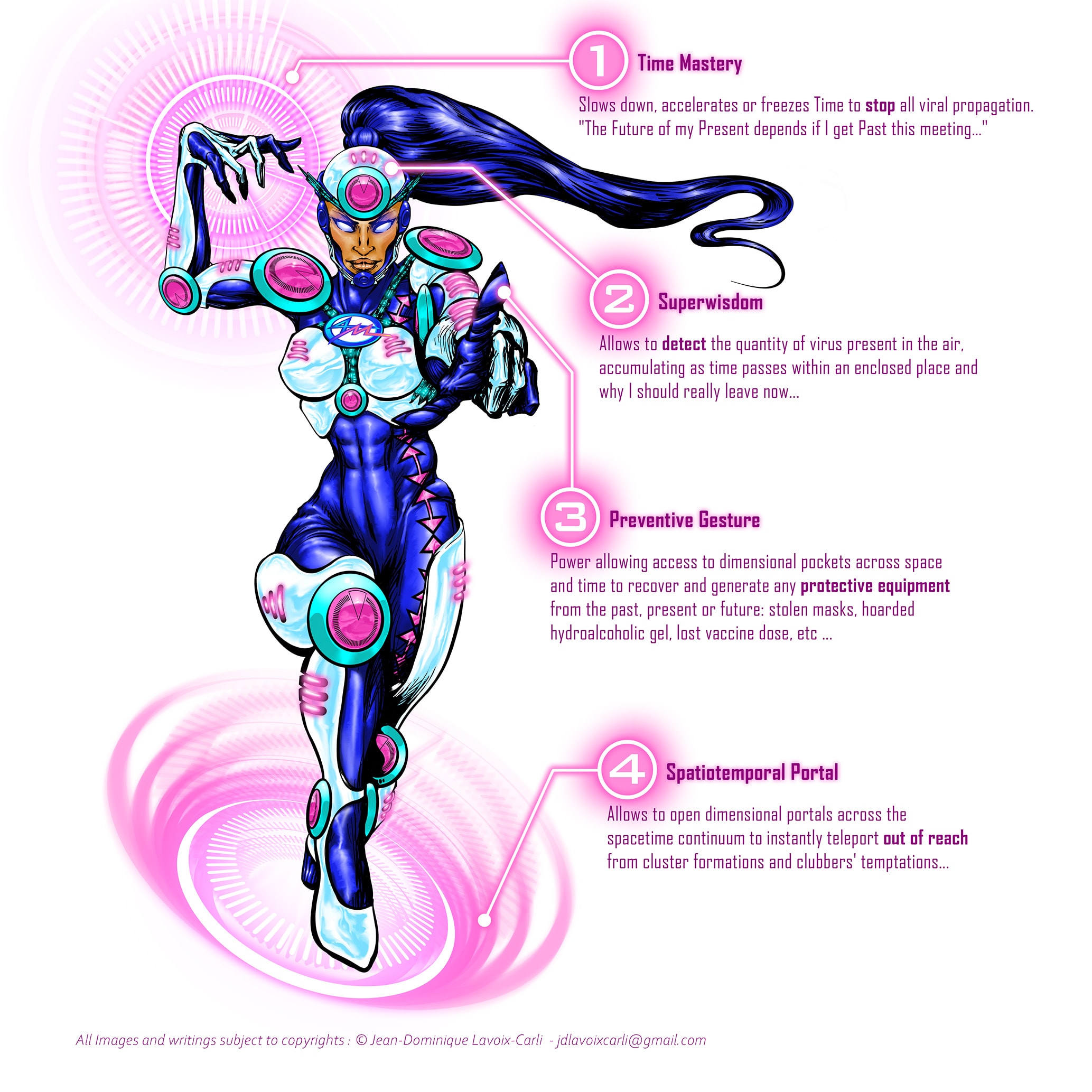
Ethnicity, Gender and Superhero inspiration :
• Super Mood Board Inspirations : Access©, Chronos©, Kronos©, Magik©, Nightcrawler©, Professor X©, Raven©, Tempo©, Tron©, The Wizard©.
• Ethnicity : Middle Eastern and representing Middle East and/or North Africa.
• Key Words : Dimensional Travel, Teleportation, Time and Space Control, Wisdom, Willpower. She is the Polyvalent Support type.
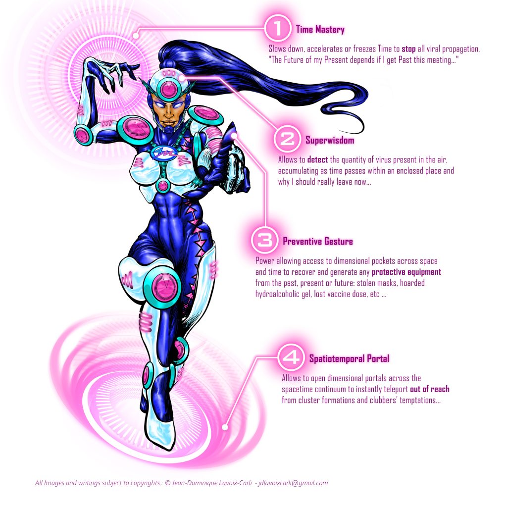
Powers :
1 – Time Mastery : Slows down, accelerates or freezes Time to stop all viral propagation. “The Future of my Present depends if I get Past this meeting…”
2 -Superwisdom : Allows to appraise the quantity of viruses present in the air, accumulating as time passes within an enclosed place and why I should really leave now…
3 – Preventive Gesture : Power allowing access to dimensional pockets across space and time to recover and generate any protective equipment from the past, present or future: stolen masks, hoarded hydroalcoholic gel, lost vaccine dose, etc …
4 -Spatiotemporal Portal : Allows to open dimensional portals across the spacetime continuum to instantly teleport out of reach from cluster formations and clubbers’ temptations…
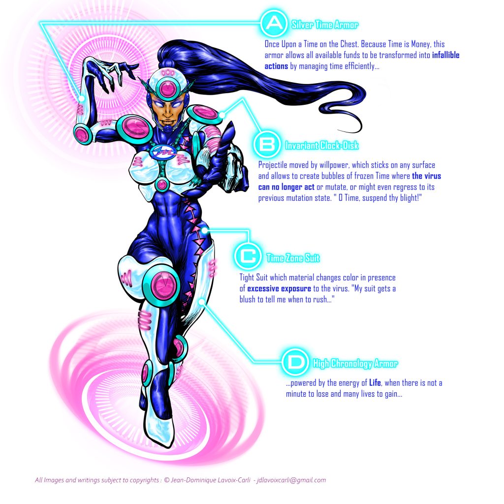
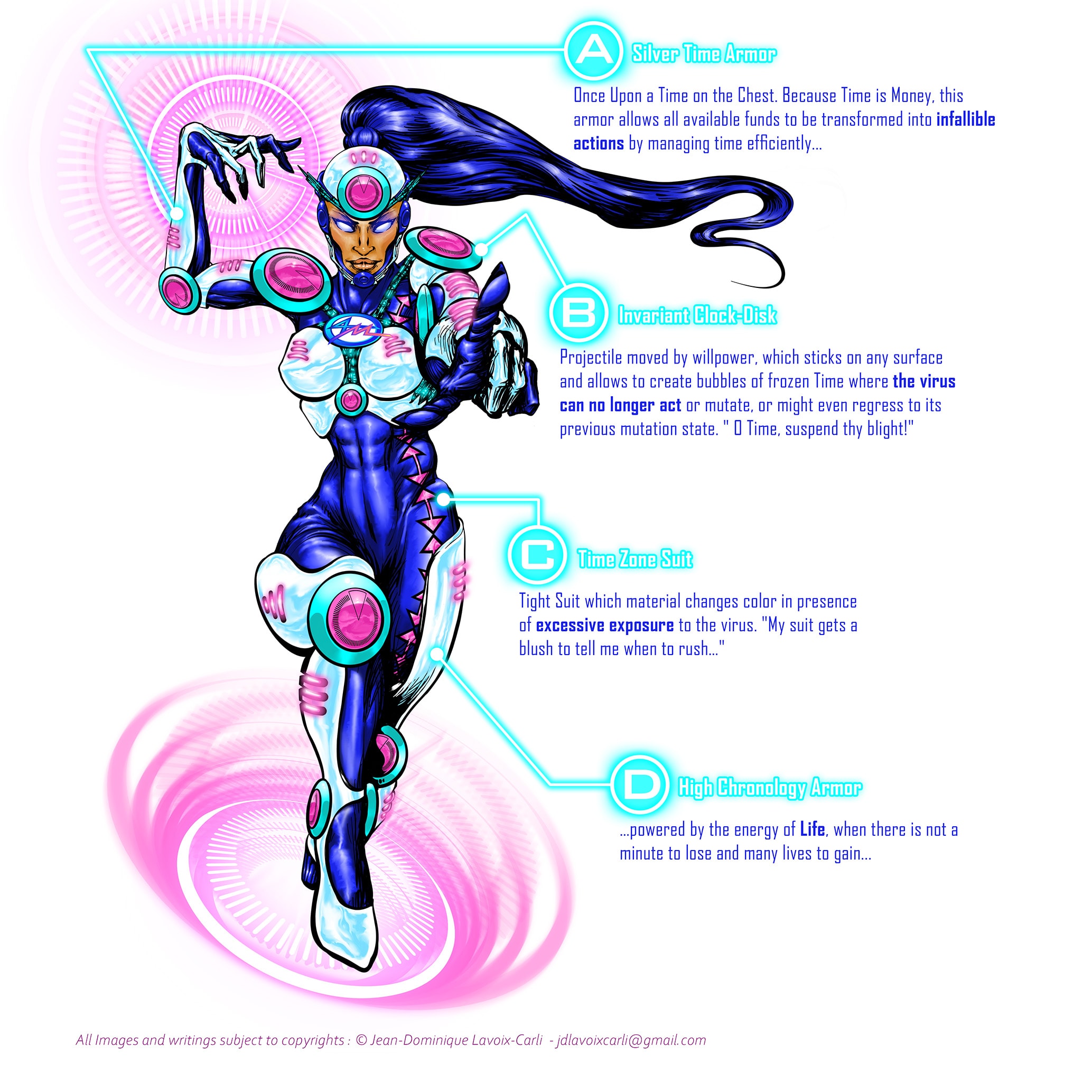
Equipment :
A – Silver Time Armor : Once Upon a Time on the Chest. Because Time is Money, this armor allows all available funds to be transformed into infallible actions by managing time efficiently…
B – Invariant Clock-Disk : Projectile moved by willpower, which sticks on any surface and allows to create bubbles of frozen Time where the virus can no longer act or mutate, or might even regress to its previous mutation state. “O Time, suspend thy blight!”.
C – Time Zone Suit : Tight Suit which material changes color in the presence of excessive exposure to the virus. “My suit gets a blush to tell me when to rush…”
D – High Chronology Armor : …powered by the energy of Life, when there is not a minute to lose and many lives to gain…
2: Art Direction & Illustrative Realization
Style Choice: Silver Age
In terms of drawing and design, I wanted these heroes to resemble the “Silver Age” style of the superheroes developed by DC and Marvel; I therefore opted for a more “hitech” and less “full tightsuit with cape” style of the “Golden Age”.
The goal was to generate both aesthetic and conceptual appeal. The concept of the Superman-like, “classical” superhero was feeling somewhat outdated and caricatured for this project. Therefore, the skintight suit with large areas of very flashy color and a cape billowing in the wind was rejected. This was viewed as too basic and childish.
In terms of drawing and inking, I drew inspiration from great names of the Silver Age such as Jack Kirby, Michael Byrne, Neal Adams or Michael Golden: a semi-clear line incorporating thick and thin strokes; shading and hatching for volume; and a strong, flowing anatomy.
Color Palette & Symbolic Language
Colors were not selected solely for aesthetic reasons. They function as a symbolic language designed to reinforce memorability and emotional identification.
The Customization Colors enable the differentiation of each member of the Group while assigning a recognizable emotional value to each preventative measure. And for a more effective memorization:
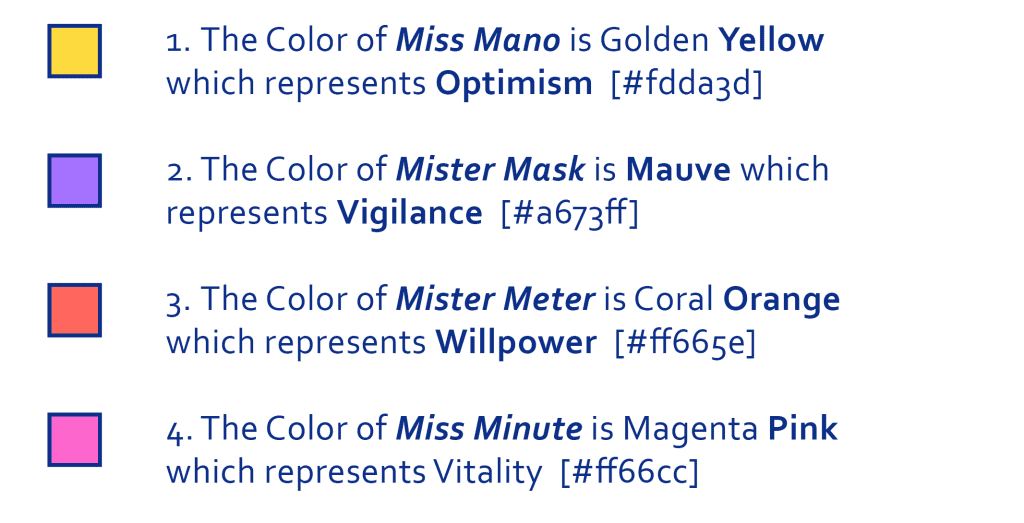
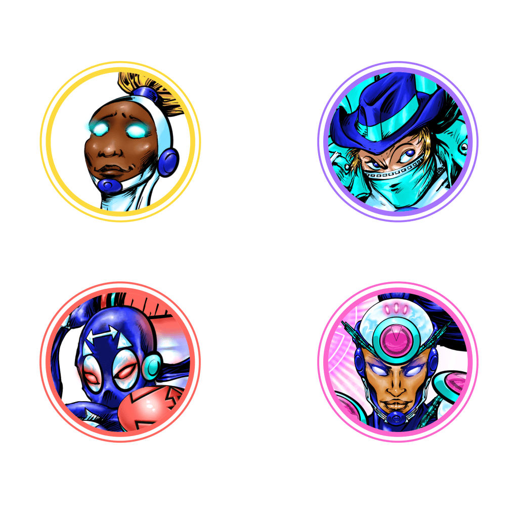
1. The Color of Miss Mano is Golden Yellow which represents Optimism [#fdda3d]
2. The Color of Mister Mask is Mauve which represents Vigilance [#a673ff]
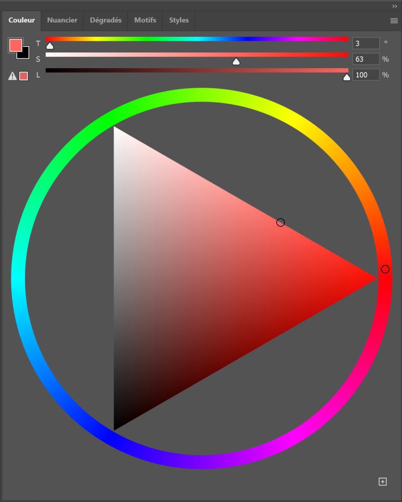
3. The Color of Mister Meter is Coral Orange which represents Willpower [#ff665e]
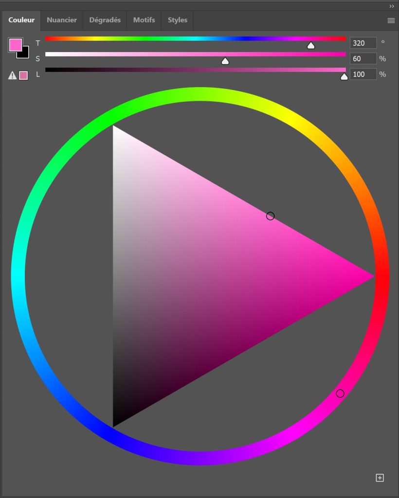
4. The Color of Miss Minute is Magenta Pink which represents Vitality [#ff66cc]
These 4 Colors are also found in the “M” of the 4M logo (see below LINK).
Individual Logos
Each hero was also assigned an individual emblem.
Beyond simple visual identification, these logos function as symbolic condensations of each preventive measure, allowing complex concepts to be recognized instantly through shape recognition.
The 4 Personalization Colors are also used as reference color codes for each of the Individual Logos displayed by each hero and symbolizing his/her own preventive measure :
Miss Mano

Represents a Pair of Hands presenting their palms to represent Cleanliness. Also evokes a stylized Eagle which represents the rise of Optimism.
Mister Mask
Represents a Stylized Mask and its four fasteners in the form of a Hexagon evoking Protection. This also symbolizes the strength of Vigilance.
Mister Meter
Represents a Double Arrow between two separate locations to symbolize Physical Distancing. Its dynamism also evokes Willpower.
Miss Minute
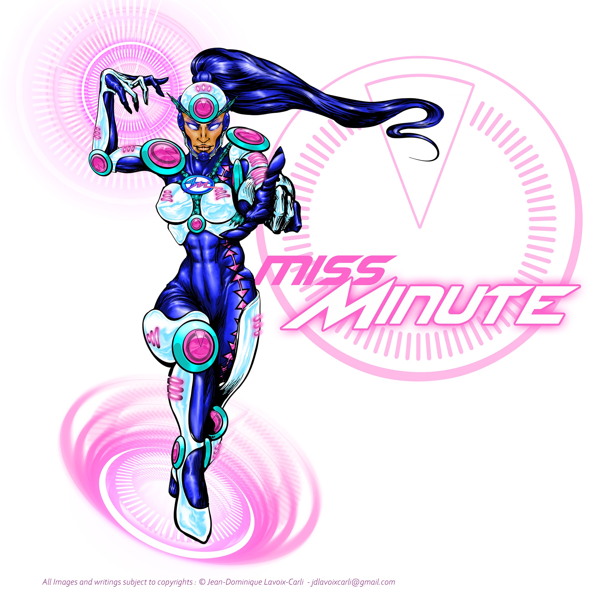
Represents a Chronometer Dial, one of its section being shaped in a triangle which symbolizes a single minute and the need to reduce one’s exposure time to the virus. It also represents the Cycle of Life.
Group Logo
The group identity needed to communicate cooperation before individuality.
While each hero possesses a unique color code and symbol, the 4M logo serves as the visual representation of their collective mission.
Its structure combines the shared values that unite the team while preserving the identity of each member.
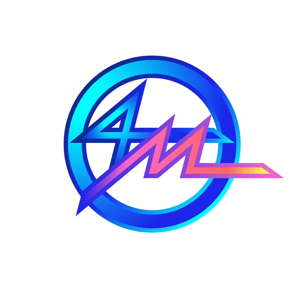
The Logo of the 4M Group has been developed in a modern, impactful and dynamic style capable of responding to the graphic codes experienced by the teenagers through the media they use such as Comics, Social Networks or Video Games.
The Colors are both frank and clear, without being aggressive, and their symbolism is found throughout the group’s graphic charter, suitable for being declined to serve clear communication.
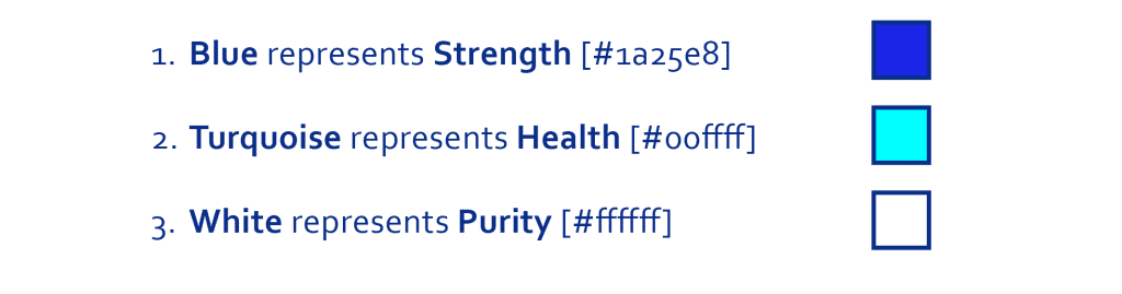
There are therefore 3 Base Colors and 4 Customization Colors :
The Base Colors are common to all the characters because they represent the symbolic virtues and objectives shared by all the members of the Group :
1. Blue represents Strength [#1a25e8]
2. Turquoise represents Health [#00ffff]
3. White represents Purity [#ffffff]
These 3 Base Colors balance is found in the “4” of the 4M logo, as well as in all the equipment and costumes of the members of the group.
As mentioned before, the “M” is blending all the 4 Customization Colors used for each character of the group. This harmonious and energetic gradient illustrates the Group’s desire for cooperation.
The shape of the “M” also evokes the pulsations of the Life Line which takes its source in Vigilance (Mauve), then evolves through Vitality (Pink), then Will (Orange) to finally end in Optimism (Yellow).
The gradient between these colors represents the need to harmonize all these virtues between them in order to be effective.
Typography
Typography plays a critical role in worldbuilding. For this project it was about designing a Heroic yet accessible visual voice.
Long before a reader consciously interprets a word, typography already communicates tone, genre and emotional intent.
For the 4M Project, the challenge was to find a visual language capable of evoking the worlds of superheroes, science-fiction and adventure while remaining clear, modern and immediately legible.
• A typography that felt too institutional would weaken the sense of imagination and identification.
• A typography that felt too fantasy-oriented would distance the project from its educational purpose.
• A typography that felt too futuristic could become difficult to read and therefore reduce the effectiveness of the communication.
The final solution emerged through the combination of two complementary visual influences :
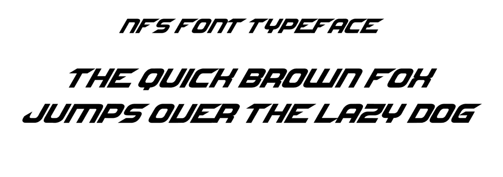
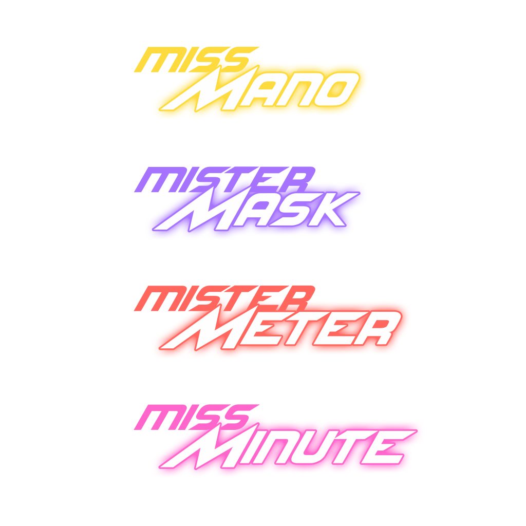
The primary structure of the character names was built using the NFS typeface, whose geometric construction conveys energy, movement and a contemporary technological aesthetic associated with comics, video games and science fiction.
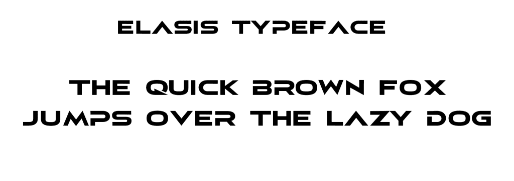
To reinforce the symbolic importance of the 4M identity, the initial “M” of each character name was redesigned using a modified version of the Elasis typeface.
This custom treatment allowed the letterform to become more dynamic and expressive while creating a visual connection between all four heroes.
The result is a hybrid typographic system positioned at the intersection of readability, modernity and heroic storytelling.
Rather than simply displaying names, the typography contributes to the construction of the universe itself.
Like the costumes, logos and completed with color codes, it becomes part of the narrative architecture.
In a narrative system, typography is not decoration. It is character design expressed through letters.
Part 4 : Backstage & Development
Here are listed the typical phases that are needed when achieving a process of World Architecture.
You may also download my brochure covering all genres and all styles for more details.
Phase A: Story
As mentioned previously, I had the idea to develop the 4M in 2019-2020 at the peak of the COVID-19 pandemic.
When I observed the lack of effective communication from authorities regarding youth, I had the idea to create superheroes to counter this global threat.
All the elements of an epic comic book scenario were there: a global threat, terror, a clearly identifiable enemy with unknown “powers”, the upheaval of a civilization… It is in times of crisis that the greatest heroes emerge : thus, I conceived this group of superheroes.
Phase B: Concept
However, these superheroes needed to be paired with real and effective public health recommendations. And since there were four “barrier gestures” (social distancing measures), I had the idea of creating a group of superheroes… rather than one or two individual heroes: this allowed for unification in terms of storytelling, visuals, branding, and mnemonics.
So I decided to limit them to four (like the Fantastic Four©) and give them simple, memorable names, all starting with the same letter: “M” – for Mano, Mask, Minute, and Meter. Simply embodying basic precautions in terms of a pandemic.
The 4M were born.
Later, working for a foresight and warning website, The Red Team Analysis Society (LINK), and being personally involved in the repercussions of climate change and its role in pandemics, I decided to extend this concept to all pandemics because, with little adaptation, the concept of preventative measures embodied by the 4M could be applied to many pandemics.
Phase C: Costume Concepts
Color should NOT be decided at the end, once all the elements are in place: it must be decided at the beginning – or at least – very early in the design process, because depending on the chosen artistic direction, the design may be affected.
I wanted a very diverse and syncretic group of heroes in which every teenager could see themselves. So I decided to have two males and two females. And each should represent a part of the world. Because, since the pandemic is global, the 4M would be necessary on every continent of the globe.
So in the end, I settled on a Caucasian, a Black, an Asian, and a Middle Eastern.
I wanted a unified visual style that would link all the heroes together. A uniform indicating that they all belonged to the same group, but with an additional unique color for each character that would personalize them and allow us to thematize the preventative measure they represent.
Phase D: Methodology – From Sketches to Final Art
Since I had drawn up a design guideline based on the Silver Age, after deciding beforehand on all the components of the characters and costumes mentioned above, I began developing my methodology according to these criteria for each character:
• I used Sketchbook software to sketch the early poses and set the different elements individually on different layers: the blue lines represented the character’s body, and the red ones represented the armor/extra props, allowing me to work on them separately.
• Once the final drawing was complete, I inked the final illustration using preset brush models to create thick and thin strokes based on hand pressure, achieving a fluid and organic effect by varying the thickness, like a real pen or brush. This made the drawing more sensual and organic, and less technical and cold.
• In the end, the individual logos were developed in Illustrator and then incorporated into the final black and white inking in Photoshop.
• Then, once the black and white inking was finished and the individual logos incorporated to create the final version of the characters, I moved on to several color tests (see Phase E below).
• The glow elements and lighting adjustments for the technological elements were perfected in Photoshop.
• The graphic layout of the background, as well as the typography (see Phase G below), were also added at the end in Photoshop.
Miss Mano
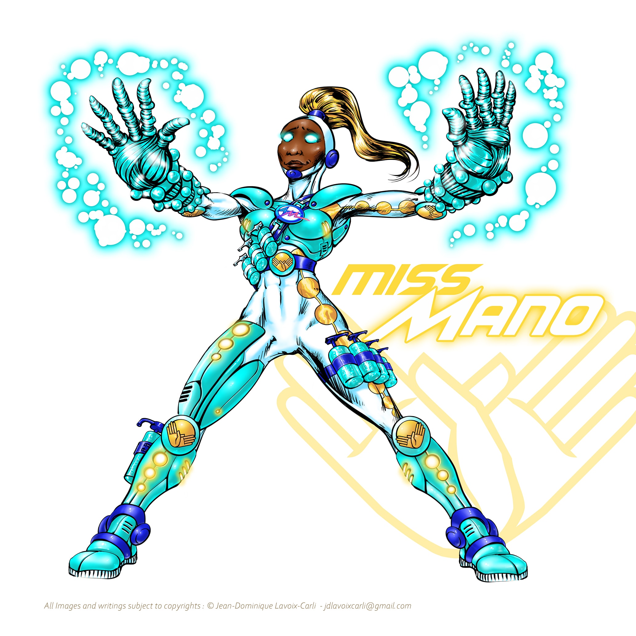
The main idea was to focus the design on her hands ; as she was supposed to be the “power blaster” of the group, I decided to focus her power on her hands, which I oversized by means of “giant gauntlets of power” crackling with energy. A purifying energy instead of a destructive one.
As this character is expansive and powerful, like a power blaster, I chose a central position that is both very confident and dominant: “I will destroy all viruses” and reassuring as well as if she was saying: “Look how clean my hands are, rest assured.”
This gives the character a reassuringly powerful stance. Therefore, representing her with legs and arms spread in a classic comic book “power display” pose was the best choice.


Mister Mask
This character being the stealthy one of the group, due to his mandatory role of being masked, it was necessary to give him the stature of a Batman© or a Shadow©. Reinforce his “bad boy” side while giving him a certain retro elegance.
So I decided to transform his trench coat into a cape made from the materials of surgical masks, which could adapt and fluidly change shape, reinforcing the character’s shadowy aspect.
This character is depicted in a classic vigilante hero pose: leaping from a rooftop or skillfully bounding out of the shadows or blending into them before launching a ranged attack. “I withdraw from the contamination before counter-attacking.”
And in this very “Batman” spirit, the living trench coat/flowing cape comes to life in a large part of the background of the composition as the character throws his masks like shurikens, not to destroy, but to protect the unmasked innocents.


Mister Meter
As the speedster of the group, I wanted to add an artifact to the character so he could “measure” distance at any time.
Therefore, I decided to give him – in addition to his super-speed of distance – a “giant ruler” that he could use as an offensive or defensive weapon.
The idea of a sword linked to Speed immediately made me think of a Ninja-type character, making him a Martial Artist, which reinforced the idea of disciplined behavior.
To ensure the viewer encounters the group’s speedster “as quickly as possible,” I deliberately shifted him to the left, contrary to the reading direction, to reinforce the idea: “You don’t gradually encounter Mister Mask: you bump into him…”
I chose a very dynamic running pose combined with kata and ninjutsu sword positions for the arms. Forming a contrast between the upper part of the character (refined and complex) and the lower part (powerful and fast)… giving this ambiguity of a super-fast ninja character.
The free space in the center and on the right of the image allowed me to more clearly showcase the graphic effects of superspeed as well as the “saber ruler katana.” The running effect also allowed me to work graphically and elegantly on the traditional ninja ribbon floating behind his hood.


Miss Minute
This character is of the “wizard,” “mystic,” or “psionic” type. She relies more on pure power and knowledge than physical strength.
As a time and dimensional traveler, it was necessary to embody his power through easily recognizable energy halos in accordance with precise gestures – almost like spellcasting.
For this magical and mysterious character who travels through time and space, I wanted to give her a regal and spellcasting stance. To illustrate her power, I had her emerge from a dimensional portal.
I gave her a refined and complex right-hand and finger position evoking spellcasting and/or a delicate manipulation of realities. The left-hand gesture also has a double meaning: it signals the start of a countdown, and it’s also a gesture of caution and attention-grabbing, like “pay close attention to the time remaining…”


Phase E: Variations and Final Color Choices
I had drawn up a design guideline based on the Silver Age, after deciding beforehand on all the components of the characters and costumes mentioned above. Therefore, I developped my color codes according to these criteria for each character and for a common group uniform, as well:
Base Costume Colors
As indicated in the Group logo section, the colors common to the 4 characters would therefore be Blue, Turquoise, and White. However, after many visual tests (see the Gallery below), I came to the conclusion that I didn’t want them to appear too “military,” which might frighten a teenage audience.

Team Costume research : Version A
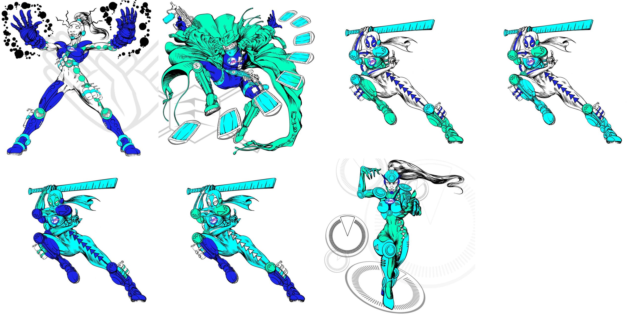
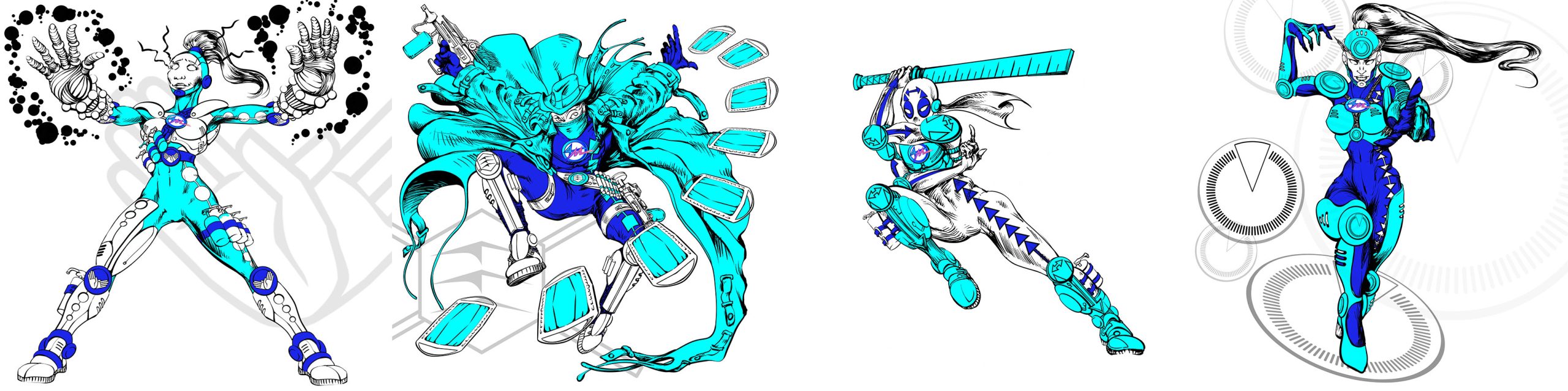


Therefore, I decided to vary the localized distribution of the base colors on the costumes to give a touch of originality and fairness among all the characters, so they wouldn’t be too “uniform.”
In the end, the most optimal choice among all the combinations was the following:
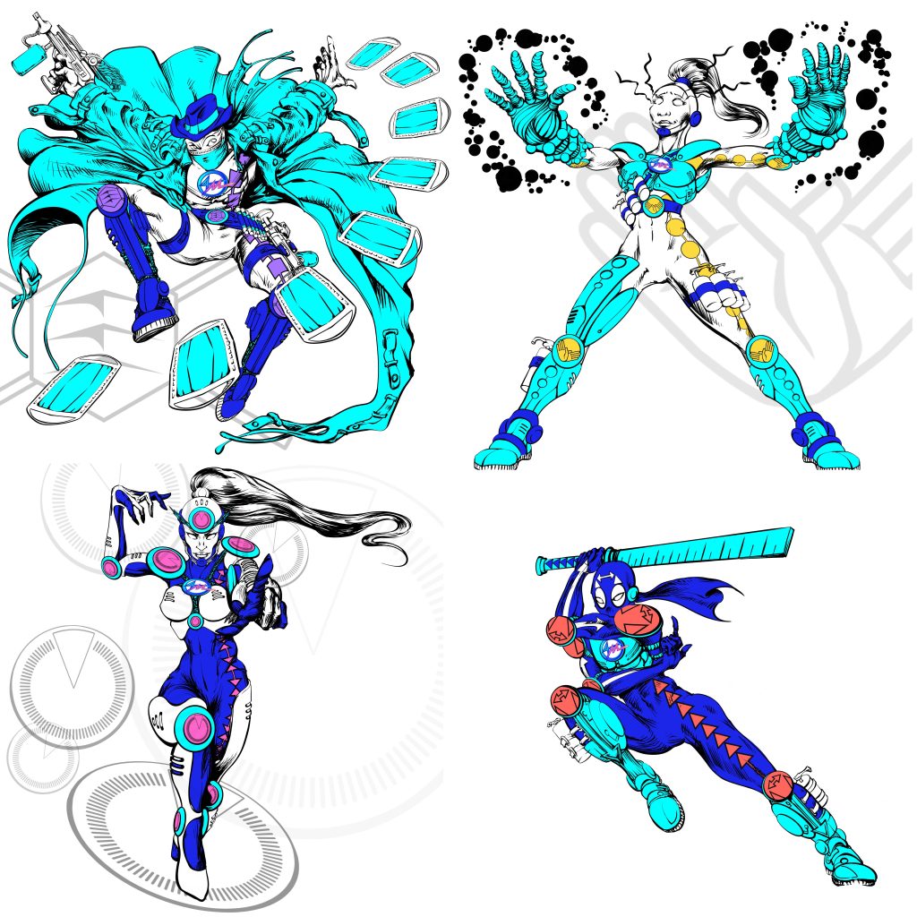
• 1 woman with a white tightsuit + a turquoise armor + blue attachments (Miss Mano).
• 1 man with a white tightsuit + a blue armor + turquoise attachments (Mister Mask).
• 1 man with a blue tightsuit + a turquoise armor + white attachments (Mister Meter).
• 1 woman in a blue tightsuit + a white armor + turquoise attachments (Miss Minute).
Individual Costume Colors: The Symbolism of the Characters and Social Distancing
Since I wanted these heroes to more closely resemble the “silver age” style of superheroes developed by DC and Marvel, I opted for a more “high-tech” style and less of a “full tightsuit with a cape.” More subtlety was needed for a teenage audience already familiar with the world of branding and complex technology.
The individual colors therefore needed to be sufficiently prominent to fulfill their signage role, yet discreet and elegantly arranged to allude to a branding message and symbolic abstraction perfectly understandable to the younger generation.
In the end, I chose colors that were complementary to each other, but also colors that would harmonize with the base of the costumes described above. Since the color base of the costume (blue, turquoise, and white) are within the range of cold colors, I logically chose warm colors to warm up the overall look, but also to create a contrast that would make the individual color stand out more easily.
After many trials, the most judicious choices were the following:
Miss Mano
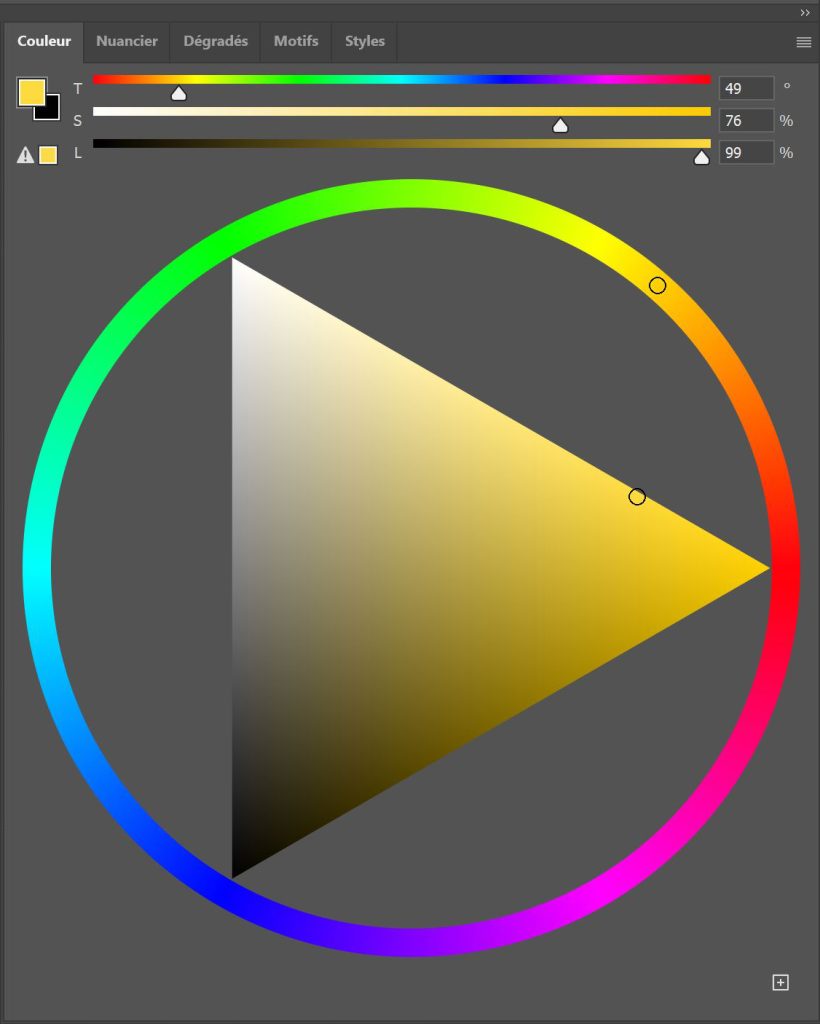
Yellow : Optimism [#fdda3d]
As the only primary color, it suggests a very explosive, power-blast vibe. It energizes the base of the costume without being too flashy.
It highlights Miss Mano‘s dark skin, which also gave me the idea of making her blonde to complement the golden yellow of the costume. Blonde hair dye is quite popular among African-American and African populations.
Mister Mask
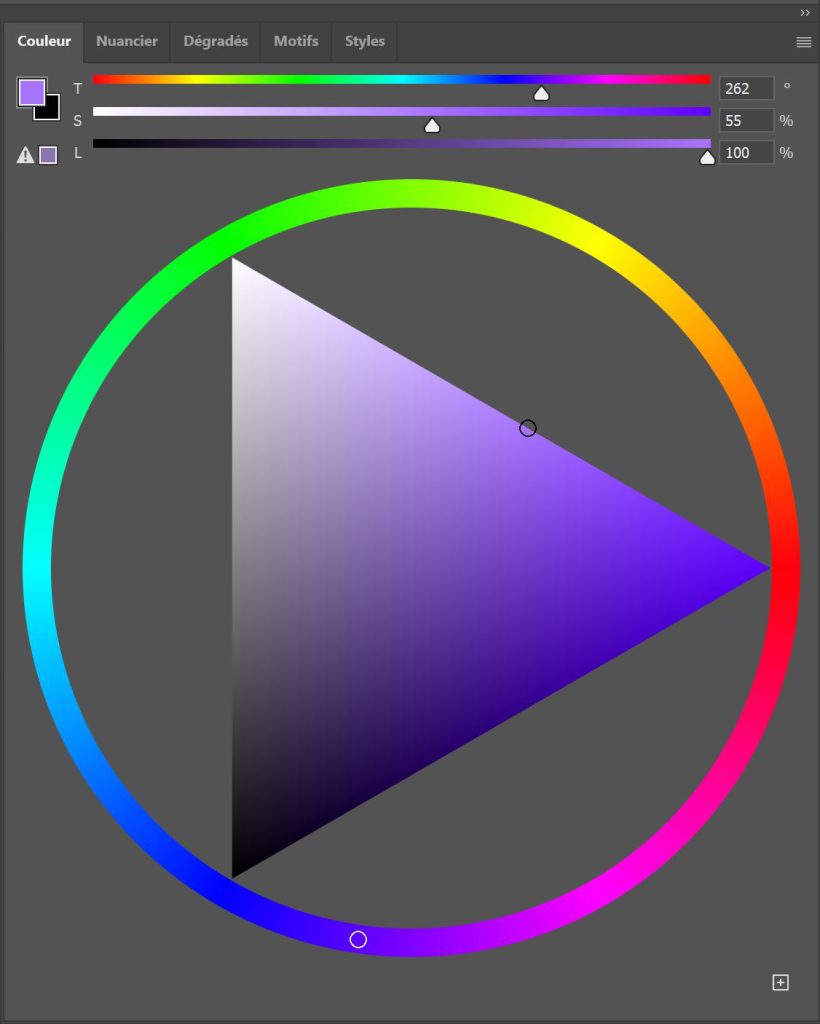
Mauve : Vigilance [#a673ff]
It was bright enough to contrast with the base of the costume, but not so bright as to suggest the character’s “stealth” nature as this violet-based color is somewhat deep, introspective, insightful -almost mystical- and discreet. Complementary to Miss Mano‘s yellow as a secondary color.
Mister Meter
Orange : Willpower [#ff665e]
Since blue and yellow were already taken as primary colors, I could have used red, but it would have been too aggressive and clashed too much with the blue of the base costume.
So I used blue’s complementary color : orange. Bright and dynamic enough to play the role of red and match the evocation of the character’s superspeed. It contrasts sufficiently with the base colors of the costume without creating a visual clash.
Miss Minute
Magenta Pink : Vitality [#ff66cc]
Since I decided against using red for these characters, I was left with only two colors harmonious enough to contrast with the costume and distinct enough to theme the character: soft green and magenta.
They both had their advantages aesthetically and practically no disadvantages: each could complement the three.
The other characters’ colors were used harmoniously. Green was a cooler color that complemented Mister Mask‘s mauve, and the bright magenta/pink possessed the same dynamic qualities as Mister Meter without the drawbacks of red, and was sufficiently distinct from orange.
In this type of dilemma, the narrative and semantic vision takes over: green is a vegetal, soothing, healing, and regenerative color. But this character is “Miss Minute”; her role is precisely to be in a state of urgency, not serenity, similar to Mister Meter moving away in space, Miss Minute moves away in time.
Consequently, her color had to be as dynamic as Mister Meter‘s: I therefore opted for magenta. The added value of this choice is that bright magenta/pink is a very… “girly”. And the “girly” look is very popular among young girls eager to express themselves through a slightly “edgy” and assertive femininity (as per Barbie©, Sentai-like squads like Power Rangers© et al.)… so it was the right choice.
Costume Trim and Graphic Charter Reinforcement
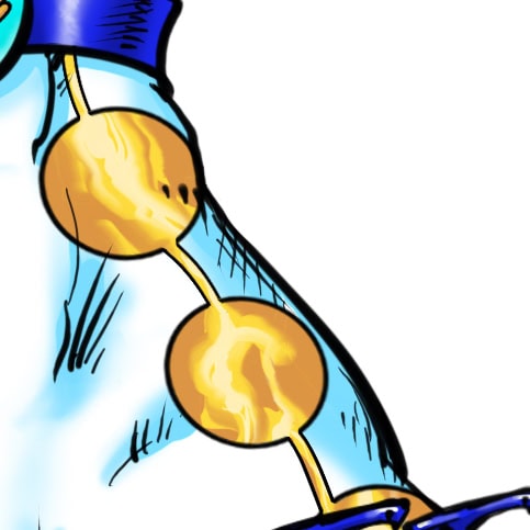
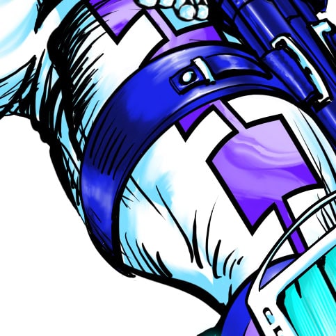
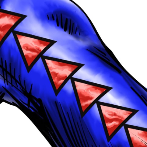
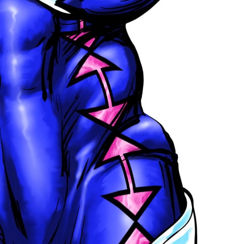
With the aim of developing a costume that offers the same characteristics as a uniform while allowing for significant personal customization, I had the idea of adding another touch of customization to each character’s tightsuit: an asymmetrical geometric trim running the entire length of the costume.
This trim extends along the entire left side of the character, from their ankle, down their leg, torso, arm, and to the wrist.
It offers an elegant and graphic asymmetry that reinforces the idea of a sporty jumpsuit, a uniform, while being characterized by a color and pattern unique to each character.
The principle is that this trim is a colored line adorned at intervals. regular repeating geometric patterns specific to the character; thus creating the combo: unique geometric pattern + one color.
This reinforces the visual message of each preventative measure for each character:
• Miss Mano : Circles.
Evoking the crackling of purifying energy around her hands.
• Mister Mask : Squares.
Evoking the shape of the mask.
• Mister Meter : Triangles.
Evoking speed of movement.
• Miss Minute : Pairs of opposing arrows repeating an hourglass pattern.
Evoking time.
Phase F: Logotypes Research
The placement of the logos was determined beforehand through drawing, color anticipation, storytelling, and world architecture. I conducted logo research along the following lines:
• The logos had to be simple, almost like signs, contrasting with the intricate details and character of the illustrated figures, as they had to be adaptable to any type of medium and any size, from the characters’ costumes to a simple individual sign.
• Each logo would be in the character‘s custom color on a white background to create a strong semantic link : logo > color > character > barrier gesture.
• Unlike “branding” logos, which are meant to represent abstract values rather than products, these logos were intended to be more like signage than a brand. Each barrier gesture had to be immediately understandable: Hand/Mask/Meter and Minute.
Consequently :
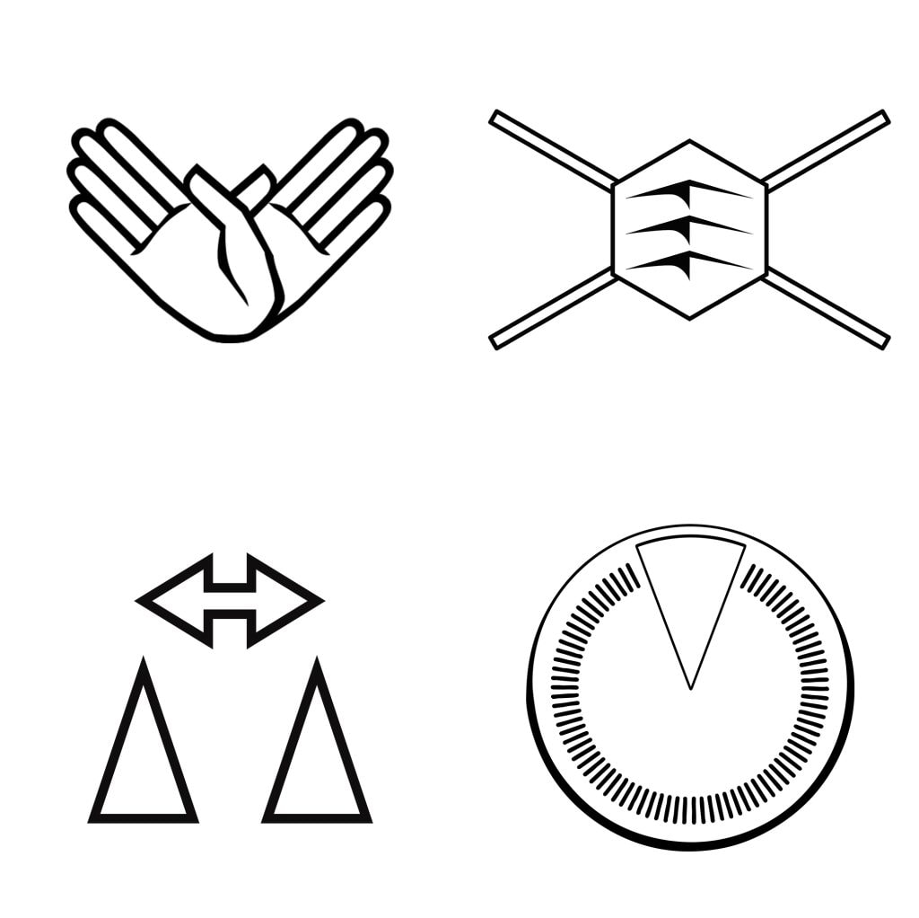
Miss Mano
Two hands spread apart, as if to demonstrate cleanliness and also to make a gesture of appeasement or welcome.
A single hand would not have been sufficient, as BOTH hands must be clean, and this would have confused the message. Furthermore, it could have been mistaken for a “Stop” gesture.
Mister Mask
A stylized hexagonal mask with three stylized “folds” and four fastening cords. The mask had to be instantly recognizable and almost evoke the image of a medieval helmet visor or a high-tech breathing mask…
Moreover, the hexagon lends strength to the monogram and alludes to the symbol of France, since the health and safety concern originated and was implemented at the national level.
Mister Meter
Two elongated triangles representing two people or two specific locations separated by a double arrow, indicating the distance between these two points.
Evoking a force that repels rather than attracts.
Miss Minute
A graduated circular dial evoking a watch, a chronometer, or a simplified clock.
A portion of this “symbolic time” is highlighted in the form of a “triangular segment” that symbolizes the one-minute time limit.
Phase G: Typeface Research
Stage 1: Selection Criteria – The Consultant’s Decision
To complete the superhero/high-tech feel, I needed a typeface with the following characteristics:
• Sans Serif : It had to be a sans-serif typeface would evoke modernity and immediacy. As, on the other hand, a serif typeface would evoke tradition, introspection, and luxury.
• Geometric : The typeface had to be impactful, perfectly legible, and convey a sense of urgent signage as well as reassuring strength.
• Modern/Sci-Fi/Hi-Tech : A typeface capable of evoking modernity, technology, and confidence in the future, while respecting superhero conventions without being too fantastical, ridiculous, or outlandish.
• Original : A typeface with a touch of formal originality that makes it memorable and permanently links it to the characters, without sacrificing legibility. A typeface that is too neutral or generic would miss the mark in delivering the message in its entirety.
Stage 2: Pre-selection – The Typographer Eye
I therefore pre-selected 186 typefaces that met these criteria. Then I divided them into 5 categories, in order to select from these categories the ones best suited to the defined criteria as well as a degree of typographic intuition:
• Geometrical typefaces (3 typefaces)
• Modern typefaces (28 typefaces)
• Official Superhero typefaces (4 typefaces)
• Sans Serif typefaces (29 typefaces)
• SciFi typefaces (39 typefaces)
• Technological typefaces (83 typefaces)
Stage 3: Broad Selection – The “Cool” Factor
From these 186 typefaces, I then selected 42 that met the initial criteria.
But to see, understand, and feel the impact and relevance of each of these typefaces, I now needed to insert them into the final illustrations to see how they “reacted” and “interacted” with the characters.
In other words, the superhero names written with these typefaces had to generate a “cool factor” in me that would make me say, “Wow! Yes, it works!”
So I created 42 Photoshop mockups with each of the 42 typefaces, illustrated in the sliders below:

Team Typeface research : Android Italic


Then, after analyzing each of these screenshots, I then classified these 42 Typefaces again into 3 categories, according to the degree of intensity of my “cool factor”:
• No : Typeface rejected. Satisfies only the typographical criteria but does not work neither the image and/or the composition and/or not having a satisfactory “cool factor”.
• Maybe : Not completely bad… but not completely good either. Requiring further examination.
• Yes : Satisfies both typographical criteria, works well with image, composition and has a satisfactory “cool factor”.
• Preferred : Same as “Yes” above. But Evokes an intrinsic “vibe” which allows us to anticipate the 4th Phase below: Refining the Vision.
Stage 4: Narrow Selection – Refining the Vision
By eliminating the “No” category from the previous Phase, I had reduced the choice of typefaces to 27.
I therefore reviewed these 27 images three more times ; I narrowed them down again and again, classifying and comparing them using the same filtering system as before: No / Yes / Maybe.
Until I manage to select the 12 best candidate typefaces, from which I can choose the final(s) typeface(s).
Stage 5: Semifinal Selection – The Experimented Intuition
The 12 candidate typefaces were as follows :
• Auto Mode
• Bonk
• Cyberfall Italic
• Elasis
• Ganymedian
• Gin Rai Italic
• Monster Mech
• Montalban
• NFS Font
• Space Quest
• Voyage fantastique Laser

Team Typeface research : Auto Mode
And from these 12 typefaces, I used my years of experience as Art Director and typographer to summon my “professional intuition” enabling me to finally select two… because of the “choice of hybridization” that I talk about in the last stage below.
Stage 6: Final Selection – The Choice of Hybridization
The typeface I chose to represent the 4M was therefore the NFS Font. It was the best candidate, perfectly meeting all the requirements I had set:
• It was sans-serif.
• It had a modern, slightly high-tech/sci-fi look and was geometric, yet maintained excellent legibility without being too whimsical or fantastical.
• It was slanted, giving the dynamism and sense of strength and urgency I was looking for.
• It was original because it mixed sharp, dynamic bevel shapes on some glyphs with softer curves on others. These shapes interacted harmoniously within a single word. Certain combinations of glyphs formed almost like lightning bolts in the spaces without affecting readability.
However, despite all its qualities, the NFS had two flaws :
• The “M” was perfect for the first part of the hero’s name: “Mister” or “Miss” but wasn’t impactful enough for the hero’s “Proper Name” which I really wanted to stand out from the other glyphs… And above all, I wanted connect it to the shape of the Group Logo, which I had already designed to be much sharper, with vibrant beveled shapes and almost a “lightning bolt” appearance.
• The “K” tended to be read as an “H”. Particularly in the case of “Mister Mask” : it appeared as “Mister Mash”.
For the first point, I therefore used the Elasis typeface for the initial “M” of the hero’s proper name – Mano, Mask, Meter, Minute – which I had reworked in Illustrator to give it the same weight and slant as the NFS Font. I also slightly increased its size so it stands out a little from the name, to symbolize that each hero is an “M” among the “4M”.
For the second point, I also modified a “K” in Elasis to give it the same slant and weight as the NFS Font, as well as its glyph boxing and kern : and it worked perfectly: Mister Mask now reads as such and not as “Mister Mash”.
Part 5 : Designing a Living Universe
The 4M were originally imagined during the COVID-19 pandemic.
Their powers, equipment and visual identity were therefore intentionally designed around the four fundamental principles that proved essential during that global health crisis : hand hygiene, respiratory protection, physical distancing and exposure time.
To embody the invisible threat of COVID-19, I also imagined an antagonist known as The COVID Queen : a symbolic supervillain representing the virus itself.
Each fictional adventure would therefore become more than entertainment.
It would provide an opportunity to communicate genuine public health recommendations through memorable characters, visual storytelling and emotional engagement.
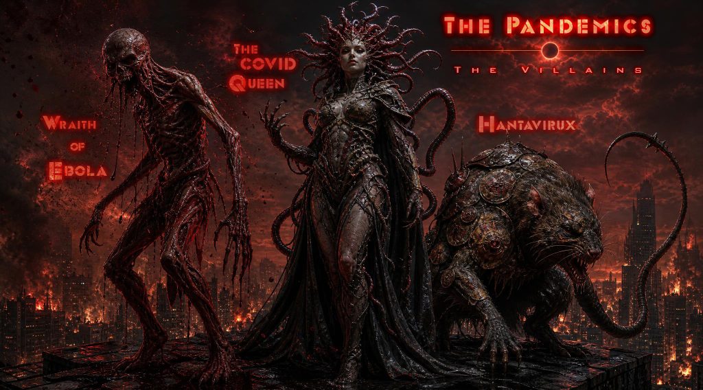
However, the real strength of this project lies beyond a single pandemic.
The underlying creative system can evolve alongside future health challenges.
Different diseases require different preventive behaviours, different communication strategies and sometimes entirely new visual metaphors.
Rather than redesigning everything from scratch, the franchise provides a flexible framework capable of adapting to new scientific realities while preserving a coherent visual identity.
New heroes, new equipment, new educational tools, new gameplay mechanics -or even a 5th member joining the team! – could naturally emerge as future needs evolve.
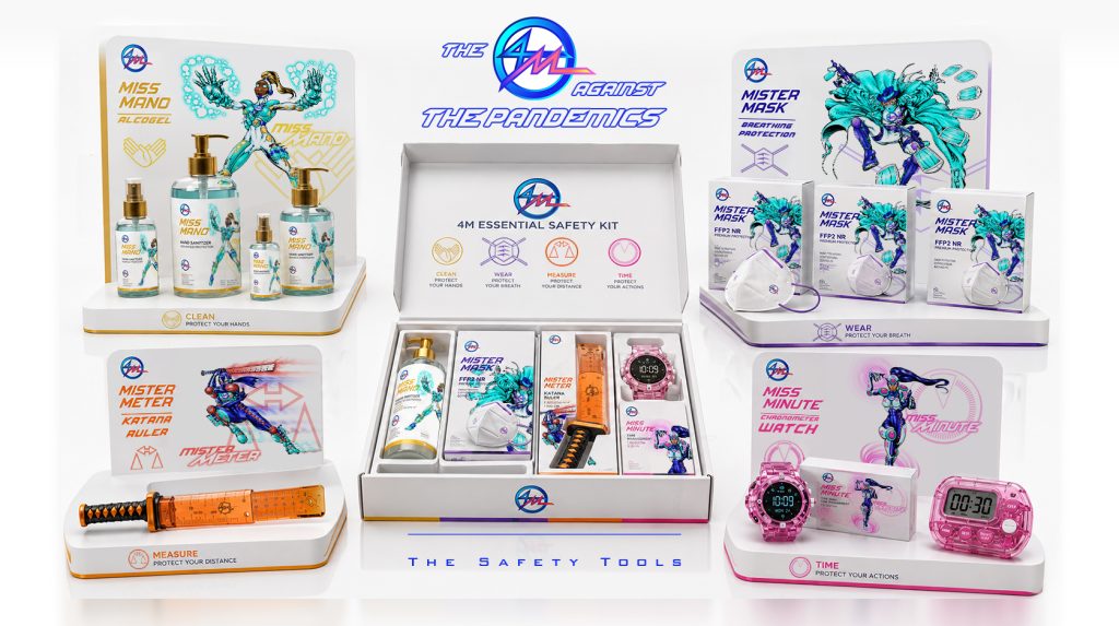
This is why I see The 4M not simply as a comic-book property, but as a long-term cultural platform capable of bringing together education, entertainment, design and public health communication.
The possibilities extend far beyond today’s media.
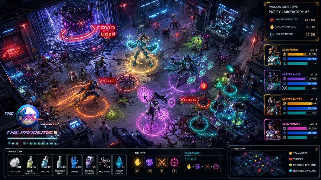
They invite future collaborations between artists, educators, healthcare professionals, game designers, museums, publishers and public institutions to transform prevention into something memorable, engaging and genuinely useful.
For, as heroism, imagination is infinite…
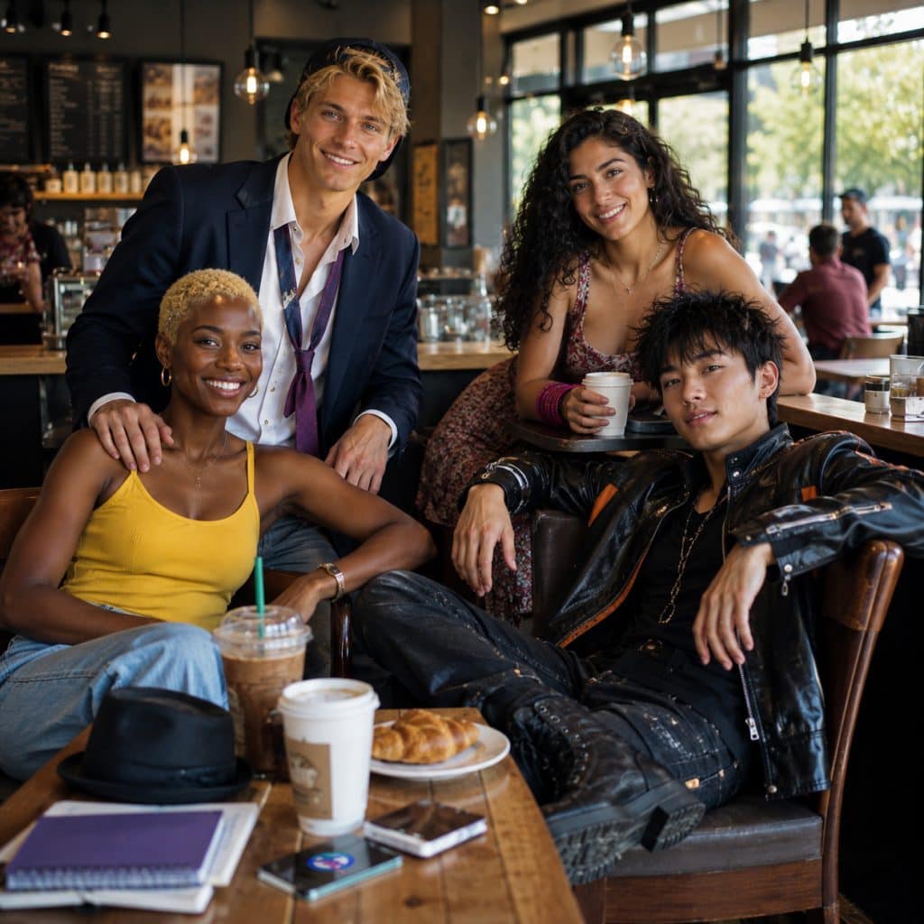
“And don’t you forget : it is up to you to be a hero like any of us…“
This post belongs to the Category :
Check my latest posts!
- “The 4M” : Designing Superheroes for Public Health
- Site Update : World Architect Offers
- Interview with a Compeer #1.1 : Desfragmentations – “The Alchemical Vision”
- Using AI creatively : Character Design – Yaràn Malak
- Article Header Design: “How to use AI for Weak Signals – Trump, the International Revolutionary?”
Check the latest comments!
Thank you very much for your comment coming from an IT expert, Nouha!
Very interesting article and excellent choice for th Sphinx!!
Splendid as always! And also this showcase the very broad scope of your design skills!


Related Themes :
Related Links :
Your comment will be posted after approval
Leave a Comment