


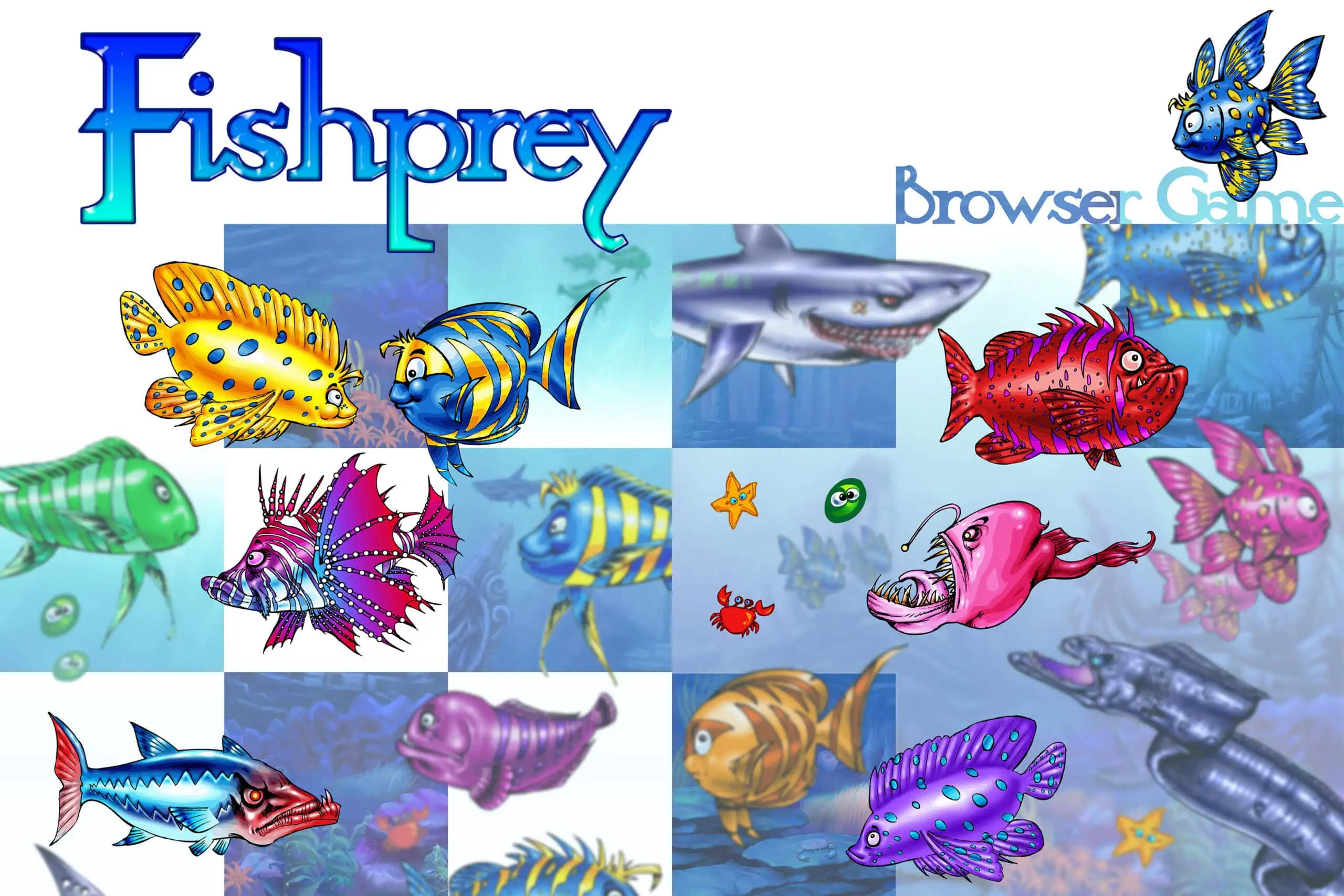
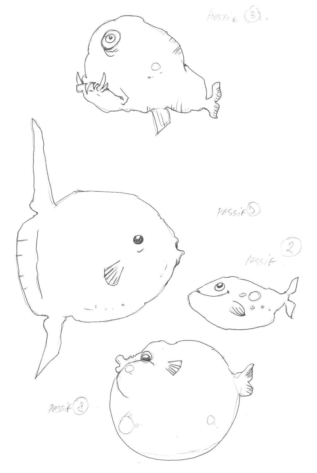
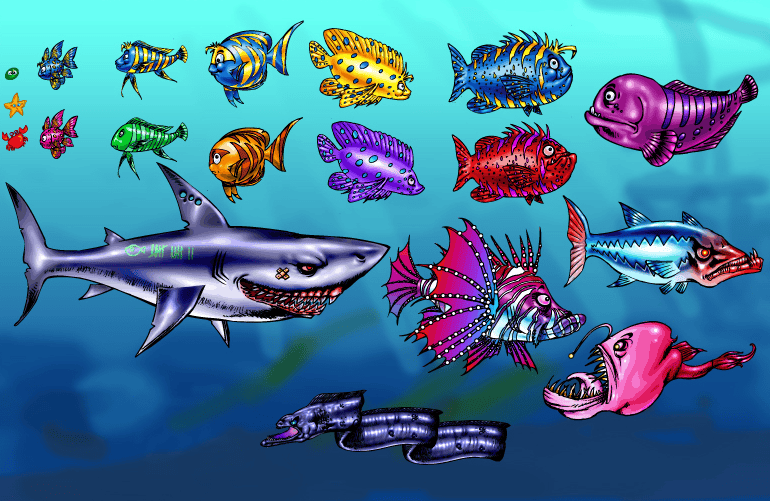
Complete Game Assets Carousel
“Smily” – Player Character 1
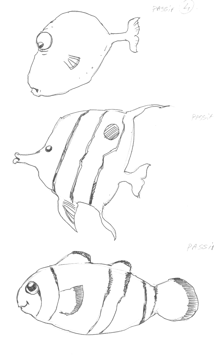
“Strippy” – Player Character 2
“Moony” – Player Character 3
“Spotty” – Player Character 4
“Chubby” – Player Character 5
“Grogne” – Non-Player Character 1
“Mmmh” – Non-Player Character 2
“Lil Tiger” – Non-Player Character 3
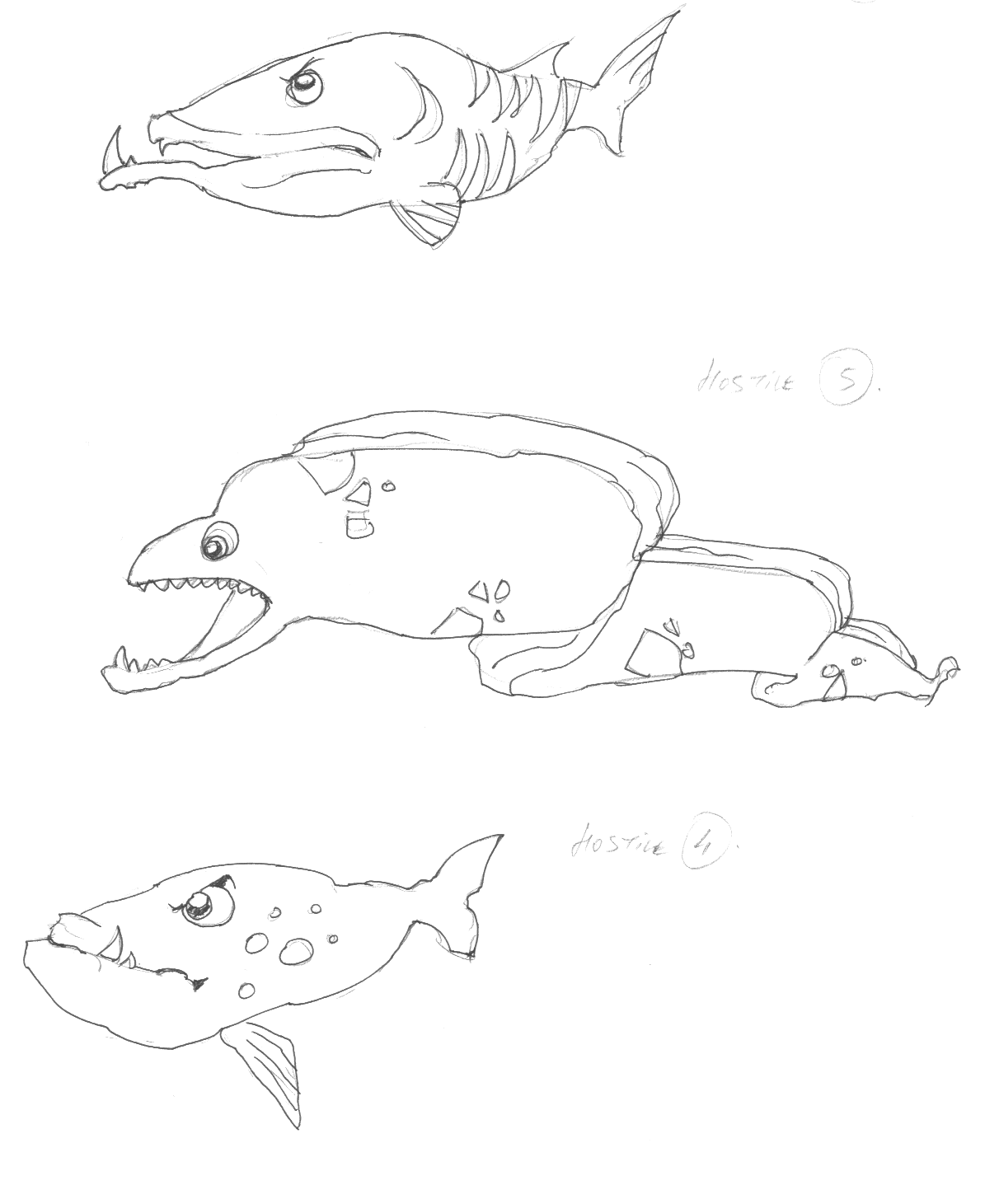
“Moody” – Non-Player Character 4
“Bloatty” – Non-Player Character 5
“Barrac” – Enemy 1
“Wolffy” – Enemy 2
“Lampion” – Enemy 3
“Stingy” – Enemy 4
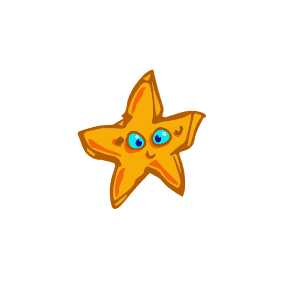
“Max” – Food 1
“Ringo” – Food 2
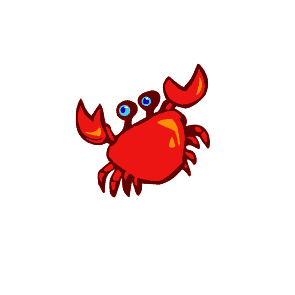
“Nebula” – Food 3
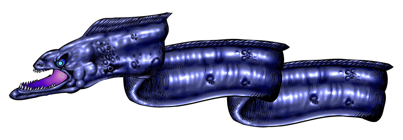
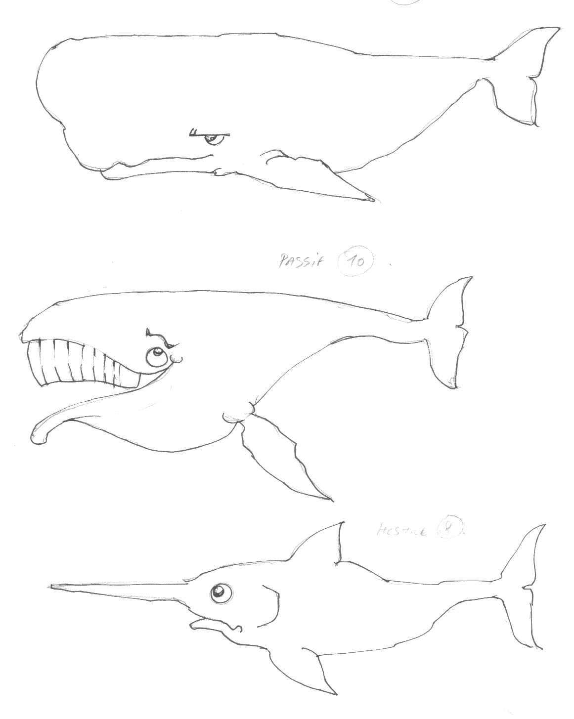
“Moris” – Trap 1
“Sharky” – Trap 2
- The Context
- Listen this Article
- Part 1 : Game Concept
- ● Game Design : “Survival of the Fittest…”
- ● Level Design : “Swimming with Sharks…”
- ● Character Design & Art Direction: “There is always a bigger Fish…”
- Part 2 : Concept Art
- ● Concept Art – Mockup Stage
- ● Concept Art – Research Stage
- ● Concept Art – Final Stage
- ● Final elements of the Game’s First Level
The Context
🐠 I have been involved in the creation of a French Browser Videogame named “Fishprey”.
I have been in charge of the art direction, conception, animation and realization of the graphic playable assets of game, as much as participating to the game design, level design, UX/UI and overall balance of the game.
This French Browser Game was part of an internet gaming site named “Muatoo”.
● The First part of this project is the “Game Concept” section where I will reveal in exclusivity how I have worked with the production team to conceive the whole project from scratch ; presenting every stage from Game Design to Level Design, as much as the Character Design’s early stages, game roles and playability . Our team included developers, senior artists and game/level designers.
● The Second part of this project is the “Concept Art” section where the different stages of the assets production are extensively detailed : Mockups, Research and the intermediate steps of the Final stage. The totality of the Player Characters, Non-Player-Characters, Enemies, Food and Traps being eventually presented at their final, playable stage.
Along the principles of creation, design and execution of each asset and game conception, I will reveal many anecdotes pertaining to the history of the game and the life of the game production project.
Listen this Article
Listen to the synthesis of this publication and what Alex Karlson and Iris Devocca from “Creative Compass” have to say about it! You may either listen directly this epidode below or access it through Spotify.
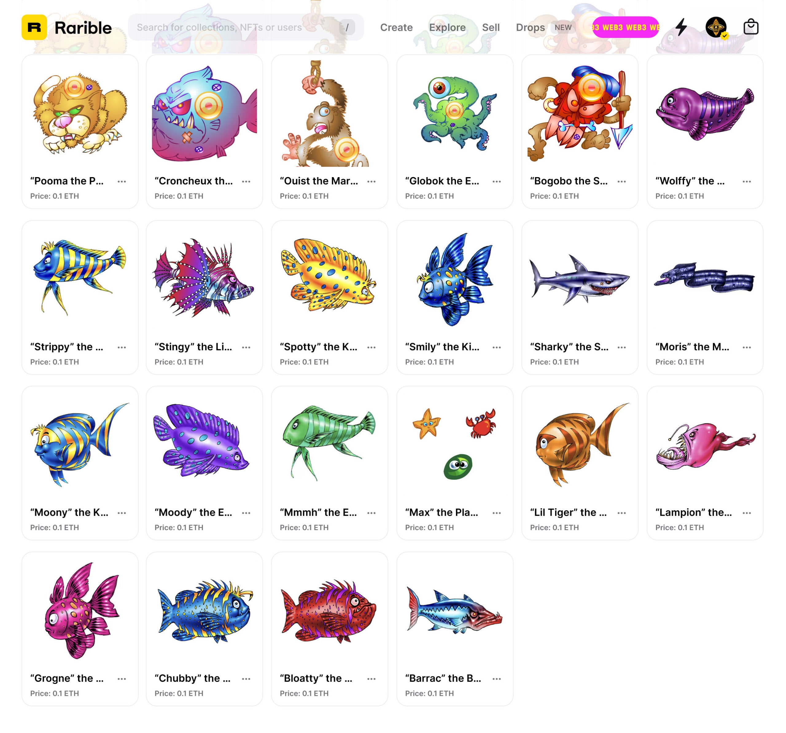
How to buy the “Fishprey” NFTs
All the Characters Assets presented in this publication are available as NFTs exclusively on my Certified Rarible space.
Please click the Link or the Picture below to explore my Rarible Gallery and don’t forget to follow me on Rarible for future exclusive content :
“Fishdom” : the legacy of “Fishprey” ?
A few years after our “Fishprey” project, The videogame company Playrix has released “Fishdom“, a game very similar to ours, but with way more assets, technology and gameplay elements ; meaning, initially, our game concept was pretty correct.
Part 1 : Game Concept
● Game Design : “Survival of the Fittest…”
The team has been asked to conceive a simple, single-user, keyboard/mouse-playable browser game which could have a very simple gameplay, along a feeling of progressive achievement. The game principle and rules were supposed to be very simple to grasp and use within minutes. That is typically the kind of game that could be as well adapted easily to a mobile game.
The best games come along a very simple principle, ergo, after some brainstorm sessions, we decided to come with a very simple pitch : “A little Fish tries to survive in an hostile environment to eventually end up at the top of the food chain.”
● The Gameplay was supposed to be a click and point kind of game, mainly focusing on the dexterity of the player who had to react immediately to his environment and guide his character through each level and achieve the “top of the food chain” status to complete the said level, levels which were increasing in difficulty, objectives and amount of challenges.
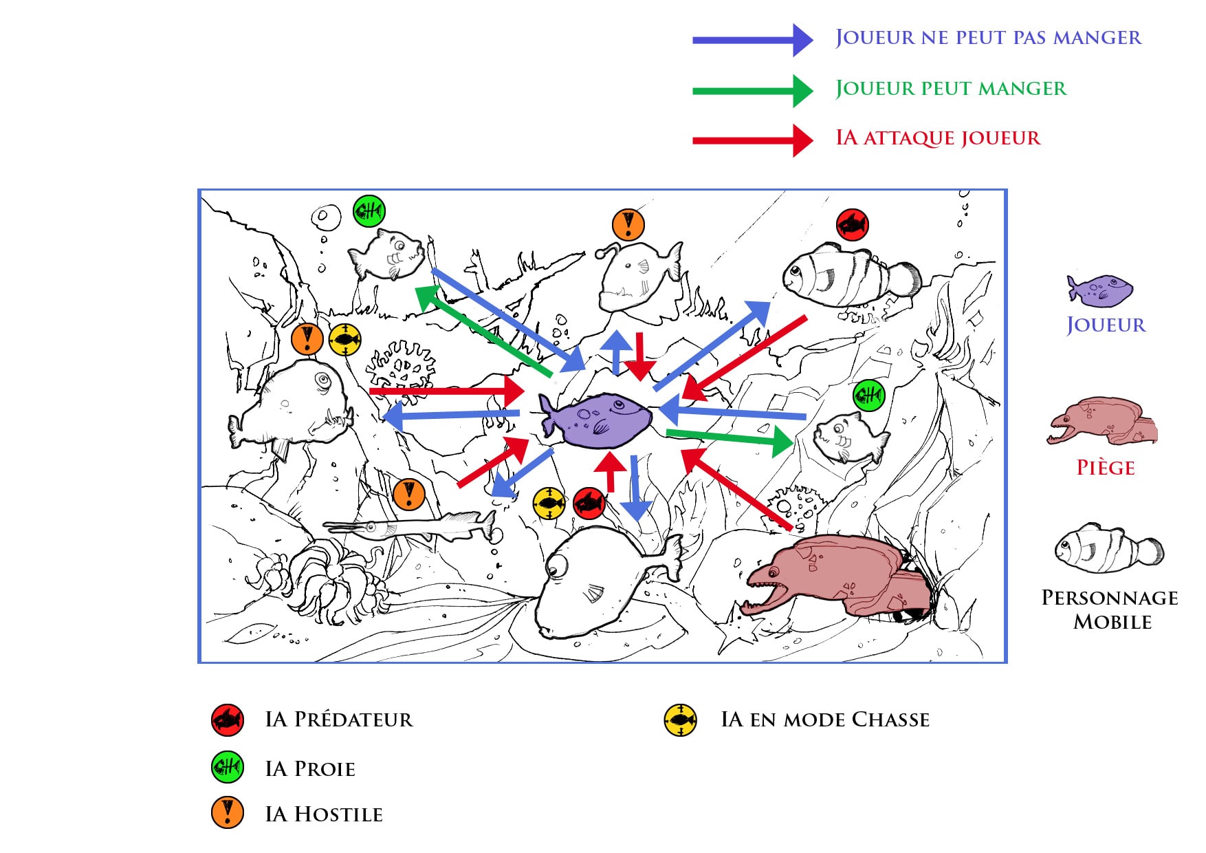
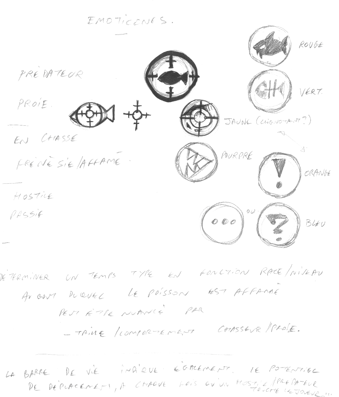
Image Caption Translation :
○ The Player Character is represented in Mauve
○ The Trap Mob is represented in Dark Pink
○ All the other Mobs are represented in White
Blue Arrow : Player Character Cannot eat Target
Green Arrow : Player Character Can eat Target
Red Arrow : AI Mob can attack Player Character
? Predator AI
? Prey AI
? Hostile AI
? AI in Hunting Mode
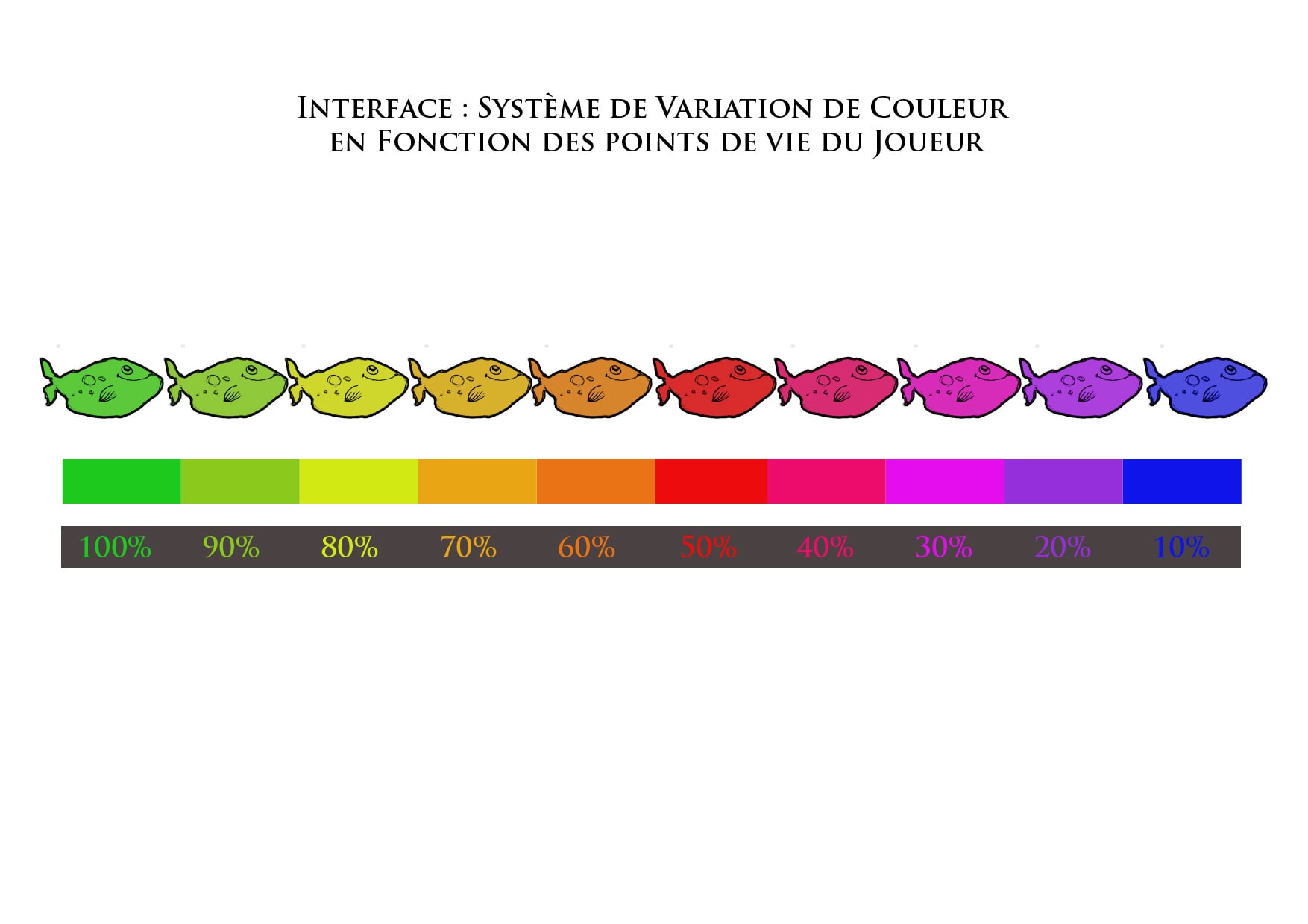
● The Game Interface (UI) had to include both a very simple color code to display the PC’s life bar, which would be proportionate to his level (the highest the level, the larger the amount of life points) and an icon system which would help the PC to figure out both the behavior of the opponents and if the opponents are edible or not.
● The AI of the Mobs would change depending of their respective zones of interaction. Each kind of opponent (NPCs, Enemies, Traps, Food) would have different behaviors depending of both their type and their radius of interaction with the Player Character : some would be voracious and very aggressive as soon the Player comes too close, some would be just curious and swim gently towards him, some would be hunters and track restlessly the player, etc.
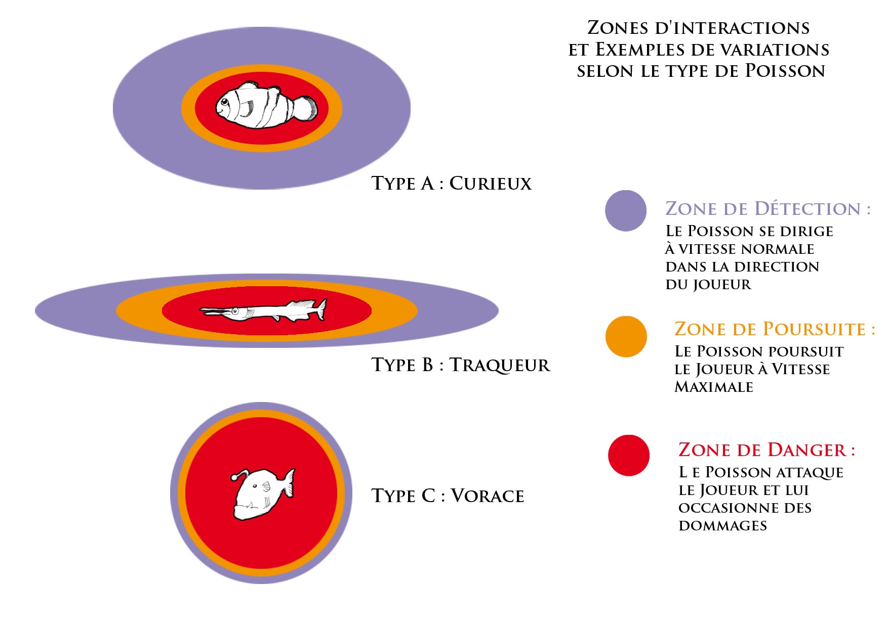
Image Caption Translation :
○ Type A : Curious
○ Type B : Tracker
○ Type C : Voracious
?
Detection Zone
The Mob moves forward the Player Character at Normal Speed.
?
Chasing Zone
The Mob chases the Player Character at Maximum Speed.
?
Danger Zone
The Mob attacks the Player Character and damages him.
● Level Design : “Swimming with Sharks…”
Each level was supposed to be filled with an evolutionary type of challenges, presenting, one after the other, more and more NPCs, Enemies, Food and Traps of different types and particularities. Since the Game principle was founded, we designed the following rules, along the definition and roles for each type of asset :
● The Player Character was starting on the Level 1 stage, represented by a tiny fish.
● The Player Character was supposed to eat enough Food to achieve Level 2. At that point, the Player would “mutate” and evolve into another kind of fish of Level 2 strength. Food assets were represented by plankton, small crustaceans and any kind of edible, passive elements which would just loiter around. The PC would instantly lose life if he would be in contact with any NPC or non-playable asset of similar or above Level.
● At Level 2, up to Level 5, the Player Character would be able to consume both Food and Non-Player Characters of lower level ; e.g. : A Level 3 Player Character would be able to consume Food, Level 2 NPCs and Level 1 NPCs and so on. The game was won once the PC would have achieved Level 5 and then would pass to the next game level.
● Beyond the Non-Player Characters-which were edible by the PC- we also added Enemies, which were basically Level 6 opponents. Meaning that there was no chance the PC would be able to ever eat them and clear the board to swim around safely. That was made to balance the game and make it still a challenge in case a PC would achieve Level 5, after some game levels.
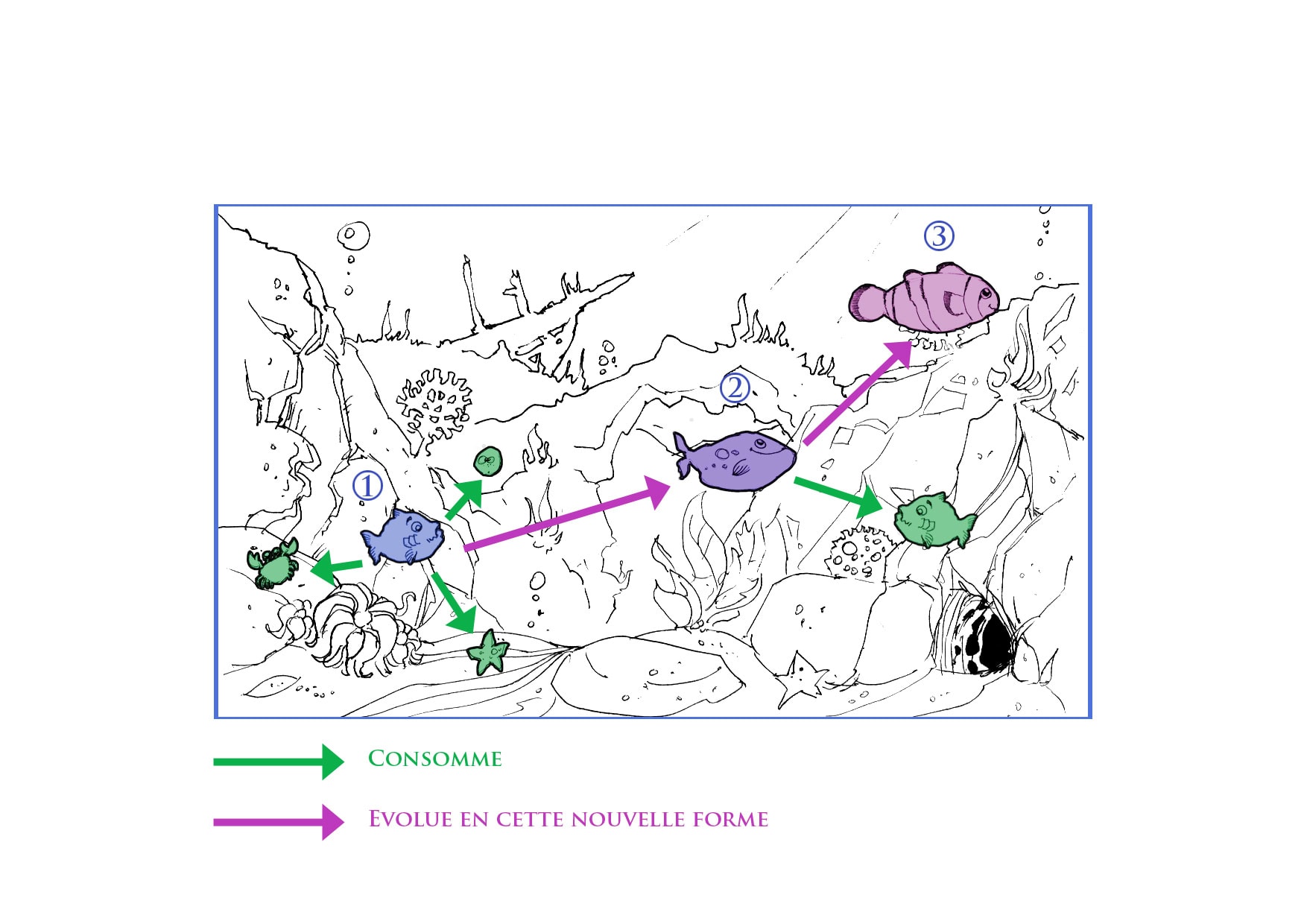
Image Caption Translation :
○ The Player Character Stage 1 is represented in Pale Blue
○ The Player Character Stage 2 is represented in Mauve
○ The Player Character Stage 3 is represented in Pink
○ The Edible Elements are represented in Green
Green Arrow : Consuming action on Target
Purple Arrow : Evoluting action into a new upgraded form
● In addition, we added Traps assets, which were dangerous mobs with a particular AI behavior which could radically change the configuration and balance of the gameplay when they would be present.
● So, in the end, the progressive level design evolution would have started with a tutorial for the PC, where he has to simply eat Food, then bringing in low level NPCs, then High Level NPCs, then Enemies, then Traps. Mixing all these components gave us a grid of progression which was our base to design and balance each level.
● Also, depending of the depth in which the assets were swimming (both PC and Mobs), the swimming speed would have been either normal, halved or doubled. Giving a supplementary parameter to give to the player when devising a survival strategy to win over each level.
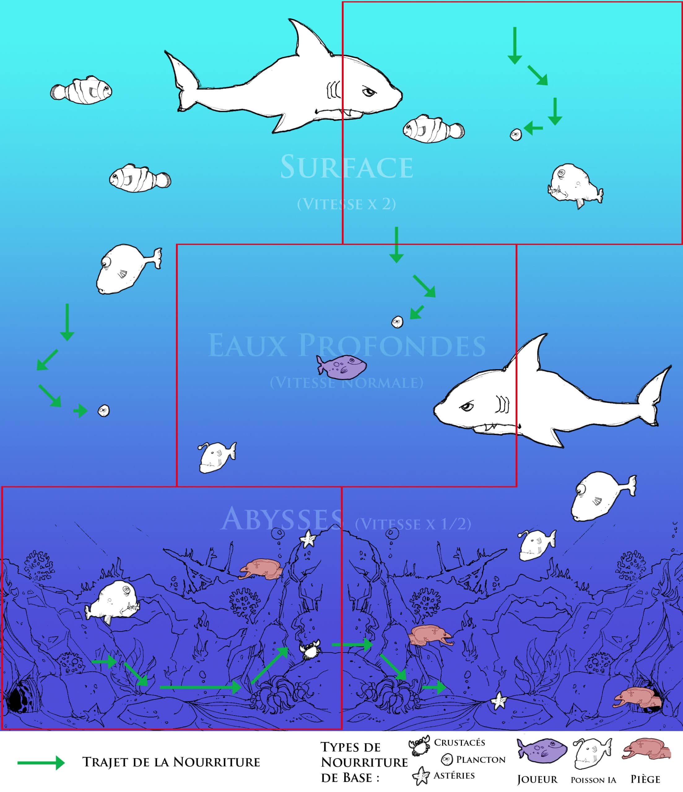
Image Caption Translation :
○ The Player Character is represented in Mauve at the center of the screen
○ The Traps are represented in Pale Red
○ All the other AI assets (Food, Enemies and NPCs) are represented in White
○ The Surface Water Zone on Top Third of the screen doubles the Swimming Speed
○ The Deep Waters Zone on Middle Third of the screen gives no modifier to Swimming Speed
○ The Abyss Zone on Lower Third of the screen halves the Swimming Speed
Green Arrow : Indicates Trajectory of the Food assets
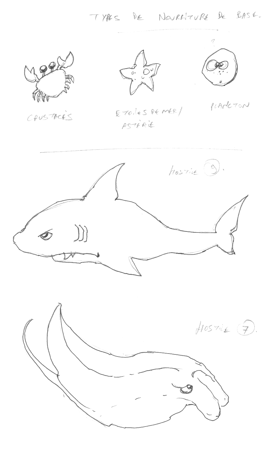
Types of Base Food : Crustaceans, Plankton and Asterias.
● Character Design & Art Direction: “There is always a bigger Fish…”
1: Player Characters
Since the game user had to instantly figure out his character in any given level, whatever his evolution stage would be, we decided the following :
A-He must have his own and exclusive color code.
We opted for an unique combination of Blue and Yellow that would never be reused for any other asset, to avoid confusion with the multiple non-playable assets around.
B-The character must look unique throughout all his “avatars”.
We decided that the PC would have his own sympathetic face along a recognizable feature : a blonde lock of hair that would be present in every stage of his mutation.
C-Each “strength” level must be embodied with a “real life” fish equivalent.
Which makes sense when visually comparing the size and power of each. For instance, the Level 1 fish must be inspired by a tiny, harmless real-life equivalent and, logically, the Level 5 fish must be larger and more imposing. It would be illogical to start the game with a Level 1 big Wolffish and end up with a Level 5 tiny Goldfish…
“Smily” – Player Character 1
“Strippy” – Player Character 2
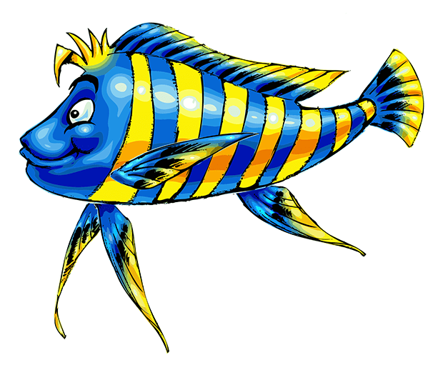
“Moony” – Player Character 3
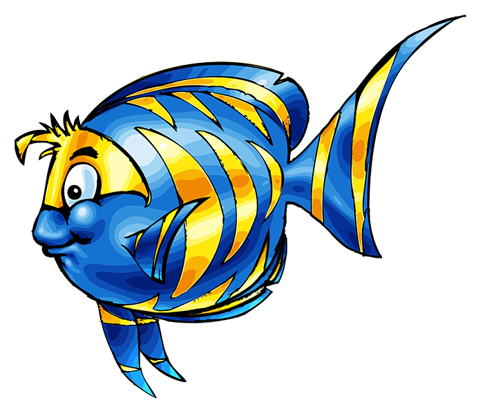
“Spotty” – Player Character 4
“Chubby” – Player Character 5
2: Non-Player Characters
To help the player to sort out Edible NPCs from Non-Edible Enemies I suggested that the NPCs’ types of fish would be the same as the Player Character’s, with the following alterations :
A-All NPC must have different colors.
We wanted the whole game to look bright and vivid, as if we were swimming in a Caribbean ocean ; ergo, even the opponents of the PC must have attractive colors, we cannot give out a grim and dark atmosphere that would contradict the “light and cartoon” feeling of the game.
So, even if each NPC was typically “the dark side” of the PC of equivalent strength, I made sure I used colors different enough from the PC’s color code, but bright enough to make them attractive yet and to sort them out between each other. Only the PC would keep the same color code throughout the game.
B-They must look “grim”…but not too much.
Since we were aiming more at something like “Finding Nemo” than “The Call of Cthulhu”, I came up with a variety of facial expressions which were sticking to the cartoon’s codes… basically “fishes with an attitude” which would be contrasting with the sympathetic look of the PC.
I stretched that principle to some extent when I came to design the Traps, later on in the game, for they should look much more scary and increase the Player’s heart rate…
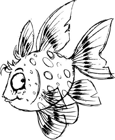
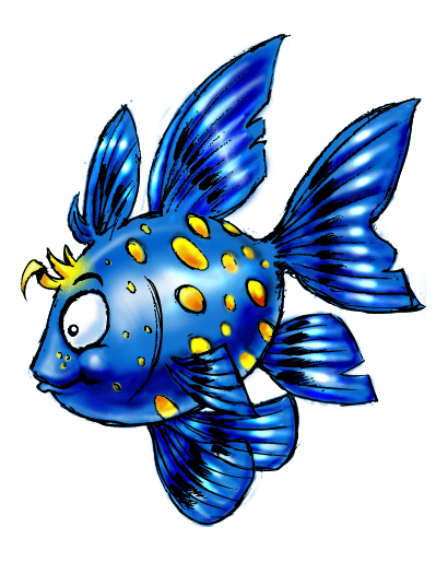
“Grogne” – Non-Player Character 1
“Mmmh” – Non-Player Character 2
“Lil Tiger” – Non-Player Character 3
“Moody” – Non-Player Character 4
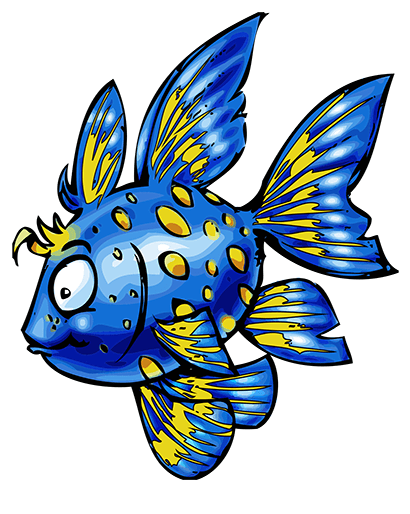
“Bloatty” – Non-Player Character 5
3: Enemies
As aforementioned, the Enemies are the Non-Edible mobs : Level 6 strength opponents that the PC would never be able to eat or overcome, whatever his level of mutation would be. In addition, these Enemies would be able to destroy NPCs as well if they would come in contact with them, thus, it was possible for the PC to lure a NPC or an Enemy into each other if he would be daring and tactical enough. In addition, each Enemy mob would have its own AI behavior depending its type which would add a level of challenge for the PC when dealing with them.
Consequently, since Enemies were supposed to be extremely different in both shape and color for the PC being able to identify them immediately within any given level. The points explained below would be the axes of Art Direction :
A-They must have a radically diferent appearence from the PCs and NPCs.
An Enemy Mob is no longer restrained in shape to “match” any of the PC or NPC appearance, thus I had full liberty to conceive each of them independently of the previous fishes researches or “series” visual connection. I was planning to introduce completely new races of fishes then.
B-They can look “Scary”.
Since these Enemies mobs were supposed to be much more dangerous (for both PCs and NPCs around) I did allow myself to make them a bit scarier than the NPCs and my inspiration stemmed from the predator or poisonous fish types… still treated the cartoon way, nonetheless.
C-Their color codes must be radically different.
Their color codes must be even more different from both PCs and NPCs. Counting back, between the blue/gold combo of the PCs and the 5 different color codes of the NPCs there were then 6 main colors that I could not use or even approach to avoid any confusion between the categories. I had to be careful that any “blue” or “yellow” I would use would be different enough from the PCs, or any “red” I would use would be different enough from Level 5 NPC, etc.
“Barrac” – Enemy 1
“Wolffy” – Enemy 2
“Lampion” – Enemy 3
“Stingy” – Enemy 4
4: Food
Initially, we were planning on 3 types of Food. As far Art Direction was concerned, it needed to fit the following criteria:
● Each Food type must be very small, yet, immediately identifiable.
● Each Food type must have its own simple behavior that the Player would be able to anticipate to develop his own strategy towards food. The appearance of such Food type would then require to reflect this behavior and/or the area of the game surface that it was supposed to inhabit and/or move within.
These criteria being set, we did expand furthermore on the rules set concerning the 3 types of Food that we needed:
A-The First food type.
It would “fall” slowly from surface to bottom throughout all levels of water, allowing the PC to catch it by swimming around the main surface of the level.
It was supposed to have a very basic nutritive value (BNV) as it was the easier to catch and was available over almost the whole surface of the game level. Typically, each stage of mutation the PC would be able to achieve to next level of mutation was equal to : [current PC Level] x 10. The Type 1 food had a BNV=1. Meaning a Level 1 PC would need to eat 10 Level 1 foods to achieve mutation to Level 2.
The most logical choice for Type 1 Food was then a Plankton: a small shape falling slowly, yet floating erratically horizontally sometimes, throughout water from surface to bottom.
B-The Second Food type.
This one would stay completely still to make it easily accessible for the PC. Yet, it was placed in an area which would make its access more perilous than for Food 1: the difficulty to access it would lies in the fact that it would be concentrated exclusively on the bottom of the ocean (eg : the bottom of the screen).
That area would be more dangerous than the surface or middle waters since the speed of the PC was halved there and Traps/Enemies would be more present (see “Traps” below).
To illustrate that balance between easy access of a stilled Food with a dangerous area in which that Food would be set, we gave to Type 2 food a BNV of 2. Meaning a Level 1 PC would need to eat 5 Level 2 foods to achieve mutation to Level 2.
The most evident choice for Type 2 Food was then a Starfish: an immobile small shape set at the bottom of the ocean. We were aware that Starfishes normally move, yet very slowly, but we decided that these kind of Starfishes were somewhat too asleep, lazy or under illegal substances to even move around…
C-The Third Food type.
It would move quicker and more erratically than Food 1. Being able to move back and forth within the most dangerous area of the game, which is, once again, the bottom of the ocean.
The Type 3 food had a BNV=5 as it was the most dangerous kind of Food to be caught. Meaning a Level 1 PC it needed to eat 2 Level 3 foods to achieve mutation to Level 2.
The most evident choice for Type 3 Food was then a Crab: a small shape being able to move slowly, then very quickly, before suddenly changing its direction without a warning, over the ocean bottom’ scenery.
It is important to note that each type of Food would disappear after some time, whatever its type would be. E.g.: Plankton would disappear when it would reach bottom of map, Starfishes would fade away after some minutes of existence and Crabs would go off map once they would have reached one of its borders.
5: Traps
The last type of Mobs we designed would be the most dangerous one: Traps. The gameplay difference between Traps and other types of mobs were as follow:
● The Traps would destroy anything they touch: whether they be PCs, NPCs or Enemies, whatever their strength would be. If it would happen a Trap would hit another Trap, they would mutually destroy each other.
● The Traps would appear according certain circumstances and/or would trigger their own events or set of changes in the gameplay.
According these criteria, we came with two different Traps, based on the most iconic sea predators:
A-Mooray Eel Mob.
It would inhabit exclusively within the small caves set at the bottom of the ocean. It would not exit completely from its cave but would rather spring out from its starting point like a coil spring, devastating everything in its path before slowly coiling back to its lair.
The AI behavior was supposed to trigger the Mooray Eel with various stimuli: a PC/NPC of a certain strength coming too close, if there were too many Food types around, etc. That behavior would change randomly during the game level, thus making the Mooray Eel Trap highly unpredictable.
B-Shark Mob.
This one would swim randomly across the whole game map, destroying everything around for some time before leaving the map. As for the Mooray Eel Trap, its AI behavior would change randomly during its appearing : sometimes he would loiter “gently” around, sometimes it would chase in turn PCs, NPCs or Enemies, etc.
We also set the gameplay for the appearing of the Shark Trap instantly make Enemies and NPCs alike to move away from it… resulting, sometimes, in a tricky situation for the PC in a map where all the Mobs flee in a radiating and centripetal pattern, away from the Shark’s path.
From here, the AD was quite easy: make these assets the bigger and/or scarier of them all… learn more on Traps on their individual descriptions below.
“Moris” – Trap 1
“Sharky” – Trap 2
Part 2 : Concept Art
● Concept Art – Mockup Stage
On this stage, the point was obviously not to come with finished graphic assets but to sketch up and create very rapid roughs to concretize our ideas and show them to the production manager. The initial reaction on such or such character’s mockup is essential to know which direction is to be adopted and developped further and which one is to be dropped.
Beyond Art Direction, having participated to all the components of the game in terms of Game Design, Level Design, UX/UI and Character Design, I came up early with some ideas that I cast as is on the paper to use them as a base of discussion with both the manager and the team. A few examples are displayed below, each mockup being like 5-10 minutes each as you cannot lose too much time on the details and have to go straight to the essential.
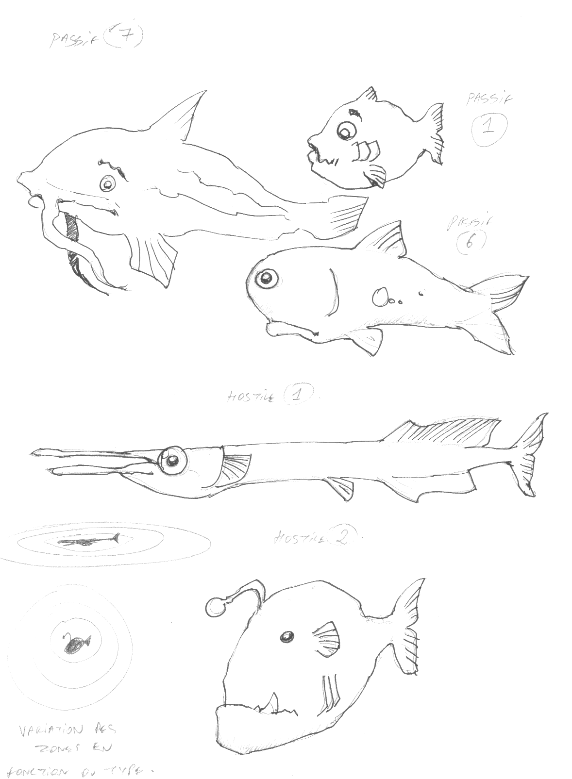
Mockups Drafts 1
Mockups Drafts 2
Mockups Drafts 3
Mockups Drafts 4
Mockups Drafts 5
Mockups Drafts 6
Mockups Drafts 7
● Concept Art – Research Stage
Once the initial directions of each and every asset of the game has been approved on the previous stage, I went with some more elaborated sketches to go further into details and overall cartoon style to confirm if that kind of Character would still work when taking into account the final animation stage. Considering the animation process on the early stage of then production helps to figure out in advance the complexity of the task and when to renounce to a “cool looking” character because its level of details would be too much time-consuming when going onto the animation phase.
On the other hand, the dialogue with both the manager and the team is essential as, sometimes, we would keep some complexity into such or such asset nonetheless because it would be a definitive “cool factor” that would enhance the overall attractiveness.
Balancing a good ratio time/production without sacrificing the quality of the game is what is essential in Art Direction.
The PCs and NPCs started to have their own personalities, please consider a few examples below and meet, in order, “Bloatty”, “Elvis”, “Lil’Tiger”, “Sharky”, “Mmmh”, “Scala”, “Grogne”, “Orfi”, “Lampion”, “Moony”, “Blubby” and “Smily”.
Elaborated Sketch 1 – “Bloatty”
Elaborated Sketch 2 – “Elvis”
Elaborated Sketch 3 – “Lil’Tiger”
Elaborated Sketch 4 – “Sharky”
Elaborated Sketch 5 – “Mmmh”
Elaborated Sketch 6 – “Scala”
Elaborated Sketch 7 – “Grogne”
Elaborated Sketch 8 – “Orfi”
Elaborated Sketch 9 – “Lampion”
Elaborated Sketch 10 – “Moony”
Elaborated Sketch 11 – “Blubby”
Elaborated Sketch 12 – “Smily”
● Concept Art – Final Stage
1: Player Characters
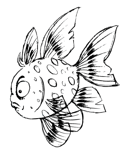
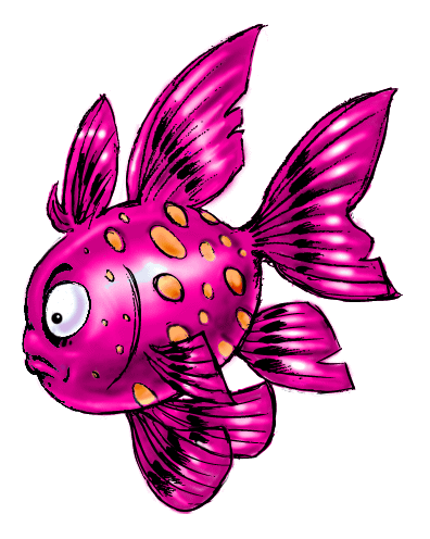
Player Character 1 – “Smily”
The different stages of the Concept Art
(Click to enlarge each picture)
Even if the initial direction was approved, the final stage of the character has yet to pass the final test of pre-game ; that includes a simulation in a simple background with a simple engine to see how each asset interact and relate to each other. Initially, “Smily” was our Level 1 base PC, the base of “evolution”. He needed to be quite small and simple, hence his initial simple shape which would prevent that too much animation over his body would blur the comprehension of the character because of his small size.
Yet, even if the initial model design was working, we chose to refine the character to make it more like a goldfish and I worked with another senior artist until we finally got the correct model with his “sympathetic” added value overall look.
In the end, every model was supposed to have all his fins and tail being animated, we finally managed to have a good compromise between outlook and animation functionality. I finished the coloring and vectorized the whole, adding more yellow to the fins to have their movements more easily spotted and voilà, our final Level 1 PC was ready !
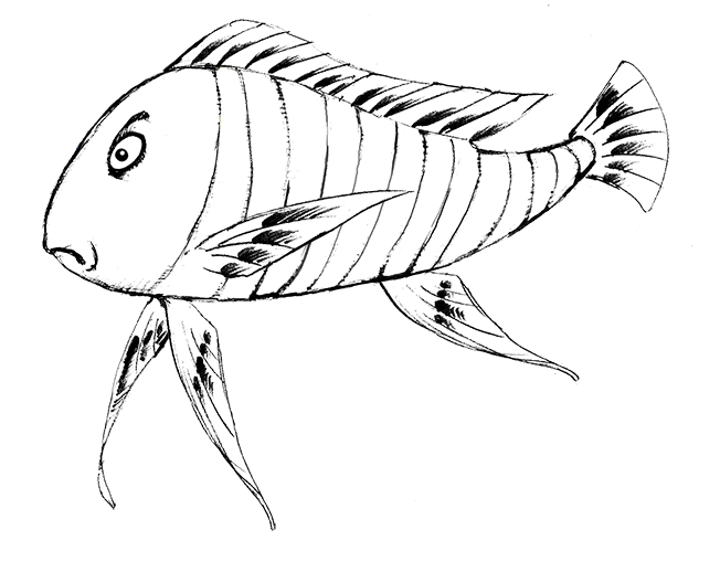
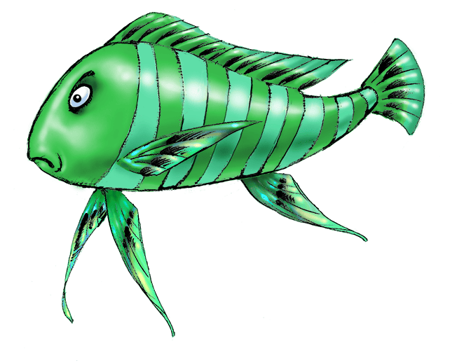
Player Character 2 – “Strippy”
The different stages of the Concept Art
(Click to enlarge each picture)
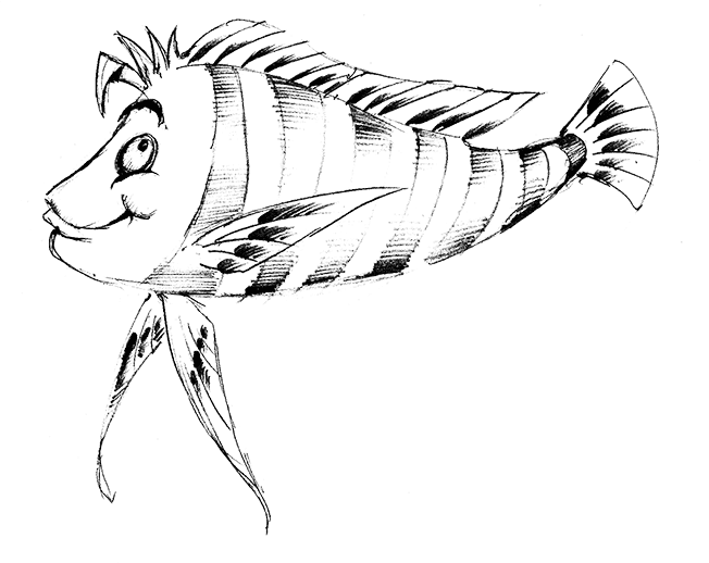
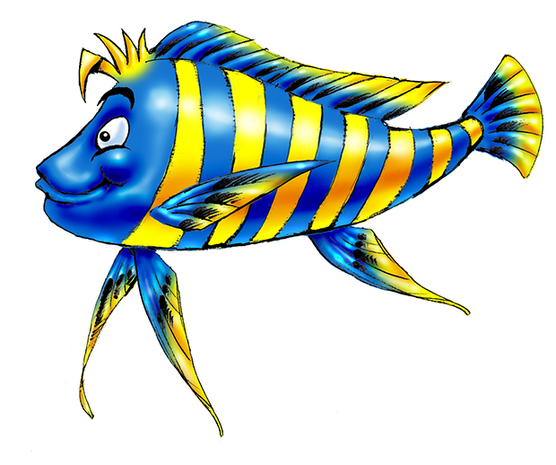
Initially, Level 2 PC was supposed to be a small fish like an angelfish, just the size above the initial “Smily” character. Though, since our Level 1 PC had his design changed to something more substantial, we could not keep this direction as the chance of confusion between the two different stages characters would be too high.
Thus, I reworked the whole concept to propose something more elongated and less spherical as a shape, integrating the features of different fishes : mixing altogether elements from a carp, a codfish, a cichlid and an imperial arowana to end up with something radically different from PC Level 1. I added some stripes to increase even more the difference with the spots of “Smily”, which led me naturally to baptize him “Strippy”.
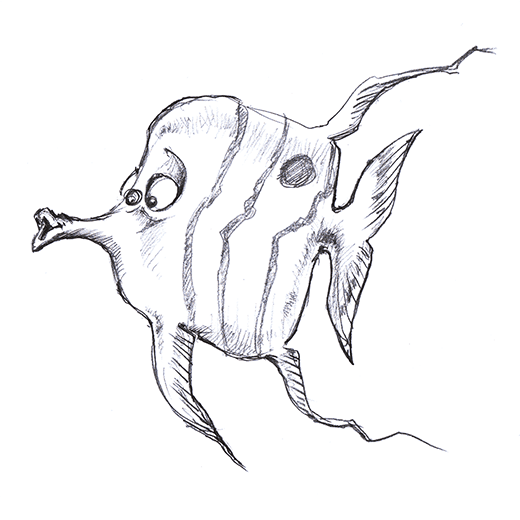
Player Character 3 – “Moony”
The different stages of the Concept Art
(Click to enlarge each picture)
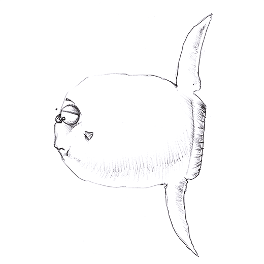
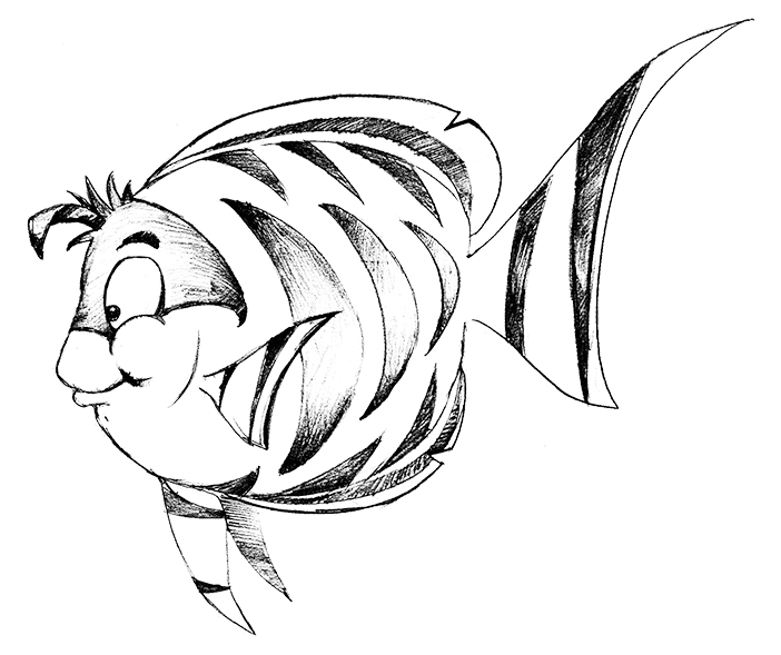
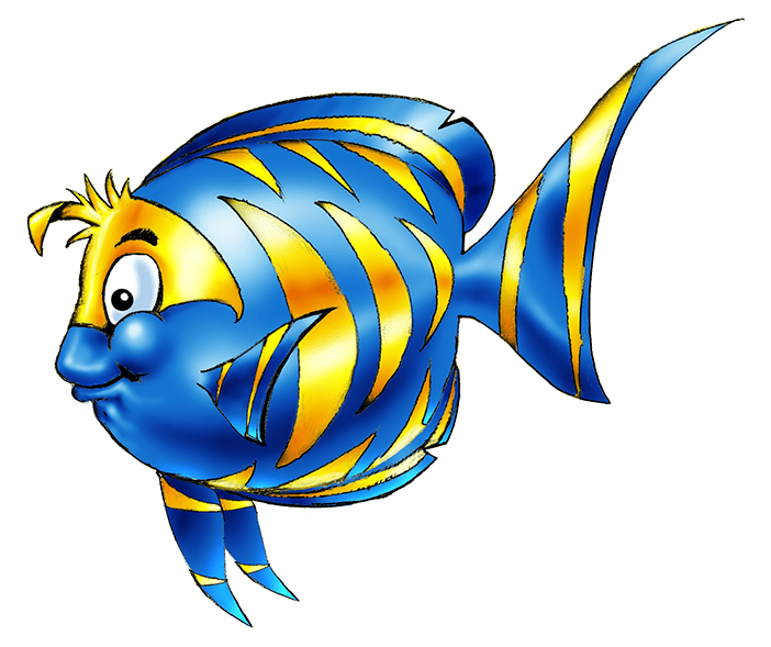
Going along the principle of changing radically each PC’s shape with each mutation, I initially gave to Level 3 PC a disk shape, much chubby, to indicate that the player was starting to have a consequent power in the food chain. “Smily” was a little sphere initially, but his fins were enough to distinguish him from a mere ball, yet the initial design of the Level 3 PC was not refined enough to make him an original character. Consequently, I modified his initial design as a sergeant major fish or a flame angel fish to go more toward a kind of moonyfish or a sunfish.
The idea was to have a neat round shape for the body with neat defined shapes for the fins, to avoid any confusion with “Smily”. I wanted to keep the tiger-like stripes from the sergeant major fish but made them different enough from “Strippy” to avoid any confusion. And “Moony” was born.
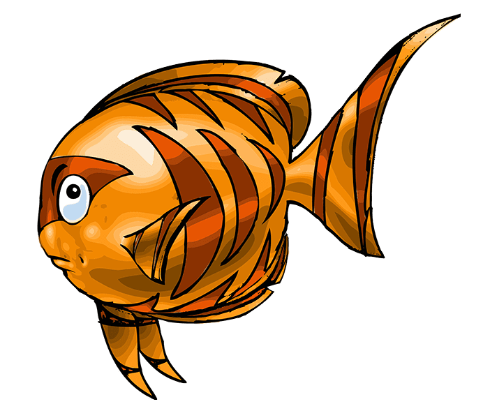
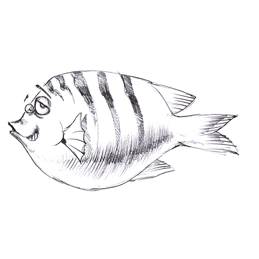
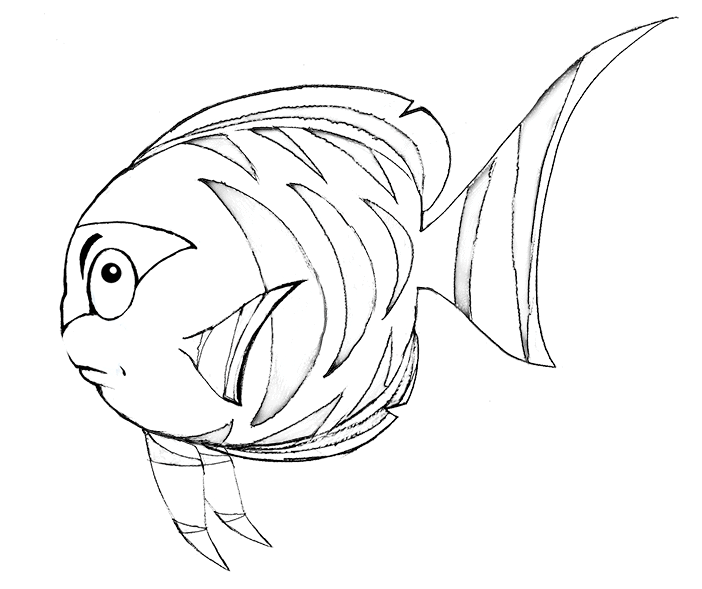
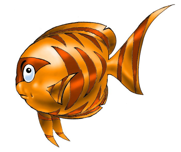
Player Character 4 – “Spotty”
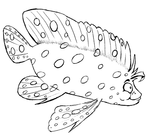
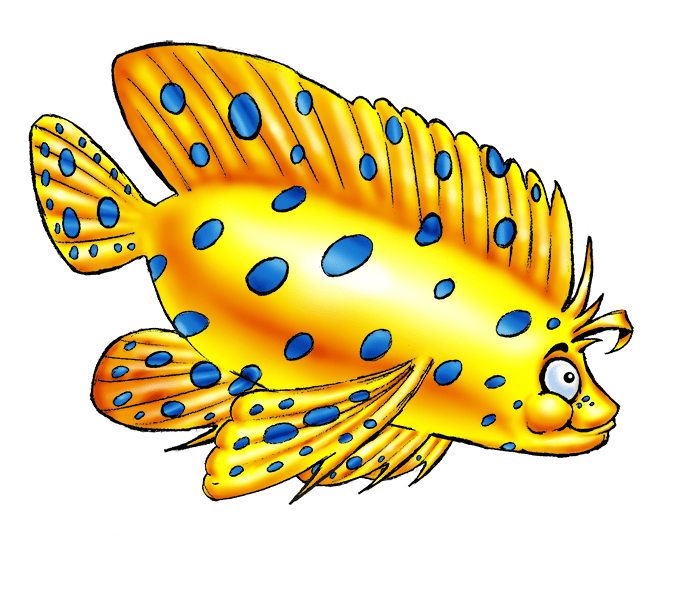
The different stages of the Concept Art
(Click to enlarge each picture)
The initial name of this Character was “Blubby” and he was loosely inspired by some form of not-too-scary humpback anglerfish, to symbolize that the PC was now pretty menacing to all the other mobs. I totally dropped that idea and, even if I managed to make him look sympathetic, his appearance was too weird and spooky to be kept in line with my own art direction ; I needed something big, yes, but still with the flourished appearance of surface fishes, and leave all the “alien-looking” fishes of the abyss for villains and enemies. That would add a visual help to the Player to sort out the “good guys” from the “bad guys”.
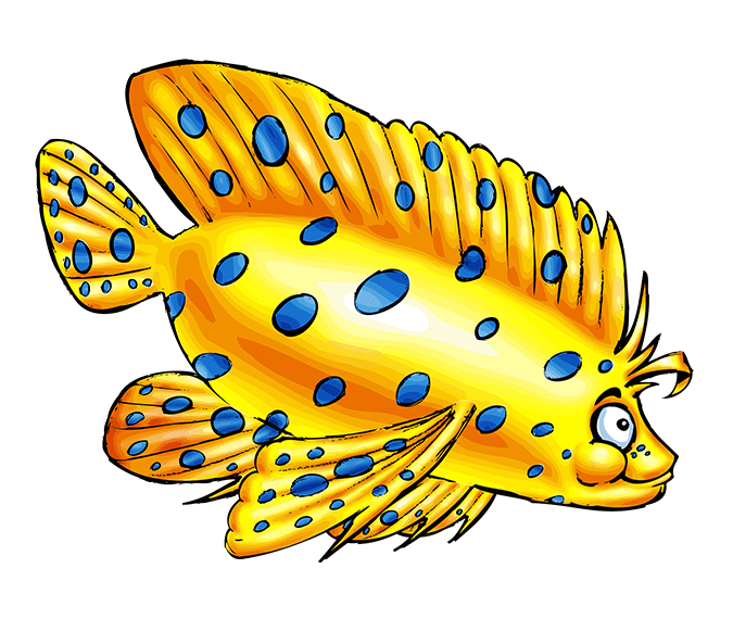
Thus, I chose to go with something more elegant, as a reward for all the efforts the Player had to get through, and designed a fish based on the Betta Siamese fish and the Mandarinfish. The large elaborated fins and his particular body shape would make something definitely different from all the previous stages of the PC. I deliberately inverted the color code to make the yellow prominent and keep the blue as pattern, as an allusion to the initial spots of “Smily”, hence the final name of “Spotty”. The dominant yellow color was also there to give the player a “gold reward” effect.
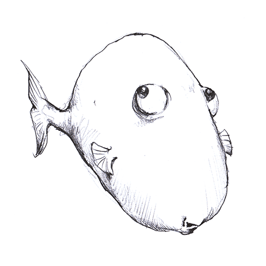
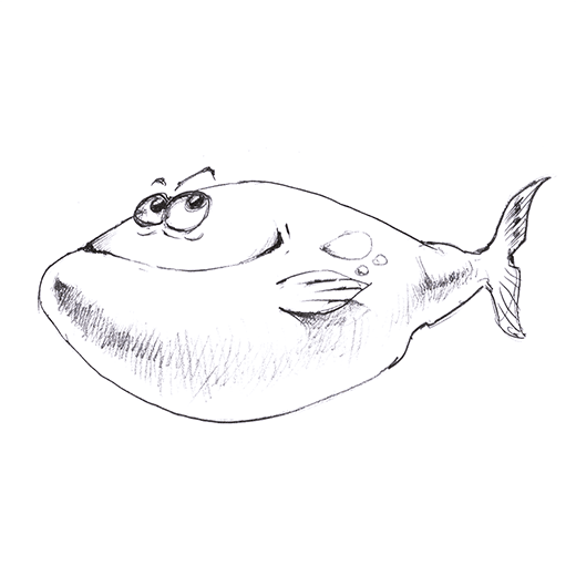
Player Character 5 – “Chubby”
The different stages of the Concept Art
(Click to enlarge each picture)
For the ultimate Level 5 PC, I wanted something really imposing and massive to give the player the feeling he was now (almost) dominating the food chain and eventually evolved into some kind of predator himself. Yet, as always, I needed to keep the “sympathetic” look and not make him a kind of horrible, devouring monster.
On the elaborated sketch phase I planned to make him a globefish which would inflate while swimming, but I dropped the idea as the animation would be too confusing for the player, especially that a size change while playing could severly impair the PC if he needed to tactically swim between a group of opponents…
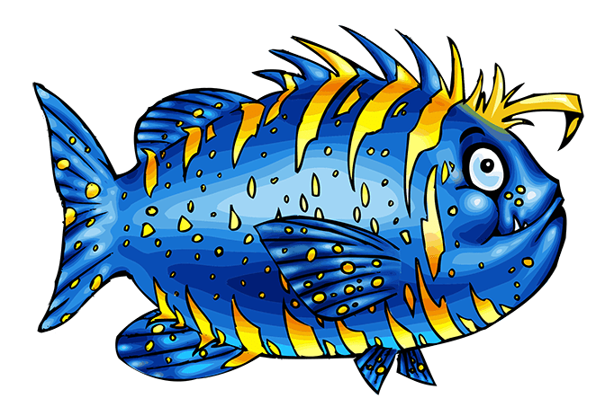
Ergo, I kept the “massive and fat” idea to apply it to a “cool-looking” wolffish ; basically the good natured “Chubby” guy that you still don’t want to mess up with in a bar… The proportions of the wolffish were ideal to keep his fins range to a minimum, thus enabling the player to focus essentially on his basic shape mass when moving without being concerned about big fins confusing movements or sudden shape/size changes.
2: Non-Player Characters
Non-Player Character 1 – “Grogne”
The different stages of the Concept Art
(Click to enlarge each picture)
The first NPC mirroring our Level 1 Player Character Hero. Remember that the NPC mobs, contrarily to the Enemies and Traps mobs, can be eaten by the PC, provided this one is of Level strictly above the one of the NPC (Level 2 PC can eat a Level 1 NPC, etc…). Therefore, the model base used for the NPCs must be the same as for the PCs for their strength level to be clearly identified by the Player ; yet, they must have a completely different color code to avoid any confusion with the PC fish character.
Once all the final shapes of the Player Characters have been determined and validated, it was quite easy to apply colors different enough to the NPC, as much as a “grim, grumpy” face expression to these baddies.
That is why I baptized the first Level 1 NPC “Grogne” (“To Growl” in French) to emphasize that matter of fact. I chose a vivid magenta pink/bright orange combo to make him a clear opposite to the blue/gold color code of the PC line.
Non-Player Character 2 – “Mmmh”
The different stages of the Concept Art
(Click to enlarge each picture)
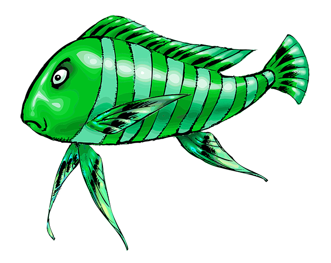
When we came to that Level 2 NPC, I finalized the pale green/dark green combo fast enough. We just had a moment of latency before giving him a name.
I made a small brainstorm session with the creative staff, discussing about the “personality” of that green fish. For some reason, I designed him as looking quite haughty and arrogant, the “fish with an attitude” kind of character who looks down on you with a despising “Mpf…” comment.
For the time of the session I was trying to voice out his personality to the staff by mimicking his face while saying “Mmmh” (as in “Mpf! You are SO inferior…”) whereas everyone around was saying “Mmmh” as well, unsure about how to eventually name him (as in “Er… Mmmh… how to name that guy… Mmmh… let’s think about it … Mmmmh…what to find…Mmmh…”).
So, in the end, we all agreed to name him “Mmmh”.
Player Character 3 – “Lil Tiger”
The different stages of the Concept Art
(Click to enlarge each picture)
For the “dark side” of “Moony”, I already had his name and colors in my mind since quite some time. Actually, when I designed the tiger-like stripes of “Moony” to distinguish him enough from his previous avatar, “Strippy”, the idea of a little, sympathetic tiger went into my mind. But since I wanted to have a form of consistency with the PC names-which are all ending in “-y”- I did not want to name the PC “Lil’ Tiger”, so I saved it for his NPC equivalent.
Starting from that point, the orange/brown color code alluding to the tiger was an obviousness.
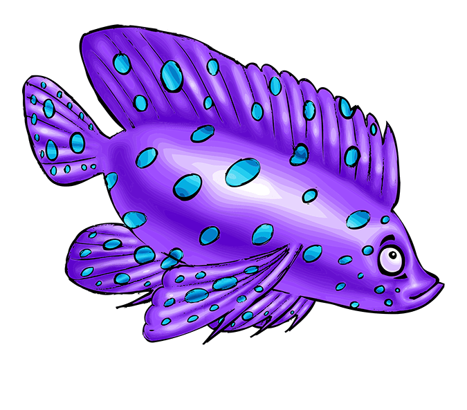
Player Character 4 – “Moody”
The different stages of the Concept Art
(Click to enlarge each picture)
Since PC Level 4 “Spotty” was so bright, beaming and shiny in his bright yellow golden skin, I used the opposed, complementary color for his counterpart and therefore used a light violet/mauve for the base color and a light blue for the spots ; the spots pattern needed to be of a relative light hue to not give the impression the mobs had “holes” all over his body.
And since “Spotty” was so smiling and bright, the idea of a sullen, depressive fish led me naturally to the “Moody” name.
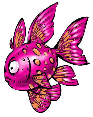
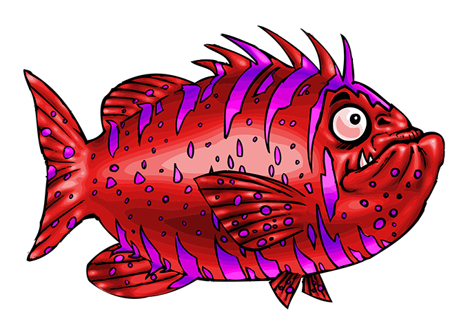
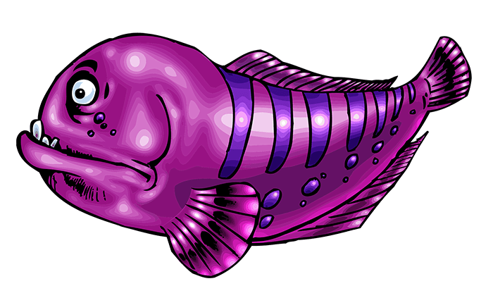
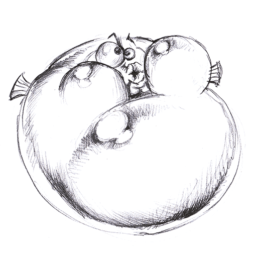
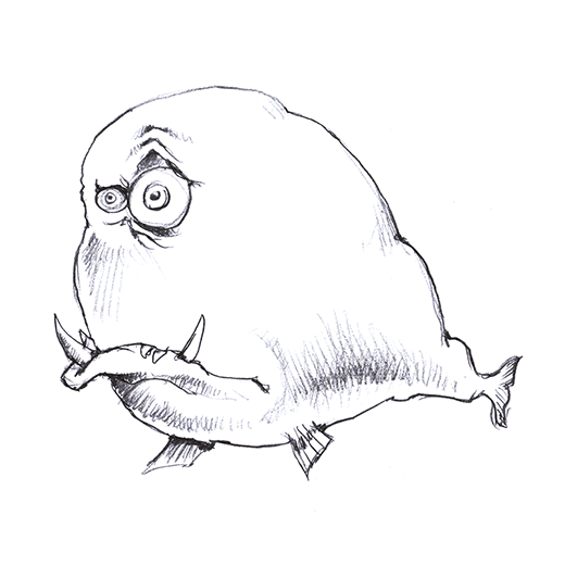
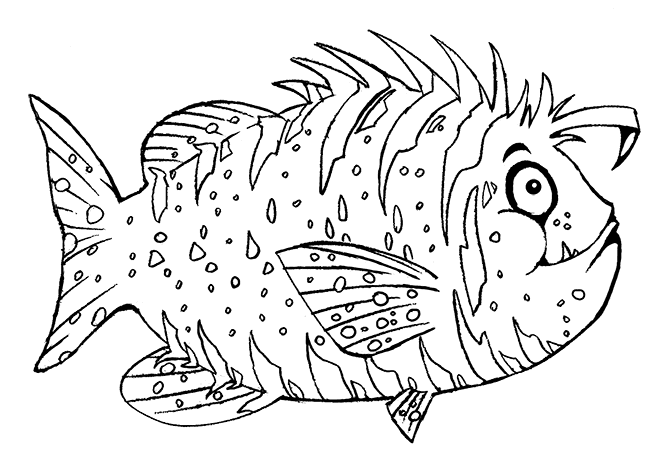
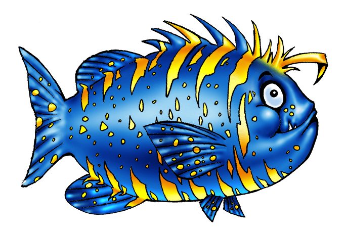
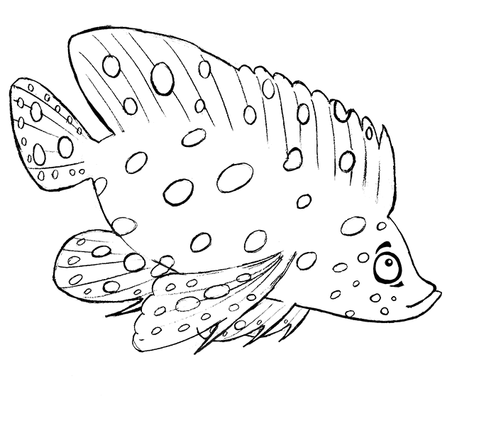
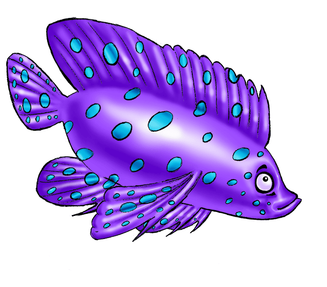
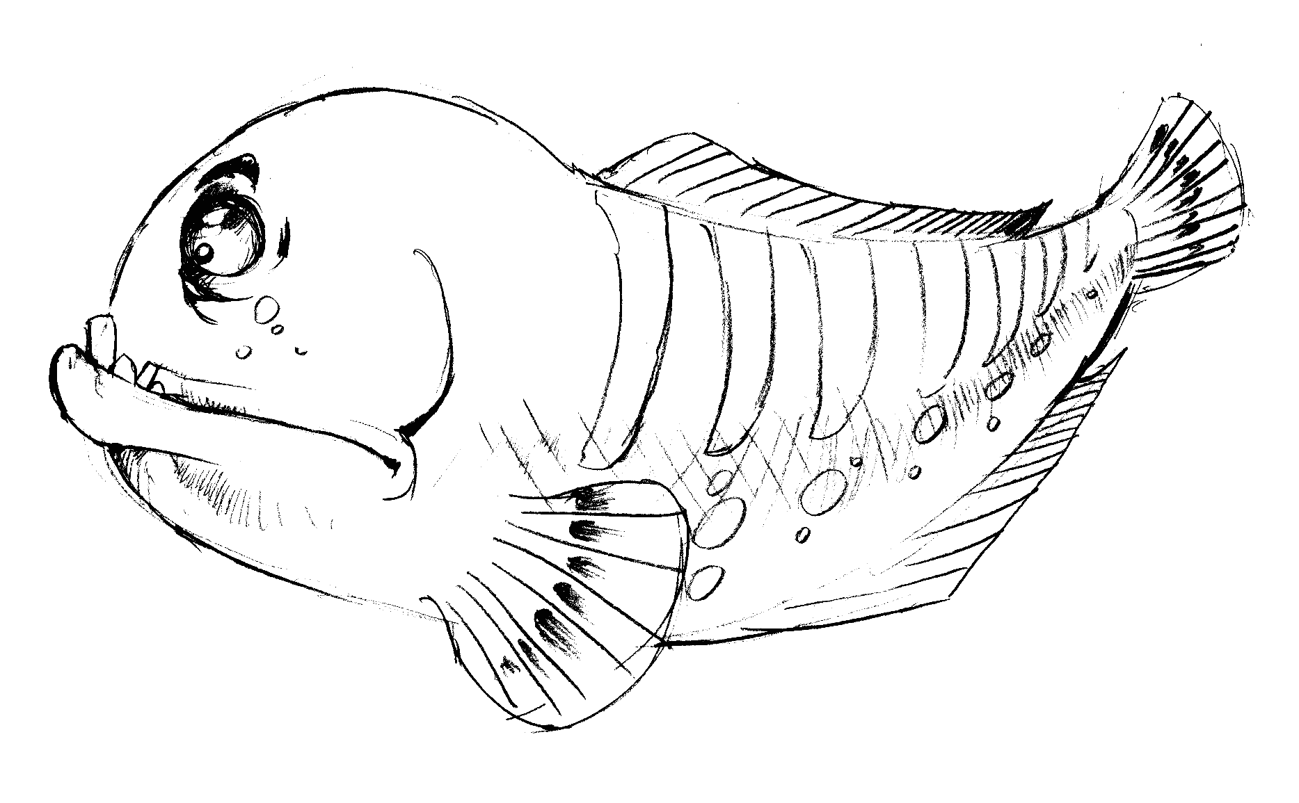
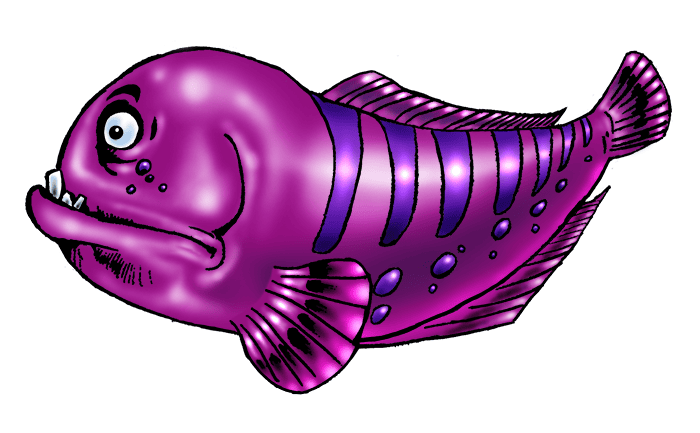
Player Character 5 – “Bloatty”
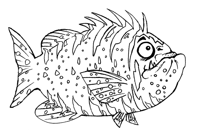
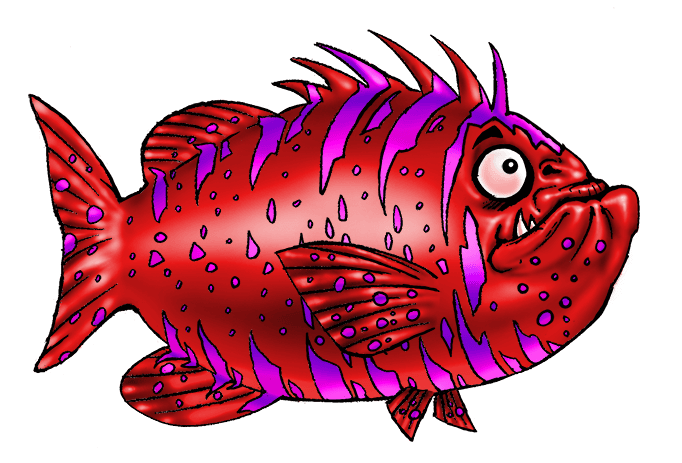
The different stages of the Concept Art
(Click to enlarge each picture)
As NPC Level 5 was the strongest NPC opponent, he needed to be designed as being quite dangerous at first glance and immediately identified as such through both shape, color and expression altogether. Hence, I saved the use of bright red color for this very character, even the bright pink color of the stripes were there to make a “shimmering” effect, a “red flash warning” of sort to tell the Player : “Warning! Big danger ahead!”.
And “big and nasty” was the very idea behind the design of this character, I really wanted to give out the dangerous Wolffish feeling with this one, even if Wolffishes are not really of that color. Red color in the animal world always indicate a form of impending danger and I used that idea for “Bloatty”… Therefore, I allowed myself to give into the process that I did cast aside for “Chubby” and, indeed, designed a kind of horrible, devouring monster- all-bloated and ever-hungry, ergo the “Bloatty” name.
The bright pink stripes are small enough to not confuse the reading of the shape, yet they “flicker” enough to enhance the dangerous feeling while still keeping the cartoonish, lighthearted concept of the game.
3: Enemies
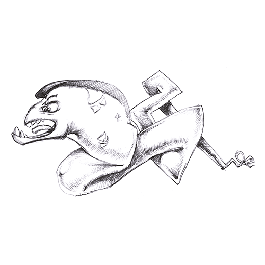
Enemy 1 – “Barrac”
The different stages of the Concept Art
(Click to enlarge each picture)
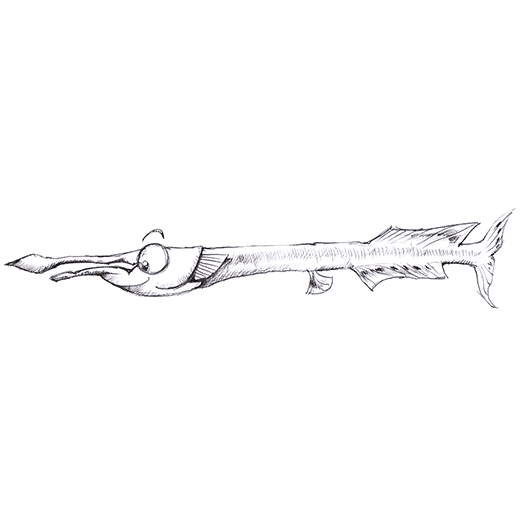
We needed one of the Enemy to be of the “fast seeker type” : a Mob which would be able of sudden burst of speed towards the PC when this one would come in its zone of detection. Initially, that type of Enemy was fitting perfectly a Garfish -temporarily named “Orfi”, since “Orphie” was the French name for this fish.
Later on, I realized that the proportions of this fish were posing a problem: it was very thin and narrow with not much surface to design or animate, as much as its face was too small for the proportions of the game. Consequently, I entirely dropped its design to create a Mob from the Barracuda fish instead : it had the same speed allure and profiled look, plus the added value to look more dangerous than a garfish. I added some “zigzag” pattern over its body to evoke a kind of “quicksilver” symbol, as if it was the speedster of the oceans.
Therefore, “Barrac” was created. And before you ask, no, it has nothing to do with Barrack Obama…
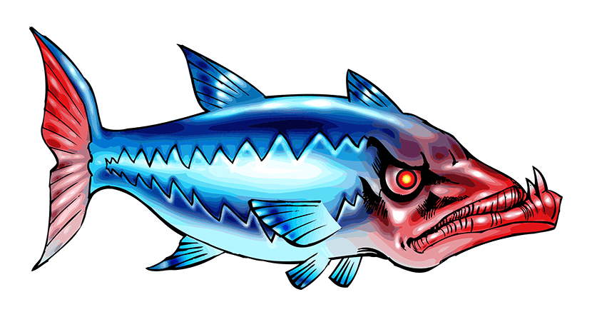
Enemy 2 – “Wolffy”
The different stages of the Concept Art
(Click to enlarge each picture)
PCs and NPCs Level 5 were already derived from the “Wolffish” type of fish; yet, I surmised that I did not used all the aspects of that very interesting, massive fish and I wondered if I was being able to create another Wolffish type without confusing it with the PC/NPC sort. I then focused on its “grudged” expression that I enjoyed creating on the elaborated sketch stage.
Focusing more on its facial expression than its massive body, I used a violet color as an allusion to the colors of both Level 5 PC and NPC. This Mob had the most erratic AI behavior of all the enemies : the algorithm was cycling regularly between the 3 other types of Mobs’ AI; ergo, it could be sometimes a “seeker ” as “Barrac”, a “voracious” as “Lampion” or a “curious” as “Stingy”, making it a very unpredictable kind of Mob.
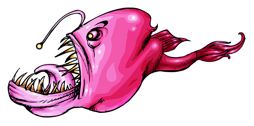
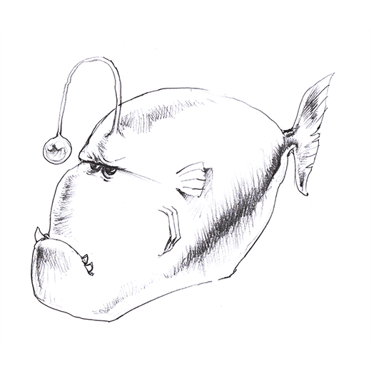
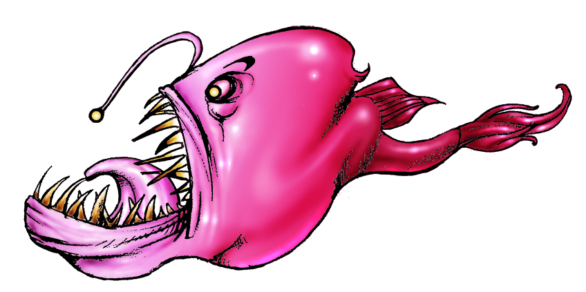
Enemy 3 – “Lampion”
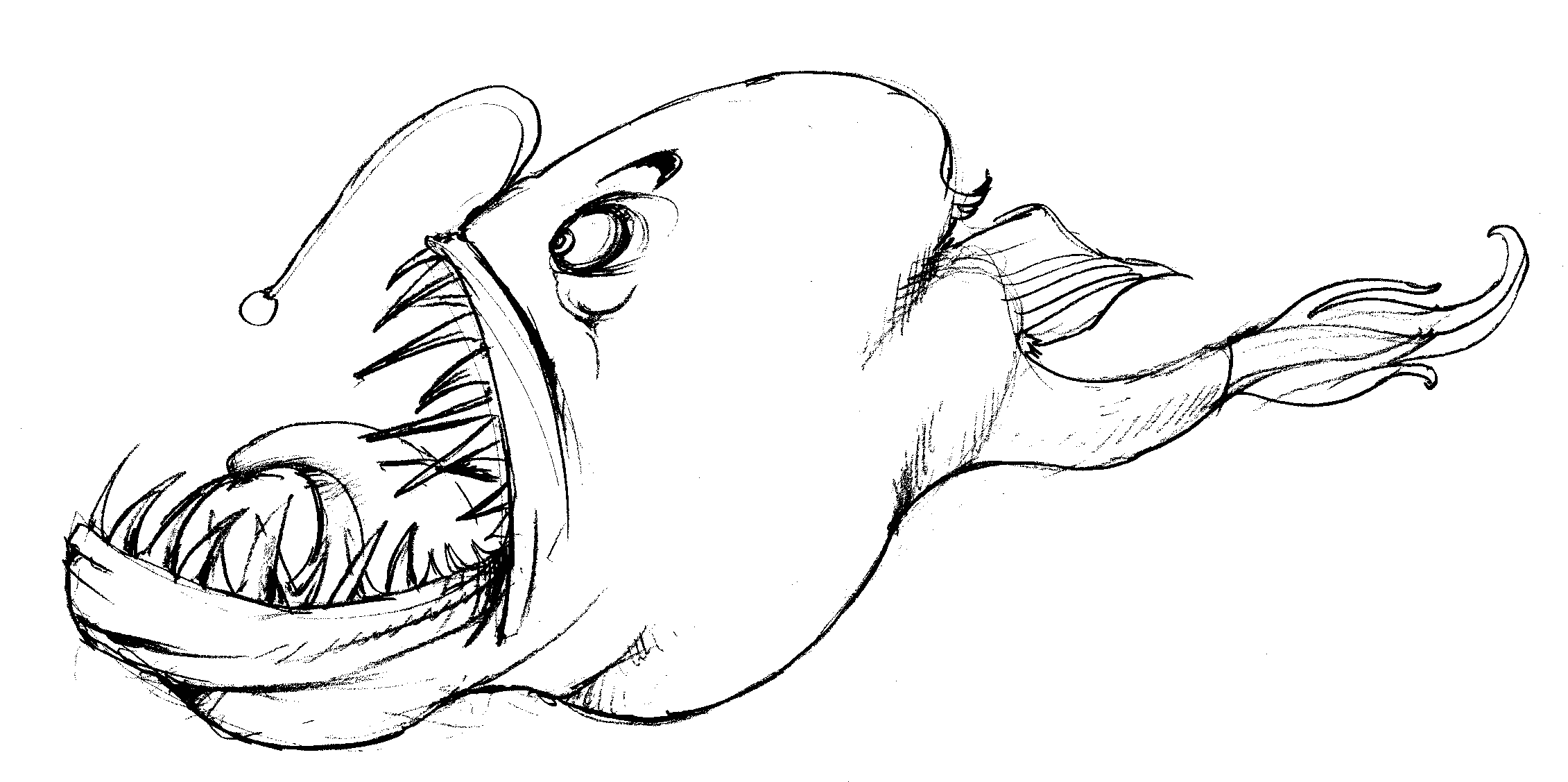
The different stages of the Concept Art
(Click to enlarge each picture)
As the production was progressing, I realized that I did not have an “abyssal fish” yet and I really wanted include one in the game, since their shape, colors and overall aspect is so weird and bizarre ; plus, the fact that one of the area of the game map was called the “abyss” (the lowest one, logically…) it was just making sense to have at least one of them. If I could, I would have added much more of abyssal fishes but the production manager told me that we already reached the maximum amount of fishes that we were supposed to include and he was satisfied with all the design of the actual fishes…. Too bad… perhaps in a future expansion.
It was difficult to choose amidst all the wonderful abyssal fishes that do exist, but I finally opted for an Anglerfish as it had the most delirious variations leading to something both scary and completely bizarre in design.
I took the obverse option of the “dark colored” abyssal fish as this opponent was scary enough in its design, so I colored it bright pink to tune down a little bit its scary appearance, as much as to make it looking weirder even.
Its AI was the “voracious” type : meaning he had a very short detection zone, but a very large aggression zone, eg : as soon it was detecting a PC it was chasing it for quite a long time, making it an opponent quite hard to get rid off once it spotted you.
Its name came to be “Lampion”, as it means “Paper Lantern” in French, alluding to the little light topping its fleshy “stem” used to lure preys in darkness. As soon the PC was spotted and “Lampion” was starting its pursuit, that light was supposed to blink constantly for as long the PC was kept as a target. A fish-warhead of sort, so to speak….
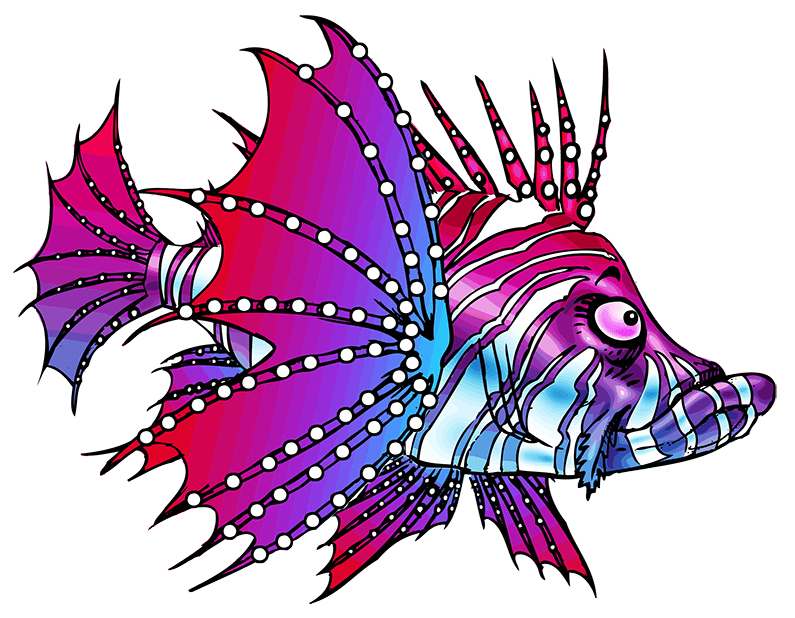
Enemy 4 – “Stingy”
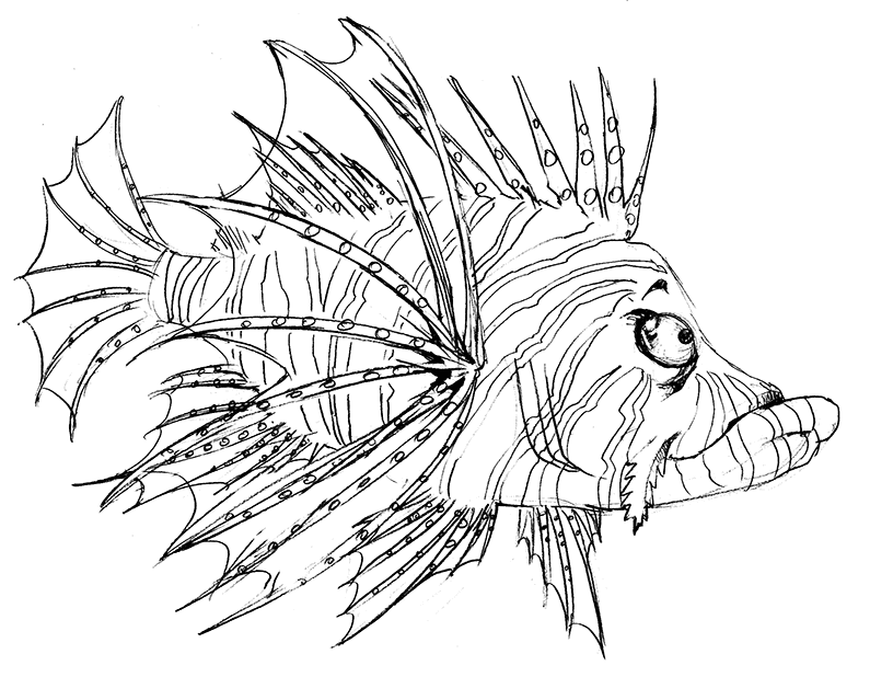
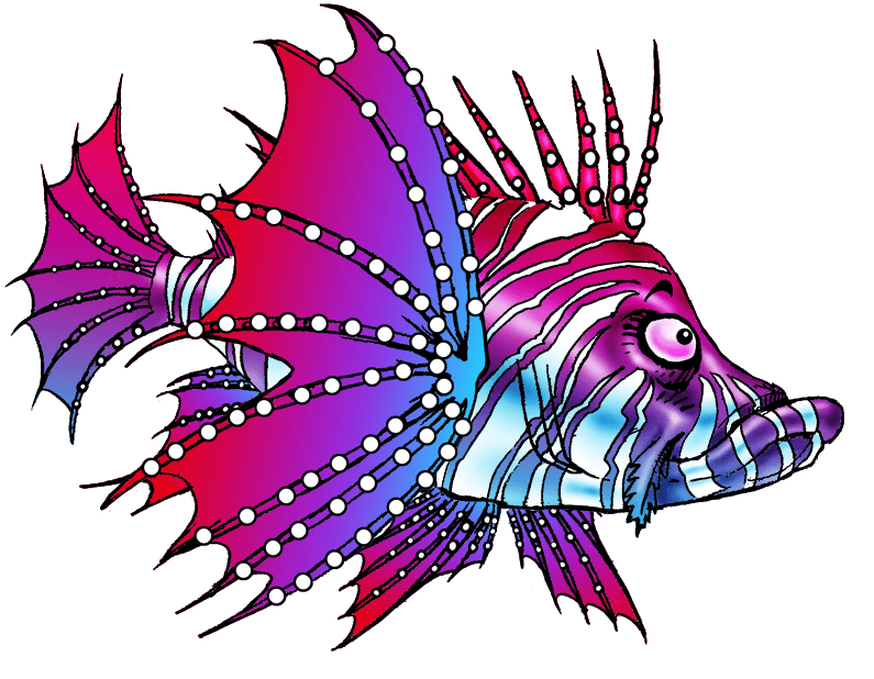
The different stages of the Concept Art
(Click to enlarge each picture)
For the last Enemy, I really wanted something flamboyant ; a form of “beauty of the devil” opponent which would reflect the gracefulness we can see in some Caribbean fishes, despite their dangerousness. And since the last AI behavior was of the “curious” type, something as beautiful and as poisonous as the Lionfish was completely appropriated.
I did many researches and tried many different designs before coming to the final form. Since “Stingy” was bearing many colors, the difficulty was double : I had to harmonize these colors in a way which was not making the model to be confused with another Mob; also, I had to be sure that the stripped pattern was not preventing the overall shape to be deciphered, yet paying homage to the Lionfish’s elaborate appearance.
Eventually, I came with this base of pure white, enhanced by this blue-purple-magenta gradient streaks. White color having not being used yet, it was completing efficiently the totality of the color palette used thus far, the gradient being used within the same range of colors it was neither too flashy or incongruous to not blur the shape. For the gradient, I purposefully used the blue tones on the lower parts and the red ones on the upper parts, since it was linking visually the shadowed bottom part of the model with the darker parts of the bottom map and the reddish ones with the surface and, consequently, the sunlight.
Initially, I wanted its fins to have some transparency, but it was consuming too much of the game’s engine rendering process to display it and I finally made them opaque, it was unjustified to cripple the rendering speed of the game for just one model.
The “curious” type AI granted “Stingy” with a large “detection/attraction zone”, meaning that he could detect the PC from quite a long distance, gently loitering towards him but not “attacking” before he was really in close contact, to balance things even. Basically, “Stingy” was relatively easy to avoid most of the times… Provided you keep him constantly at the corner of your eyes, making his presence in a level map a very pestering one, tactically speaking.
4: Food
Food 1 – “Max”
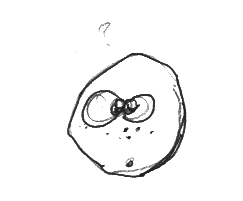
Early concept sketch
(Click to enlarge )
Since all Food Mobs were the tiniest ones, I could not overload them with a lot of details. The “plankton” type 1 food was just a small green ball with two blinking eyes, seeming to say : “What am I doing here?…”. I used a matching colored outline for all the Food types, as their small sizes would have blurred or smeared their respective colors if they would have been outlined black ; they needed to be spotted and identified by their colors immediately despite their tiny size.
Of course, I named that Plankton “Max”, related to a deplorable wordplay on “Max Planck” and his work on the smallest scales of the quantum theory. Ergo, a “Max Plankton” particle having the smallest “scale” of the Mobs sounded appropriate for a game about fishes…
There has been a special “easter egg” or “perk” hidden rule stating that if the PC would reach Level 5 mutation exclusively by eating plankton, a quantum superpower would be triggered which would shrink all the NPCs, Enemies and Traps of the game to a plankton size, allowing the PC to eat all of them, regardless of their nature or level, for a short amount of time, increasing the PC’s score. A bit like the “power pellets” of Pac-Man enabling it to devour the ghosts.
Food 2 – “Ringo”
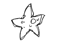
Early concept sketch
(Click to enlarge )
The nearly immobile Fishstar type 2 Food had no eyes initially. But it was making no sense that all the Mobs of the game-including Food- would have eyes except this one. So, I added this confused gaze, not only for AD consistency but on the Game Design level, as well : thus helping the Player to identify positively that asset as something to interact with and not as an unimportant element of decor/background.
Evidently, I named that Mob “Ringo” for “Ringo Starr”… The “easter egg” effect would state that if a PC would reach Level 5 mutation exclusively by eating Starfishes, the Beatles’ song “Yellow Submarine” would play and a random type of Mobs present in the map would start to accomplish some dancing ballet or synchronized swimming (like all the Level 3 NPCs or all the “Barrac” type Enemies for example) ; during that dancing time, these mobs would be completely inoffensive as much as edible (as Level 0 Mobs) and the PC would score triple points if he would eat exclusively these mobs.
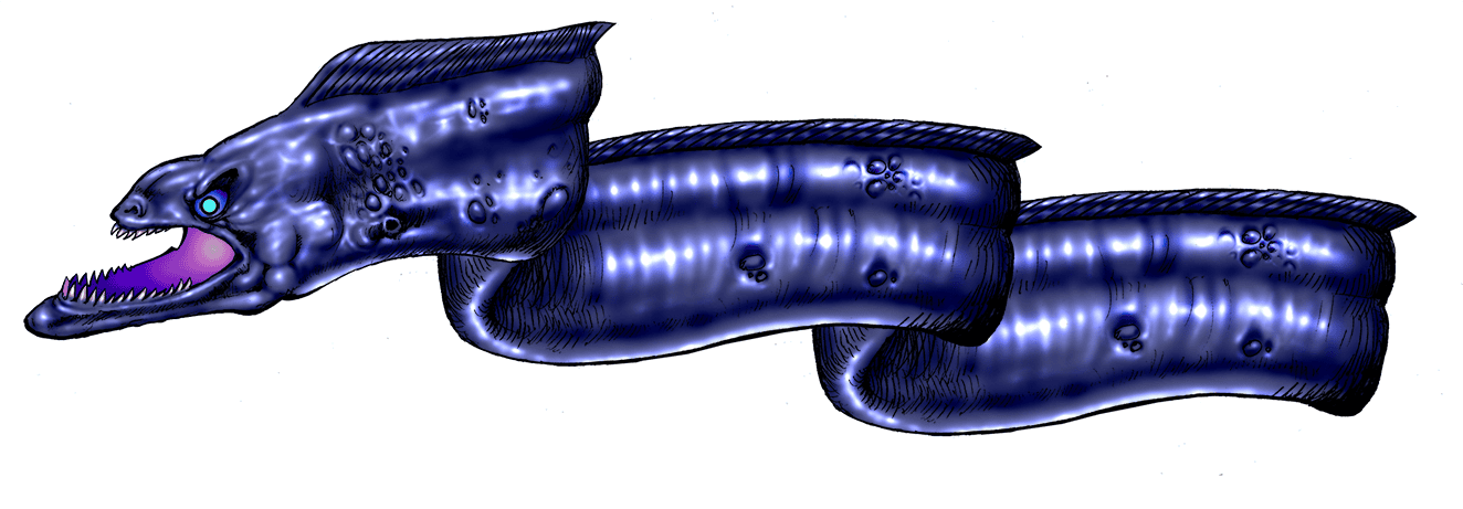
Food 3 – “Nebula”
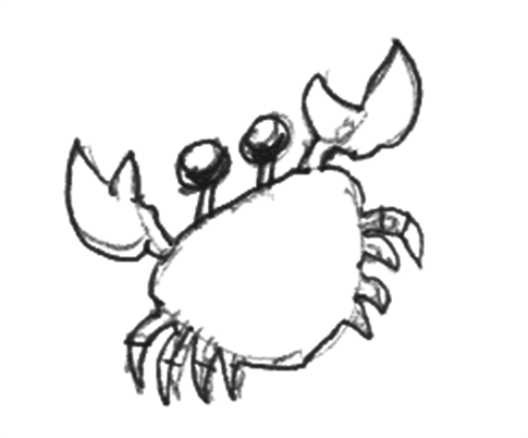
Early concept sketch
(Click to enlarge )
To be sure about gender equality, I decided to make the type 3 Food a female Crab Mob. Of course, that doesn’t immediately jump out as an evidence since gender determination of crabs is a delicate task. Once the gender determination was done, it was easy to come with a female name which made sense on the gameplay level : “Nebula” ; of course as a reference to one of the brightest nebula type ever observed : the Crab Nebula set in the Taurus constellation.
“Easter egg” effect : If the PC would achieve Level 5 mutation by eating exclusively Crabs, then all the Crabs Food Mobs would grow to a gigantic size, reaching Level 7 strength equivalent (overall, big enough to reach the “abyss” lower part of the game map) for a short amount of time.
All the NPCs, Enemies and Traps would be instantly destroyed (the PC would be unaffected by the giant “Nebula”), exploding in a myriad of little “Nebula” Mobs that the PC could consume normally, increasing potentially his score. Tactically, it was interesting for the player to modify his gameplay to attract and lure opponents mobs towards the giant “Nebula” to benefit from their destruction.
5: Traps
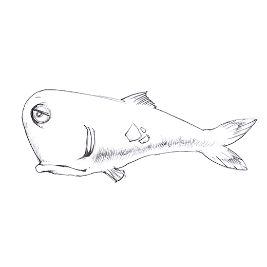
Trap 1 – “Moris”
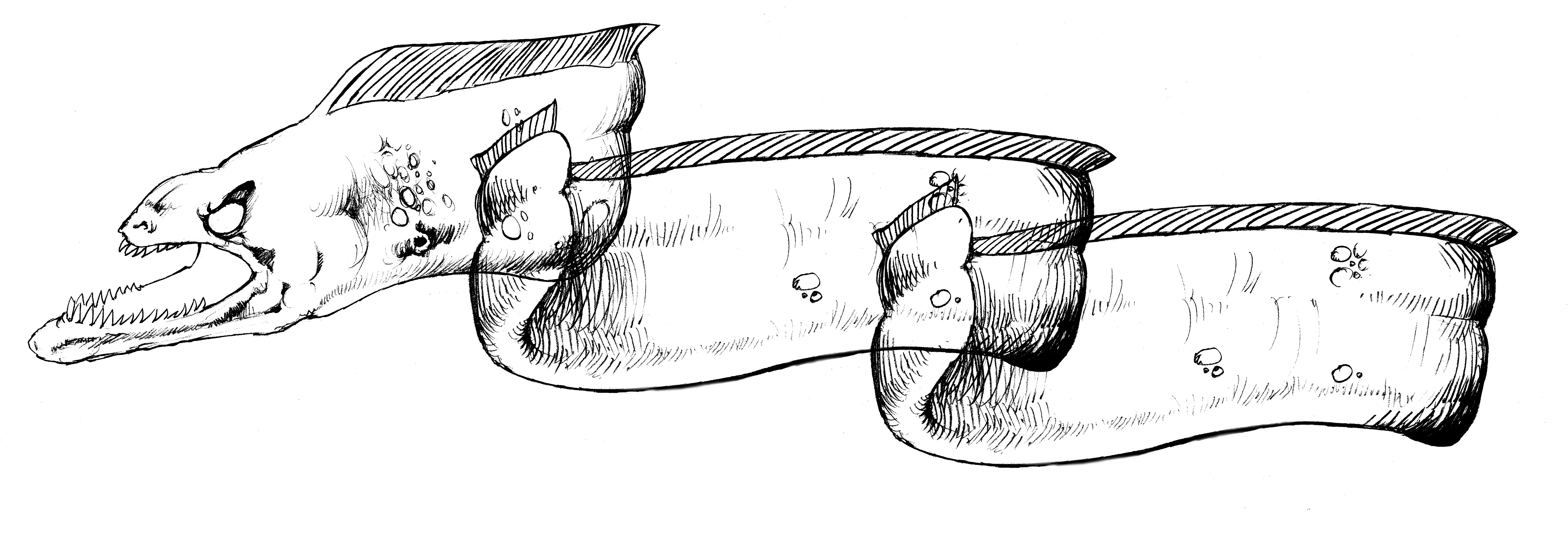
The different stages of the Concept Art
(Click to enlarge each picture)
As stated earlier, that Trap Mob was a stationary one; yet, it was no less dangerous as the player had no idea about the springing range of this Moray Eel model and the reasons of its triggering before some time of observation. Indeed, each “cave” set in the bottom of the map might have a random type of “Moris” whose PC detection, agression and springing range was determined randomly at each map, as much as it was able to attack randomly a particular type of NPCs and/or Enemies as well. Therefore, the unfolding reaching movement of this Trap would vary between 1/10th to 1/3rd of the width of the map.
As soon the PC would enter the detection range of “Moris”, its evil eye would start to glow within the shadow of the cave, leaving only one second for the PC to swim away before this Moray Eel would spring out in its direction, destroying everything in its path (except “Sharky”).
Visually, I designed it as an “Alien/Xenomorph” type of Mob, bringing it on the fringe between cartoon and semi-realistic styles, as I wanted it to look really nasty and scary, as much as its AI behavior.
The model itself was set in three separate parts which were articulated and attached to each other to simulate the unfurling movement, as much as for the developers to calculate the range of the spring. Consequently, the developer was attributing such or such coordinates to the different parts to know at which point of the model they had to attach to each other : one for the model at rest and one for the model fully deployed; the animation of the unfurling movement being calculated between these two states.
Initially, this model was named “Elvis” (for “Moray Eel-vis Presley”) and its initial design was displaying him with a Pompadour haircut. Though, since the design evolved into something more scary, I dropped that name to baptize him “Moris” (for “Mor-ay eel”).
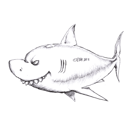
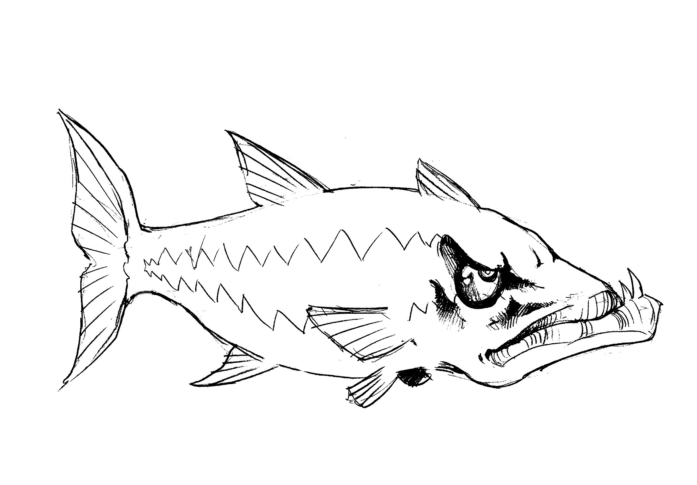
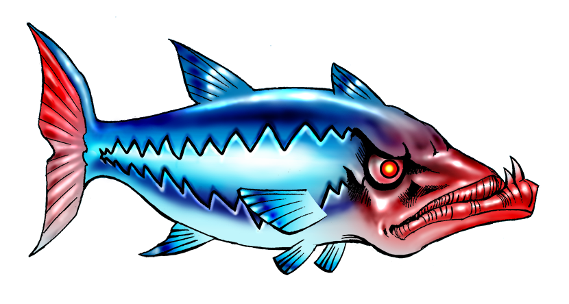
Trap 2 – “Sharky”

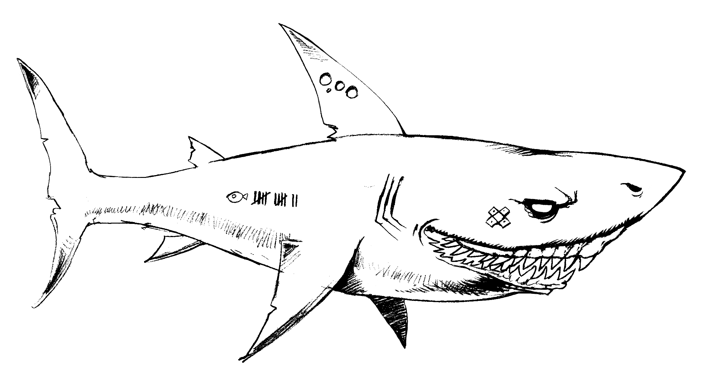
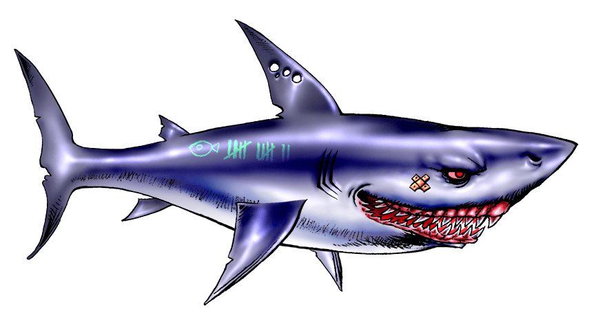
The different stages of the Concept Art
(Click to enlarge each picture)
Certainly the deadliest opponent in the game, “Sharky” was the most massive of all the models. Initially the design of this Shark was rounder and shorter, but gameplay wise, it needed to take more space in length and less in height to give the player more space to avoid him, since the game map was set on a vertical configuration and not an horizontal one.
On the visual aspect, I did not want him to look too much as “Bruce” from Finding Nemo, especially that our shark was not vegetarian at all. I really wanted to give him the profiled, steel aspect of a killing machine, enhanced by his “scoring tattoos” painted on his flanks, as if he was a form of war pilot shooting down his preys one by one.
To help further the PC about the impending arrival of the “Sharky” Trap, a sort of “Jaws” music was played announcing his arrival. Since “Sharky” was so massive and that he was to trigger a fleeing pattern in all the mobs of the map, we made him to have a relatively low speed for the PC had a chance to set a dodging strategy…
Now, the fact that “Sharky” was going through the map level so slowly was, as well, meaning that the AI behaviors of the other Mobs was changed for the same amount of time ; up to the player to use that knowledge to prepare an optimal dodging strategy.
● Final elements of the Game’s First Level
1: Game Models complete display
Below are represented the final models and their respectful sizes within the game map.
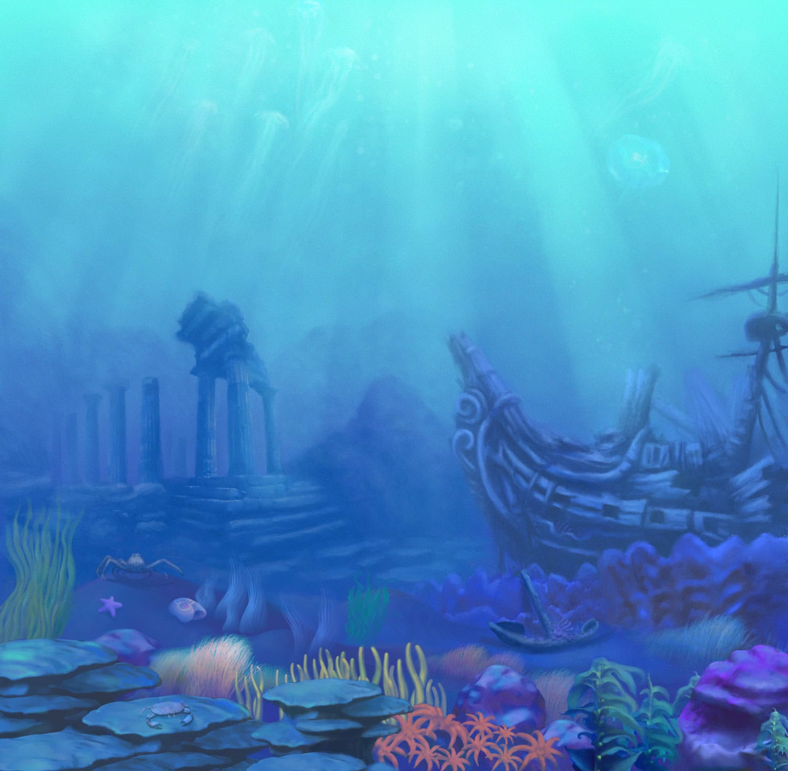
2: Game Background screen
The settings of the First Level of the game named “Sunken Galleon”.
This post belongs to the Category :
Check my latest posts!
- Using AI creatively : Character Design – Yaràn Malak”
- Article Header Design: “How to use AI for Weak Signals – Trump, the International Revolutionary?”
- Creative Compass : Where Art meets Story
- Article Header Design: “Uranium for the U.S. Nuclear Renaissance: Meeting Unprecedented Requirements – Part 1”
- Article Header Design: “Towards a U.S. Nuclear Renaissance?”
Check the latest comments!
Thank you very much for your comment coming from an IT expert, Nouha!
Very interesting article and excellent choice for th Sphinx!!
Splendid as always! And also this showcase the very broad scope of your design skills!
Related Themes :
Related Links :
Your comment will be posted after approval
Leave a Comment